

Hello there,
I hope everyone had a lovely holiday celebration, and got a special gift you love! I have been inspired by one of my Christmas gifts to start this new post category – Your Perfect Palette. I sent my mom about ten Amazon links for design books I’d like as Christmas gifts (another post with design and styling book recommendations coming soon), and she was going to pick a few books to surprise me with. I was really crossing my fingers for The Color Scheme Bible, by Anna Starmer, and I got it! Hence this new blog series has been born!
The book is chock-full of unexpected, inspirational color combinations, and tried and true color rules such as, green can often be used as a neutral to balance a space – especially softer shades of green. Another good tidbit – all reds go together, as do all pinks. And soft oranges almost always feel warming.
Now, I am usually a believer that all rules are meant to be broken, but it’s nice especially when you are learning to have some guidelines. So, with each Perfect Palette post I’m going to focus on one unique color combination, and a room where this palette might look fabulous in your home. This week is all about a BOLD bathroom and contrasting colors.
When you contrast dramatic colors, your end result often creates an energetic environment. And I don’t know about you, but I could certainly use a jolt of energy each morning, as I groggily step into the bathroom.
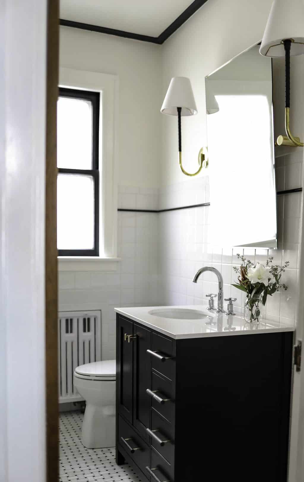
In this bathroom, the main wall color is a bright marmalade (or orangey-red). The butterfly image is perfect for color inspiration, or could be blown up and used as artwork. When working with bold colors remember to keep decoration to a minimum. The colors are doing a lot of work, so you don’t need to add lots of artwork or extraneous decor.

This is Valspar Marmalade Satin Interior paint.

The main accent colors are mint, turquoise, and deep red (think blood orange or ruby red). You might think that red and orange clash, but here they are similar enough in tone and saturation to work together. The cools blues serve as the perfect accent to balance all the warm orange, and then the deep red highlights the orange – injecting an even hotter and energetic color into the space.

Earthy yet dramatic lighting fixture.

Lush red towels feel regal.

Ultimate gorgeousness in turquoise shower tiles!

Perfect accent decor with flowers, or as is.
Silver seemed like another perfect highlight for lighting fixtures or mirrors, and I felt the imagery was beginning to take me to Morocco. I continued on that theme with a few ornate mirror options.


And there you have it! A BOLD and ENERGETIC bathroom that feels like a trip to Morocco each morning (haha, a girl can dream, right?)
XO – Claire

Leave a Reply
October 7, 2024
read the post
YOU MIGHT ALSO LIKE
April 17, 2024
read the post
September 2, 2021
read the post
August 24, 2021
read the post

Meet Claire
Claire’s creative energy comes from her unique perspective on the world as both a trained interior designer and a passionate yoga teacher. Her affinity for kitchen design, timeless style and eclectic decorating are shared here, along with lots of interior design education and tips. Thanks for being here, please enjoy!

