The Warwick Reno: Spring Home Tour #2 – FULL REVEAL
February 28, 2018
I am SO EXCITED to finally be writing this post! Our upstairs remodel has been in the works a long time. We started the process in the summer of 2016 (with tearing out the old linoleum floors and planning the bathroom remodel). Remember the BEFORE PHOTOS from when we first moved in? And the terrible upstairs BATHROOM?
Not anymore! So fresh and so clean.
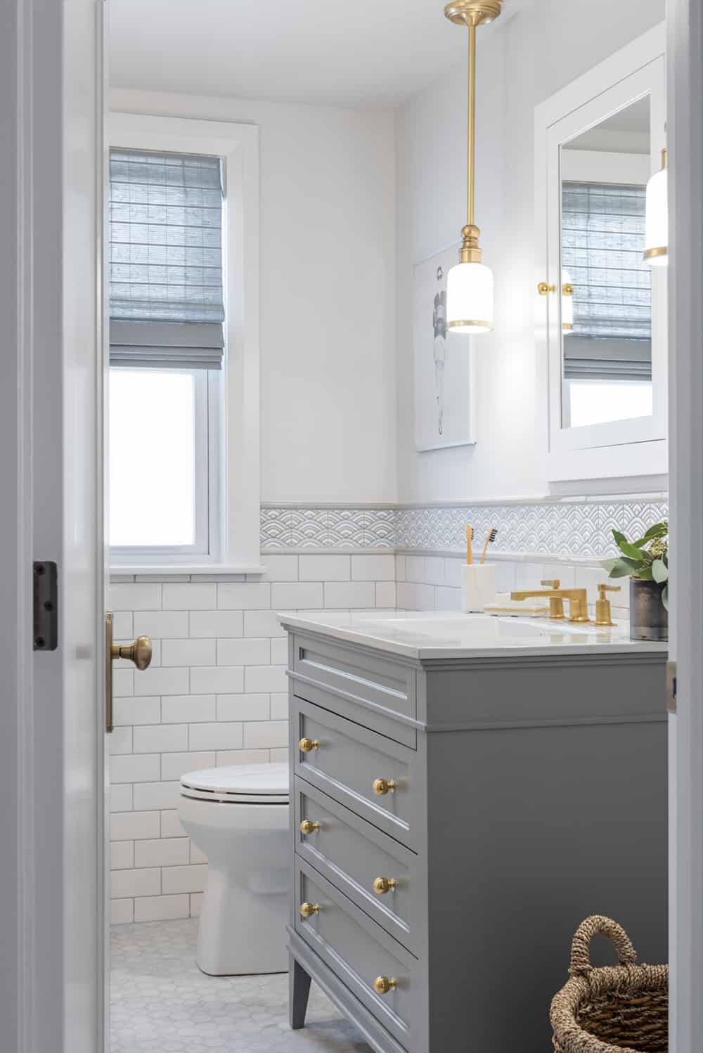
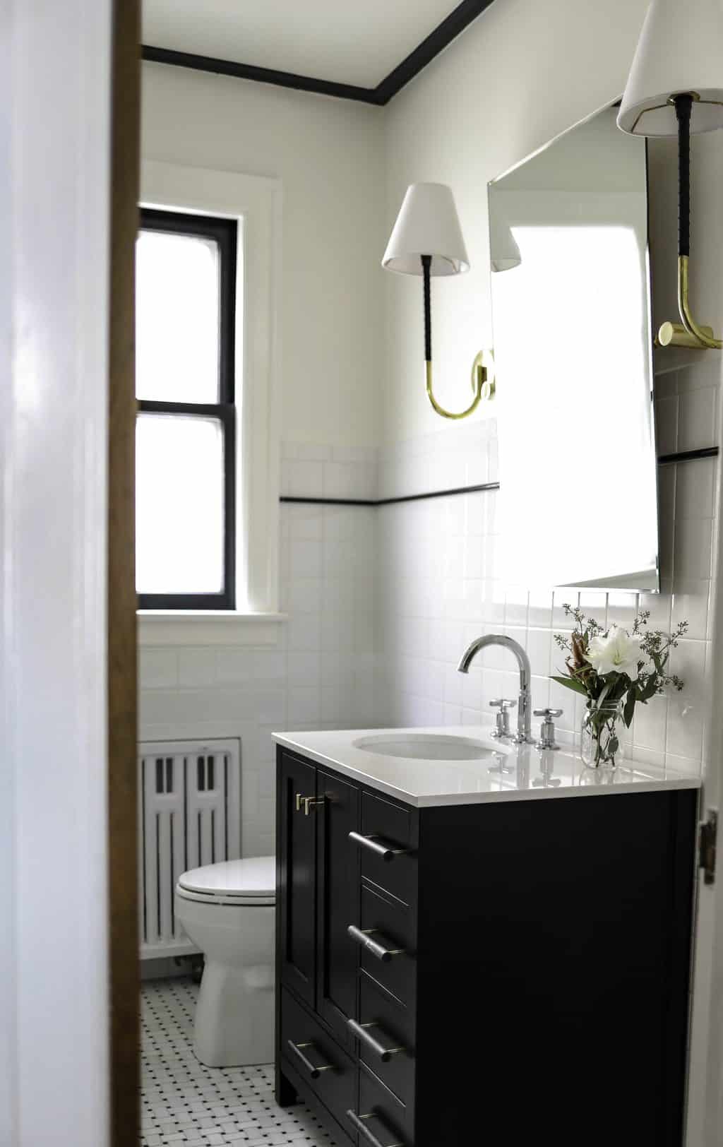
The small bathroom was gutted, re-framed and we tried to make the most of the footprint. More details in the post.
We waited until Luke had time off last summer to really dive into the complete gut. Here was the post with our ATTIC BEDROOM DESIGN. We hoped to be done with the upstairs renovation by September of last year, but with the reality of all there was to do, we just finished in the new year. When we purchased the house, the couple we bought it from had a legal cat rescue, so no one had lived upstairs in years – just the cats! The space has come a long way! With major improvements to the plumbing, refinishing of floors, new drywall, added electrical, new baseboards, doors, door hardware and lots more!
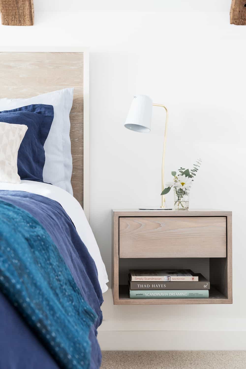
Master detail. I designed the floating end tables to save space and keep a light and airy feeling. Lamp by Unison Home.
SECOND FLOOR TOUR:
Below is the full tour of the second floor and links to many of our resources and sponsors. I didn’t want to ruin all the pretty pics with the before shots – so CHECK HERE to refresh your memory on where we started. We’ve been in the house two years next month. Our spring tour of the FIRST FLOOR was posted last year around this time.
Many thanks to our photographer Todd Crawford, who helped me capture the upstairs in all its remodeled glory! You can follow Todd on Instagram HERE.
THE LAYOUT:
Some explanation on the upstairs layout. The second floor is one long hall with nice size rooms at either end (one end has master and coffee nook and the other has lounge and nursery). In the view below, you can see the original french glass doors to the master bedroom. We love the clean lines of the new hall doors from METRIE (we used the True Craft collection) with gorgeous hardware from NOSTALGIC WAREHOUSE (we used the Deco collection).
The door ajar next to the master is the bathroom, and across from the bathroom is the coffee bar nook – which we are obsessed with! Our Monogram under cabinet fridge is perfect for late night snacks, storing bottles and morning coffees. The hall really functions as an extension of the bedroom. I like to call it a “dressing room,” as our clothes are in the closets and my dresser is in the hall to free up room in the bedroom.
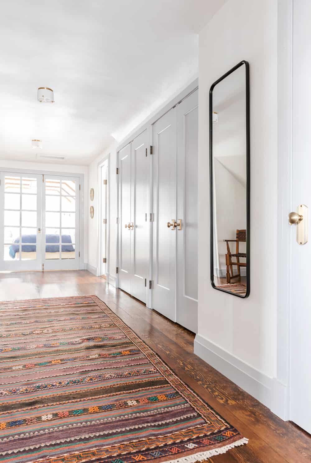
View of upstairs hall looking towards master bedroom.
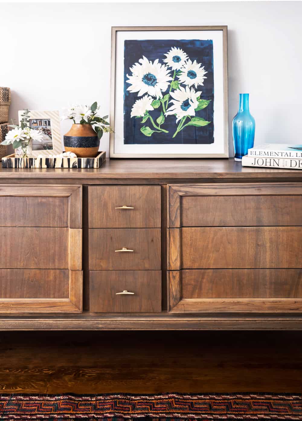
Dresser in hall by MegMade.
The cute little ceiling flush mounts are from Hudson Valley Lighting (called the Blackwell collection). We were able to switch out existing can lights with three fixtures and I love their soft glow and low profile. The floor rug is vintage, but mirror is a steal at Target (link to similar). We used Benjamin Moore Chantilly Lace (my favorite bright white) on all walls and Benjamin Moore Tundra as the contrasting trim/door color. It’s a soft blue-gray color in-person. I wanted the space to feel really airy and relaxing, as opposed to our more formal DOWNSTAIRS.
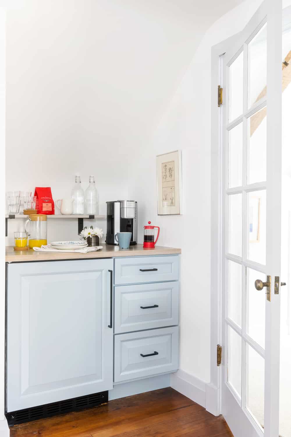
Coffee bar nook outside the master bedroom. Under cabinet fridge by Monogram is covered with custom panel. Cabinetry is from the Haas line we carry at the design studio.
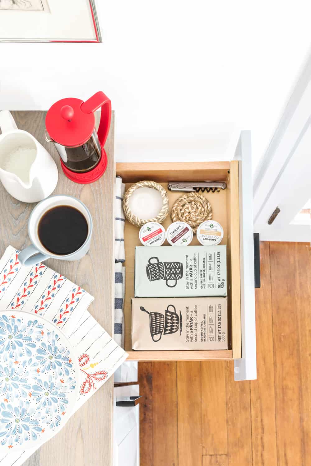
Ready for coffee!
THE MASTER BEDROOM:
This room had terrible paneling and only a sub floor. We also had to replace an old radiator with a baseboard radiator to be able to build in a window seat. We drywalled over the paneling for cost savings, Luke built the window seat (my favorite!), we added reclaimed decorative beams for architectural detail/ warmth and put cozy carpeting on the floor.
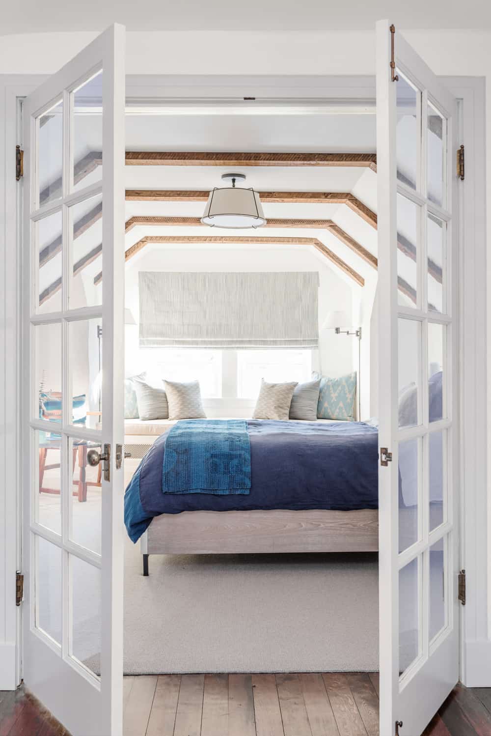
Looking into the master bedroom.
We just love how the attic bedroom design turned out. Originally, we brainstormed all these things we could do with the dormer, but in the end just a simple window seat and the ceiling beams really gave the room nice character. In keeping with the light and airy feeling, I used mostly blues, grays and tans in the bedding, textiles and wood tones.
Our duvet and sheet set is the Linen Color Block collection by UNSION HOME. The saturated cobalt blue is a great color, and I love the rumpled/casual look of 100% linen. I accented the blue with handwoven textiles from a Texas company, which weaves all their products in India, KUFRI LIFE FABRICS. I had the pillows and flat roman shade made locally. The indigo kantha blanket at the end of the bed is by DIGNIFY – this company employs at risk women in Bangladesh to create these colorful and comfortable blankets. Our bed is called the Shana and is from HORCHOW. The end tables were made by my favorite carpenter, EMOTIVE RECLAIM, to match the bed.
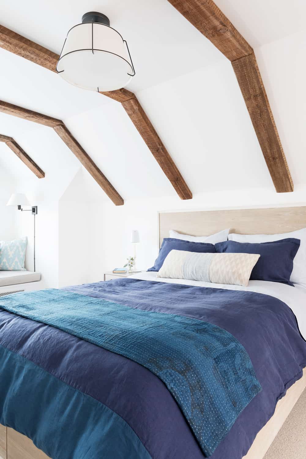
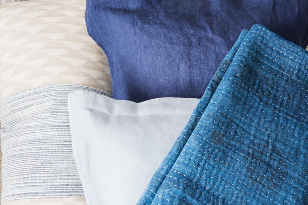
Textile details..
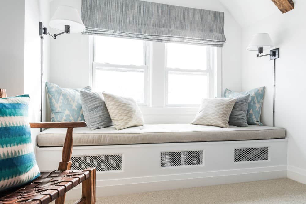
There are a few artful touches on the bedroom walls. Wallpaper and home decor company PORTER TELEO gifted us this beautiful framed piece, called “Abstract Quilt in Bleu” – acrylic ink on Japanese paper. Works perfectly with bedding, doesn’t it? And I worked with Charleston, SC based artist MARQUIN CAMPBELL to create this one-of-a-kind abstract based around our color scheme and the ocean.


THE BATHROOM:
Moving onto the bathroom! We were able to make the footprint a little bigger by pushing into an existing closet to create a built-in storage area. Our medicine cabinet and vanity are by RONBOW (Laurel collection), and I love having drawers for storage as opposed to cabinets in the bathroom. The sink and shower faucets are by WATERMARK (H-Line collection) and lighting is HUDSON VALLEY (Chatham collection). The decorative tile border is in a custom color by FIRECLAY TILE. They have a really fun online tool where you can play with tile patterns and colors. Again, I was inspired by water, the ocean – light and airy feeling was the goal.
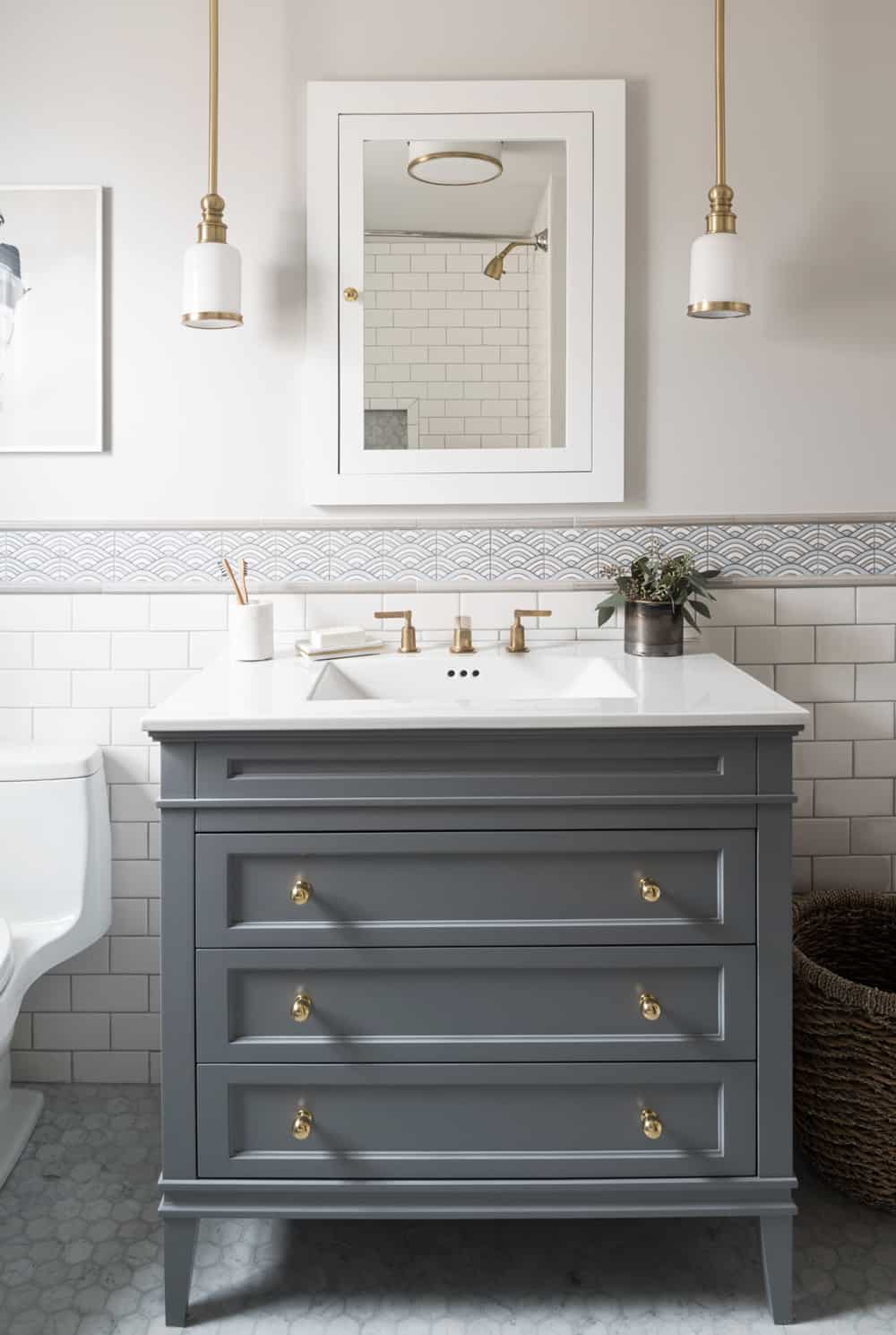
Vanity drawers are cut around the plumbing for max storage! Love using pendants in the bathroom to free up limited wall space.
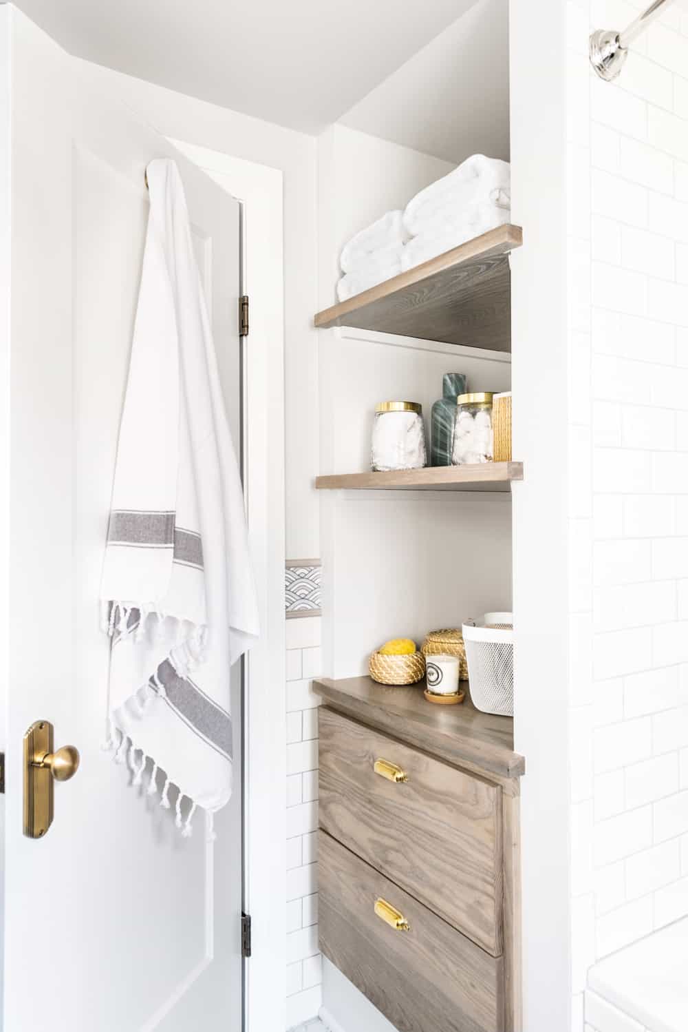
This was the space we bumped out into a closet that faced the hall. Allowed us to create this great storage nook, which we needed in such a small footprint.
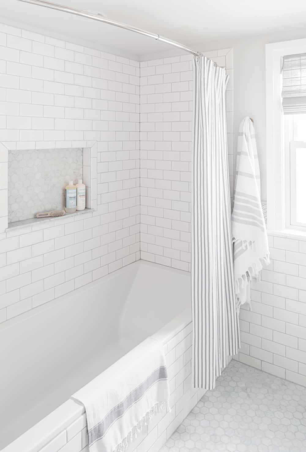
We went with a 5 1/2 foot tub for a little extra luxury! The Kohler Underscore. Has a great back rest and is extra deep.
THE LOUNGE:
Are you still with me?! We’ve got just a few more areas. At the other end of the hall, we created a den or family room, which is more relaxed and kid-friendly than our living room downstairs. The sofa faces a wall with a mounted TV (not pictured) and I can’t wait for family movie nights when Willa is big enough to watch movies.
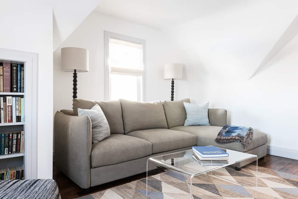
Sofa is from Interior Define, rug Jayson Home, coffee table and pouf CB2, and lamps Target.
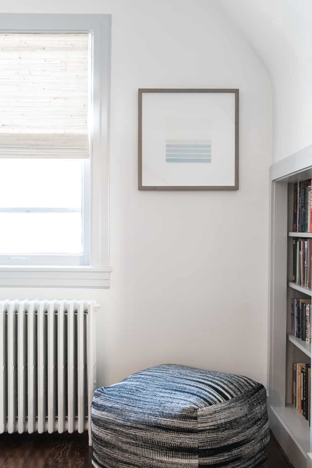
The little bookshelves openings were already built-in to the eaves, but had glass shelves which we replaced with wood. Another special piece of art hangs in this area. Modern embroidery by New Zealand artist JANE DENTON, who lives in Wellington (where Luke and I lived for 2011). Another tranquil reference to water.
THE NURSERY:
Last but not least is the nursery (which is located off the lounge on the wall not pictured). I did a separate reveal post all about the ATTIC NURSERY DESIGN, but here are two pictures to refresh your memory. I went significantly bolder with the colors in the nursery, but tied in black, white and brass details from the rest of the rooms upstairs.
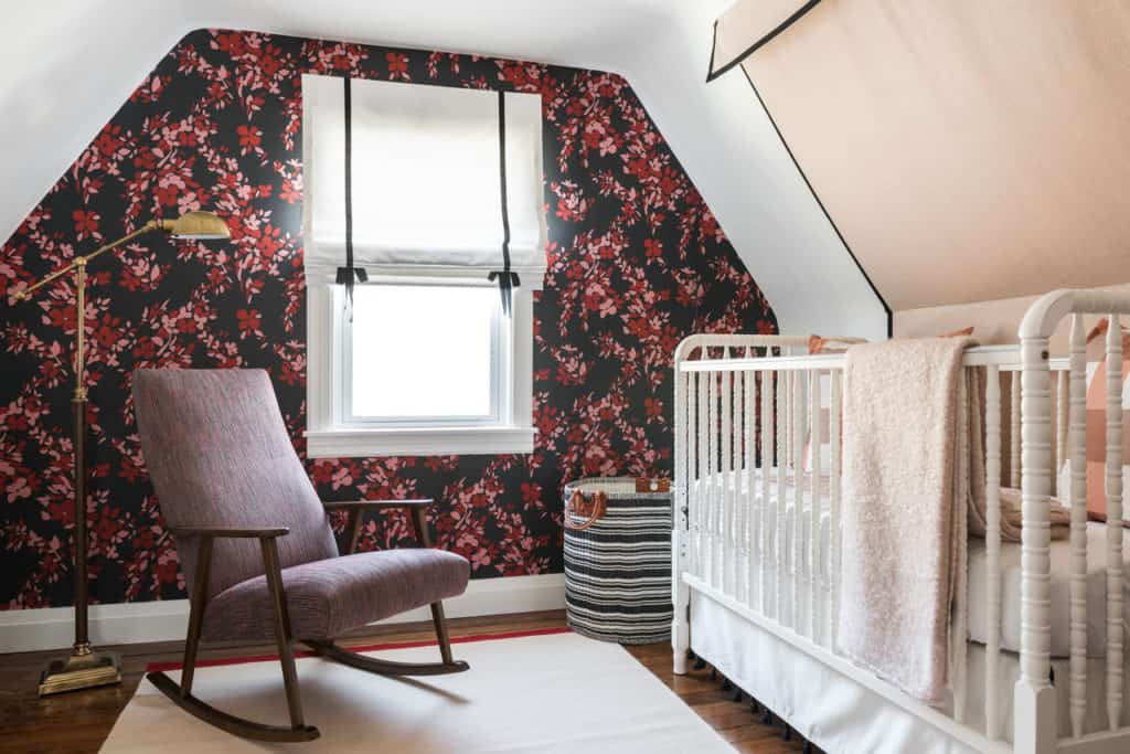
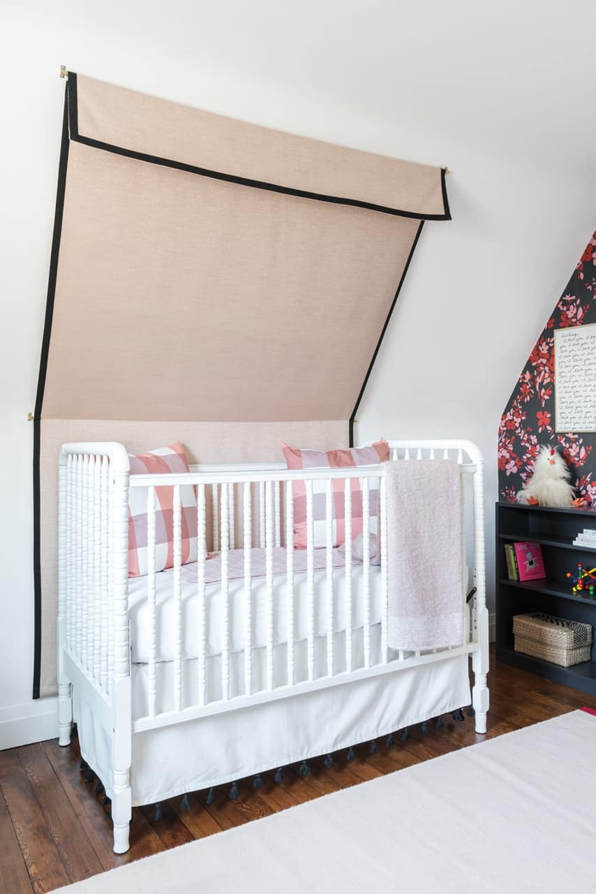
There you have it! Lots of hard work (labor from Luke and contractors) and design ideas from both of us went into this renovation. I’m thrilled with our little sanctuary, and look forward to the next few years raising Willa and enjoying it all together.
Thanks for taking the tour!! Let me know if you have questions or sources I might have missed. A big thank you to all the sponsors linked in this post. All opinions are my own and I only work with brands I love and recommend to my clients and blog readers.
XOXO
Claire + Luke + Willa
Leave a Reply
October 7, 2024
read the post
YOU MIGHT ALSO LIKE
April 17, 2024
read the post
September 2, 2021
read the post
August 24, 2021
read the post
Meet Claire
Claire’s creative energy comes from her unique perspective on the world as both a trained interior designer and a passionate yoga teacher. Her affinity for kitchen design, timeless style and eclectic decorating are shared here, along with lots of interior design education and tips. Thanks for being here, please enjoy!