The Warwick Renovation: Hollywood Regency Style Dining Room
May 17, 2016
Let’s start from the beginning. If you’re new to the blog or this series, welcome (if you’re not, thanks for reading along)! My husband Luke and I recently purchased a vintage Tudor-style bungalow on the northwest side of Chicago, and we will be documenting our design process and renovation journey here on the blog! This post shows lots of BEFORE photos of the house if your curious.
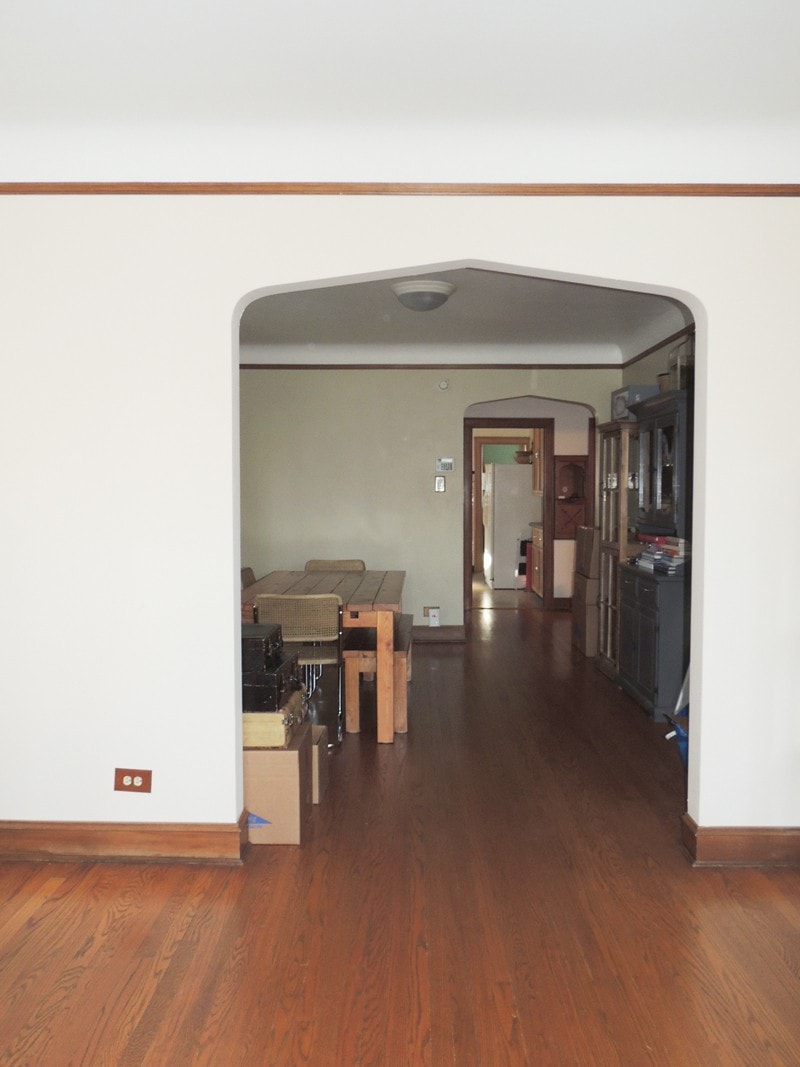
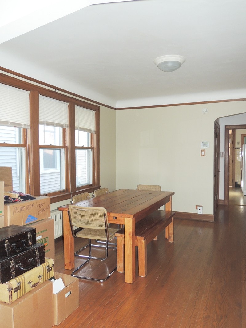
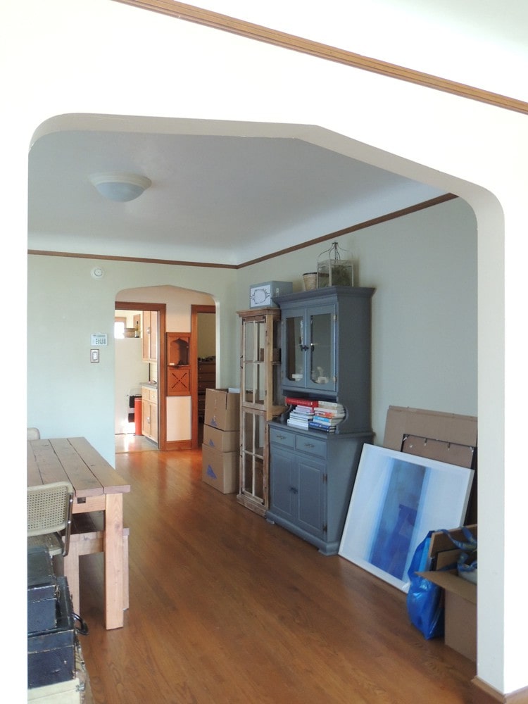
And here are a few of the before shots of the dining room to refresh your memory:
Admittedly, I’ve been feeling overwhelmed with all the design decisions. I have a new sense of compassion for my clients, it’s not easy to make choices without a second opinion! We are beginning the renovation with the entry, living room and dining room. The dining room just came together most easily for me, and so I’m sharing that first, but we are working on a custom built-in for the living room, wallpaper for the entry and then starting on the kitchen and my office, so lots to come! My style has definitely evolved/changed since our last home, which was more mid-century mod inspired. I’ve been really drawn to antiques, gold, lacquer, velvets – really anything that screams hollywood regency. I find this totally fascinating since the height of hollywood regency style was in the 1930s, which was right when our home was built, 1932. Maybe the old bones of the home are speaking to me?!
If you don’t know much about hollywood regency style, here’s a great summary article on the history of the style by A Beautiful Mess. Two current designers who really represent a modern take on this style in my opinion are Kelly Wearstler and House of Honey. I’m a big fan of both of these designers.
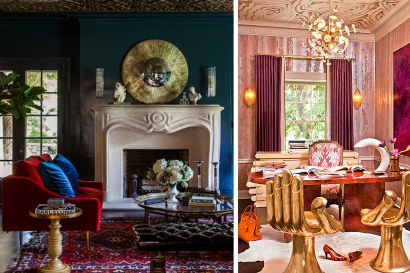
Room on the left by House of Honey, room on the right by Kelly Wearstler.
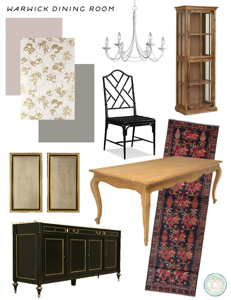
This style is pretty “fancy” and quite opulent for the average home owner, so I’ve toned it down a notch, but I love any excuse to throw in a little design knowledge, so there you go! Now you know where I’m coming from a little bit more. Here’s the design board and some of my major inspirations. My best advice for starting a room design is to just start somewhere! Maybe it’s something you already own, or a vintage piece you found, or a wallpaper you can’t live without. Maybe it’s all three of those. In our case, it was all three! The wallpaper, cerused wood hutch and vintage chandelier (what is pictured is just an online place holder, I could not find this painted white iron fixture anywhere!) all informed my design as major elements in the room.
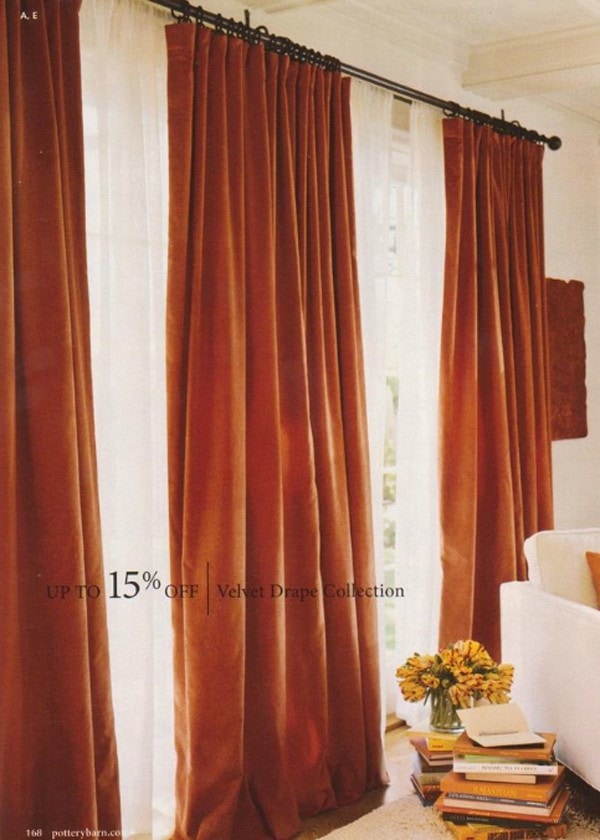
I’m thinking white sheers with velvet panels on the windows…still undecided on the color.
And on the west wall there will be a large wallpaper panel, or panels…still figuring that one out too. But I’m totally in love with the Asian inspired wallpaper.
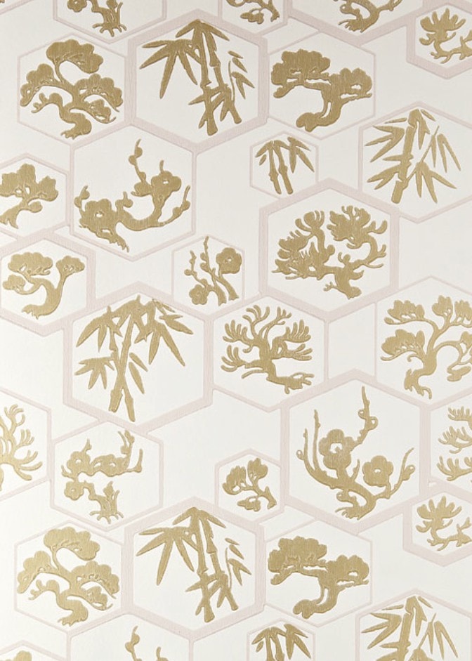
Farrow and Ball – Shouchikubai 4502
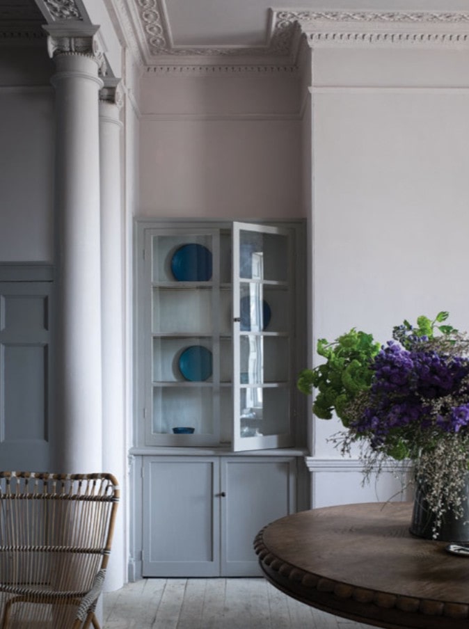
And of course the wall colors are still tentative, but we are going to paint color samples and pull the trigger soon. Here’s the inspiration photo that set me off the deep end. I was having visions of the white chandelier against the palest pink ceiling. These are both new colors from Farrow and Ball’s latest nine new color collection Peignoir is the dusty/grey pink, and Worsted is the grey. Am I lucky my husband is a romantic or what!!?
Alright, there you have it, and I did it. Designed one room for this house, only 10 or so to go. What do you think? Paint colors you think I should look into? Awesome wallpaper installations I should see? Tell me in the comments!
XO – CLAIRE
Leave a Reply
October 7, 2024
read the post
YOU MIGHT ALSO LIKE
April 17, 2024
read the post
September 2, 2021
read the post
August 24, 2021
read the post
Meet Claire
Claire’s creative energy comes from her unique perspective on the world as both a trained interior designer and a passionate yoga teacher. Her affinity for kitchen design, timeless style and eclectic decorating are shared here, along with lots of interior design education and tips. Thanks for being here, please enjoy!
