Sit back, relax and get ready for a long post folks! We are going back to the beginning at The Warwick Reno with BEFORE photos from April and the design plan from June. Okay, okay, here’s a pretty after photo to get you to hang on for the ride:
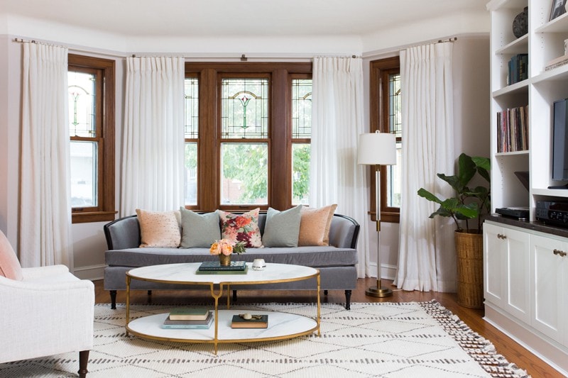
The Living Room…after!
Here’s where we were right after move-in this spring:
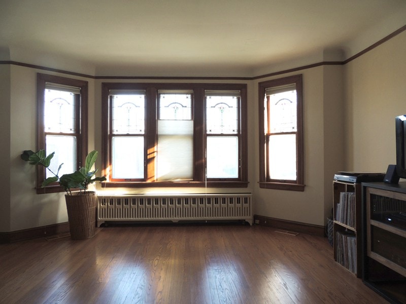
The Living Room…before!
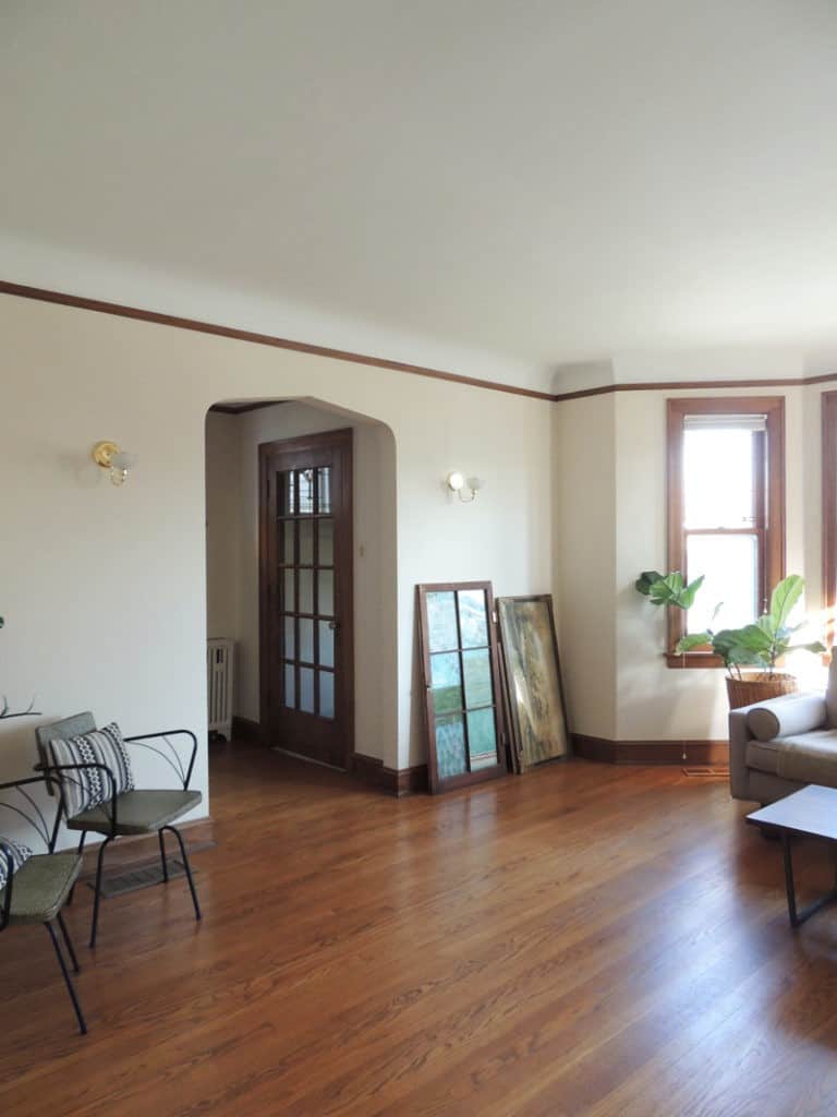
Before, looking towards entry.
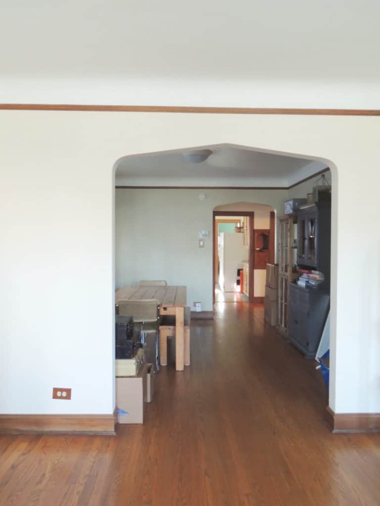
Before, looking towards dining room.
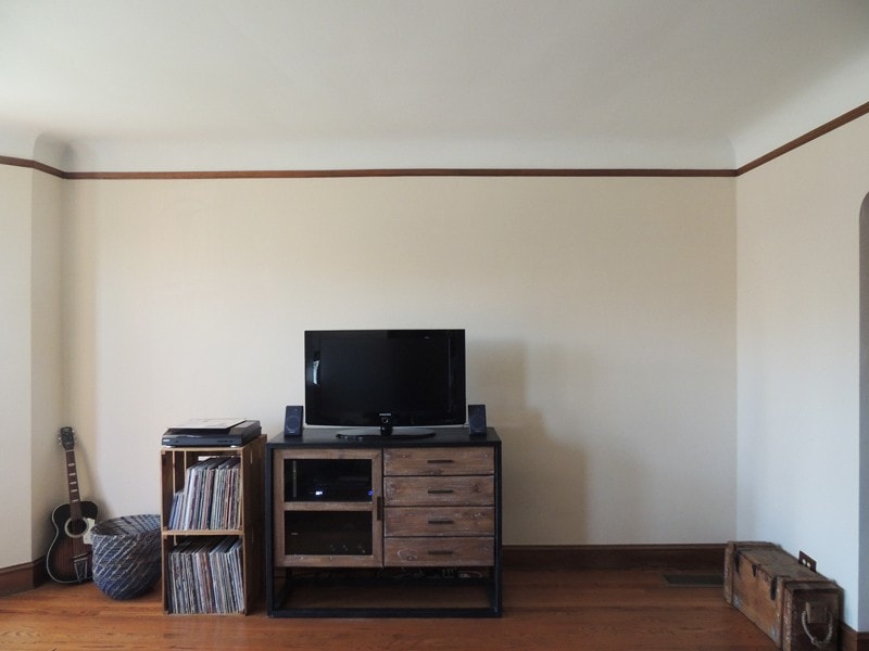
Before, location for new built-in media center.
And here is some of the initial design inspiration:
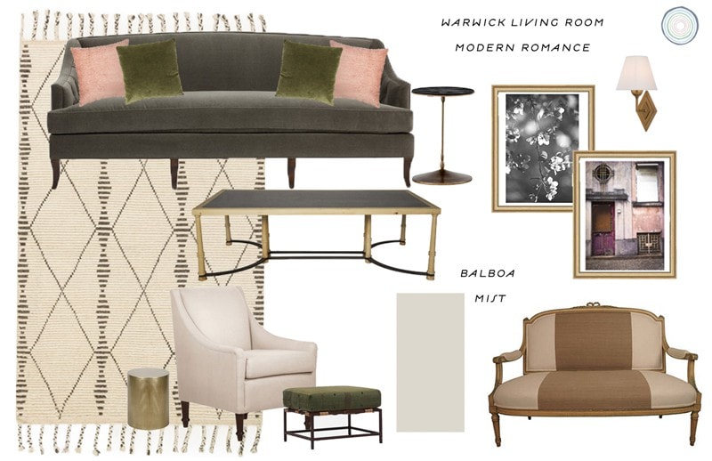
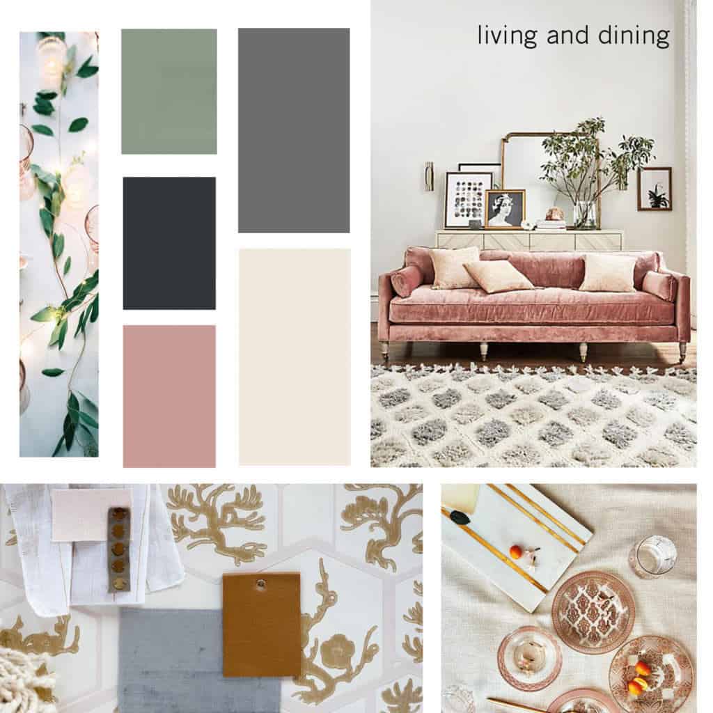
These are the (general) steps we took to update and transform the space:
- Patched peeling old ceiling, electrical work to move sconces down to correct height.
- Painted all trim, walls and ceiling. Left windows and doors as original wood to maintain some character. I opted for soft white drapery to help lessen the impact of the beautiful, but heavy wooden, stained glass windows.
- Luke built the media center out of plywood, and installed it. We painted it in place. The countertop is reclaimed wood, which was stained and cut to size. Not exactly a DIY project for most (unless you’ve got mad carpentry skills), but I’m thinking I’ll write up a post about what to consider if you’re considering a built-in at home.
- Mostly, new furnishings including the vintage sofa we had reupholstered/painted (I got the sofa for $25!!! at a local junk shop) and a few special pieces from Horchow, including our marble coffee table, lucite and brass lamp, and bone inlay side table.
- The entry console was stained in Minwax Perfect Brown by MegMade, and we added casters and new drawer pulls. The gold frames hanging on the picture rail are vintage finds from my favorite (Divine Consign, Oak Park) with prints from Minted. Other pieces were retail finds from West Elm (antiqued glass mirror), and Anthropologie (watercolor circle print and diamond mirror). The rug is by Loloi Rugs.
- Accessories have been collected over time, I love South Loop Loft and The Savoy Flea for vintage decor.
- The biggest splurge was the bay curtain rod and drapes, which were both custom orders. Window treatments are my number one overlooked, but biggest impact item for interior decorating!
- The paint color on walls is Skimming Stone by Farrow & Ball (but color matched by Benjamin Moore) which I don’t always recommend, but in this case we liked the color-match better! The trim is Ben Moore Cotton Balls, which is a warm white that worked well to brighten our north facing room.
- Like all spaces, there’s still more to do! I have a pair of Milo Baughman style Parsons chairs to reupholster so we have some more seating. I’m torn on what color/s to use on the upholstery. Do I stay neutral or add more color into the living room? What would you do?
Okay, that’s the history in a nutshell! I left out a few arguments on paint colors, wood and trim, late nights of painting, and several months worth of dinners eaten on a dusty, no longer pictured coffee table. Mostly, I’m just proud of us and that we’ve made it through this room, and several others together (and improved our communication and design skills along the way). Renovating with your partner is certainly a memory making experience, enjoying the little victories together is good stuff! I think we are in a good place for round two upstairs…
Here are the pretty pictures!!
The AFTER photos:

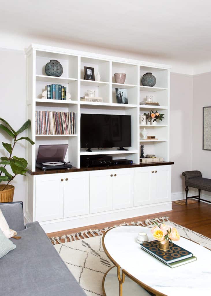
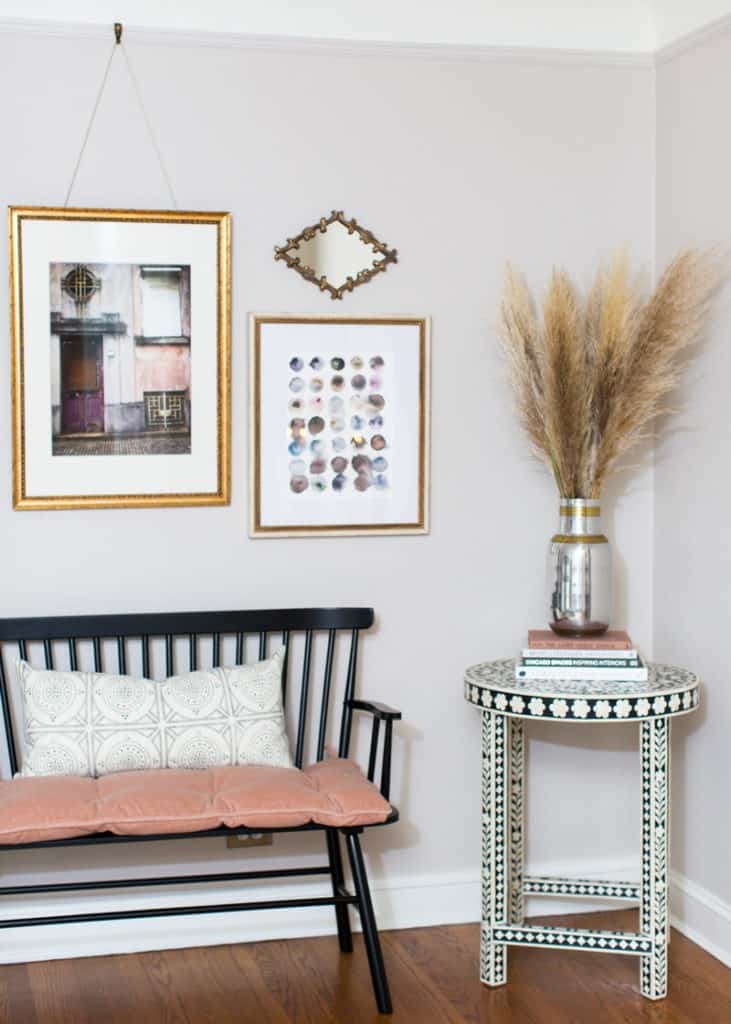
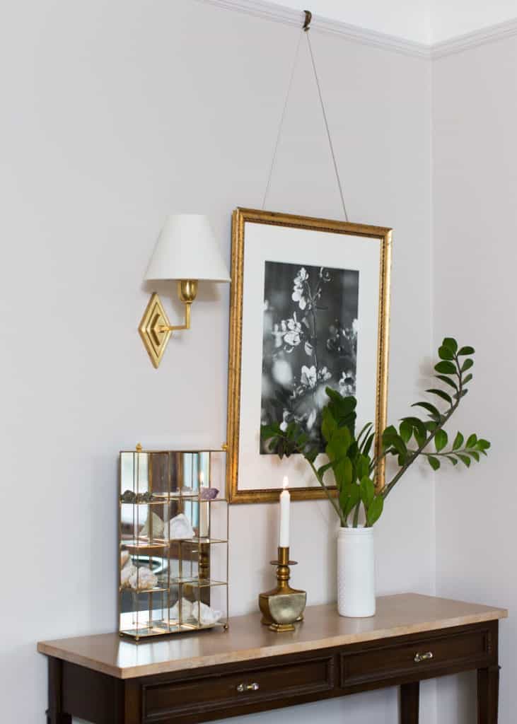
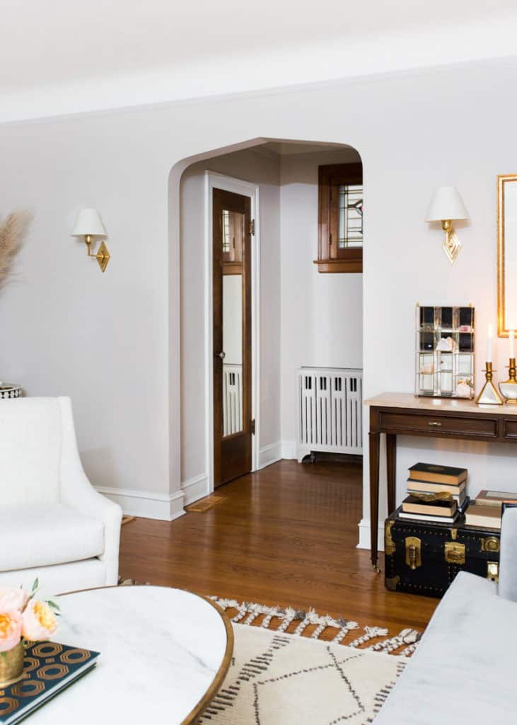
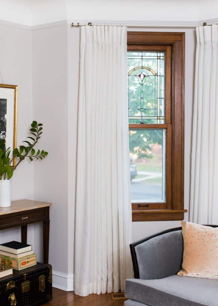
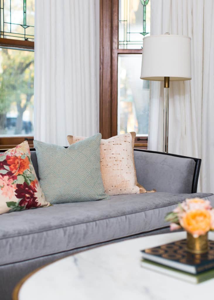
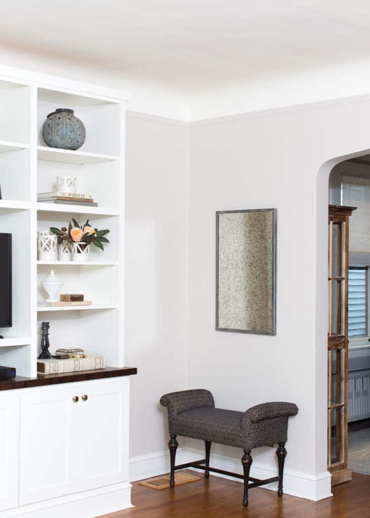
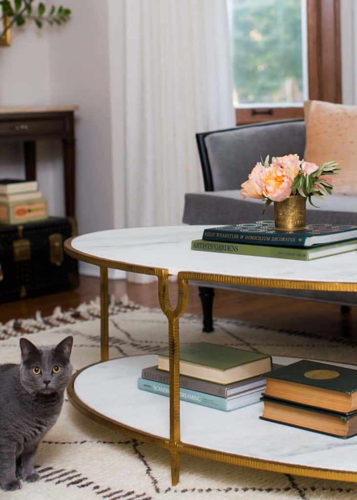
I’ll end on this note with our adorable kitty, who I’m so glad Carolina got in a photo! Also, if you love any of the Horchow pieces, they are all 25 – 30% off during the currently friends & family sale through the end of this week! Thanks for taking the time to read this reveal post. I really love this design stuff and I’m so glad to have a place to share it.
XOXO – CLAIRE
photography Carolina Mariana, additional styling Elise Metzger — this post is partially sponsored by Horchow but all opinions are my own, thank you to the brands that make this blog run!
Leave a Reply
October 7, 2024
read the post
YOU MIGHT ALSO LIKE
April 17, 2024
read the post
September 2, 2021
read the post
August 24, 2021
read the post
Meet Claire
Claire’s creative energy comes from her unique perspective on the world as both a trained interior designer and a passionate yoga teacher. Her affinity for kitchen design, timeless style and eclectic decorating are shared here, along with lots of interior design education and tips. Thanks for being here, please enjoy!