With the One Room Challenge in full swing, I’ve gotten a little distracted with my other posts. I realized I never posted the AFTER photos of the entryway! You all have been so lovely with your comments and positive feedback on Instagram. I love how the entry turned out. It’s definitely small, but I think it packs the punch I was hoping for and sets the right tone for entering the house.
I don’t think I’ll ever get sick of the sweet little arched door. Painting the door black was totally the right call in my opinion, sometimes you just need some black paint to add a little glamour to a space! I feel like I’m mixing art deco patterns and fabrics with global textiles and decor touches (in this house in general). Not really what I set out to do, but interesting how it is developing.
My entry with black door and wallpaper:
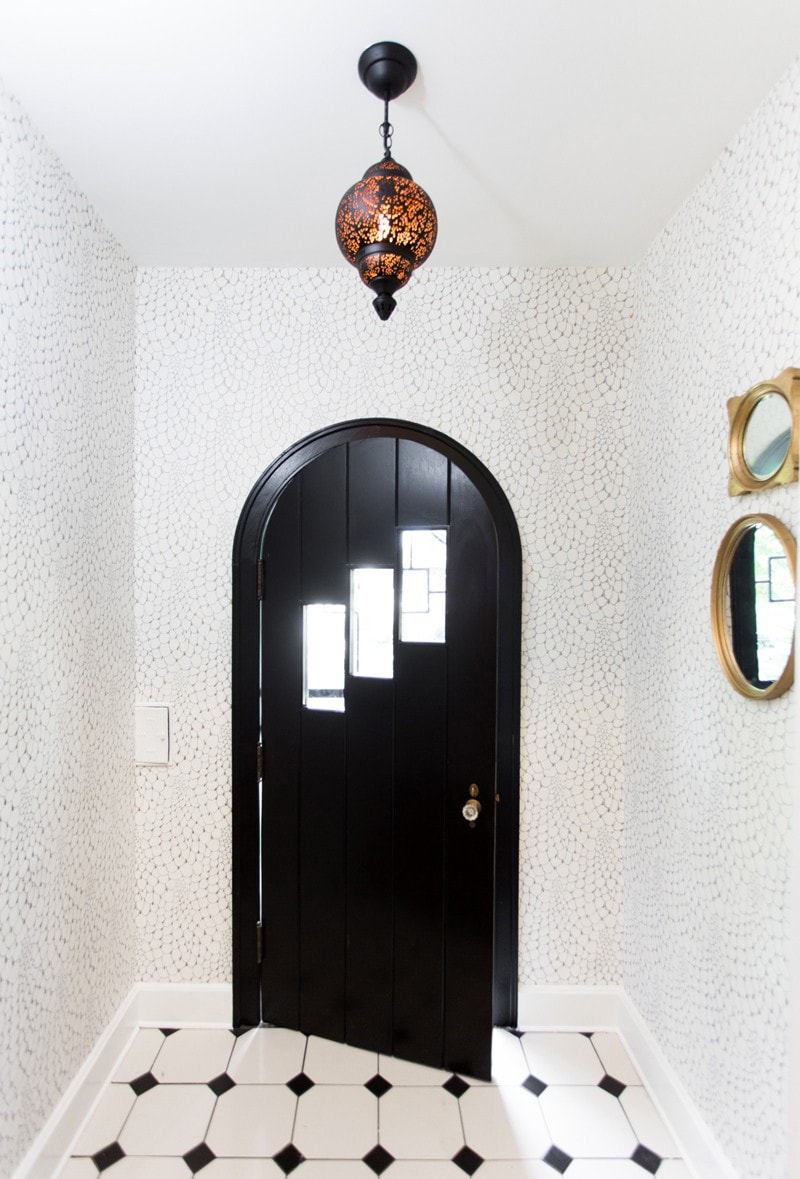
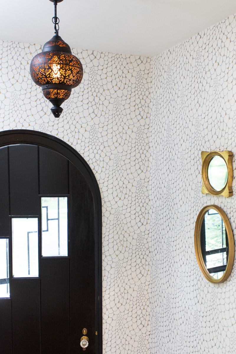
You can take a look back at the before photo/s and design plan. I think we stayed very close to our vision. And of course, I could not have done it without my friend and wallpaper designer (and sometimes hanger!) Erin Minckley of Relativity Textiles. The is her Peacock pattern in gold. This wallpaper pattern is her biggest seller! I’ve seen it in some other awesome projects lately.
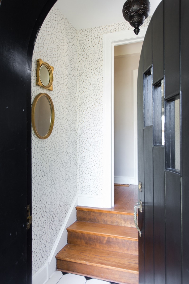
The lantern turned out to be just the right size! You can still find it at Jayson Home online. It’s called the Nina and comes in three sizes. I love its Moroccan roots and that gold interior creates a welcoming ambiance in the evenings. The tile I didn’t change. I’m not sure how long it’s been in the house, but it’s a classic pattern and color so I worked with it! I actually really like it. You can find lots of similar options by searching “black and white ceramic floor tile” online.
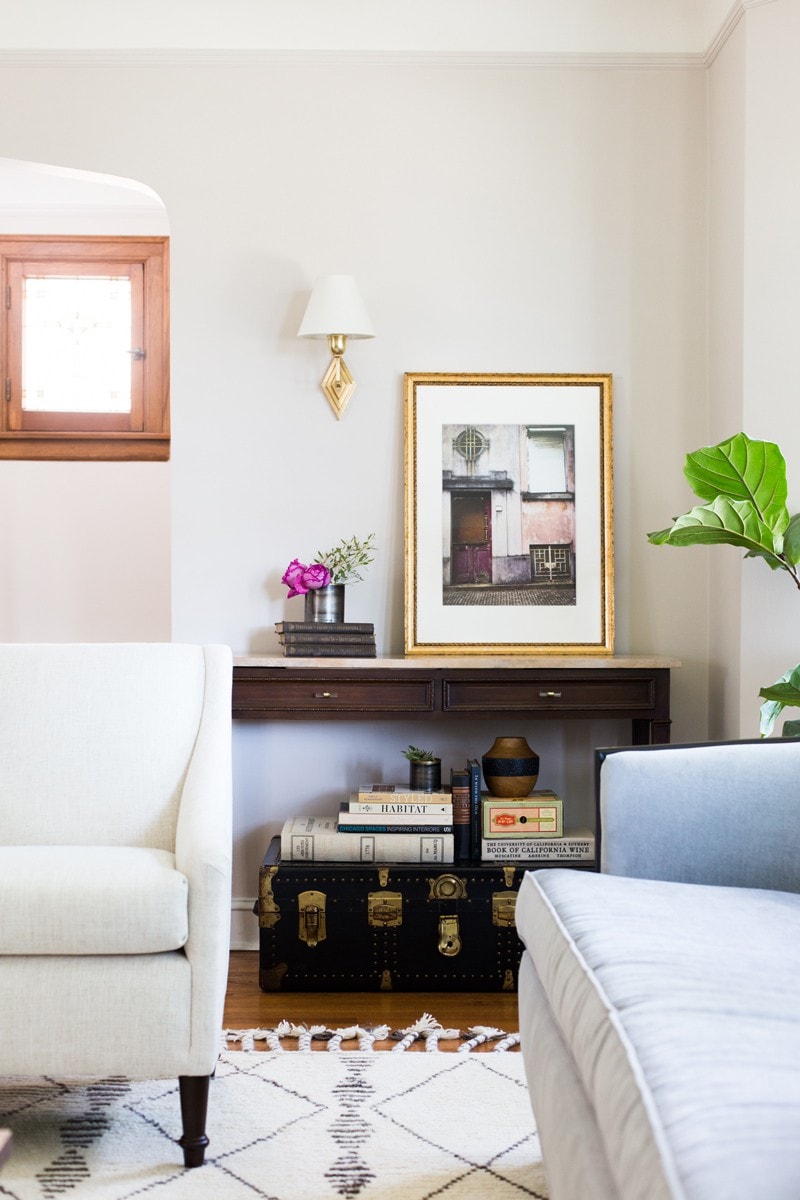
I’m so excited to finish up the rest of the downstairs and reveal the kitchen. Here’s a little sneak peek of a corner of the living room that is looking pretty good! The Bettina wall sconces from Circa Lighting are so pretty in person. I cannot speak more highly of Circa’s quality, honestly, we’ve been buying a lot of fixtures and their fixtures have a great weight and look to them. They are a go-to source in my client projects as well.
There you have it! Of course, I’m biased but I really love it and that’s all you can ask for. When you have to look at something day in and day out you want to enjoy it. If you need help transforming your space, let me know!
XO – CLAIRE
Leave a Reply
October 7, 2024
read the post
YOU MIGHT ALSO LIKE
April 17, 2024
read the post
September 2, 2021
read the post
August 24, 2021
read the post
Meet Claire
Claire’s creative energy comes from her unique perspective on the world as both a trained interior designer and a passionate yoga teacher. Her affinity for kitchen design, timeless style and eclectic decorating are shared here, along with lots of interior design education and tips. Thanks for being here, please enjoy!