Spring Home Tours Week Three: Farmer’s Daughter Interiors
April 21, 2017
Alrighty! By now you know the drill, it’s Friday and that means it’s #SpringIntoHome home tour time. This week it’s my fellow Designer Blog Conference Award Winner, Kelsey Grose of Farmer’s Daughter Interiors who won Best New Design Blog. Kelsey and I really connected at the conference for several reasons. We are both new business owners, share a love of vintage pieces and renovated our own homes with our husbands! We also both love the blogging and marketing sides of the design business. Kelsey is one of few other designers I know whose business name is not her own name. You’ve got to give a read to her post about the meaning behind her business name – it’s a really special story.
Here is Kelsey’s home tour in her own words. She is based in Saskatchewan, Canada.
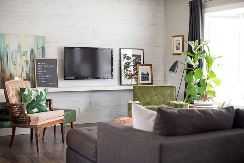
“We’ve lived in our home for just over three years, since just after we got married. It was in pretty rough shape when we bought it and we started renovating before we even moved in. Our renos involved shifting the stairs to allow for a larger dining room, taking out some of the interior walls, moving a few of the windows, and completely re-configuring the main bathroom.
Our home isn’t huge but, having done almost all of the reno work ourselves, it’s been a labour of love and suits the two of us great for now. I’m happy to say it’s basically completed now – we finished the basement a year ago and the exterior this past fall.
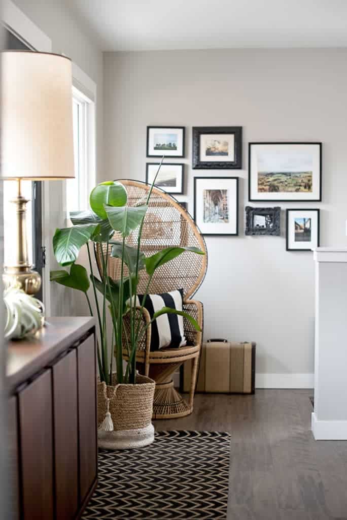
The retro chair in our living room was my Granny’s – she’s long passed away but I remember it in her house from when I was a kid. It sat in my aunt’s garage for a long time and last year I finally had it recovered in a gorgeous green velvet from Robert Allen. I love that it has a new life now and reminds me of someone I love. If I start my day early enough, I perch there for a few quiet moments in the morning.
Quite a few of the pieces in our home are vintage finds, actually. I always appreciate how vintage accents add depth to a room and tell a story – not to mention the constant thrill of the hunt when I unexpectedly stumble across something lovely. The brass lamps (below) we’re totally thrifted and were in such great shape, I didn’t change a thing about them!
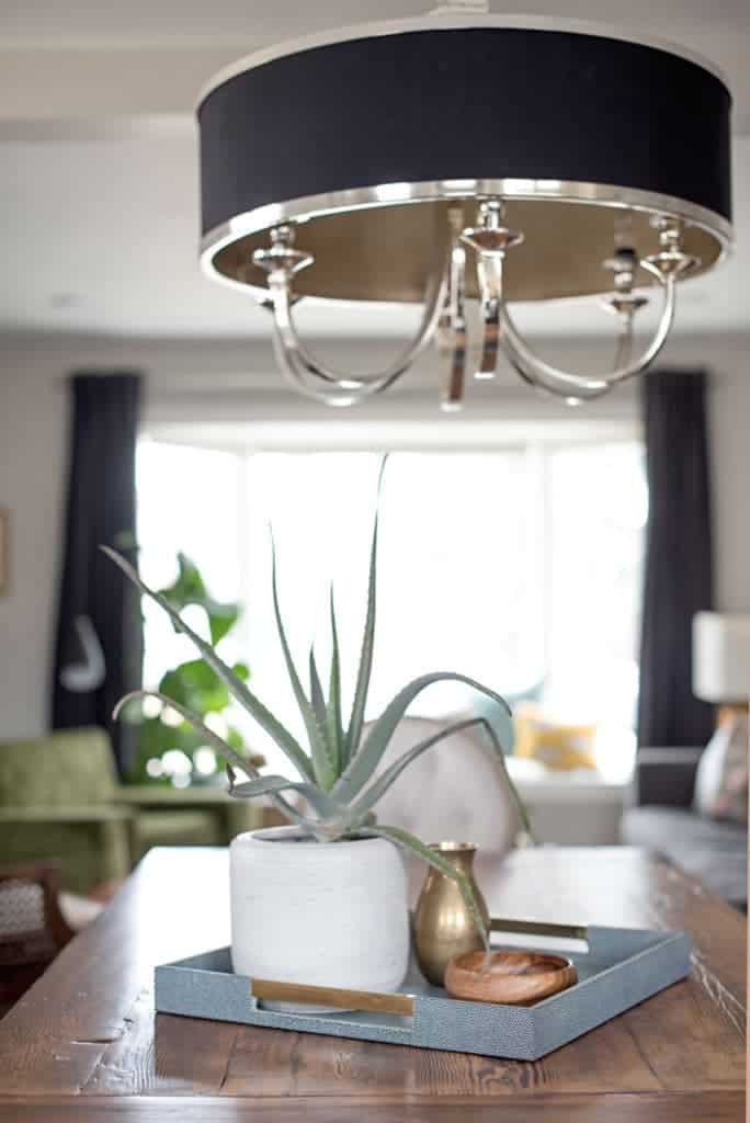
I’m a big believer in having things in your home that are personalized to you and hold meaning in some way or another. For me, that especially goes for the things I hang on my wall. Two of my favorite passions, besides interior design, are traveling and photography – I love framing photos I’ve taken from travels or experiences because they always evoke a memory when I take time to stop and look at them. Oh, and plants. You may have noticed I like plants too.
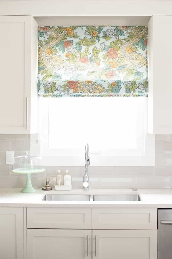
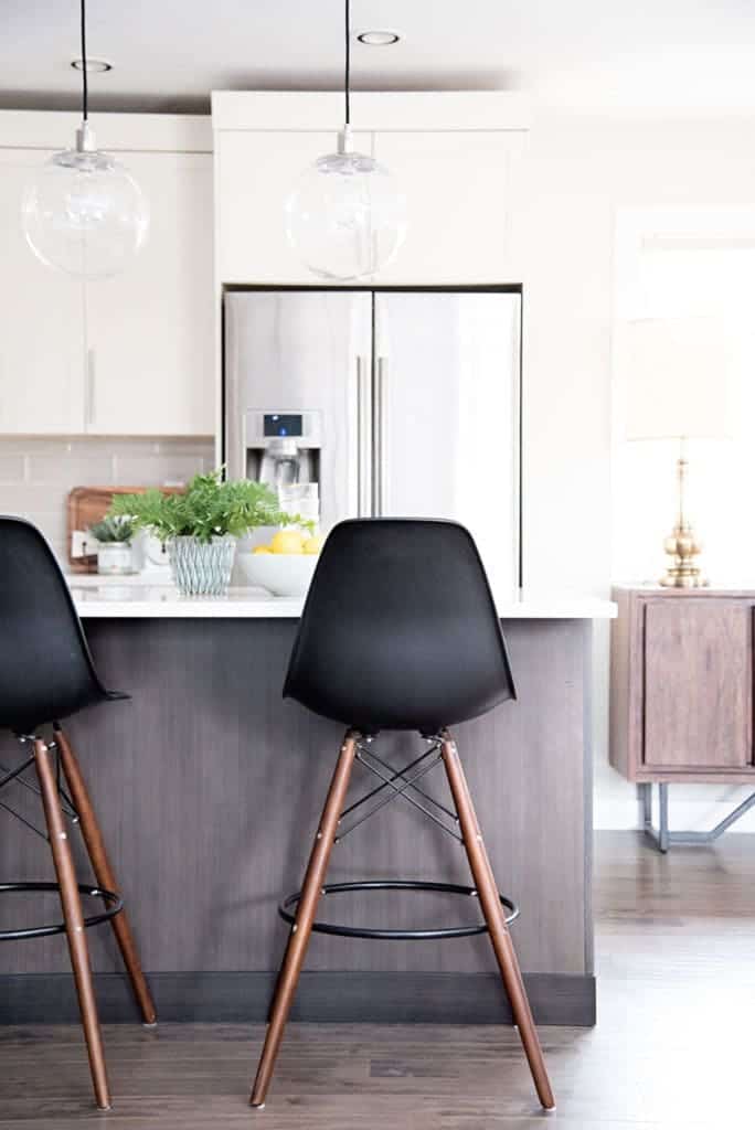
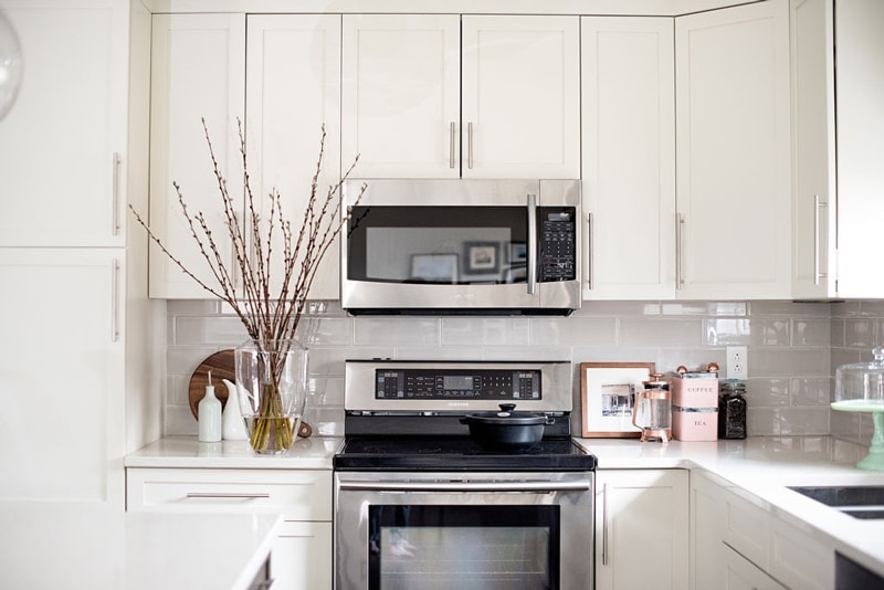
The kitchen was one of the biggest projects that we tackled with this house but of course, it was so worth all the work we put in to be able to have a more efficient space and the open concept layout we wanted. The island is quite large and is the hub of everything that goes on in our house. When we have friends over, often the women gather around the island and visit while the guys are in the living room space. The West Elm pendants have a presence but don’t take up much visual space which I love.
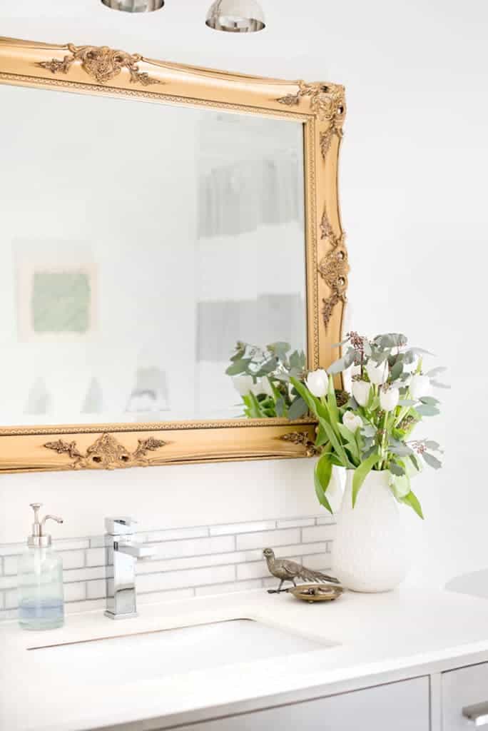
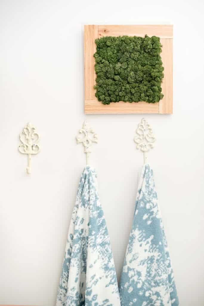
When we have people over for the first time, the bathroom gets the most comments. Again, I’ll spare you the ‘before’ photos but this room was pretty hideous when we bought the house – untouched since 1967. We removed the home’s main boiler stack that was taking up too much space, re-jigged some of the plumbing to move the shower placement, and re-configured the windows to allow for the most natural light possible. The mirror is an auction-sale find and the moss wall frame (it’s real!) is from my friends at Wildflower Florist.
The master bedroom has been an ongoing project and was one of the last rooms I focused on (although the Clarke + Clarke wallpaper was one of the first things I ordered for the reno – almost four years ago!). I’m learning that beautiful, quality-made bedding is something worth investing in and I’m loving our new linen bedding from Loomstead. It breathes so well and the linen adds great texture, whether it’s summer or winter.
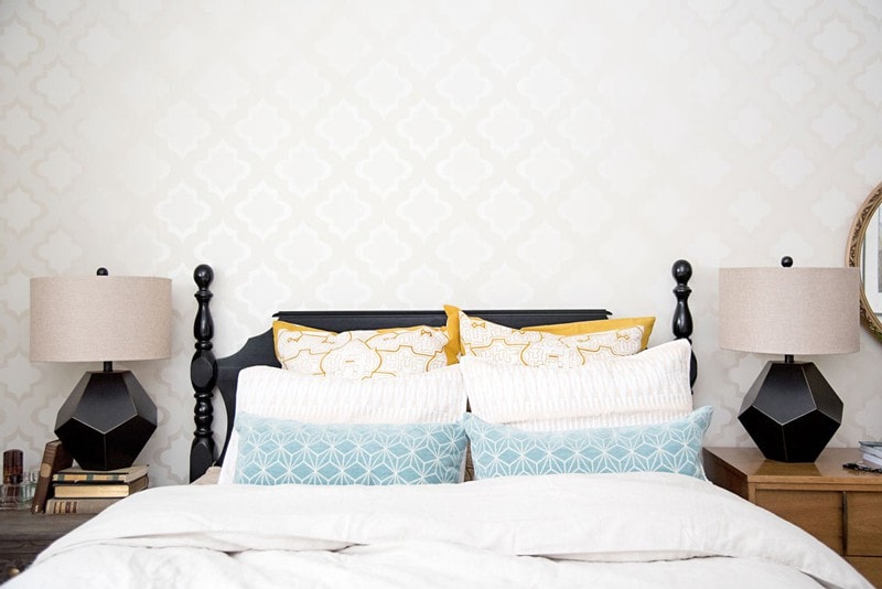
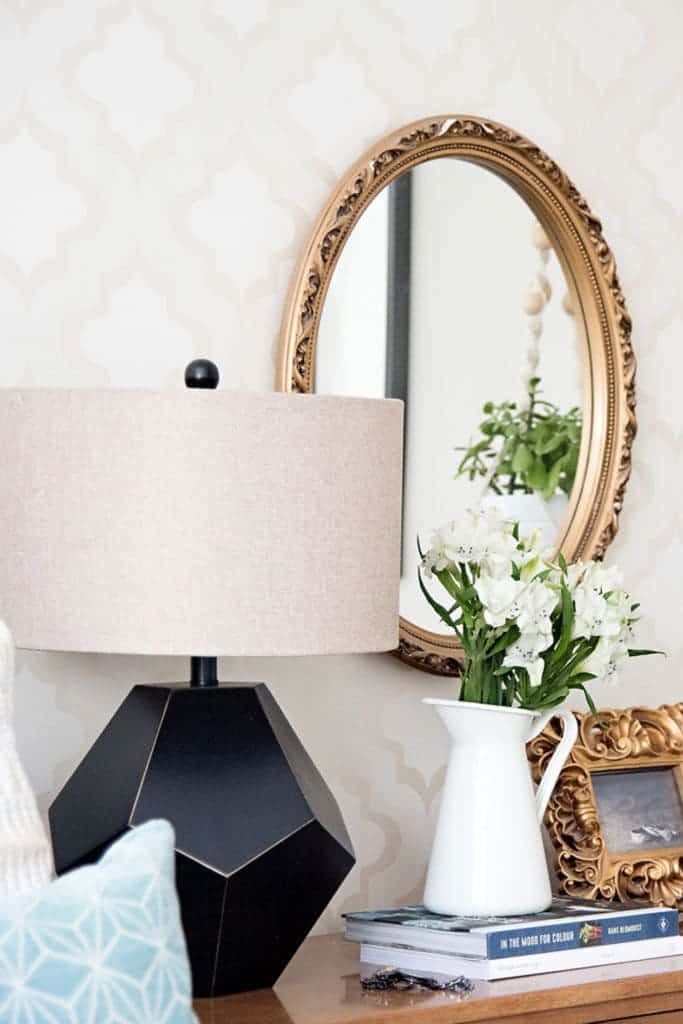
Vintage finds in this room include the bed frame which we spray-painted, the gold mirror, and the dresser (it was in my husband’s family and now we have it). Moving the bed off-center to the room is one the best tricks to make a small room feel larger – now we have some walking space on the door side and it’s made a huge difference. The evolution of this space is almost complete, I’m just waiting to find the perfect piece to hang above our bed.”
Photography by Candace Schwartz of Jackson Designs
Don’t miss the rest of the designers and bloggers on the home tour! And come back next week – my tour is up next!
Centered by Design – Instagram | Blog // View from my Heels – Instagram | Blog
Doreen Corrigan – Instagram | Blog // Bria Hammel Interiors – Instagram | Blog
XO – CLAIRE
Leave a Reply
October 7, 2024
read the post
YOU MIGHT ALSO LIKE
April 17, 2024
read the post
September 2, 2021
read the post
August 24, 2021
read the post
Meet Claire
Claire’s creative energy comes from her unique perspective on the world as both a trained interior designer and a passionate yoga teacher. Her affinity for kitchen design, timeless style and eclectic decorating are shared here, along with lots of interior design education and tips. Thanks for being here, please enjoy!