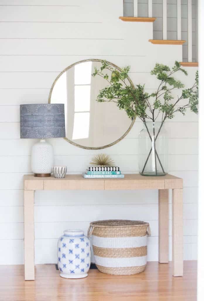
Today I’m excited to introduce you to Meredith Rodday of View From My Heels. Meredith’s home is just outside Boston and has a distinctively coastal feel with lots of blue and white. I’ve never been to Nantucket, but Meredith’s home makes me dream of east coast beaches and warm summer days on the waters edge! There’s a bit of the California bohemian feel too. You can’t go wrong with some of the gorgeous pieces Meredith has collected from one of my favorite online decor retailers Serena & Lily. If you love the look of her home, definitely check out the their selection. Meredith blogs about design, helps her clients design stylish spaces and is a mama of twin boys!
This home tour is the last on our #SpringIntoHome series. If you’ve missed any of the tours you can check back on all the pretty interior inspiration with tours from Doreen – Suburban Chicago, Bria – Minnesota, Kelsey – Sasakatchewan, Canada, Claire – Chicago and now here’s Meredith’s tour in her own words:
Home Tour with Meredith Rodday – View From My Heels
“a little background if you’re new here: we purchased our house as a new construction spec home almost 5 years ago. the builder did an excellent job and we feel really lucky about that. however, as with many new constructions homes, there was a level of character and definitely personalization missing. i’ve worked really hard over the last 4+ years to turn our house into a home. there have been mistakes for sure (the laundry room for example has been painted twice and wallpapered once and it’s still not right) but we’ve also done a lot of great changes (like swapping out almost every single light fixture!). we undertook one major set of improvements/renovations in the fall of 2015 that really helped in the character department.
the dining room: i’ve never had our dining room professionally shot because it’s always been in varying states of done-ness (more like undone-ness). i’ve shown parts on instagram but now it’s ready for it’s full reveal! the art was my starting point and was the catalyst for changing out the rug, table, and chairs. the last pieces were the drapery which is so simple but adds that extra detail and the sideboard that i searched high and low for. i’m so happy to be finished in here…except maybe grasscloth one day?!
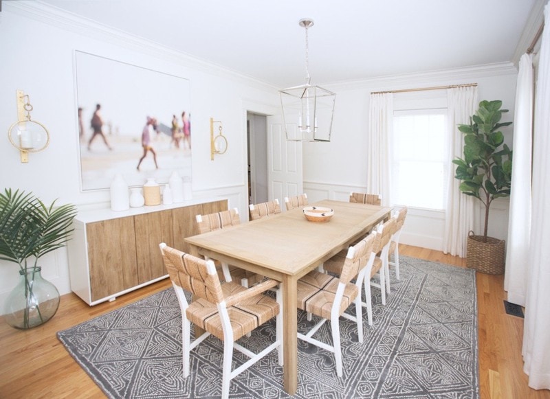
i actually ended up painting the white frame of the sideboard the night before the shoot because it was an off white color that didn’t work with the rest of the room. it was such an easy fix and made all the difference. i struggled majorly with how i wanted to style the top so at the last minute (seeing a theme here?!) i grabbed a bunch of ceramics from homegoods and combined them with what i had from west elm for an understated mix. i think it works!
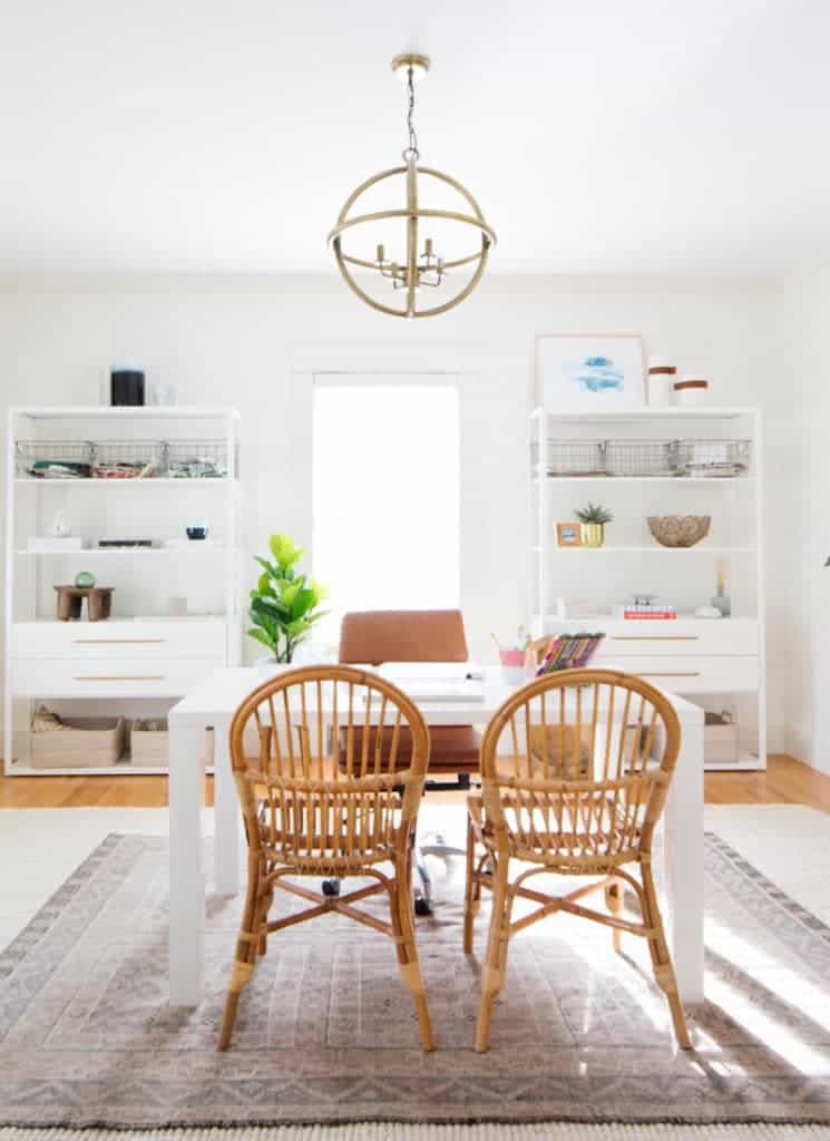
office: finally we have a legit functioning office! the shelves are from ikea and the hardware is a hack from studio mcgee. i’ll do another post with a deeper dive on this space as well as maybe a few others.
family room: the big change here from the last set of photos is our leather sofa. during our improvement project, we covered the back wall in shiplap and redesigned the mantle for a much fresher, more modern look. there even used to be sconces where the tv is! redoing this space was one of the best decisions – it changed the entire feel of the room.

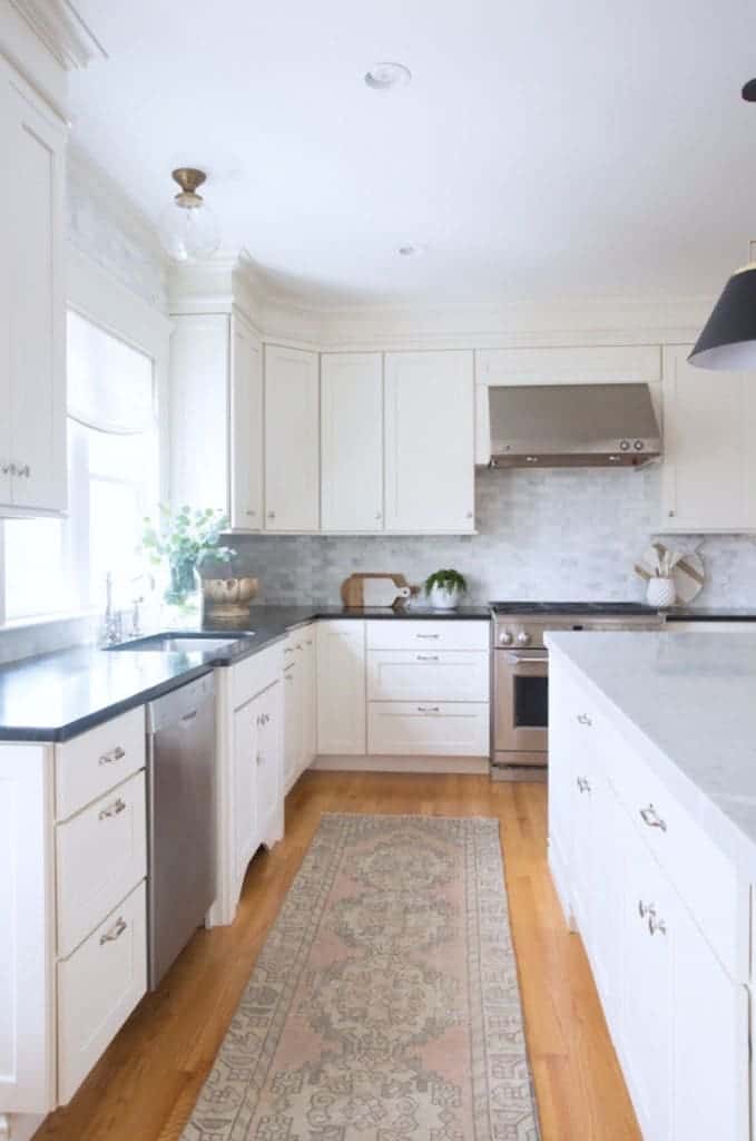
kitchen: since we’ve lived here i’ve changed the hardware, added the marble backsplash, and changed the lighting. but the biggest change of all was removing the beige granite slab on the island and replacing it with this extra thick carrara beauty. it made a huge difference. i also added a runner earlier this year and i’ve loved the bit of pattern and warmth it immediately brought to the space.
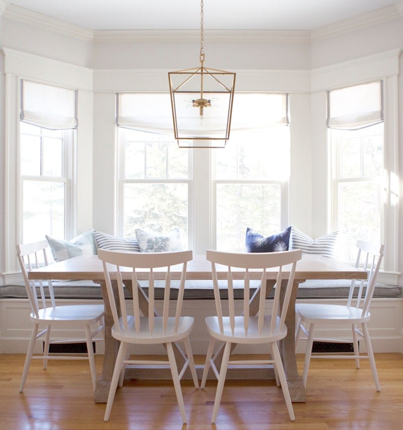
we added the built in seat during the renovation project and it was a no brainer. it’s so inviting!
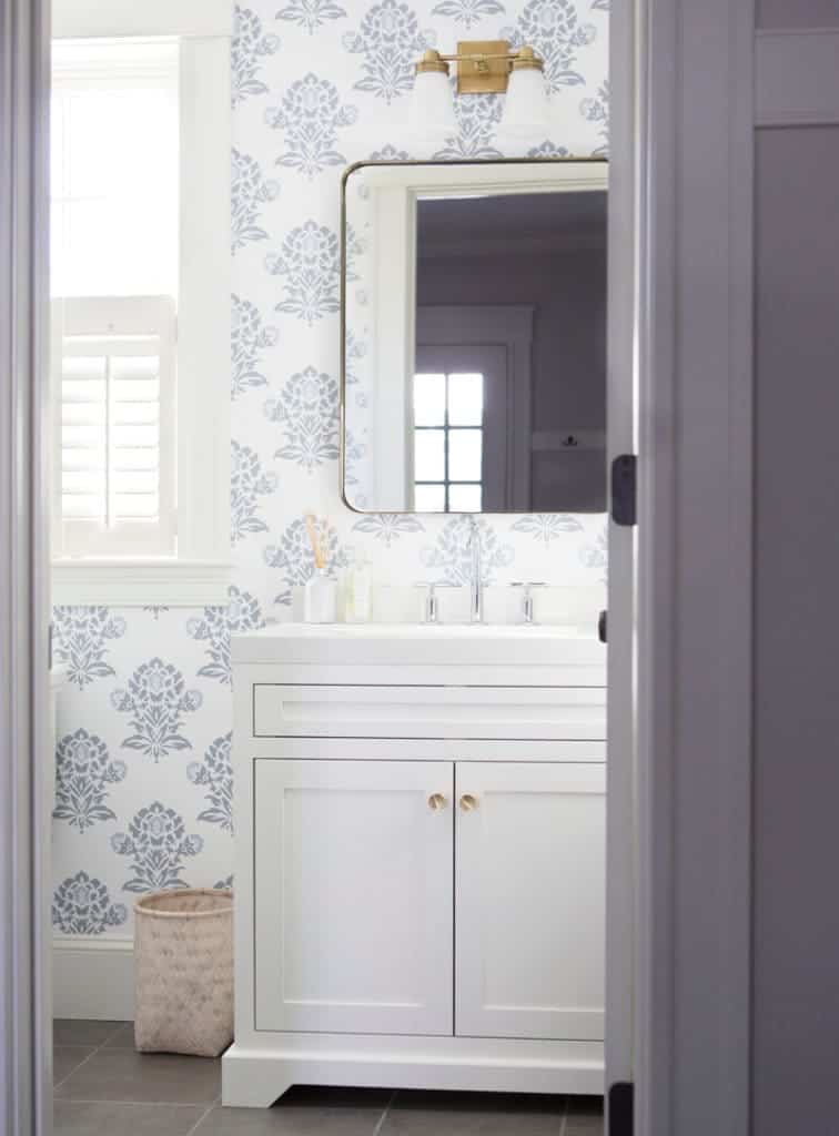
powder room: this is another space that’s seen it’s share of changes. when we moved in i initially papered it in a hot pink and white trellis pattern… and quickly regretted it. so during our reno i changed it to this much more serene pattern from serena & lily (unfortunately no longer available) and had a custom vanity made. the extra thick quartz counter and rounded mirror were the perfect finishing touches.
charlie’s bedroom: i’ve shown parts before but never as a whole. we can see this room as we walk from our bedroom at the other end of the hall and it’s always such a bright spot that makes me smile! i added the board and batten and wallpaper last year with a new ikea dresser.

basement bedroom: this room has been decorated basically the same way in all three of our homes so it was in major need of a redo! i worked my tush off to pull it together in time and on a small budget. i ended up not springing for the woven pendants from the original design although i hope to someday – just wasn’t in the budget this time.

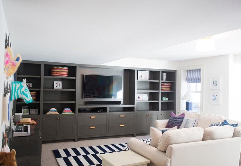
playroom: this space was a total blank slate and i slowly figured out my plan for it. i added wallpaper to one wall, roman shades in the same pattern as the wallpaper, painted the rest of the walls white and designed a bank of charcoal gray built ins – the real game changer. the boys love hanging out down there and so do we.
thanks so much for reading! i’ve had a great time participating in this #springintohome tour and i’m so grateful to the other ladies who have joined me in this tour. i’ll miss our friday reveals! it also had the bonus effect of making me finish up some long overdue projects. now on to that laundry room…maybe?!”
Thanks for checking out another tour friends! Did you like this series? I think seeing real homes is great for idea generation and inspiration for real-life spaces. Hope to do something like this again.
XO – CLAIRE
Leave a Reply
October 7, 2024
read the post
YOU MIGHT ALSO LIKE
April 17, 2024
read the post
September 2, 2021
read the post
August 24, 2021
read the post
Meet Claire
Claire’s creative energy comes from her unique perspective on the world as both a trained interior designer and a passionate yoga teacher. Her affinity for kitchen design, timeless style and eclectic decorating are shared here, along with lots of interior design education and tips. Thanks for being here, please enjoy!