I can’t believe I’m finally writing this post. Designing the nursery has honestly been tough! I think it’s a lot of self-imposed pressure, but also, a good friend wisely said that this is “the most important person” I’ve likely ever met. I can’t disagree, never before have I experienced this level of anticipation waiting for anything. What will she look like? Will I be a good mom? Will her nursery design make us both happy? (probably more of a designer concern – wink, wink). I’m excited to share what I’ve finally settled on; a sophisticated palette fit for a modern baby girl nursery (in a vintage house).
When designing, I always like to have a main inspiration to pull from. In this case, I knew I wanted it to be wallpaper and eventually knew I wanted it to be a floral. I love this inspiration image of a room with similar attic like ceiling lines to ours. I was having trouble settling on a print. Should it be large scale or small, spread out or tight, bold or softer? During my search I discovered that Farrow & Ball just launched three new florals as their 2017 Wallpaper Collection!
Wallpaper Application Inspiration:
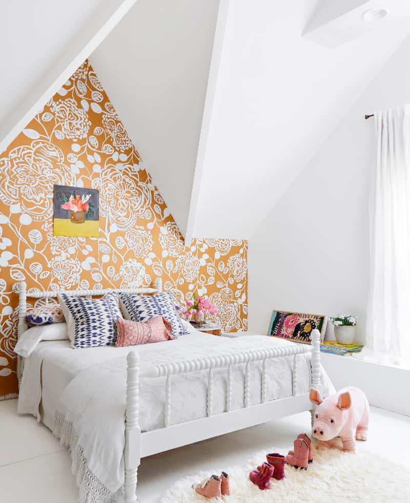
Via CountryLiving Inside A Mississippi Farm House.
We also have another Farrow & Ball print in our dining room (see below – Shouchikubai is name of that pattern), so it felt fitting to choose one of their new designs for the upstairs as well.
Our Dining Room with other Farrow & Ball print:
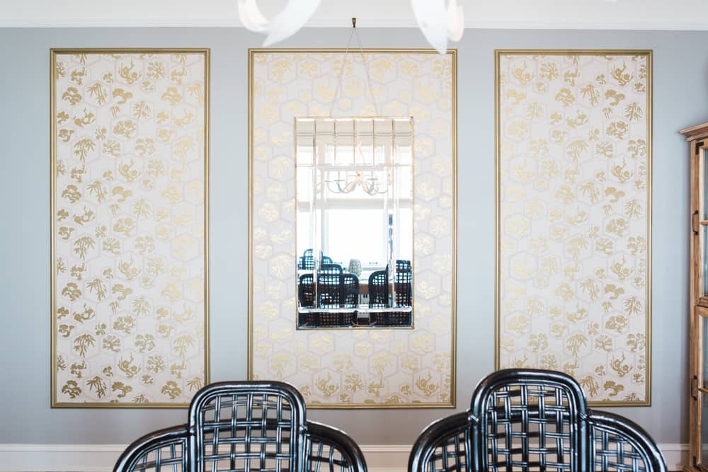
Our dining room. Photo Aimee Mazenga.
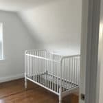
Here are some before photos of the nursery. It’s a sweet little room, just big enough for a nursery or kid’s room. On top was the very beginning when we sanded the floors and took off base board and door. Bottom pics include floor freshly stained, room painted in Chantilly Lace by Benjamin Moore, and new baseboard and doors from the Metrie True Craft collection (more on the new trim and doors once we share the completed upstairs renovation).
I love the Jenny Lind crib, which was a hand-me-down from my sister-in-law and I think works really well in space. Do be careful if you have a Jenny Lind that is older, as there was a recall, or additional parts needed to keep crib at correct safety standards (I think at Pottery Barn Kids or Land of Nod). I believe the new ones all meet those standards, and you can shop this post and all my finds at the bottom of the post! Also, here is a great post about spool-turned furniture if you want to learn more about the history of the Jenny Lind style. Note: chair pictured was just a place holder for scale and I know I need a rocker or glider!
Nursery Before:
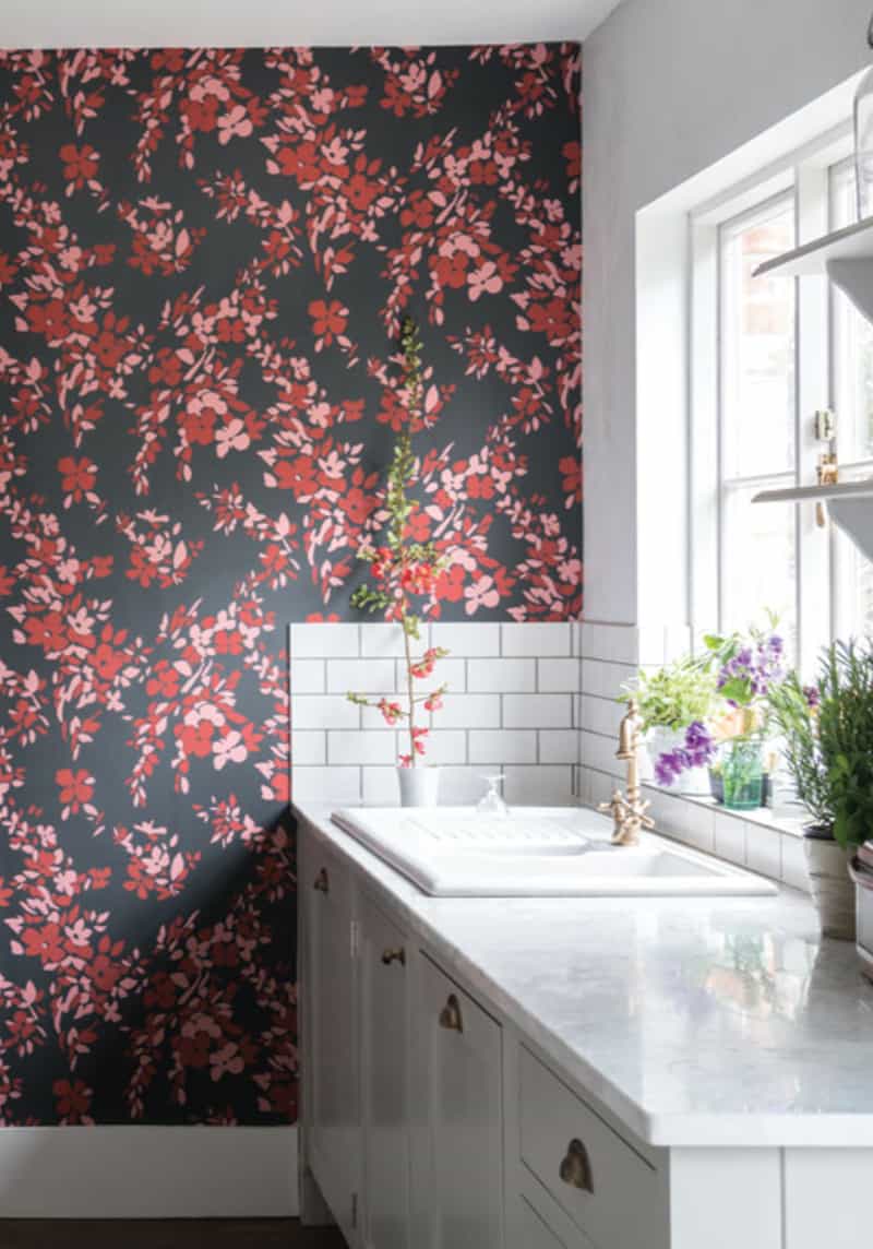
FINALLY, all that leads to my (Luke let me have this one) wallpaper selection!!! – HEGEMONE
I totally deviated from my original ideas of pale pastels (gray, lavender and aqua) and decided something bold felt way more interesting to me. I loved this marketing shot from Farrow & Ball and felt like the floral looked so fresh against the white. Also, the paper ground is their Off-Black color and I’ve used a lot of black and white combos in the house (like the KITCHEN and ENTRY) so again, is seemed fitting and classic, but still modern. You can never go wrong with black and white in my opinion. Throw in pink, which totally makes sense for a nursery and red is really the big surprise. By letting the red just stand out in the wallpaper and with only a hint of it in the wool rug, red plays a necessary supporting role for interest, but does not overwhelm.
The plan for the modern baby girl nursery is to wallpaper the two straight walls between the eaves of the roof, add a simple rug, pretty window treatment and create a sort of canopy over the crib for interest on the sloped wall. I prefer the lines of a Danish-style rocker to a big glider, and with a tall back should still be able to get pretty comfortable. A campaign dresser, bookshelf (not pictured) and art will round out the space. I haven’t decided on bedding yet, but I’m leaning towards all white. Would love suggestions if you have baby bedding lines you like!
MODERN BABY GIRL NURSERY
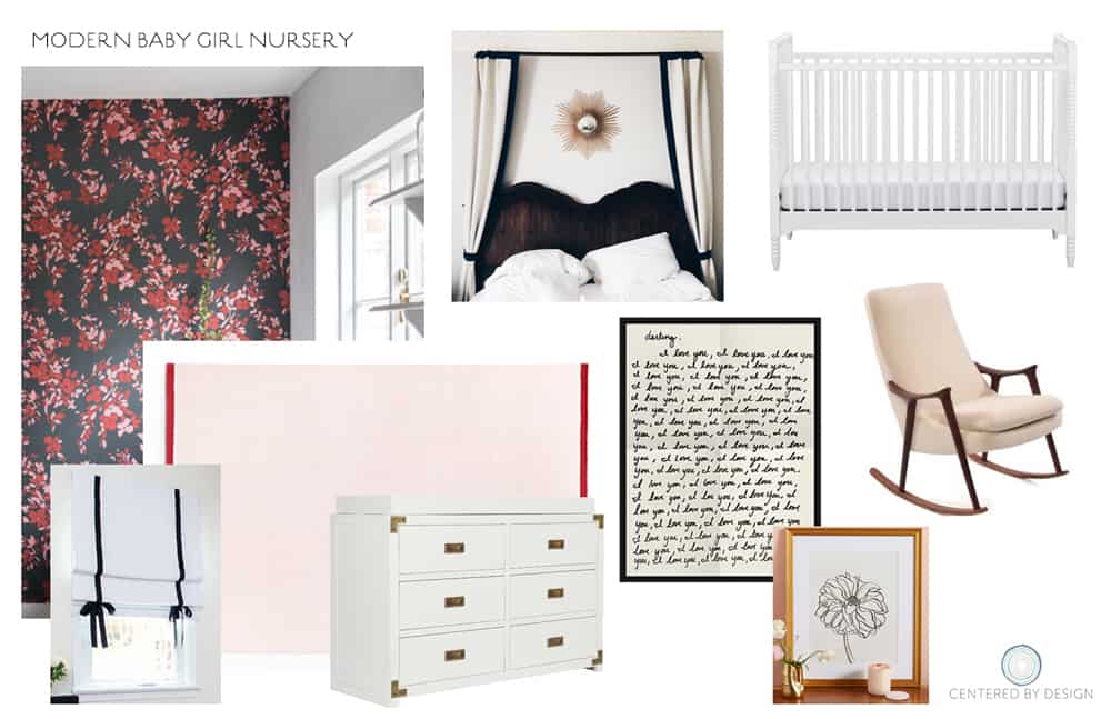
I’ve linked lots of the same or similar items we shopped for to create this modern baby girl nursery. Crib was originally Land of Nod. My dresser and rocker are both vintage finds, and the rug pictured is from a small family owned company Nordic Knots.
Can’t wait to have the room all ready to go! What do you think of the bold paper? We have one more shower in two weeks, and after that I think I’ll be in full nesting mode. Getting more and more excited to meet this little person, and trying best to stay calm during the holiday chaos – hope you are taking some deep breaths as well!
XO – CLAIRE
Leave a Reply
October 7, 2024
read the post
YOU MIGHT ALSO LIKE
April 17, 2024
read the post
September 2, 2021
read the post
August 24, 2021
read the post
Meet Claire
Claire’s creative energy comes from her unique perspective on the world as both a trained interior designer and a passionate yoga teacher. Her affinity for kitchen design, timeless style and eclectic decorating are shared here, along with lots of interior design education and tips. Thanks for being here, please enjoy!
