Project Reveal: Southern Charm Renovation for a Young Family in Wilmette
June 9, 2022
Fall in love with the process, and the results will come. That wise quote certainly holds true for our team at Centered by Design. We absolutely love the projects we get to do for each of our clients, and while the process is where the real design work happens, it feels incredible to see the result of our efforts. We’ve noticed you, our readers, happen to be big fans of project reveals, too (read about another recent favorite here), so today we’re excited to share one of our biggest ones yet.
Southern Charm Home Renovation Details
We were delighted to take on this major renovation to this 4-bed, 3.5-bath home for a Chicago family who recently relocated from the city to the suburbs. Though the 1930s-era house is in Wilmette, we wanted to bring in all the charm of homes found in the South, a style the homeowners are very drawn to.
5 Words
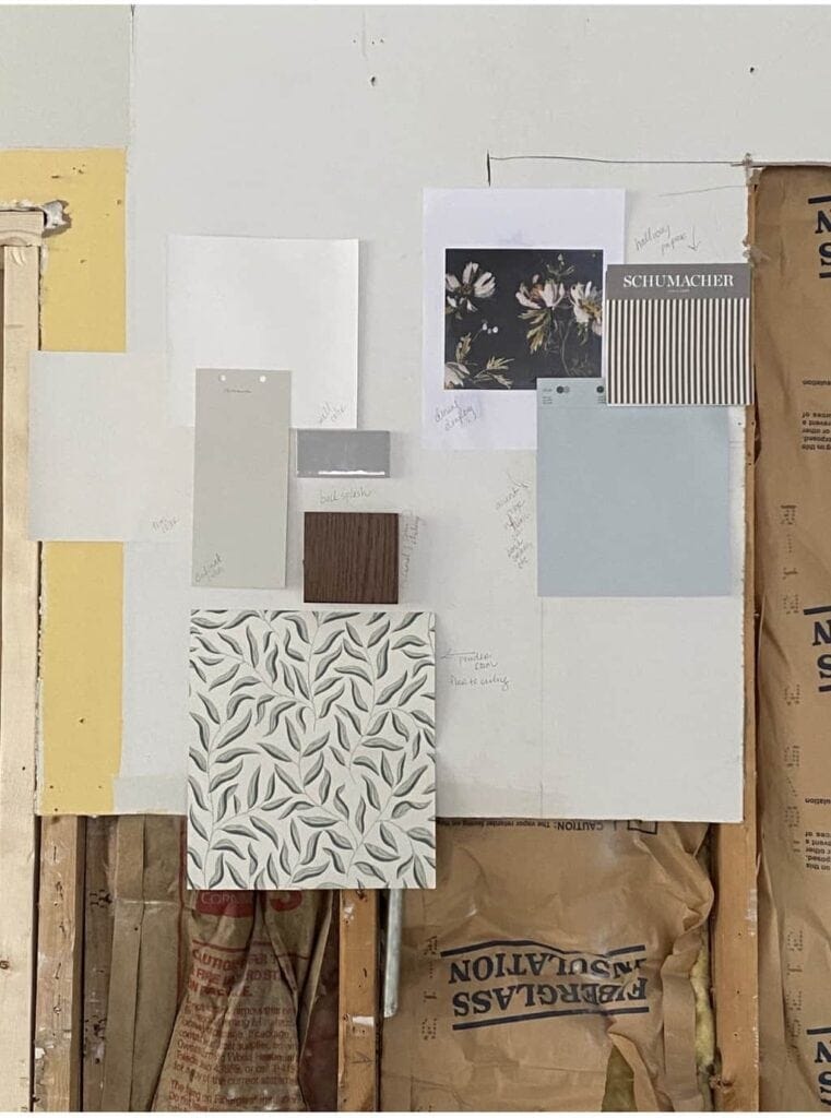
We ask all our clients to describe their style in five words before beginning. These homeowners, who have a toddler and a new baby on the way, chose:
Inviting, tailored, family friendly, classic, bright
Scope of Southern Charm Renovation
For this project, we tackled design and build of the entire first floor of the home, as well as the stairs leading to the second-floor hallway. This included full renovations to the kitchen, mudroom and powder room, along with furnishing the family room, dining room, front entry and living room.
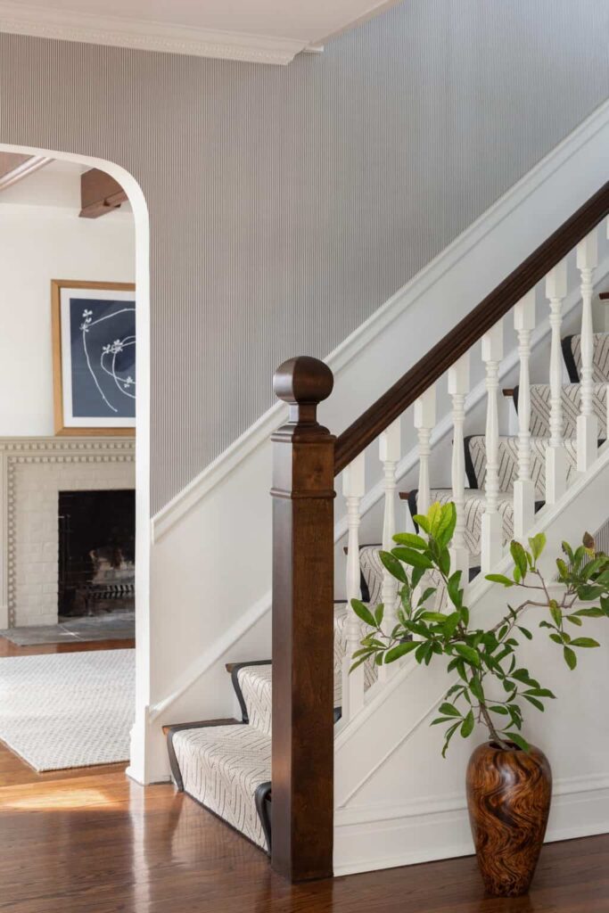
We wanted to highlight the classic architectural elements to bring out the home’s natural charm, including the staircase and baluster, Egg and Dart crown molding and dramatic wooden tresses. Also high on our client’s wish list: a showstopper kitchen that radiated quiet beauty and functional design, with a nature-inspired palette of blues, greens, browns and whites.
Biggest Challenges
The traditional-style home had great potential, but we had to find a way to maximize its smaller footprint and work with some challenging angles to really make it work for its three (soon to be four) residents.
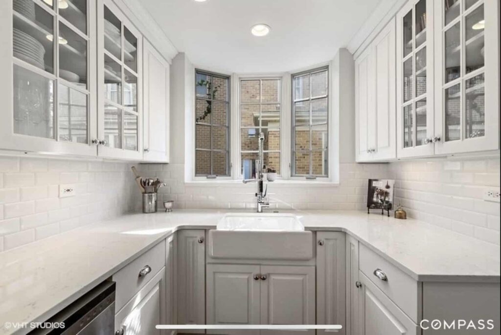
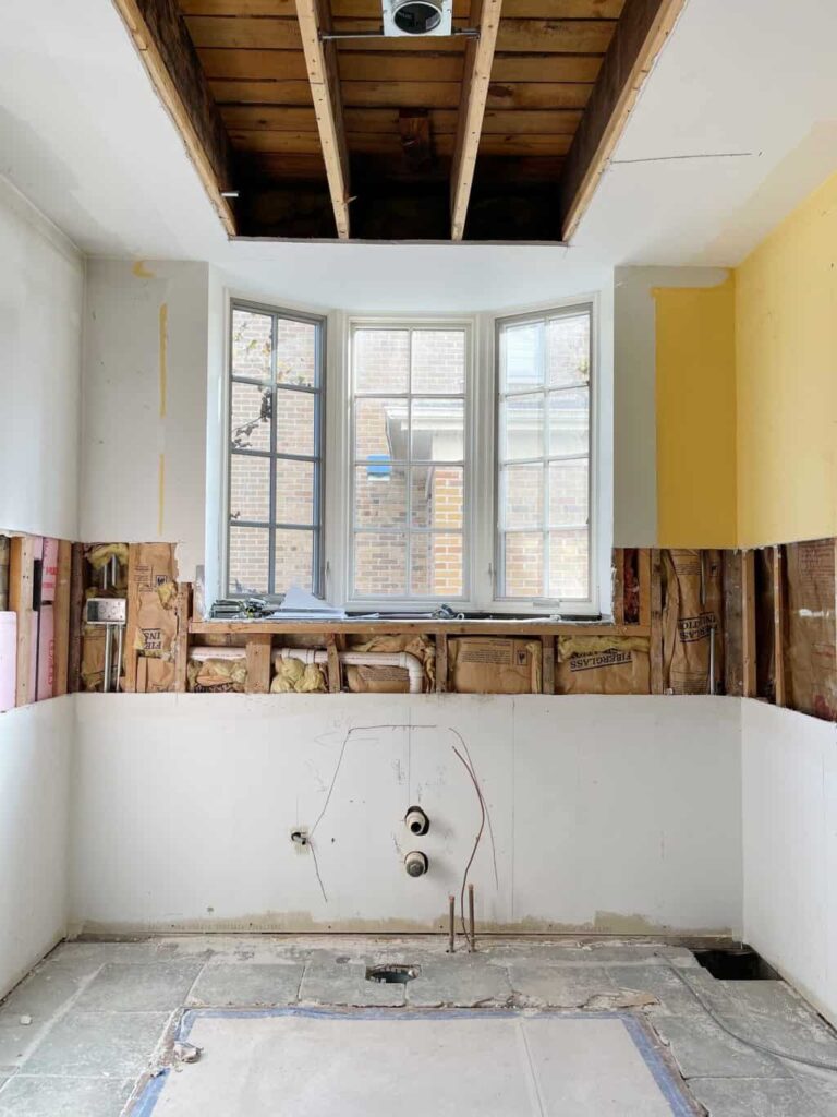
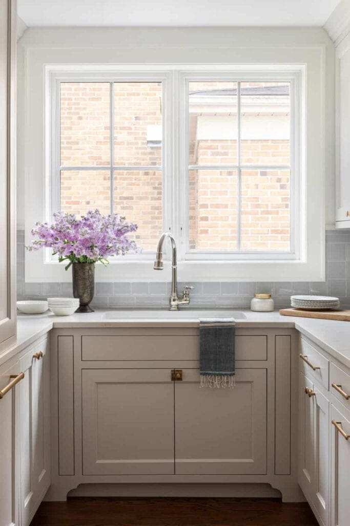
You know the showstopper kitchen we mentioned? It didn’t come easily. The space itself was quite tight, so creating a livable, stylish space for this growing young family was among our greatest challenges. It was important to create lots of storage options. To do so, we closed off the pass way to the dining room to create a wall of closed storage. We also designed tall cabinets on both sides of the range to serve as a pantry. Finally, we modernized the bay window by straightening it out and created a clean design by adding Anna Sacks tile.
Styled By: Cate Ragan
Before getting started with the demolition, we wanted our clients to be able to visualize what their new kitchen would look like. To do this, we presented them with a 3-D rendering (one of the many perks of working with an interior designer). The final design of the kitchen is nearly identical to this, from the feature hood down to the hardware.
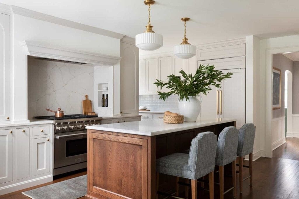
Styled By: Cate Ragan
Favorite Details of Southern Charm Renovation
No matter how beautiful a kitchen design may be, it’s only as good as its functionality for the family who uses it. That’s why we took care to incorporate special details in this kitchen, including a coffee and cocktails bar, to suit our homeowners’ lifestyle. We designed this area with open shelving to display dishes and cookbooks, too, a warm touch borrowed from Southern homes.
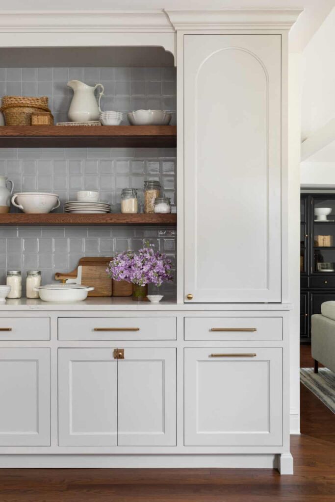
Styled By: Cate Ragan
For the small powder room off the kitchen, we chose a pretty bay leaf print wallpaper by Sandberg to add an organic, calming element. A black framed mirror and small pedestal sink complemented the design without overwhelming the compact room.
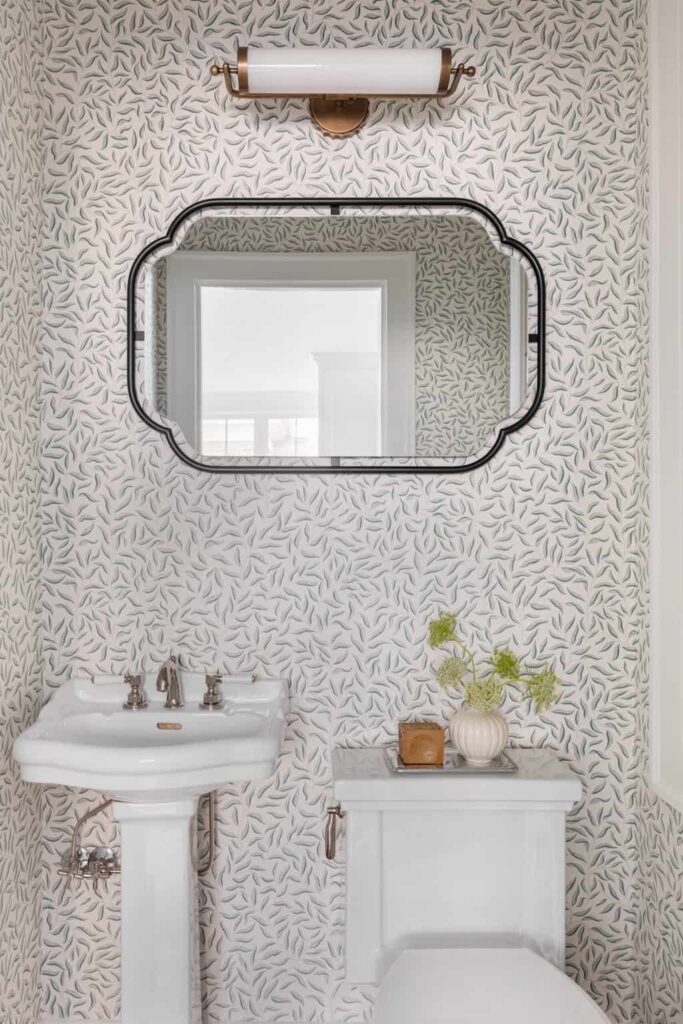
Styled By: Cate Ragan
In the family room, where our client’s toddler needed space to roam free, we selected comfortable furniture that didn’t compromise on style. Our favorite piece is the black hutch, styled with neutral accessories with lots of texture to create a cohesive, tailored look. Beneath the shelves is closed storage, a perfect solution for hiding toys.
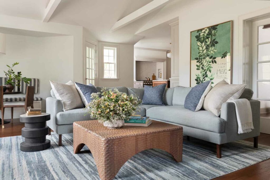
Styled By: Cate Ragan
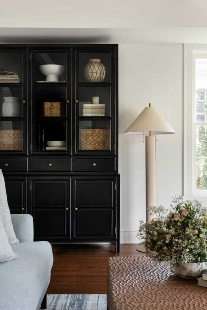
Styled By: Cate Ragan
Behind the family room is the breakfast nook. In this functional space, we built a custom storage bench that’s anchored by an oversized ceiling light.
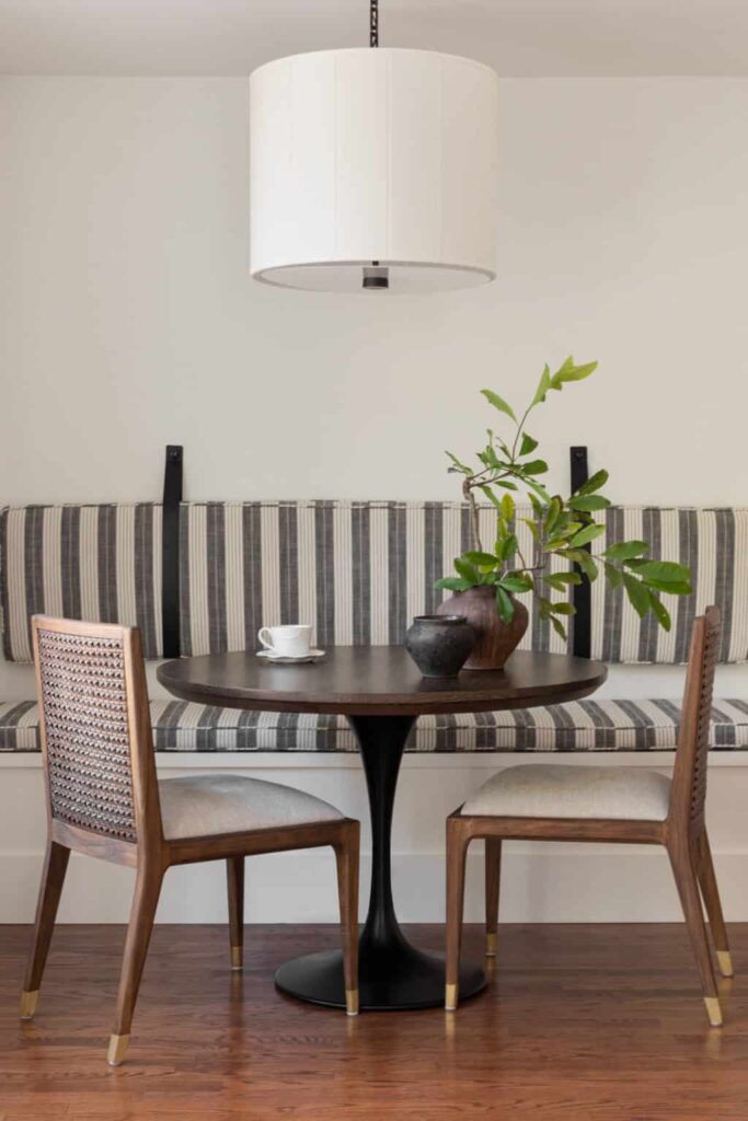
Styled By: Cate Ragan
Another big transformation was the combination mudroom and laundry room. We added even more storage in this room and installed a wall of drying racks (a must-have for the homeowner). A marble patterned tie floor helped us pull this look together, making this room not just a place for household chores, but a place to enjoy spending time in.
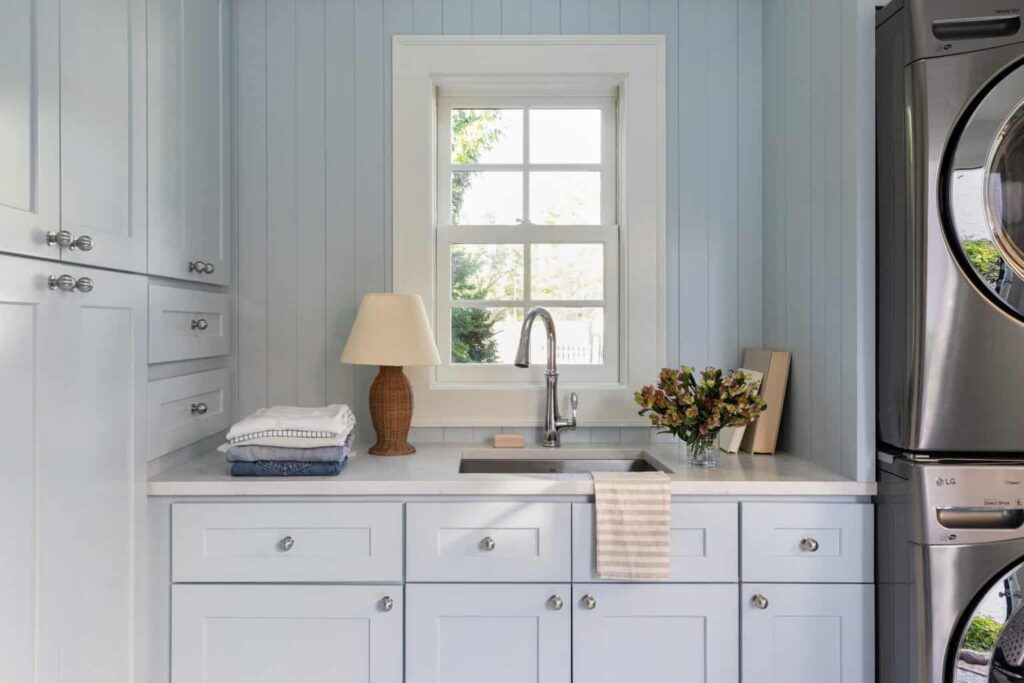
Styled By: Cate Ragan
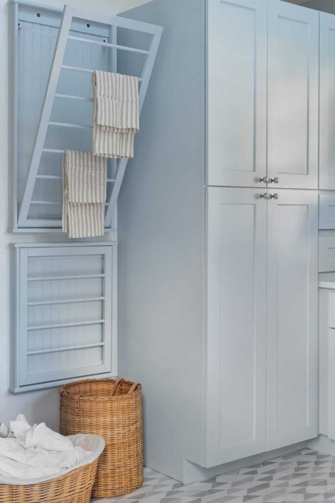
In the entry way, we used striped Schumacher wallpaper in mushroom (going back to the nature-inspired palette) to anchor the space. We brought the dated staircase up to code by raising the railing and adding new spindles. The black-and-white stair runner with leather trim and new light fixtures completed the transformation of this area.
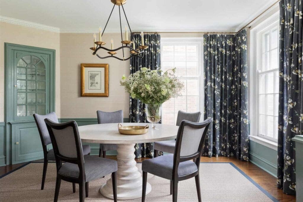
The dining room features Kelly Ventura drapery, grass cloth wallpaper and green painted trim. It will be a perfect space for entertaining.
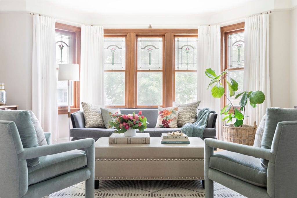
Finally, we saved the best for last: the living room. We are still waiting on furniture to arrive and expect to complete this space this summer.
What the Clients Said
“Working with the Centered by Design team was one of the best decisions we’ve ever made. Moving is stressful enough; adding a major renovation and small kids into the equation is even harder. Claire and her team guided us every step of the way, making us feel calm and confident in our decisions. They turned our house into a comfortable home to raise our family, host friends and enjoy time together.”
How Can We Help You?
Though we’re based in the Midwest, we have a soft spot for Southern charm, too. We so enjoyed working with these homeowners on this major renovation to a near century-old home. By embracing its unique footprint and getting creative with its small spaces and storage, we were able to transform this Southern Charm project into our client’s dream home. Are you ready to renovate? Contact us to learn more about Centered By Design’s services and how we can help you design your dream spaces.
Leave a Reply
October 7, 2024
read the post
YOU MIGHT ALSO LIKE
April 17, 2024
read the post
September 2, 2021
read the post
August 24, 2021
read the post
Meet Claire
Claire’s creative energy comes from her unique perspective on the world as both a trained interior designer and a passionate yoga teacher. Her affinity for kitchen design, timeless style and eclectic decorating are shared here, along with lots of interior design education and tips. Thanks for being here, please enjoy!