

Photoshop Tutorial: Create Your Own Color Palette
April 26, 2015
I’ve been slowing building my Photoshop skills. Digital design skills are very important for interior design work today and there are lots of ways to learn, but I’ve found the best way is to keep practicing! I took a local course at the School of the Art Institute Chicago last year, and I’ve done a few quick online classes like THIS one on Skillshare. I like to try and master one or two tools at time and repeat the same steps over and over, which I find is the best way to imprint that tool’s function in my brain.
This brings us to the inspirational color palettes! I am in LOVE with color. Color makes me happy, people respond to color, it evokes our emotions and can set the stage for your design whether it be an interior, event or outfit. Color palettes are uber fun to create, and I wanted the ability to create my own very specific palettes from photographs that inspire me. I find nature especially inspiring when it comes to color, and Photoshop’s tools give you the ability to really hone in a specific hue, tone, tint or shade. The Eyedropper tool makes it really easy to pinpoint colors and their endless variations in Photoshop.

Here’s a quick review on what those terms mean. Hues are pure color, tints add white, tones add grey, and shades add black – all to the pure color.
Okay, so here we go with the tutorial. It might seem a little daunting, especially if you are very new to Photoshop but don’t worry! If I can figure it out, I promise you can too!
Step 1:
Open Photoshop and click File > New. You’ll see this box pop-up. Name your document and create a width and height. Since I’m usually posting for Instagram I’ll go with a square size, something like 1000 pixels x 1000 pixels. This is a good size for the web. You can leave all the other boxes as is and click okay.
 Step 2:
You should now see your white box on the screen. It’s time to use the rulers on the top and left of the screen to create divisions to help you keep your image and colors in line. You click and drag on the ruler, and you’ll see a blue line appear. Drag the blue lines from either the top or side to create the desired divisions. If you drop one and don’t like where it is placed, hover over the line and you’ll be able to move it. You can also drag it completely off the white box and it won’t be seen in the final image. Actually, the rulers won’t be seen at all anyways, but just so you know, anything that is not on the white box or your “art board” won’t be seen when you save the image.
 Step 3:
You need to bring your inspirational image into Photoshop now. First, save the image to your desktop. Next, drag that image until you are hovering over your Photoshop icon. You will know it’s okay to drop the image when you see the words Adobe Photoshop CC highlight over the icon (I’m doing this on a Mac, btw). When you drop your image the screen will look like the photo below. You’ll have two tabs on the screen. The first is your new file (mine still says Untitled), and then you’ll have the name of whatever image you brought into Photoshop.
 Step 4:
Okay, here comes the trickiest part. You now have to pull your inspiration image into your file. This takes some trust so just go with it! There are two main steps. 1. You are going to click and drag the tab of your inspiration image and pull it onto the tab of your new file. It’s one motion, just click the tab on the right and drag it towards the tab on the left. When you let go, your screen should look like this. Your image will be on top of the white box and have the label on top. You should see it over on the right labeled Background. 2. To merge the image into the white box you need to do one more drag and drop. Click and drag the whole layer labeled Background into the Photoshop/ art board area. If you look closely, you’ll see a white line come up around the black Photoshop background when you drag it in. Let go and it should like the image has merged with the white box. Go to next step immediately.
 Step 5:
When you drop your image into the white box, you won’t have much control over it until you hit Command – T, this is the transform command and you will see little boxes around the image (just as pictured below). You will also notice that the image is now operating as it’s own layer (look to the right). This is important because we are creating several layers and organizing them within our grid to create the final color palette image. Hold down the shift key and grab a corner of the box to scale the picture bigger or smaller. Fit in inside your grid to your liking.
 Step 6:
I’ve placed my inspiration image in the lefthand 2/3 thirds of my grid and divided remaining 1/3 third into 4 parts. You will not see these blue rectangles! In this step, we are creating the rectangles. You should see your blue ruler marks, and if you are creating an image like mine you’ll have grid lines that you need to fill in so we can finally get to the COLOR part! Towards the bottom of your tool bar on the lefthand side you will find the Rectangle tool (hover over tools to read their names). When you click on the rectangle tool you’ll notice your mouse changes to a cross bar, click and drag within your guideline to create a rectangle in each of your empty spaces. Each time you draw a rectangle Photoshop will make it a new layer, and it will name them 1,2,3,4 and so on (see image below).
 Step 7:
Now comes the fun part!! You are going to change the color of your rectangles to create the perfect color palette. First, click on the layer you want to alter and then double click inside the little box showing your rectangle. When you double click the color picker box will pop-up (like the image below). You can change the rectangle’s color from here, or you can use the Eyedropper tool to pick out an exact color in the image (this is why I do this whole thing in the first place!) being able to pinpoint a color is really fabulous. With the color picker window open, click the eyedropper tool and click anywhere in your image. You’ll see the current color in the bottom of the window and whatever color you’re clicking on in the top window (notice the blue/green split on the image below). You can click around as much as you want, once you have found the color you want to use hit Okay in the color picker box, and that rectangle is good to go! Repeat this step for all your rectangles.
 Step 8:
You are almost done! The image is ready to save. Go to File > Save for Web. The following box will pop-up. You can leave everything as it is, but you have the option to adjust the image size (px = pixel) if needed. Simply press Save and save your customized color palette so you can share it with the world!
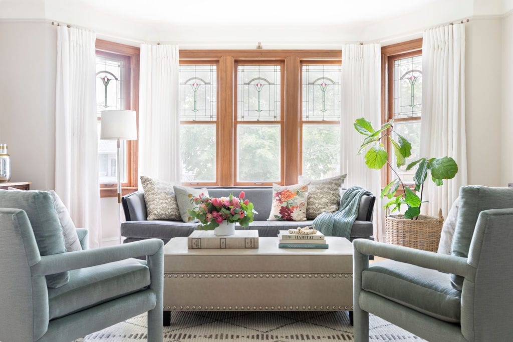
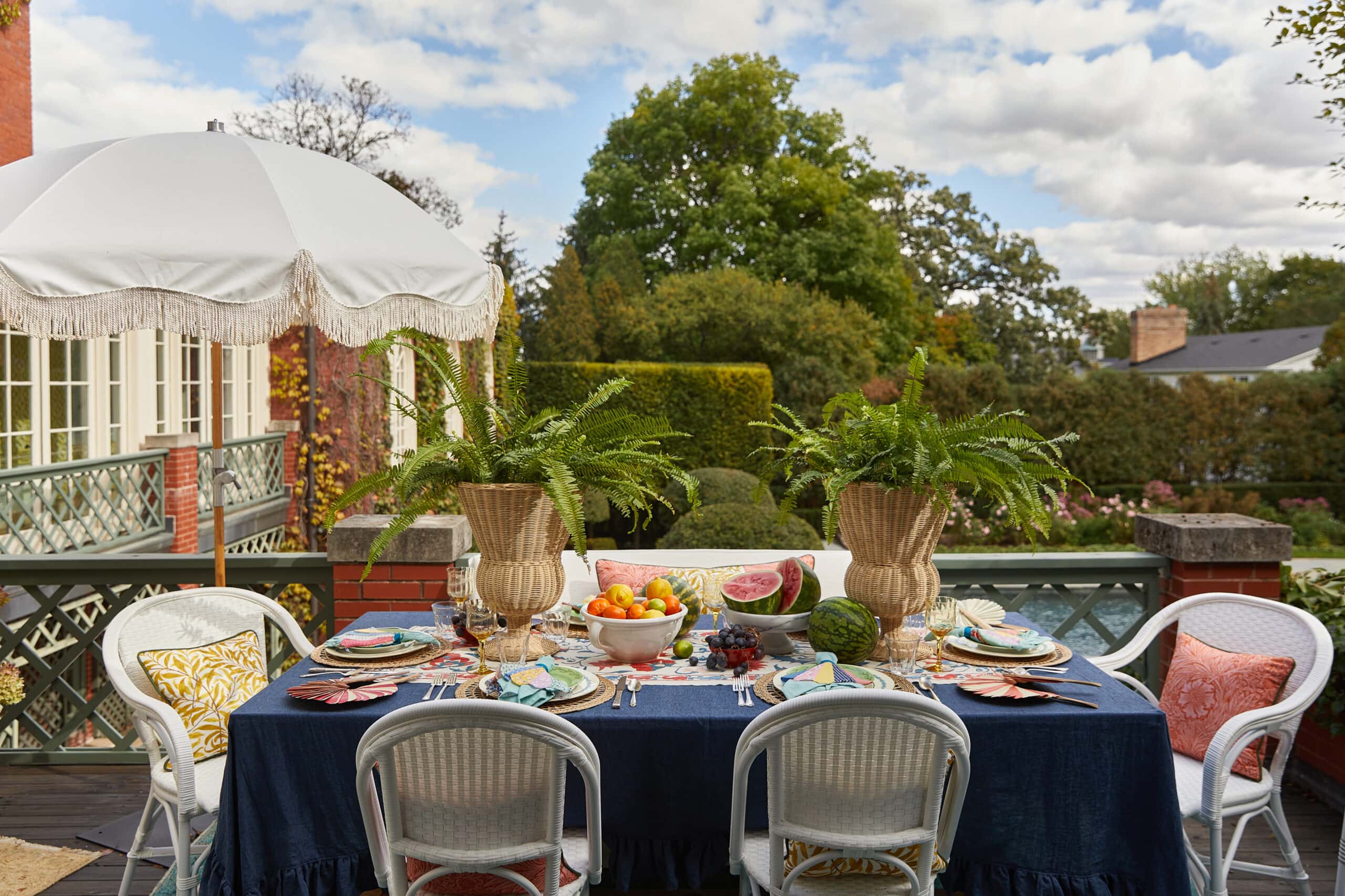
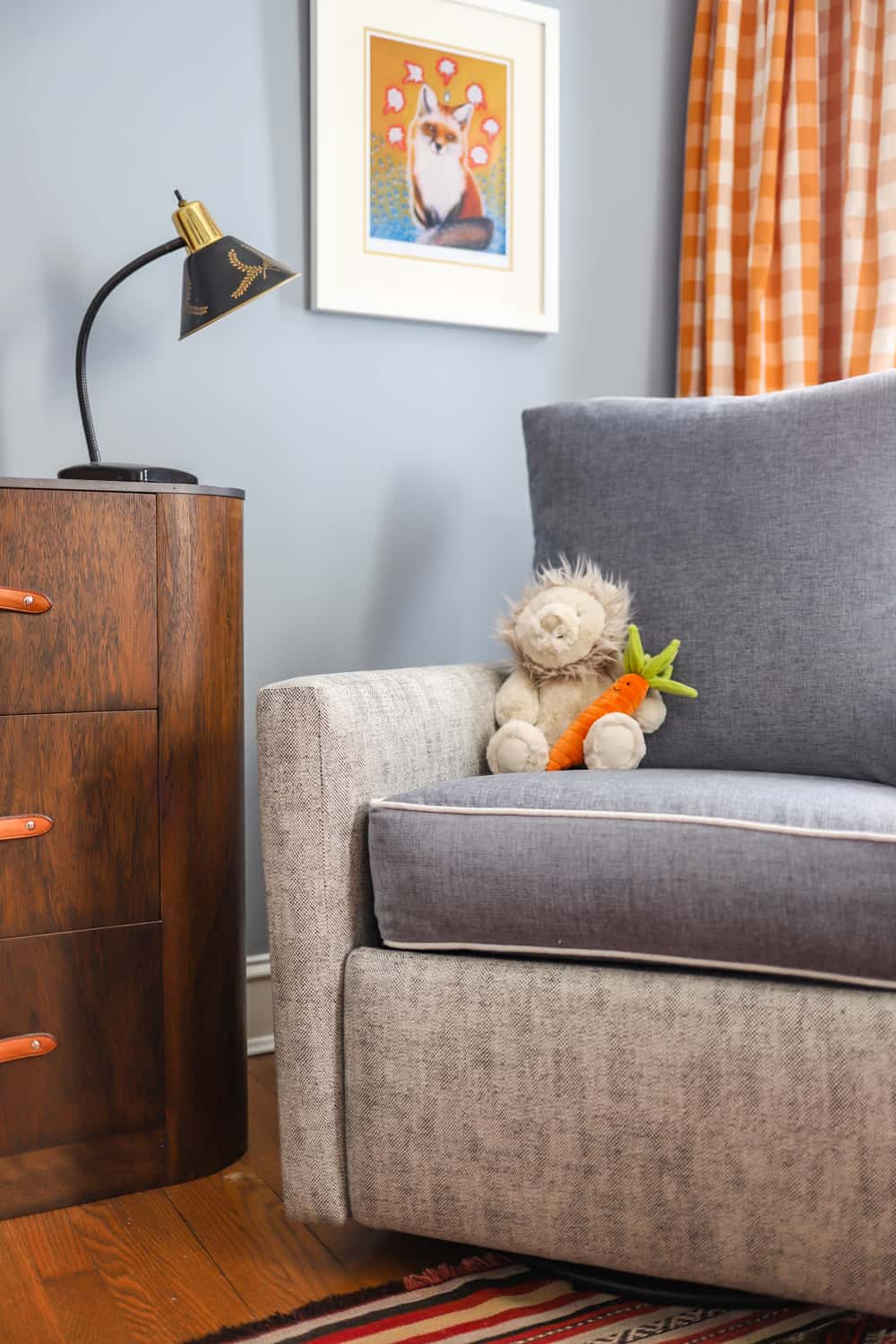
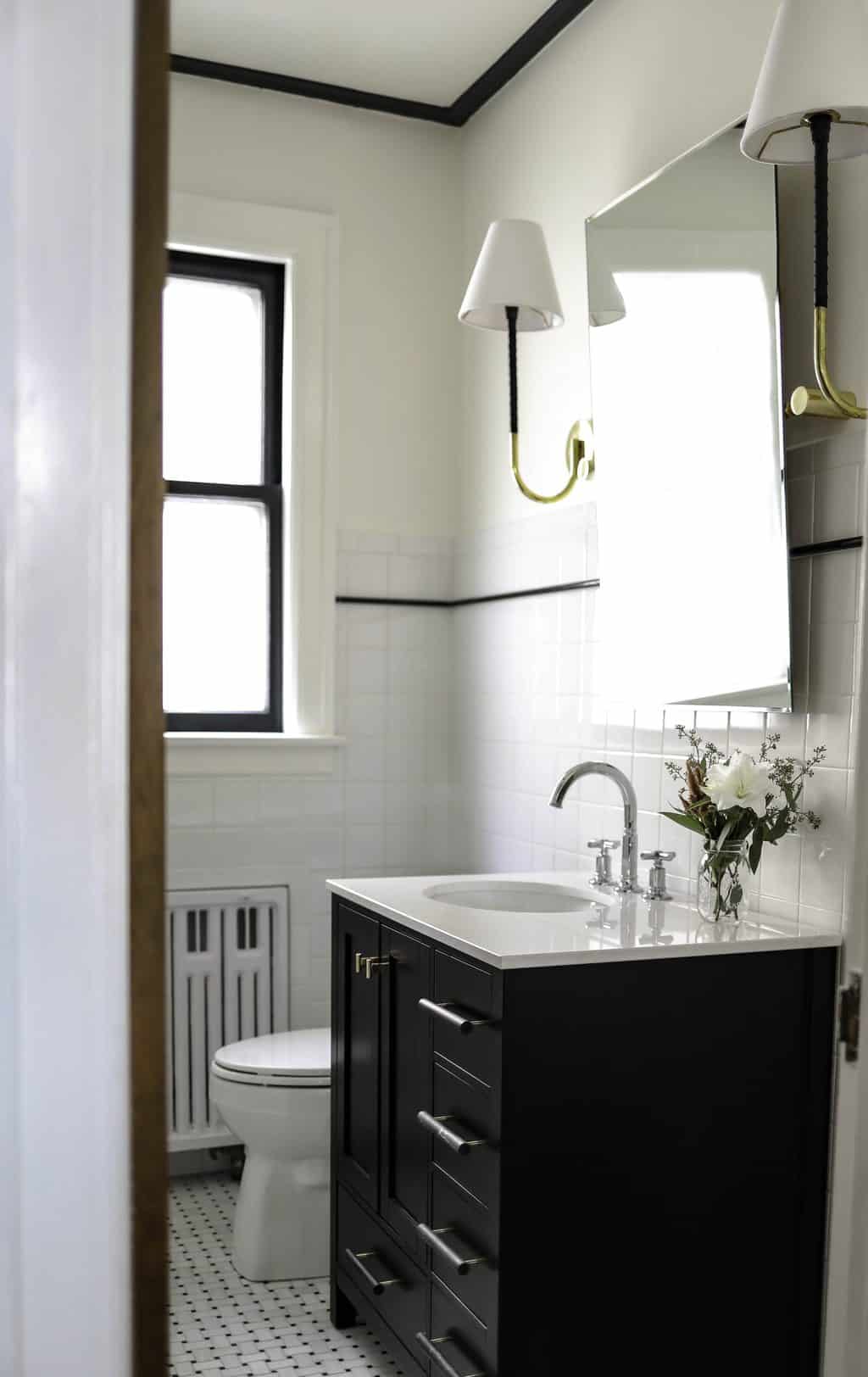
 Here are some of my color palette creations:


Hope you give this a try! Feel free to message me with any questions or issues that arise.
XOXO – CLAIRE
Leave a Reply
October 7, 2024
read the post
YOU MIGHT ALSO LIKE
April 17, 2024
read the post
September 2, 2021
read the post
August 24, 2021
read the post

Meet Claire
Claire’s creative energy comes from her unique perspective on the world as both a trained interior designer and a passionate yoga teacher. Her affinity for kitchen design, timeless style and eclectic decorating are shared here, along with lots of interior design education and tips. Thanks for being here, please enjoy!


[…] from Centered By Design shares a little Photoshop lesson that reviews some basic layering skills, and teaches how to use the eyedropper tool to create […]