

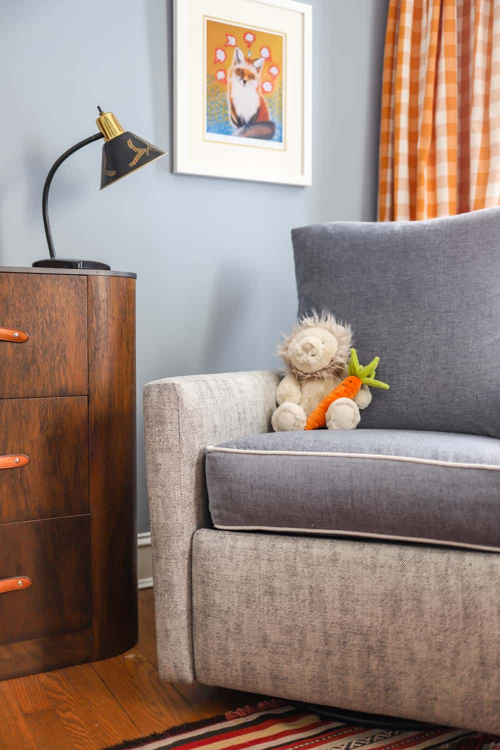
We have seen pastels popping up in fashion and interiors in a big way over the last five years. Different shades of our favorite colors always flow in and out of home decor trends, BUT one we feel that has particular staying power is Powder Blue. Some might consider this chalky hue a safe alternative to all the grey out there (we agree!) and really respond to powder blue when it’s the statement color in the room! Here’s more on decorating with powder blue.
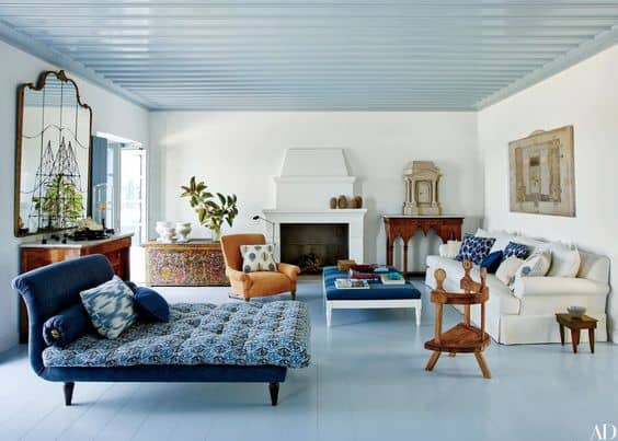
Designer: Isabel Lopez Quesada, Source: AD
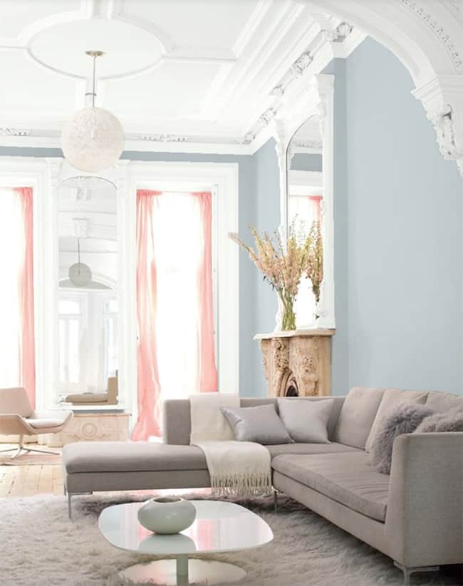
It’s a bold and (often) beautiful move to paint a ceiling or moldings in a color other than white, but as you can see, powder blue can really work in many different settings. We naturally respond to a blue ceiling because the sky is blue, and taking the saturation down to a powdery blue hue adds an element of sophistication.
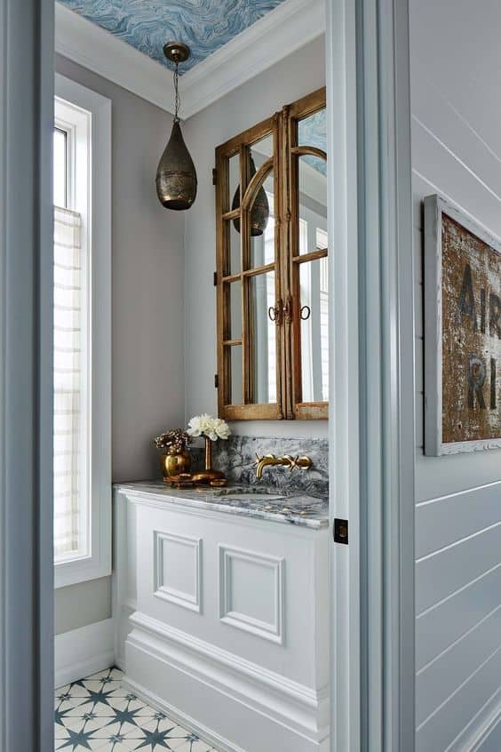
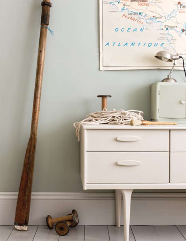
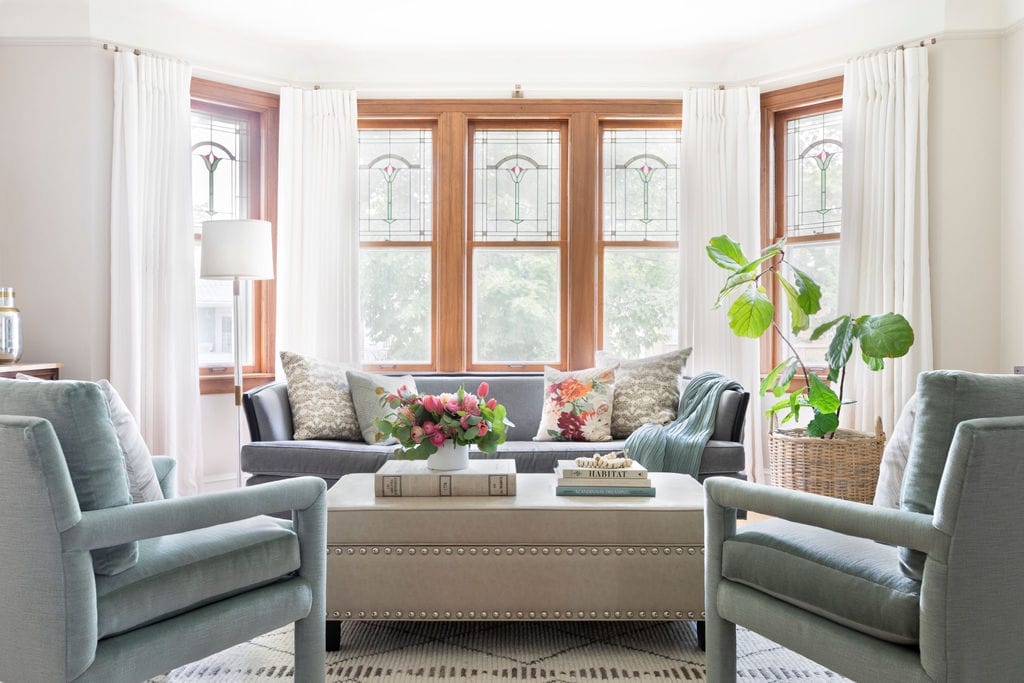
Source: Pinterest, designer unknown
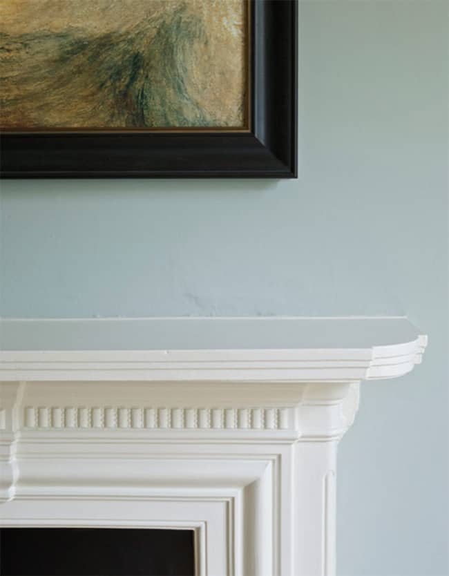
We love when clients are willing to go for painted molding or millwork! It’s our job to consider where it will start and stop and how it mixes in with traditional white molding. You can see both the powder blue door frame and the white crown molding in this shot, and it looks so good together! When considering a light blue paint color always go more grey than you think to avoid it looking too baby blue. Really good soft blues have some black in them to temper the intensity, and we also like when they go slightly blue-green as well!
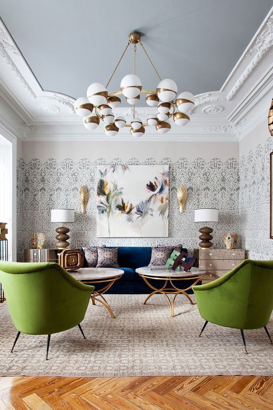
Source: Casa Decor 2018 Madrid as seen on the Trendland blog.
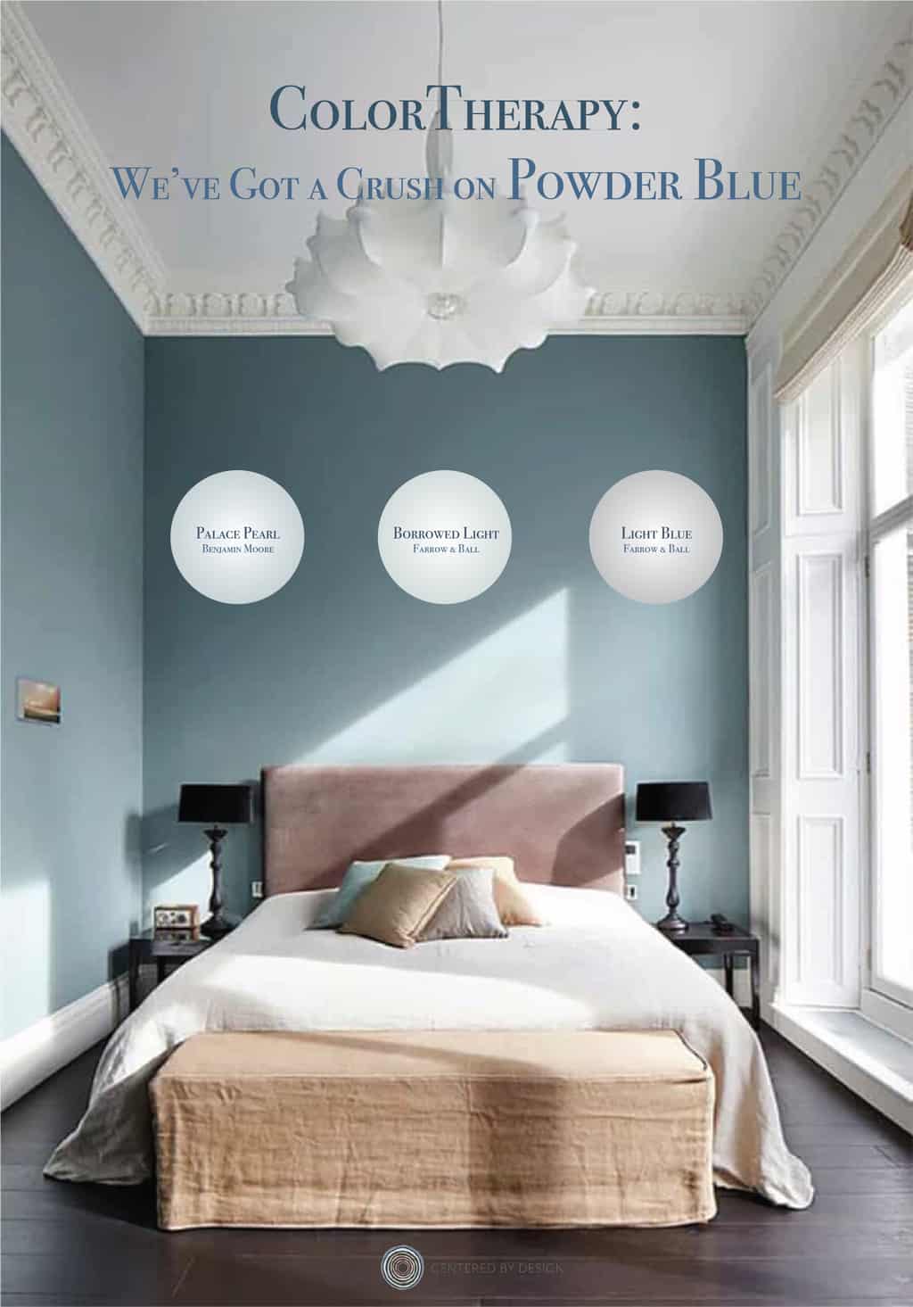
A few of our very favorite soft blue hues are:
Benjamin Moore Rendering of Palace Pearl in Living Room.
Light Blue Farrow and Ball
Borrowed Light Farrow and Ball
There have been lots of navy blue kitchens in the past few years and we’re excited to see powder blue popping up in kitchen cabinets, stoves, hoods and tile as a brighter alternative. The soft color really shines in a kitchen setting when combined with marble, wood and metal.
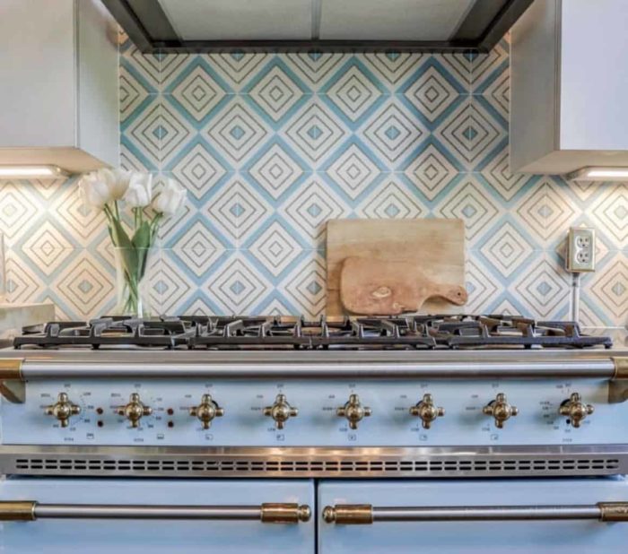
Source: Lacanche US
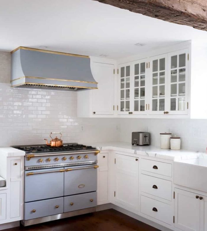
Source: Lacanche US
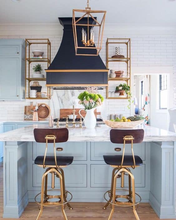
Source: Addison’s Wonderland blog/Instagram.
We hope some of these images encourage you to consider decorating with powder blue as a statement, rather than simply an accent!
XO – CLAIRE
Pin this image to share the article on Pinterest and follow us on Pinterest for more design inspiration!
P.S. Your personal sanctuary is closer to home than you think, let’s find it together. Visit our PROCESS page to learn more about working together on your next interior design project. We can’t wait to hear from you!
Leave a Reply
October 7, 2024
read the post
YOU MIGHT ALSO LIKE
April 17, 2024
read the post
September 2, 2021
read the post
August 24, 2021
read the post

Meet Claire
Claire’s creative energy comes from her unique perspective on the world as both a trained interior designer and a passionate yoga teacher. Her affinity for kitchen design, timeless style and eclectic decorating are shared here, along with lots of interior design education and tips. Thanks for being here, please enjoy!

