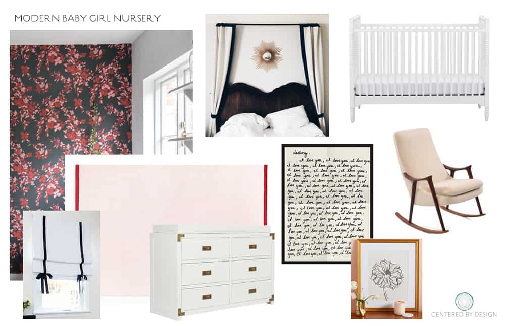
With only 10 days until baby girl’s due date, I’m excited to finally be revealing the before and after of our attic nursery! I’m going to include some before photos below, but if you want to reacquaint yourself with the full BEFORE tour of our Tudor-bungalow, you’ll remember that our upstairs feels more like an attic than a full second floor. The bedroom we decided to use for the nursery has some funky ceiling lines, but it made for a great space to create a graphic accent wall with wallpaper. After much deliberation, I was certain a floral pattern was the way to go. I had a wonderful time working with Farrow & Ball, and choosing a pattern from their new 2017 collection of floral inspired papers. We chose the floral called Hegemone. I love the wild artistic feel and description, “taking its name from the Greek goddess of fruit and flowers, the design blooms freely in all directions to bring your walls to life.“
Here’s my initial inspiration board and DESIGN PLAN for the attic nursery:
Here are the BEFORE photos. Major updates to the room included sanding and staining the flooring, fresh coat of paint and new baseboard and door from METRIE (awesome online resource for interior moldings and doors). The nursery is about 10′ x 10′ and was just enough space to fit all the essential pieces of furniture, which for us includes the crib, bookshelf, rocker and dresser/changing table. There is no closet in the nursery, but luckily we’ve got lots of closet space in the adjoining hallway.
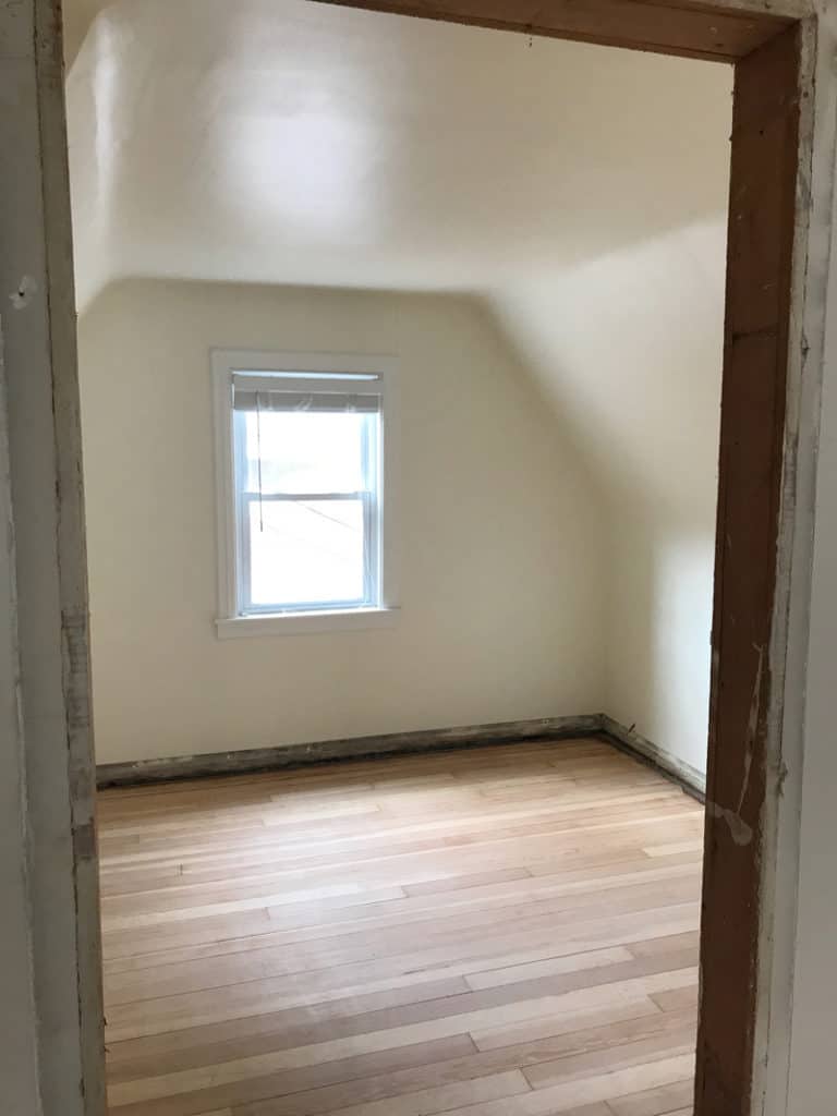
Those clipped ceiling lines were calling out for a fun pattern or print!
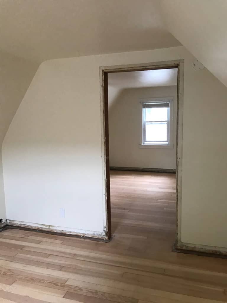
We created the accent wall/s on each side of nursery.
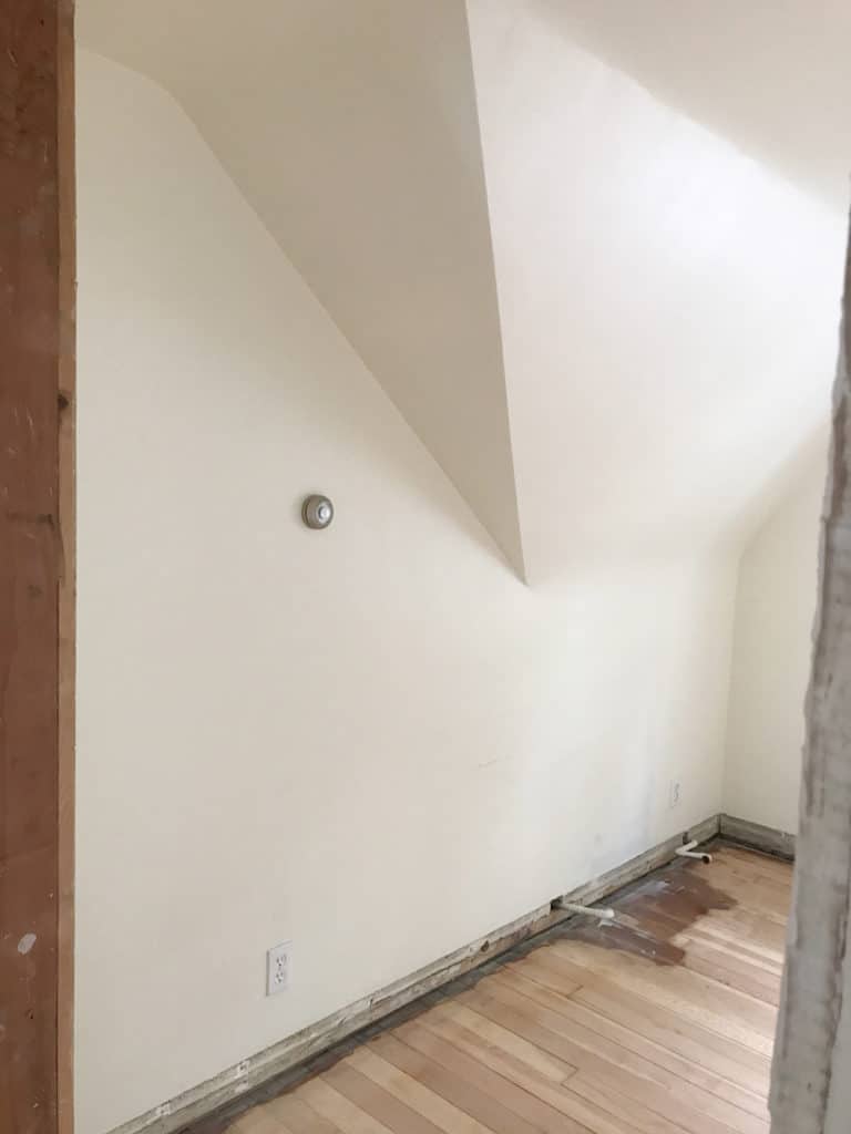
Radiator was moved so we could sand floors, and this side of the room had just enough space for a long, low dresser.
Here are the AFTER photos. I really love how it turned out! I think my favorite detail (aside from the gorgeous paper) is the canopy detail over the crib. Using the attic sloped ceiling line to our advantage, the canopy helps fill out the white space by softening the room with some additional fabric and color.
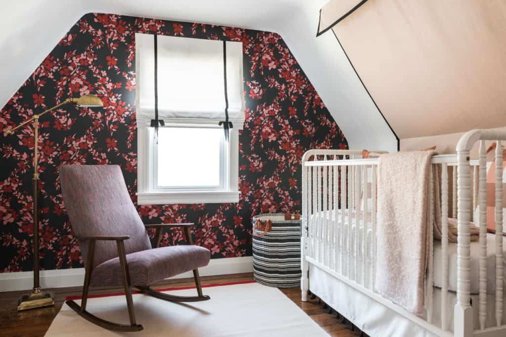
SOURCES: Danish rocker and lamp – vintage. Rug – Nordic Knots. Basket – Serena & Lily. Crib – Jenny Lind style. Bedskirt – Pottery Barn Kids. Bedding – Boll & Branch.
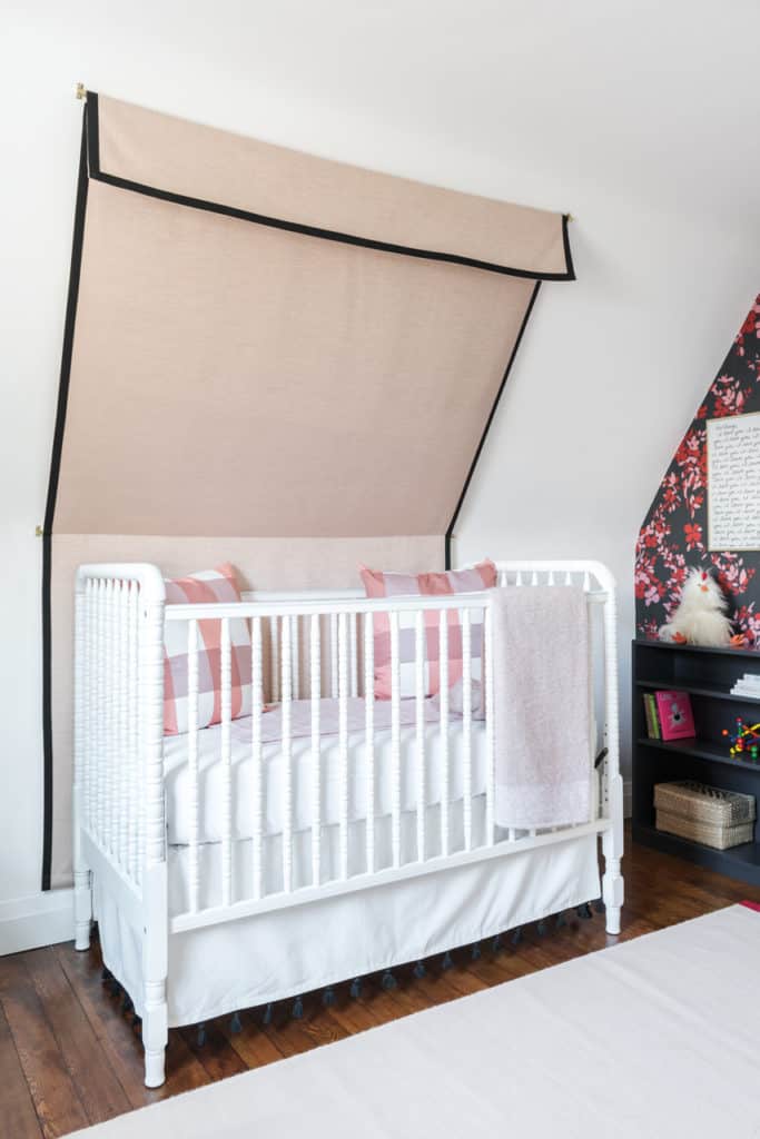
SOURCES: See above. Canopy – custom. Pillows – Unison Home. Bookshelf – vintage (re-painted Off Black by Farrow & Ball). Art prints – Kate Spade and Sezane. Jellycat Stuffed Chicken – Land of Nod.
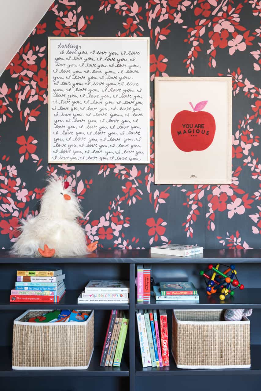
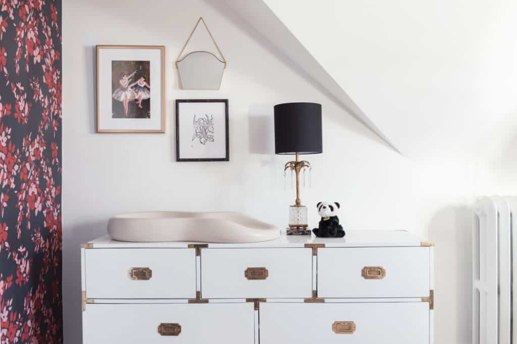
SOURCES: Art prints – Jenny’s Print Shop. Framing by Framebridge. Campaign style dresser – MegMade. Lamp & mirror – vintage. Peanut changing pad by Keekaro. Roman shade – custom.
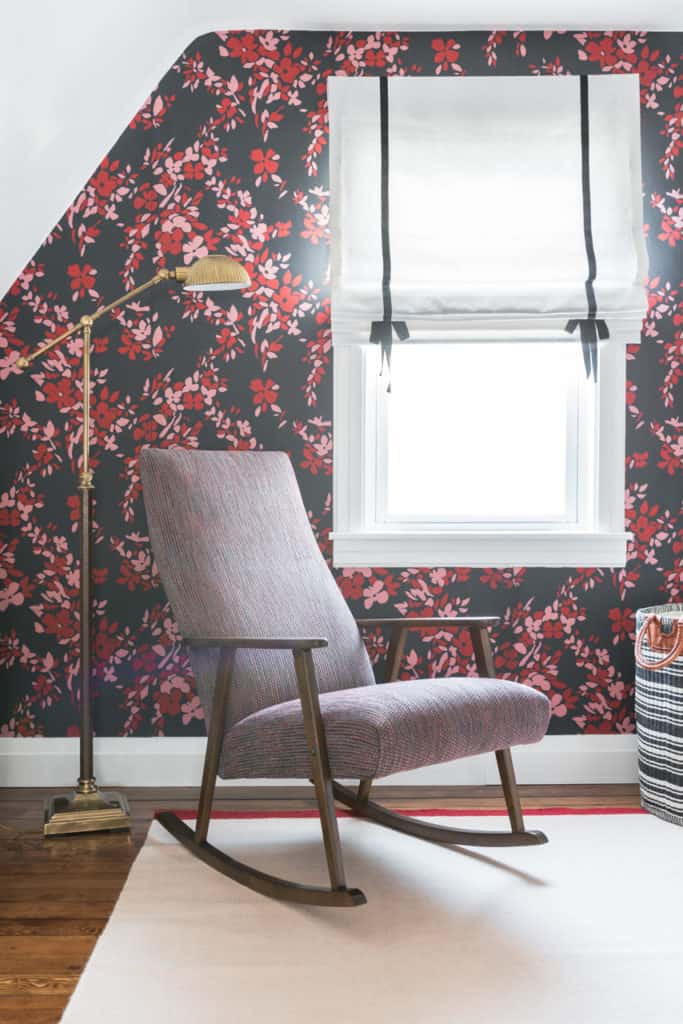
It was really fun dreaming this room into existence and I can’t wait to meet this baby girl! I hope this has given you some new ideas for small space or attic nursery designs. I also can’t believe how much black I used in this nursery, but how light and bright it still feels. I’m a big advocate of using some black in almost all interior spaces, it always adds a chic element. Many thanks to Farrow & Ball and JC Licht brands who sponsored the wall covering. You can see all the gorgeous color ways of the Hegemone wallpaper HERE.
After photography by Todd Crawford Studio
Let me know if you have any questions, or sources I missed. Would love to hear what you think about the transformation! Do you like the bold wallpaper for a nursery? Would you choose something more subtle or soothing? Does this inspire you to use an accent wall in kid’s space?
XO – CLAIRE

Leave a Reply
October 7, 2024
read the post
YOU MIGHT ALSO LIKE
April 17, 2024
read the post
September 2, 2021
read the post
August 24, 2021
read the post
Meet Claire
Claire’s creative energy comes from her unique perspective on the world as both a trained interior designer and a passionate yoga teacher. Her affinity for kitchen design, timeless style and eclectic decorating are shared here, along with lots of interior design education and tips. Thanks for being here, please enjoy!