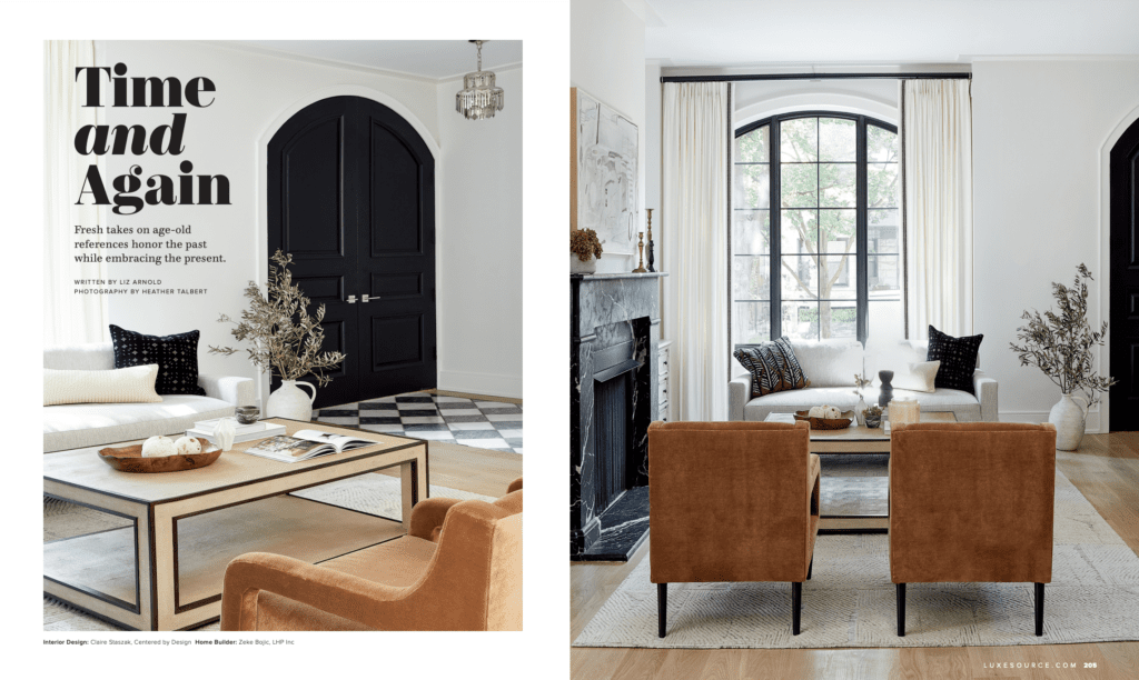
Luxe Interiors + Design magazine featured one of our recent renovation projects in its latest issue! Today we are taking you behind the scenes of this modern organic home. In the world of shelter publications, project reveals typically must be exclusive to the magazine and not published elsewhere (including the designer’s own website or social channels) before the issue is out. So while this has been a long time in the works, we are very excited to finally be able to share it with the world.
Modern Organic Home Renovation Scope
This renovation of a beautiful historic home in Lakeview, originally built in 1894, was for a family with two young boys. It had previously been transformed from a standard brick two-flat into a single-family home. When this family purchased it, they fully gutted the house, then hired us to oversee a full addition and dig out the basement. The architect had given us the original plan for the building, but he was not on the project. This meant we were able to work alongside the builder, Little House Productions, and take responsibility for the interior architecture and cabinetry. It was exciting and creatively fulfilling to have so much of a home to design!
5 Words
Modern, classic, organic, comfortable, elevated
Biggest Challenges
Couples often have different styles, which can prove challenging to create a design they will both love. In this case, the husband had very modern taste, while his wife gravitated toward more traditional style. We were able to juxtapose the two looks together to satisfy them both.
Another big challenge with this project was the timing. The renovation was underway when the pandemic hit, so we had to take a brief pause from working. Supply chains weren’t as much of an issue back then compared to what they became a year later. Still, navigating the project during a time of great uncertainty wasn’t easy.
Favorite Details
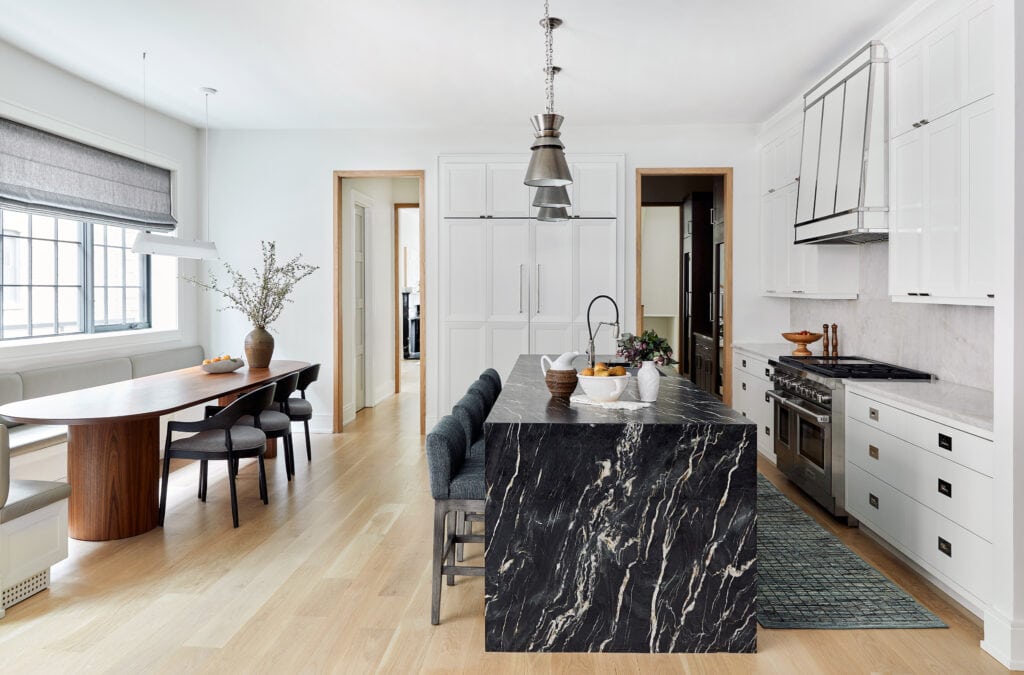
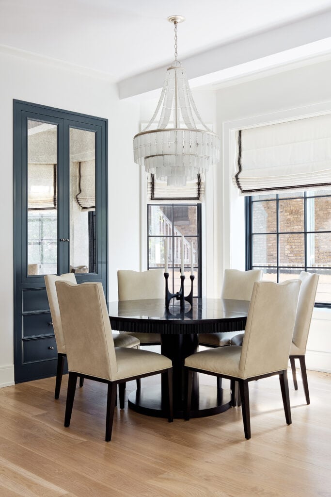
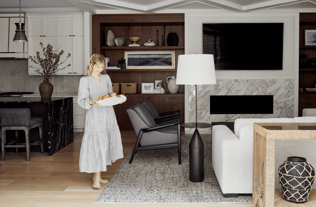
The entire first floor serves as an entertainment space for this busy family, with custom details like a walk-in pantry (complete with a coffee bar, dry bar and wine fridge), a 10-person breakfast nook and a pocketed sliding glass door that opens to the backyard. We wanted to create architectural elements that were interesting and modern but that evoked a spin on traditional design. For instance, the entry’s formal Georgian-inspired gray-and-white marble floor juxtaposed with a slanted coffered ceiling in the family room.
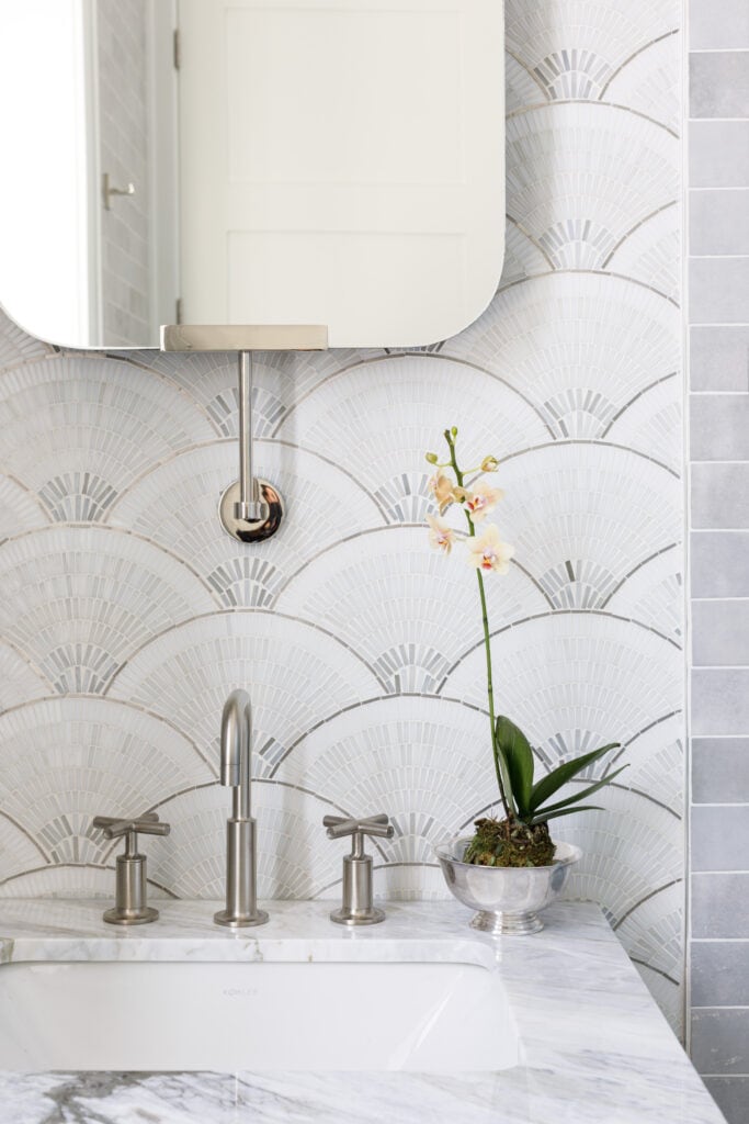
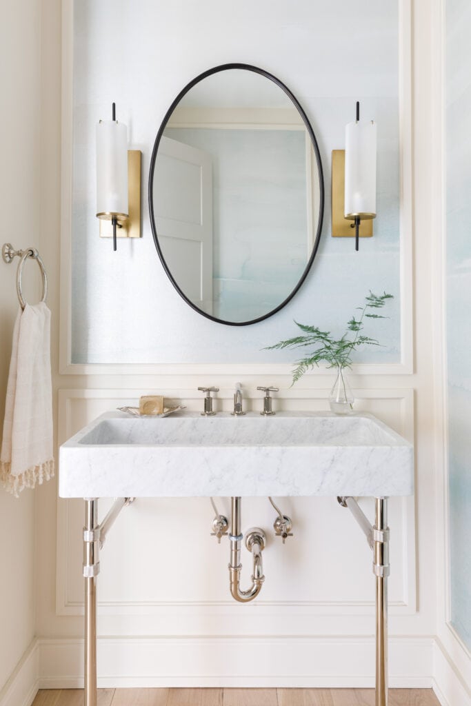
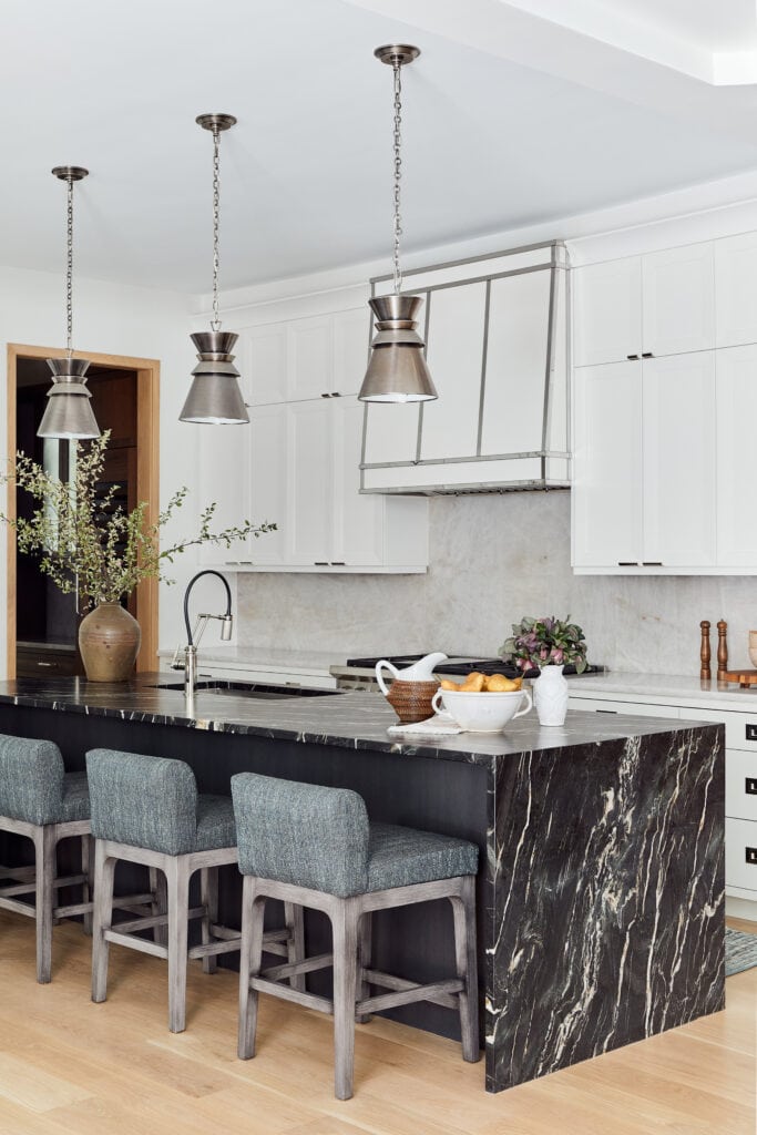
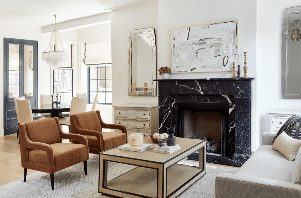
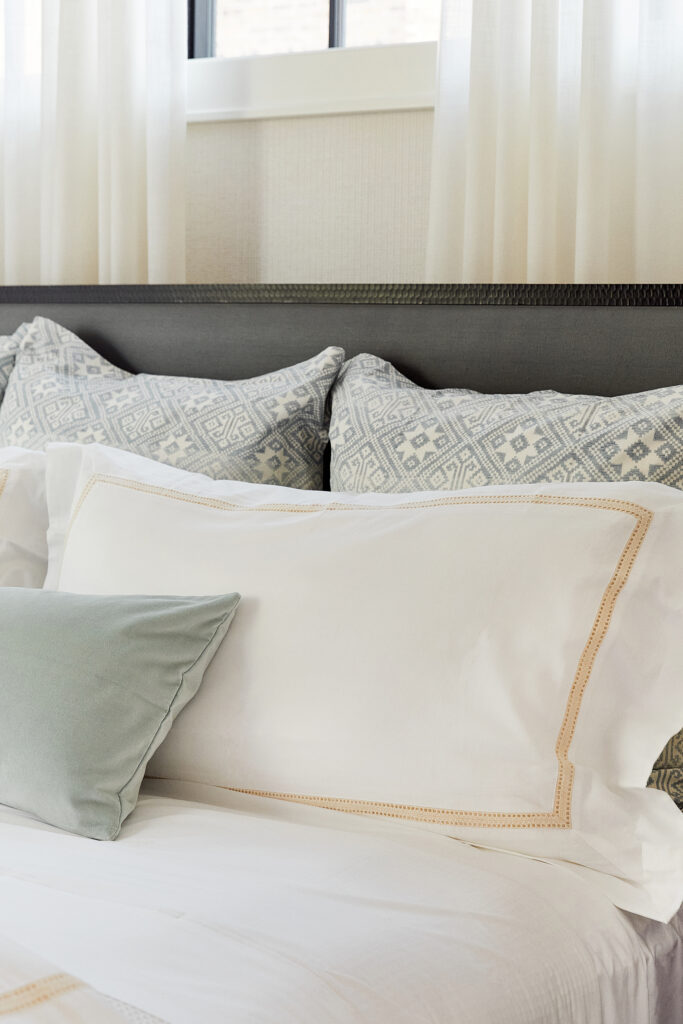
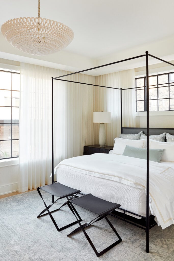
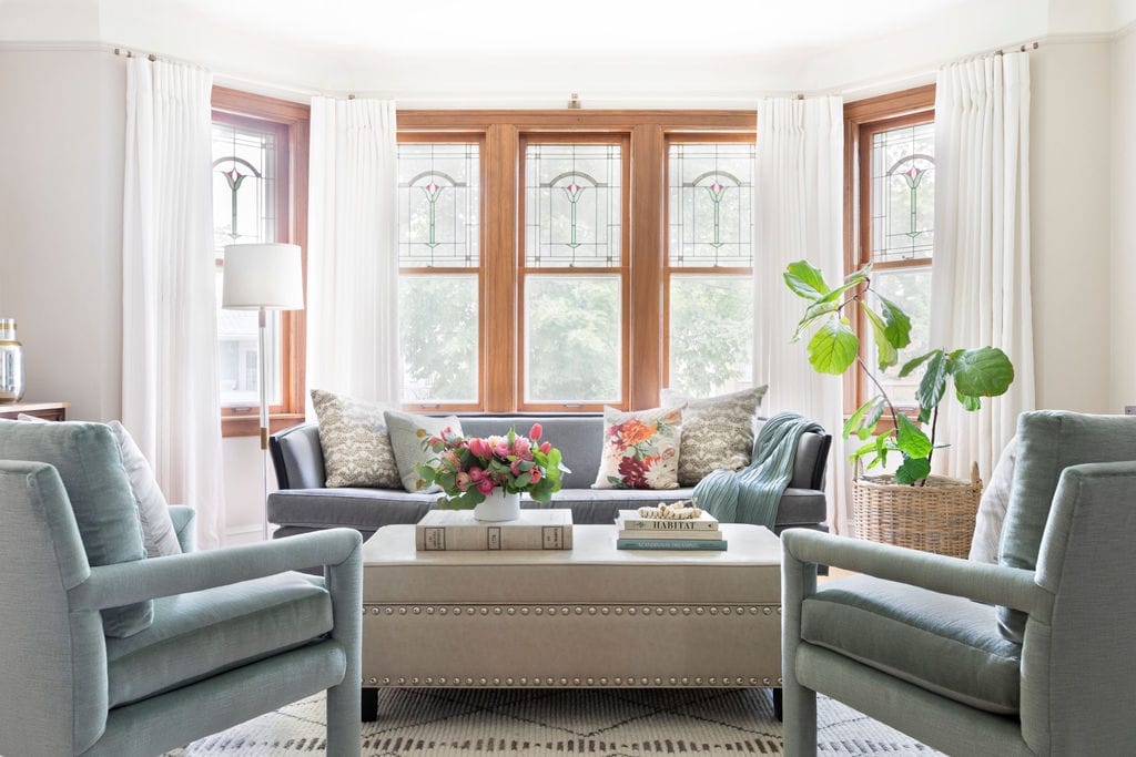
Wood and stone helped set the palette for the design, including walnut, light oak, white and black marble. These are all grounding hues that also provide a nice blend of light and dark. Throughout the home, we kept color subtle, breaking up the mostly neutral theme with rust-colored velvet armchairs in the living room and soft aquas in the primary bedroom and powder bath. Wide-plank light oak flooring helped to unify the home — a design choice the couple luckily agreed upon from the beginning.
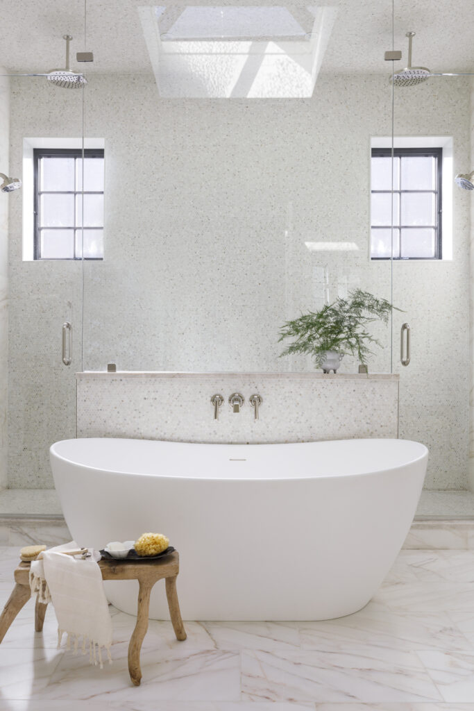
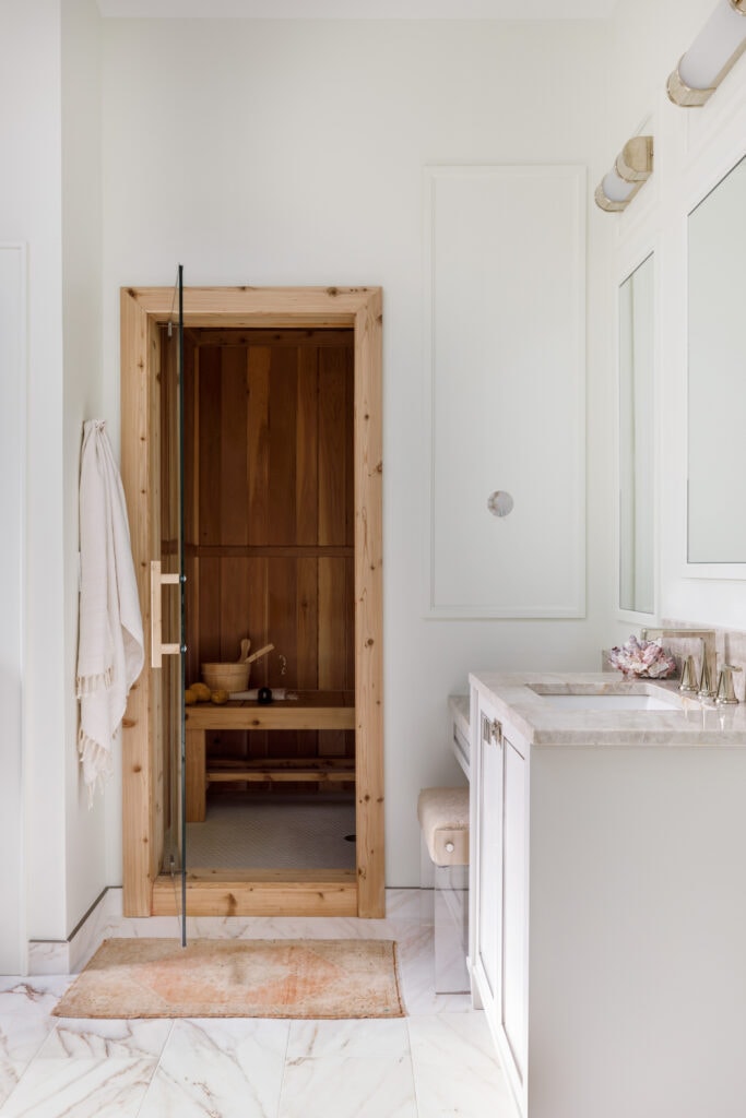
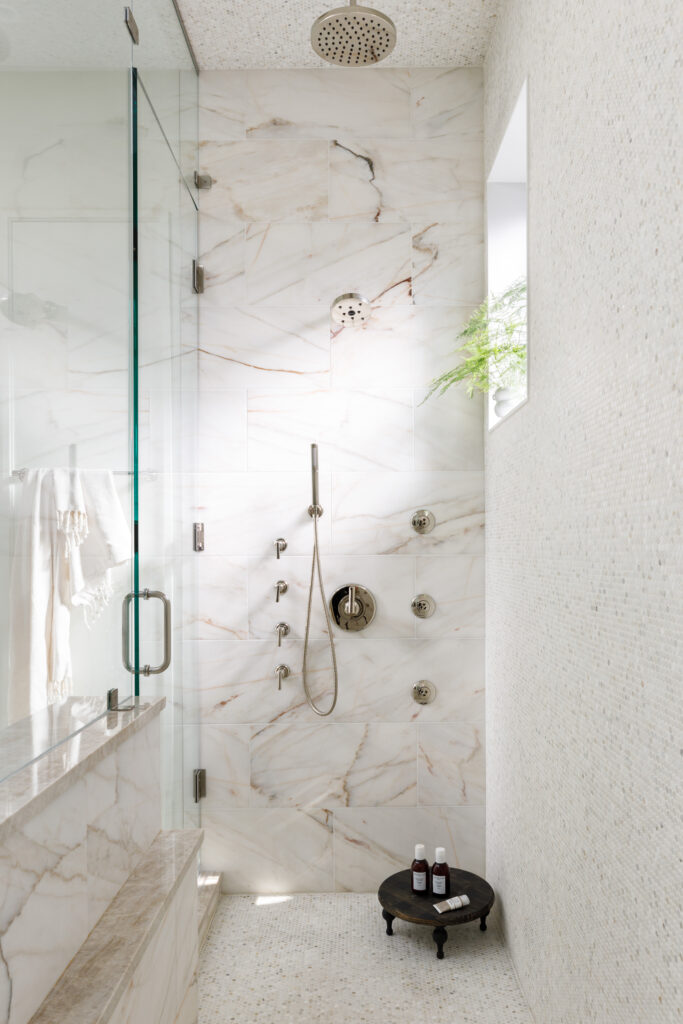
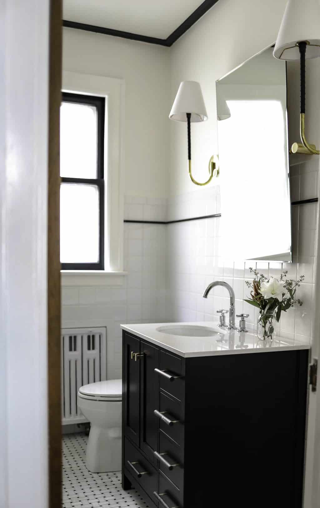
Bathroom Sanctuaries
A Modern Custom Kitchen and Living Spaces
A Bedroom Oasis
What the Clients Said
“The home feels very personal and reflective of who we are as a family.” For us, that’s the ultimate compliment!
How Can We Help You?
Check out more project reveals here and here. Then, contact us today to learn more about how Centered By Design can help you design your dream home.
Leave a Reply
October 7, 2024
read the post
YOU MIGHT ALSO LIKE
April 17, 2024
read the post
September 2, 2021
read the post
August 24, 2021
read the post
Meet Claire
Claire’s creative energy comes from her unique perspective on the world as both a trained interior designer and a passionate yoga teacher. Her affinity for kitchen design, timeless style and eclectic decorating are shared here, along with lots of interior design education and tips. Thanks for being here, please enjoy!