Today I’m really excited to share that a project I was a large part of, The Ross House, has been featured on Design*Sponge! This is exciting on many levels:
- My girlfriend Lauren, her boyfriend Kevin and his step-dad contractor kicked butt ripping this house back to the studs and created an awesome new floor plan. I’m so happy their hard work can be shown off!
- Lauren’s home buying process, which started well over a year ago was a big reason I started Centered By Design, built a web site, and opened an official business in the state of IL. She needed a decorator/designer’s help to aid in her decision making processes and challenge her neutral design aesthetic. I knew I was up to the challenge and didn’t want her to hire anybody else!
- Seeing this house go from bare bones to perfectly styled and ready for glamour shots, just reinforces my love of interior design, and the process of helping clients create their idea of personal sanctuary. The fact that Design Sponge liked the project enough to showcase it online is pretty sweet icing on the cake!
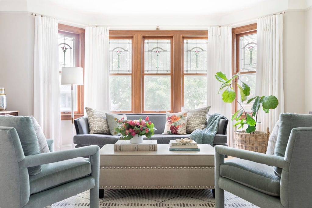
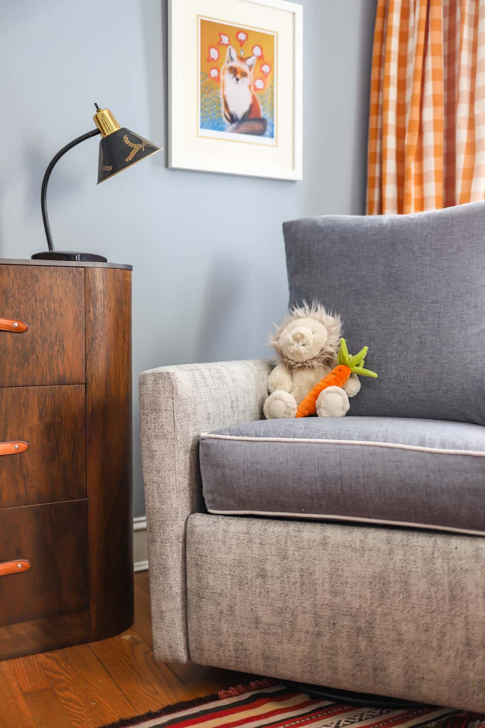
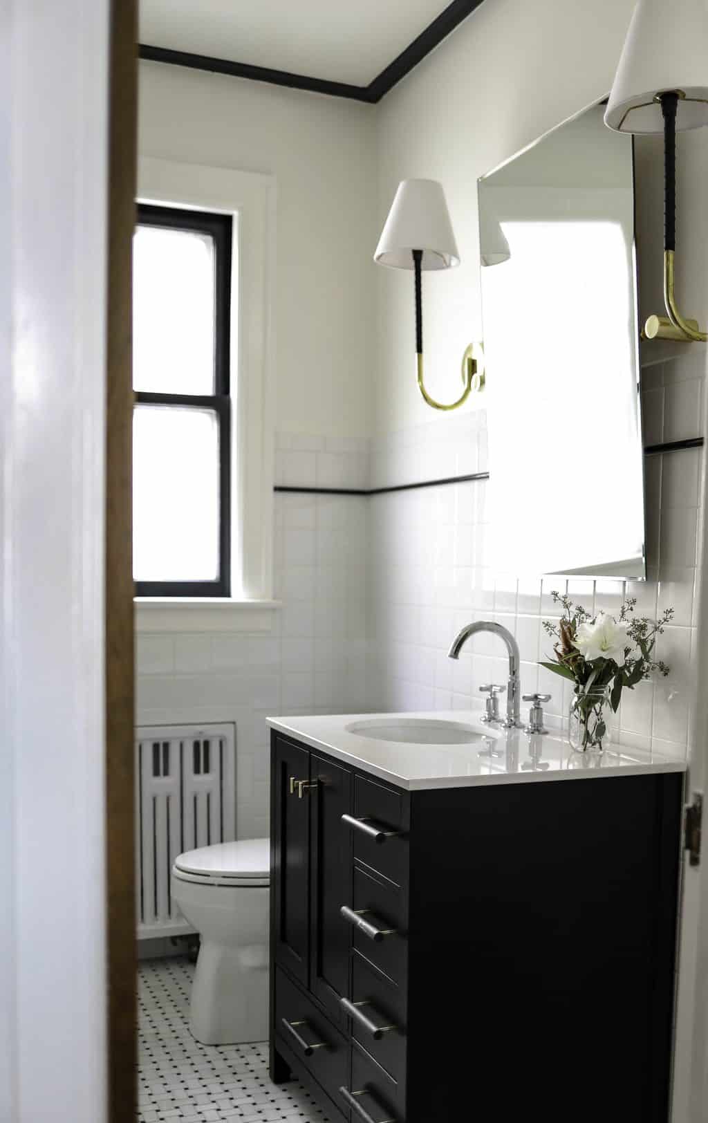
Here’s a look at some of the before and after pictures, collages courtesy of Design Sponge. To see more finished project photos see my portfolio of The Ross House.

The entrance went from blah to banging with an etsy stencil kit (by Cute Stencils) and Sherwin Williams Indigo Batik paint.

Sherwin Williams Simple White was used in the front room, and SW Mindful Grey in this transitional sitting room.

In the main bedroom Martha Stewart Gaberdine created a deep, relaxing feel and worked well since there is ample sunlight with the large east facing windows.
Read the full Design*Sponge article for even more behind the scenes details.
XO – CLAIRE
Leave a Reply

October 7, 2024
read the post
YOU MIGHT ALSO LIKE

April 17, 2024
read the post

September 2, 2021
read the post

August 24, 2021
read the post
Meet Claire
Claire’s creative energy comes from her unique perspective on the world as both a trained interior designer and a passionate yoga teacher. Her affinity for kitchen design, timeless style and eclectic decorating are shared here, along with lots of interior design education and tips. Thanks for being here, please enjoy!


I LOVE IT!