

Designing our Mediterranean Reverie French wallpaper collection with Isidore Leroy was such a fulfilling process that pushed me to be creative in new ways (…never have I analyzed colors so thoroughly). Don’t miss the Journal post detailing how the collaboration came to be, my inspiration, and the process of working with incredible French artists to make my imaginary lost garden a reality. I really wanted to create versatile papers that could bring the Mediterranean spirit into all different styles of interiors. It’s surreal to finally see the paper going up! Today, I’m sharing some exciting installs and moodboards of our French wallpaper collection.
Marbré de Venise Installs
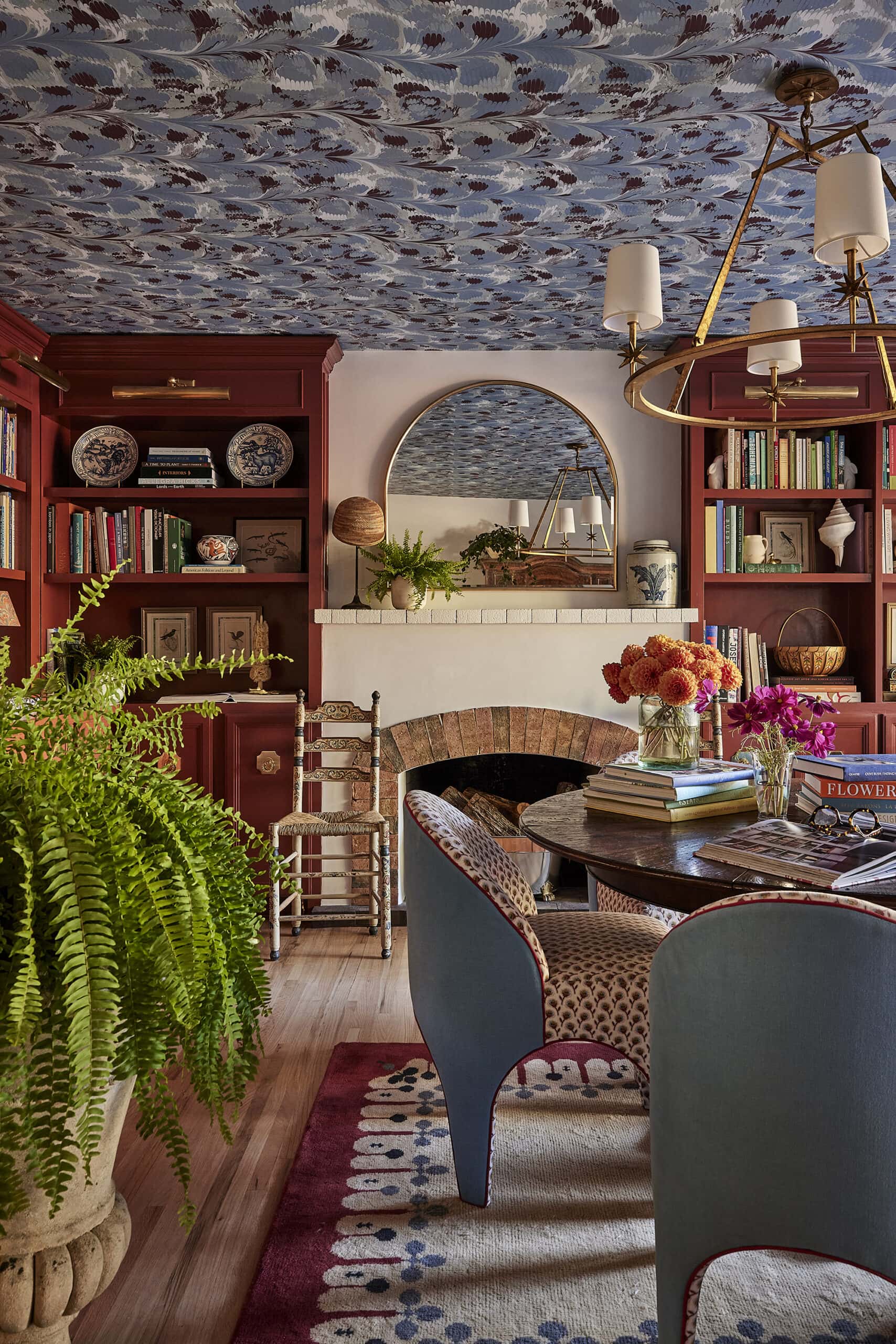
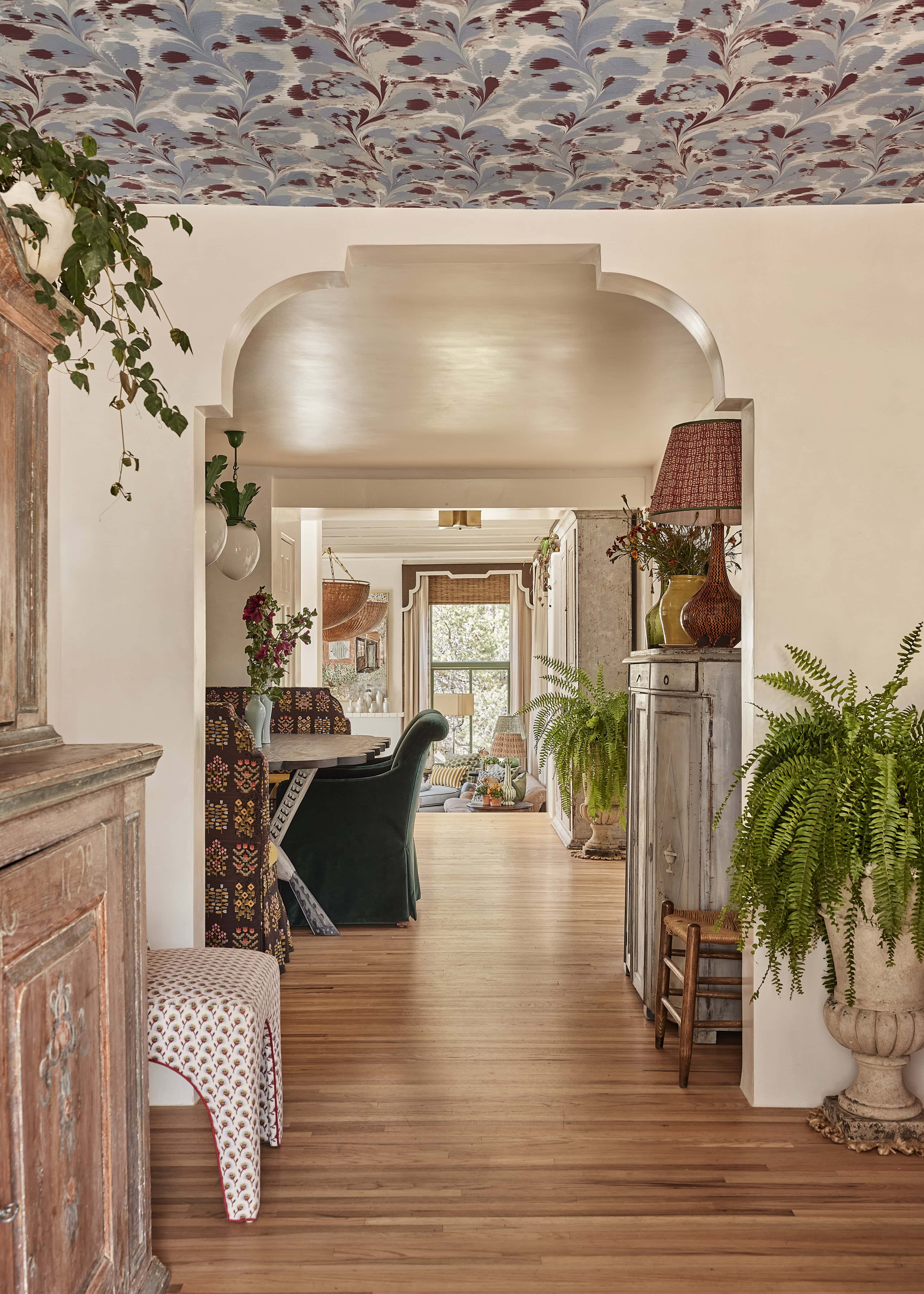
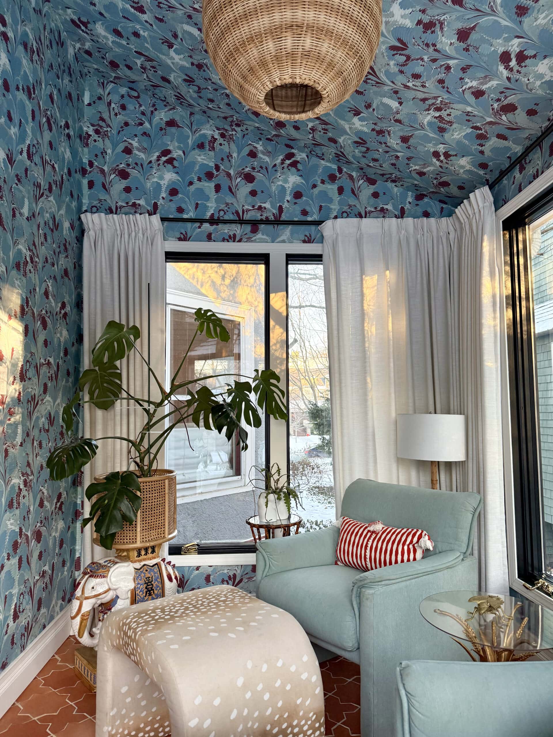
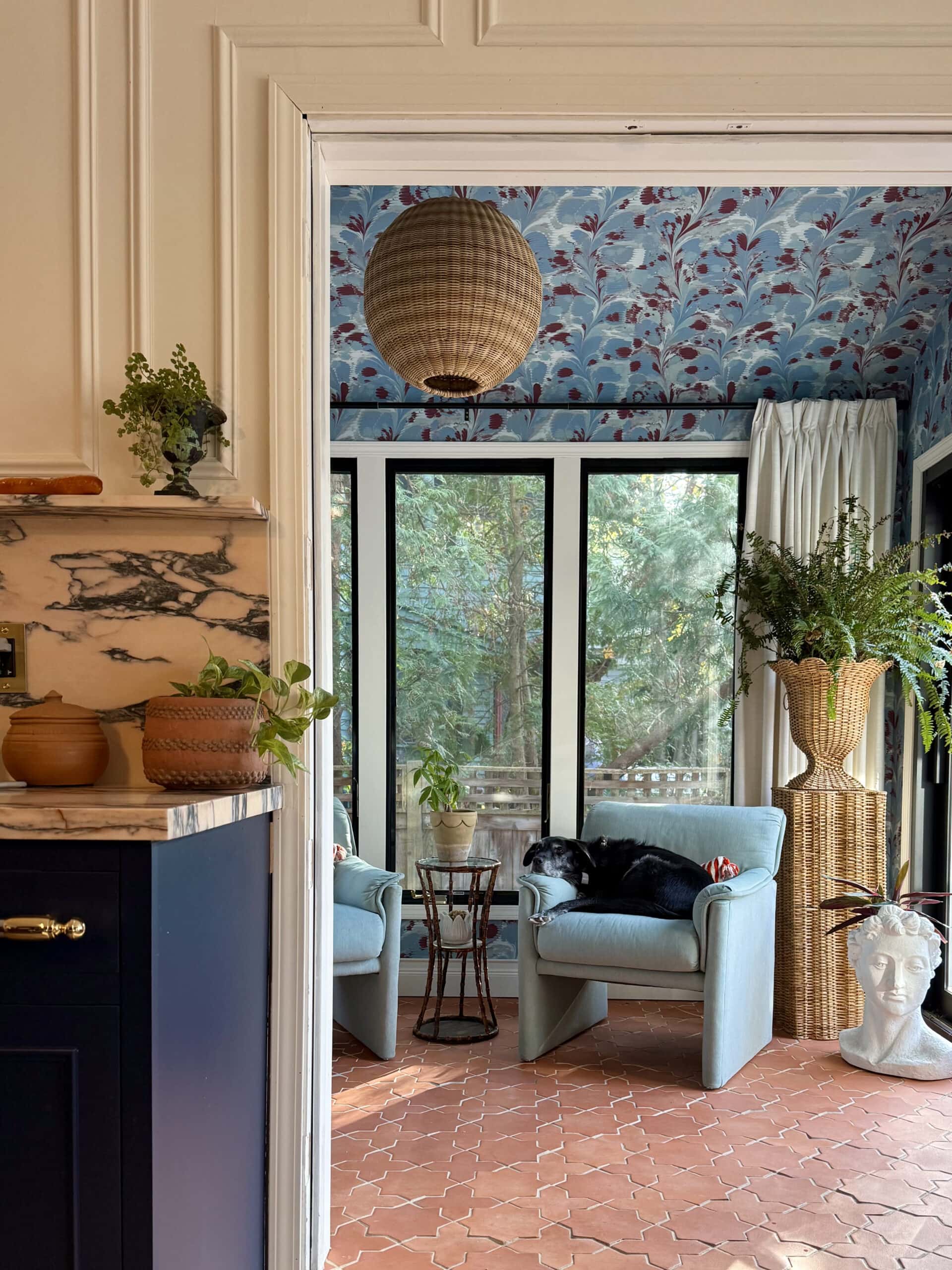
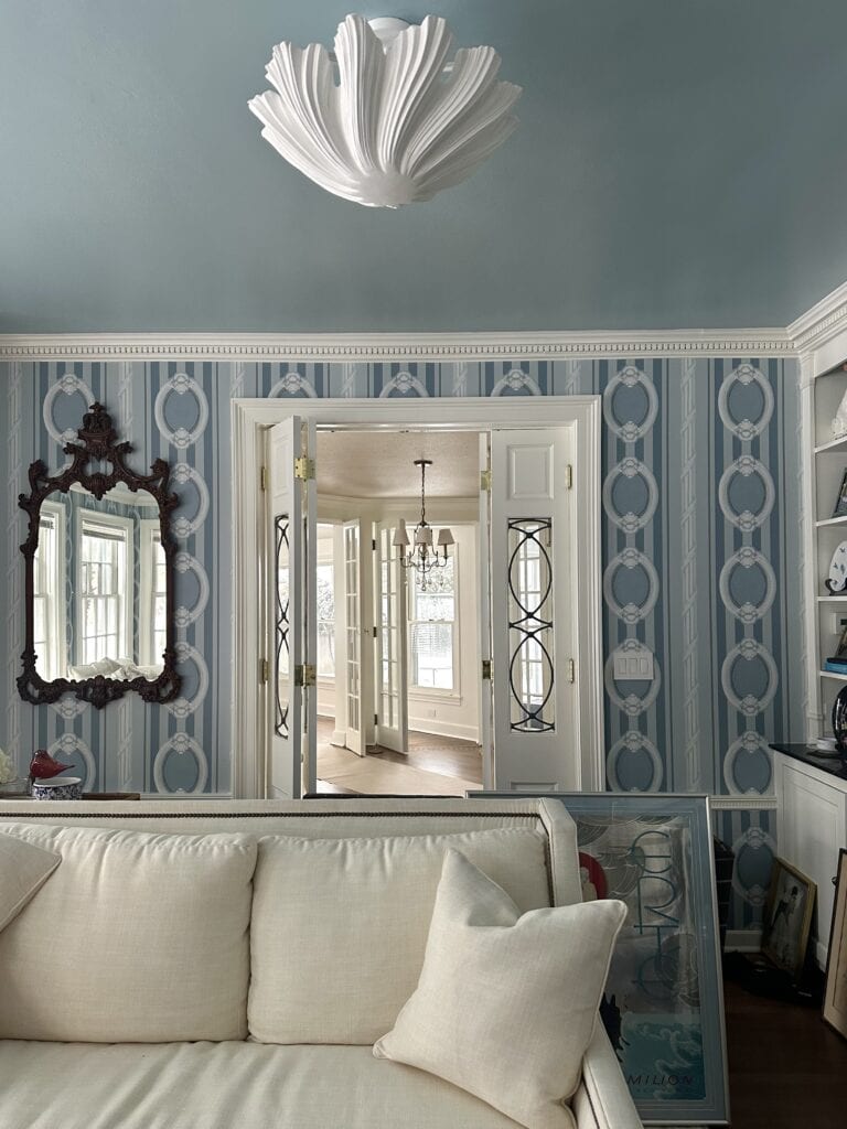
Our friends at French & French Interiors used the bleu colorway of our Marbré de Venise in their home, recently featured in House Beautiful! We love utilizing the 5th wall, the ceiling. A ceiling wallpaper moment is unexpected and bold, while allowing breathing room for other design elements to shine.
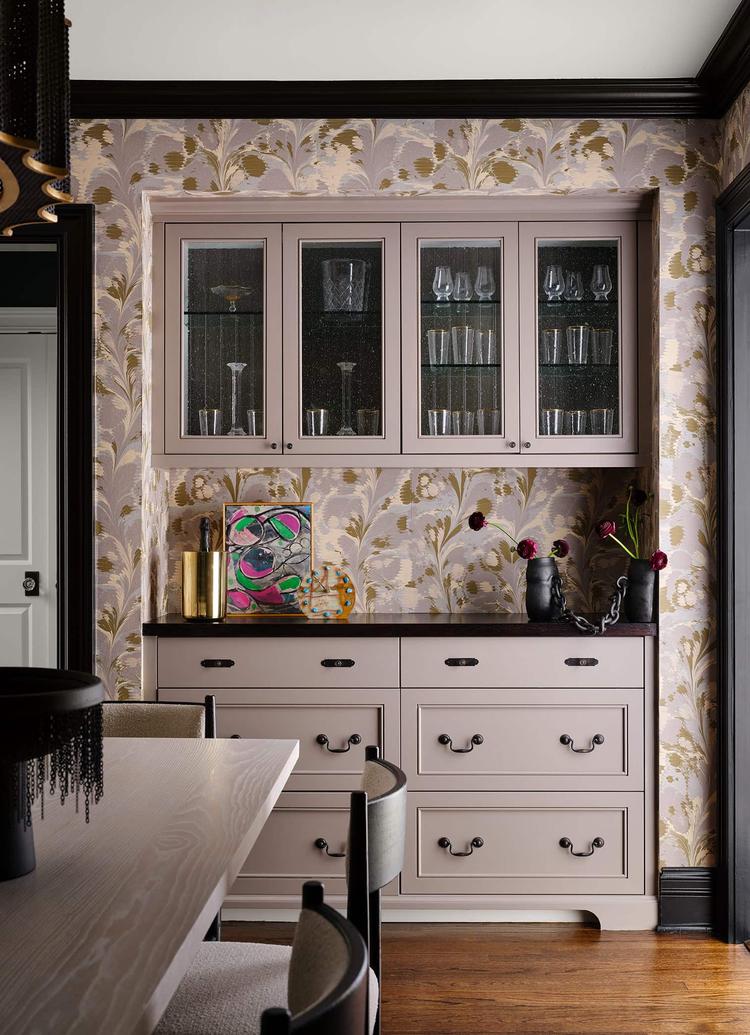
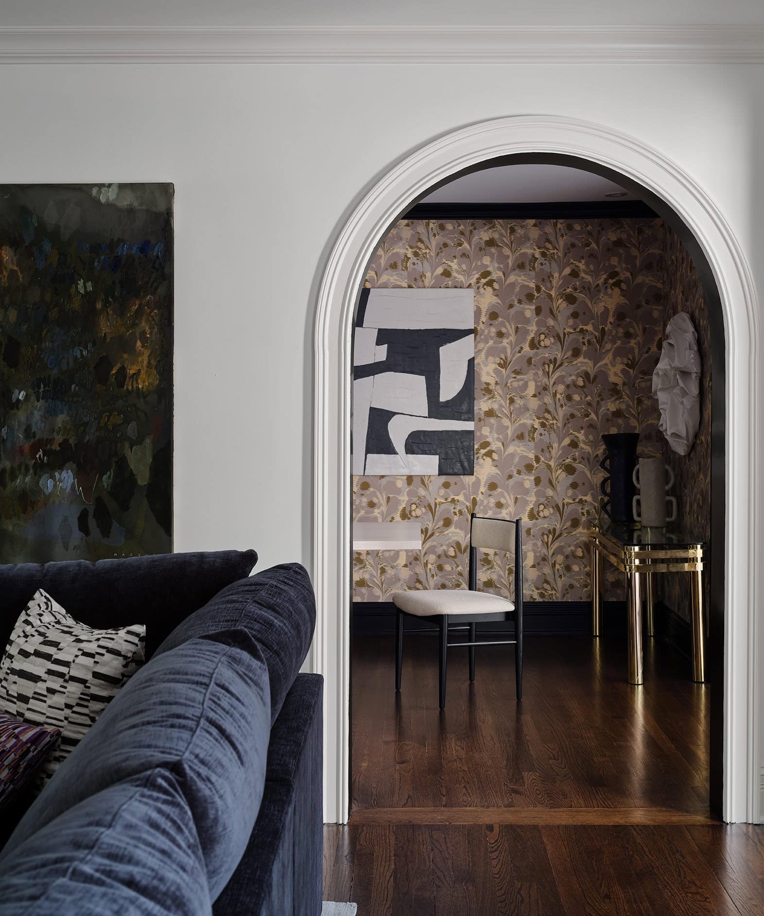
Stone Textile Studio used the jaune colorway in this beautiful, contemporary dining room. A favorite detail of ours is the color match on the millwork, so gorgeous!
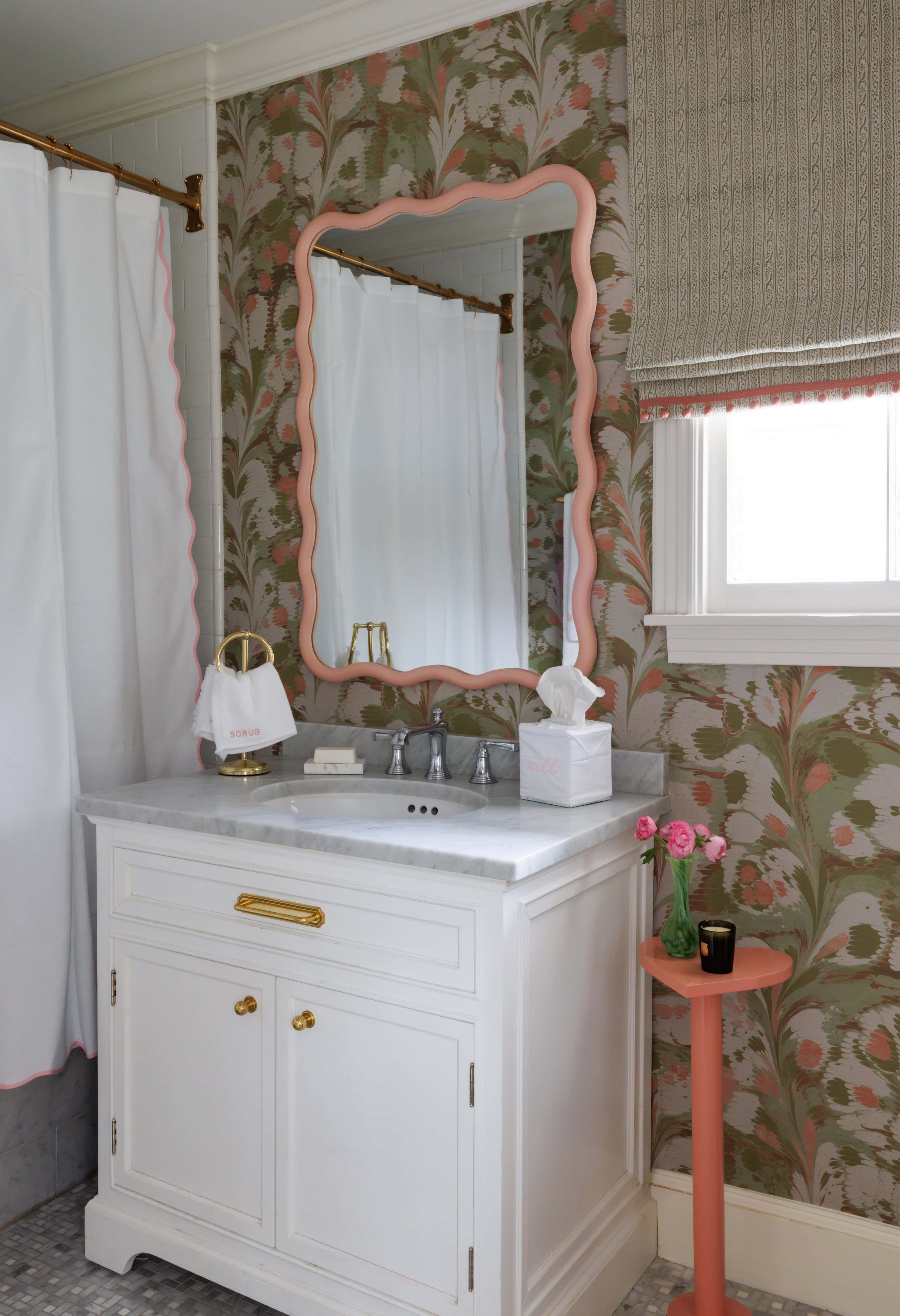
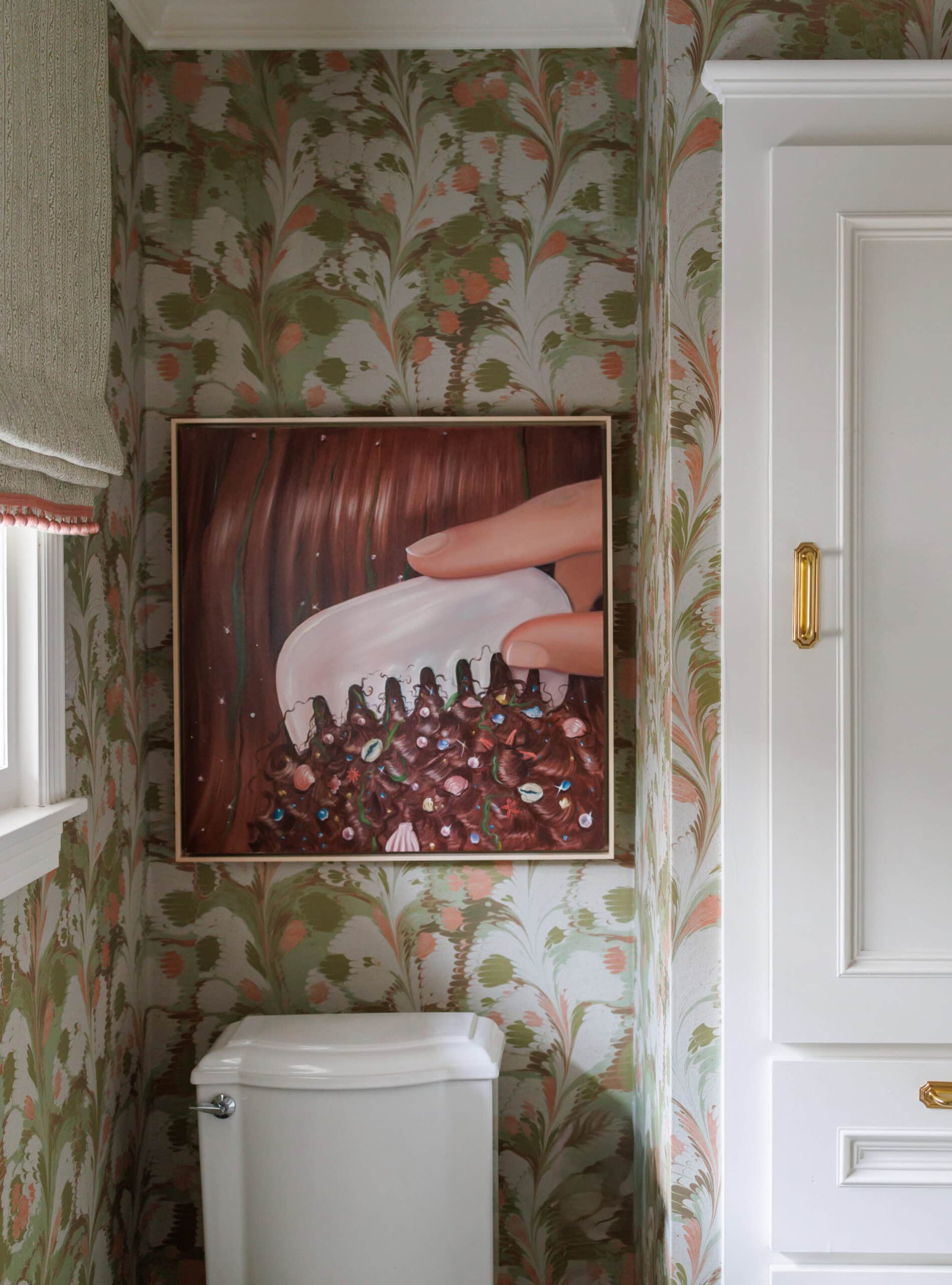
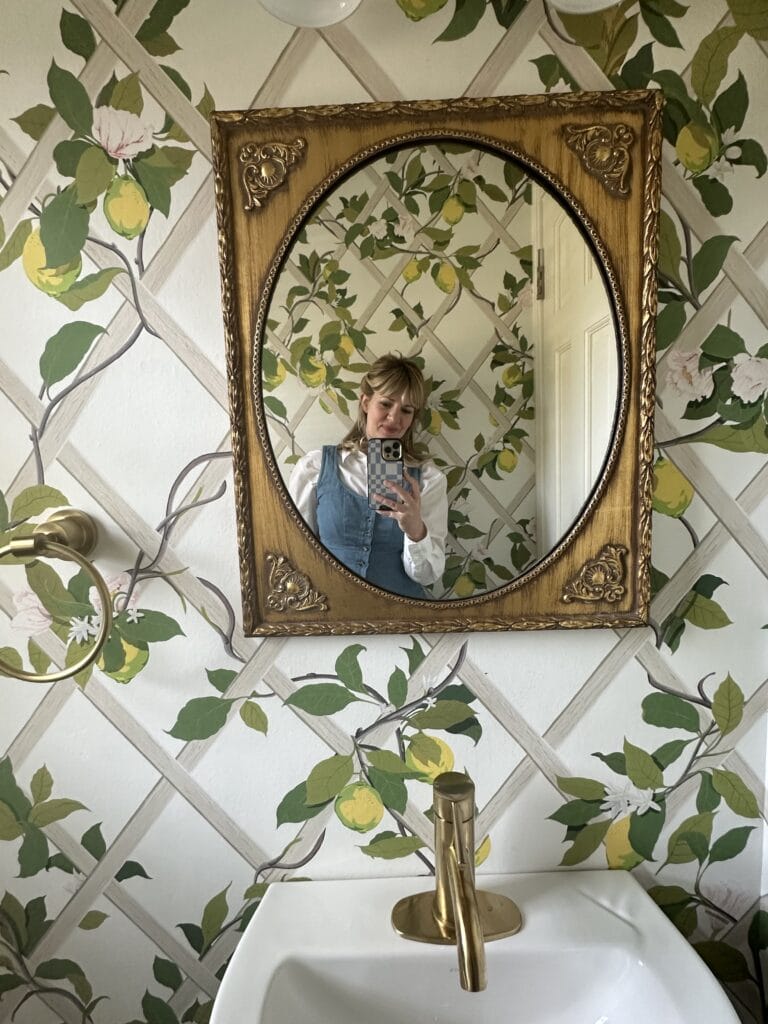
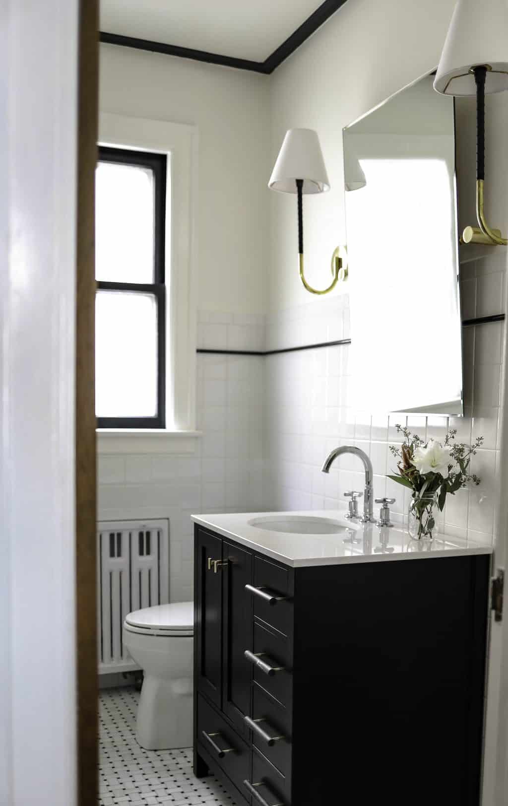
How cute is this bath by Natalie Steen of @TheNatNote?! The rose colorway is so versatile and playful here.
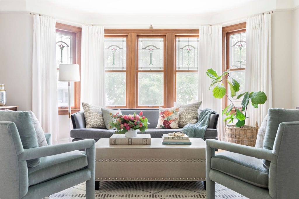
Kate Pearce of @KatePearceVintage used the paper to bring a Parisian touch to her 1899 Evanston home sitting room. We love the use of the paper on the ceiling and how it blends so well into the walls and angles.
Rayure Cameo Living Room Moodboard
It’s been so fun to have clients gravitating toward our papers! We love the traditional, yet bohemian take on this living room. The floral drapery will add a pop of color and pull in the blue from the paper. We plan to color match the ceiling in a light blue to make the white light fixtures will pop. Sneak peek of the room below! And more install shots from my iphone. 
Paradis Perdu Dining Room Moodboard
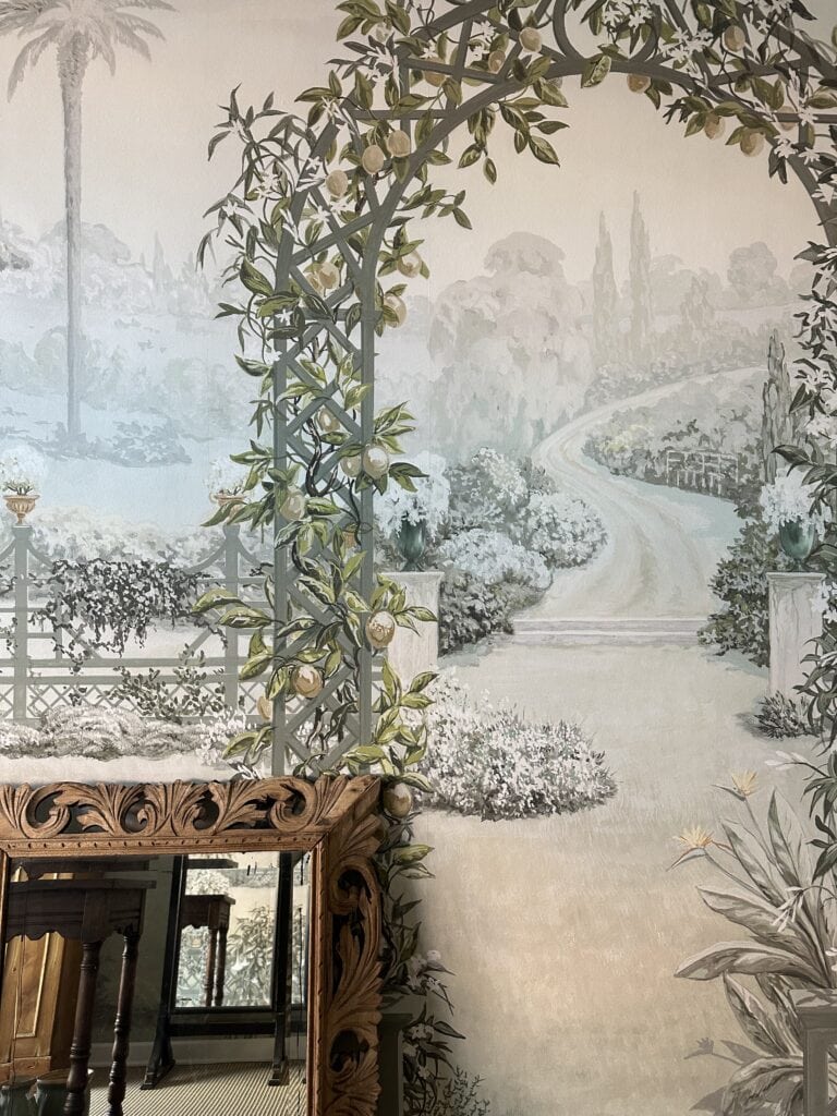
Not to play favorites, I keep finding myself gravitating toward the Paradis Perdu mural in the verdure colorway. Our North Shore Design Annex is wrapped in this magical paper and has such an impact. I can just imagine a chic dinner party in this European inspired dining room. We love pulling in vintage crystal lighting with a more transitional dining table and chairs with clean lines. 
Treillis Family Room Moodboard
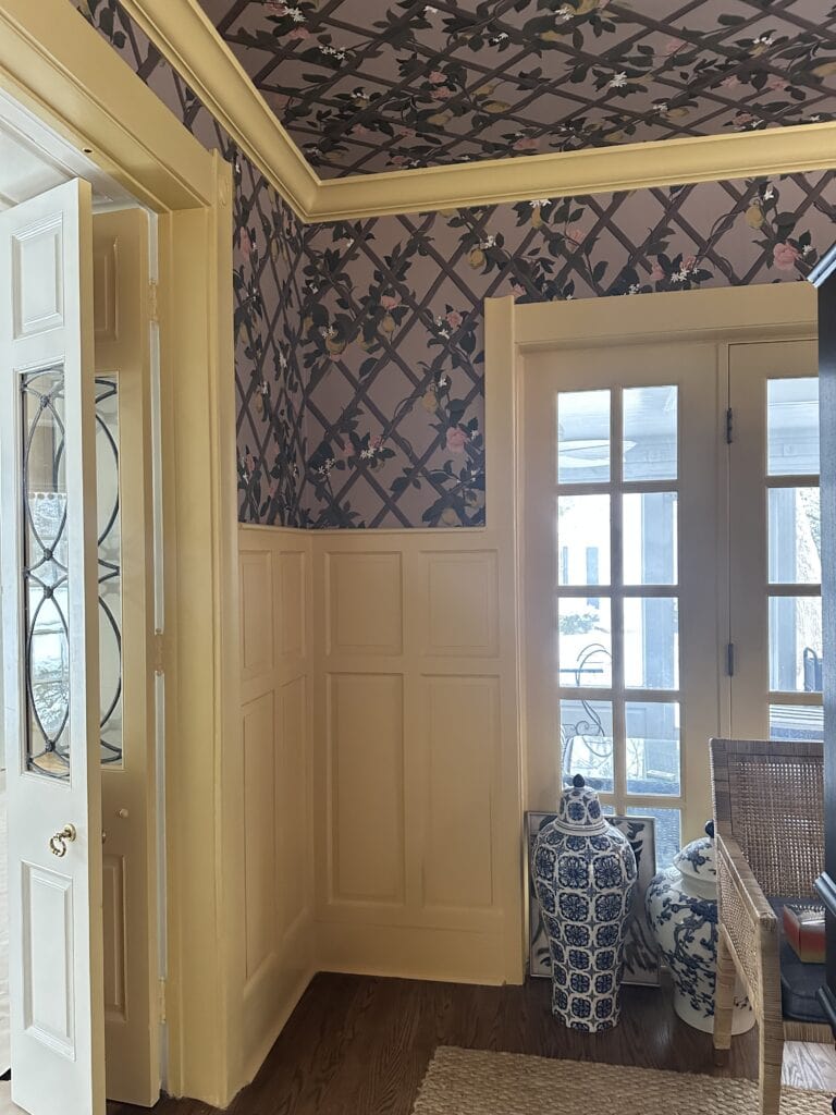
We are here for a color-forward family room. We design for primarily families with young kids and love the idea of having fun with this space. In this room, we are using the rose treillis on the ceiling and painting the walls yellow. 
Are you a fellow wallpaper lover? I hope this post left you feeling inspired. The endless ways you can design different moodboards around one paper makes me giddy. I love seeing what my team puts together and how that evolves into our final scheme. Keep an eye out on Instagram for more install shots of the collection soon!
-
- Trellis in Original
-
- Paradise Lost in Verdure
-
- Trellis in Rose
-
- Cameo Stripe in Bleu
Leave a Reply
October 7, 2024
read the post
YOU MIGHT ALSO LIKE
April 17, 2024
read the post
September 2, 2021
read the post
August 24, 2021
read the post

Meet Claire
Claire’s creative energy comes from her unique perspective on the world as both a trained interior designer and a passionate yoga teacher. Her affinity for kitchen design, timeless style and eclectic decorating are shared here, along with lots of interior design education and tips. Thanks for being here, please enjoy!

