How the Architecture of Your Home Should Inform Your Design
July 19, 2021
Your styles and tastes may change throughout your life, but the architecture of and era in which your home was built may greatly influence the design. Interior designers have the knowledge and experience to be able to remodel a home to feel true to its original architecture while breathing new life into the design. But to the untrained eye, you may not know where to start — especially if you’re wondering how to decorate old houses. Consider this your guide to letting the architecture of your home inform your design decisions.
First, Investigate
Before you buy anything or make any design choices, go on a fact-finding mission. Learn as much as you can about your home through the following tips:
Look up the year your house was built and the architect.
Take it a step further by researching what was going on in the world or the area at the time your home was built. See if you can connect with the architect and ask him or her for more information on the style and features of your home.
Walk through your home and observe every last detail.
Look for things such as moldings, original door or cabinet hardware, unique ceiling details, original tile, stained glass windows — anything that might be true to time period or the architect. For instance, if you bought a Frank Lloyd Wright home, you’d want to understand more about what influenced his design portfolio and why he made the choices he did with architecture.
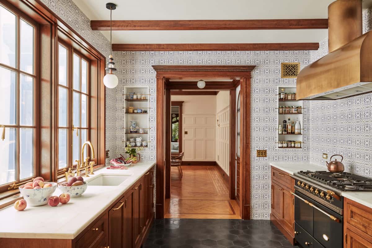
Credit: Jessica Helgerson
Consider Hard Goods and Surfaces
Now that you’ve learned about your home’s history and details, why should you care? Well, using this information is the key to creating thoughtful design that will blend beautifully with your home’s architecture and roots. (That doesn’t mean everything in an old house has to look old, or vice versa, either.)
This is where you consider the hard goods — aka, the architecture of your home and more permanent aspects of your home. Do you want to add details that are reflective of the original details, such as intricate molding or a carved fireplace? Or do you prefer a more modern look with clean lines? Choices around tile, lighting, cabinetry and millwork all come into play here. Once you’ve determined your approach, ensure it’s consistent throughout your home to create good flow.
Ask Yourself These Questions
Will you paint the original trim?
In my own home, a 1940s bungalow, I opted to paint a lot of the trim white, but left the original stained glass window trim as wood to honor the original character of the home. (See more of my home by checking out this post!)

Interior: Centered by Design
Will you do recessed or overhead lighting?
Personally, I don’t love to fill a historic home with can lights, and I only add overhead lighting sparingly and with great intention, because otherwise it might not feel true to the time period.
Will you choose details like color choices and tile patterns based on the era?
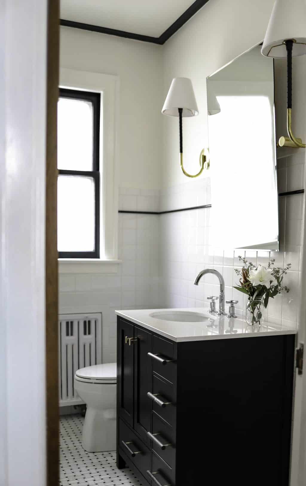
Looking at designs from the time period in which your home was built is a great place to start for inspiration. You certainly don’t have to do a checkerboard tile floor in your 1950s kitchen, but some modern homages to details like that will help your home feel cohesive.
A great example of incorporating true-to-the-era hard goods is this home we worked on in Chicago’s Bucktown neighborhood. Built in 1891 across from a church, it was once used as a rectory. To keep with the history of the property, we bought a vintage church door to use as a primary bedroom door, alongside exposed brick. Then we incorporated more modern furnishings to avoid feeling stale.
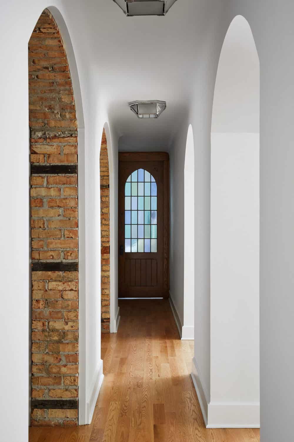
Interior: Centered by Design
Jessica Helgerson, an interior designer based in Portland, Oregon, is a pro at amplifying the original beauty of a space and making everything feel like it “fits.” Her perspective on design is informed by a respect for historical architecture coupled with an appreciation of playfulness and brightness of modern design. (Follow her on Instagram for loads of inspiration.)

Credit: Jessica Helgerson
Choose Your Soft Goods or Furnishings
Soft goods are the furnishings you’ll add to your home, and there are a few ways to approach these. There’s no right or wrong choice here — it’s really up to your style and tastes.
The spectrum of choices ranges from making a “time capsule” to juxtaposing modern with old. For instance, you may choose to:
- Pick items that feel as if you’re in the original era of your home.
- Include just a few of these older items mixed with newer pieces.
- Go for a complete juxtaposition with modern furnishings in an old home, or home with detailed architecture and moldings.
- There is no right or wrong way to decorate old houses, but I prefer a mix of old and new furniture forms and architectural details. A consultation with an interior designer can help you determine where to begin and what might look better as old vs. new details.
In Claire’s Own Home
In my own bungalow, we paid homage to the era in which it was built by introducing some Hollywood Regency, Art Deco shapes and finishes. This included diamond motifs throughout, including brass sconces with a diamond backplate. Keeping the original black-and-white entry tile, and mimicking the kitchen in the same color palette. And we also honored the original architecture of the home by recreating some of the arched passageways into other areas of the home that only had small openings or doors. You can see here how we recreated an arch into the kitchen that was not there before.
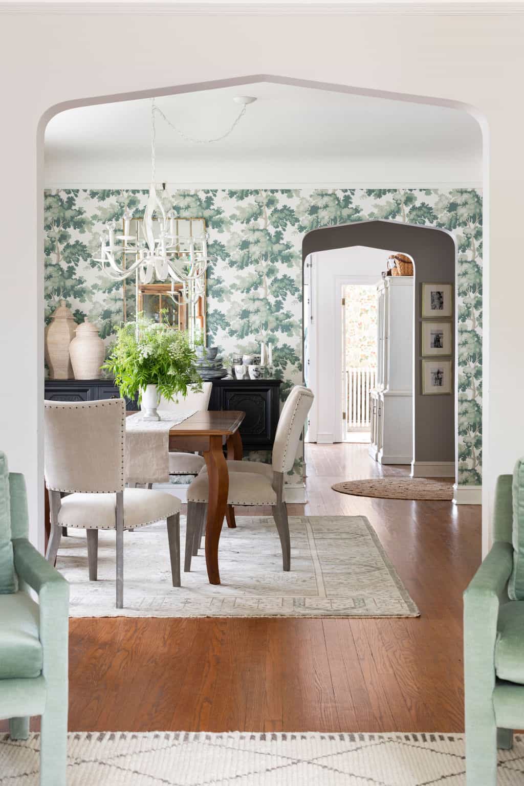
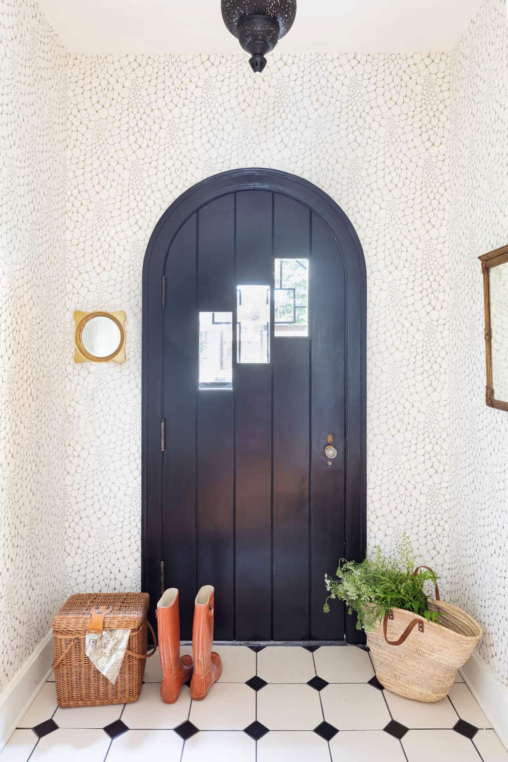
What questions do you have about how the architecture of your home should inform your design? Is your style more inline with the era of your home, or do you prefer a juxtaposition of styles? Tell us in the comment below or get in touch to tell us how Centered by Design can help with your next design project.
Leave a Reply
October 7, 2024
read the post
YOU MIGHT ALSO LIKE
April 17, 2024
read the post
September 2, 2021
read the post
August 24, 2021
read the post
Meet Claire
Claire’s creative energy comes from her unique perspective on the world as both a trained interior designer and a passionate yoga teacher. Her affinity for kitchen design, timeless style and eclectic decorating are shared here, along with lots of interior design education and tips. Thanks for being here, please enjoy!