Today, we’re talking all about playroom design, and I’m going to take you behind the scenes in my daughter’s special room. The first thing to know about our playroom is that it wasn’t always a playroom! Originally, this space in the back of our house was my home office. Because it’s right off the kitchen, it became a natural place to have our daughter, Willa—who’s now two-and-a-half—play, as I can keep an eye on her while making breakfast, dinner, etc.
When we started calling it a playroom, though, we never really made any updates specifically for her. We’d just thrown a changing table and some shelving in, added a rug and tons of toys. It still had my office vibes and once we were stuck inside so much due to COVID, I wanted to remake this room into a happy space that felt more intentional for Willa. Take a look at the design board, below.
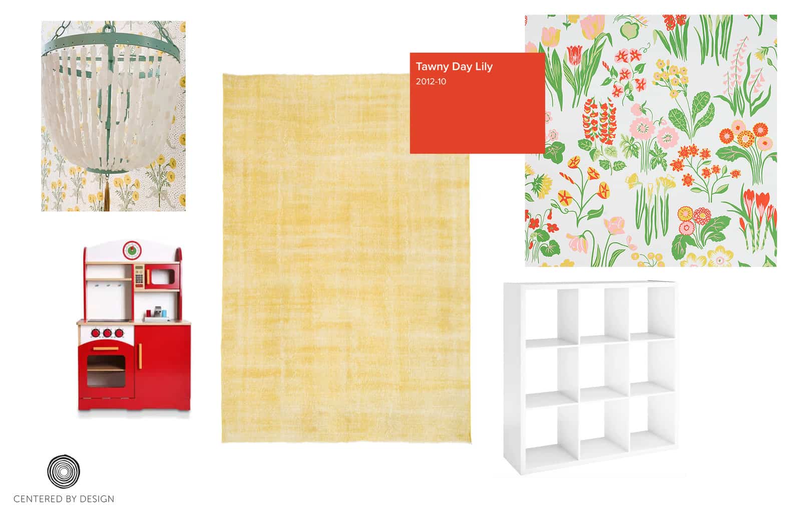
Choosing a Playroom Color Scheme
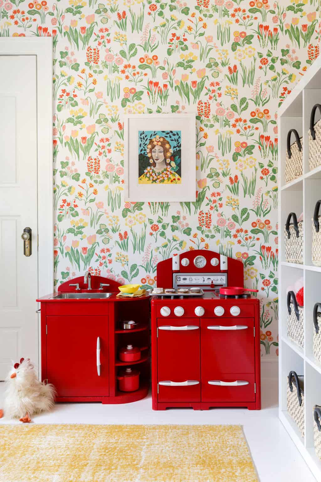
Red is her favorite color, and I knew that her cousins already had a super-cute red kitchen from Pottery Barn (similar here) that we wanted to bring into the room. When I came across this wallpaper from Schumacher, called the Carly, it felt so happy and ’70s. It went great with the red theme, without being too red—almost a sophisticated yet playful take on the color. This was important because even though it’s no longer my office, I spend a lot of time in there, too, and wanted it to be a room that would be a pleasure to be in.
I went with coordinating window treatments to match the wallpaper—something I’ve always wanted to try. It’s not often that a company offers coordinating wallpaper and textiles. So when I saw that Schumacher did for the Carly collection, I was excited to try the pattern-on-pattern idea. These are custom Roman shades, and they came together perfectly with the rest of the room. I’d suggest working with a local seamstress or drapery expert to figure out exactly how to match the patterns; once the wallpaper is up, you’ll measure for where the pattern in the fabric will go to get everything to line up.
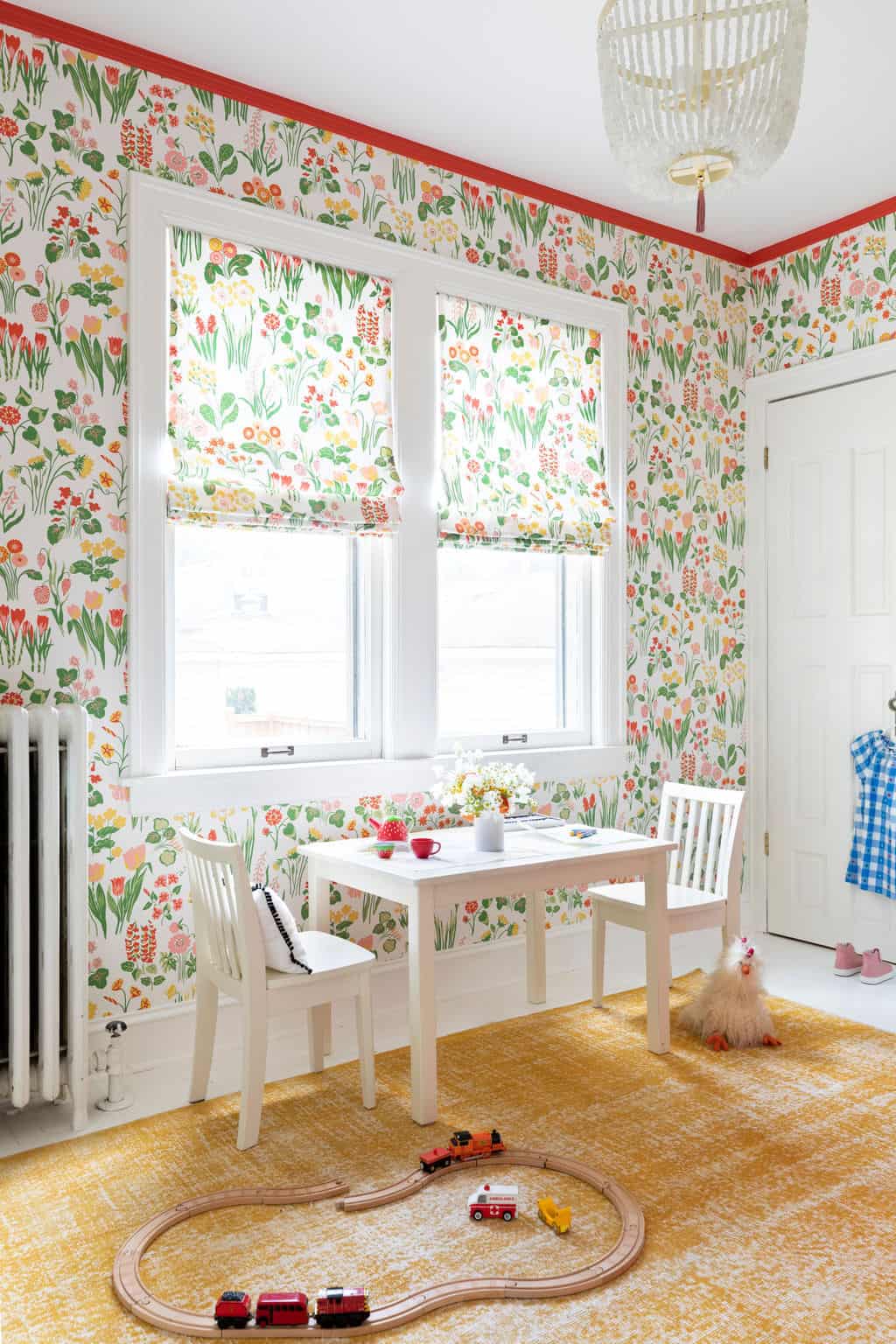
Adding Playroom Design Details
When we first redid this room several years ago, we painted the floors white (see details of how we did it here—it’s not as scary as it sounds!). With this new red color scheme, I thought it would be fun to paint the ceiling trim watermelon red, as a fun detail to really make it pop.
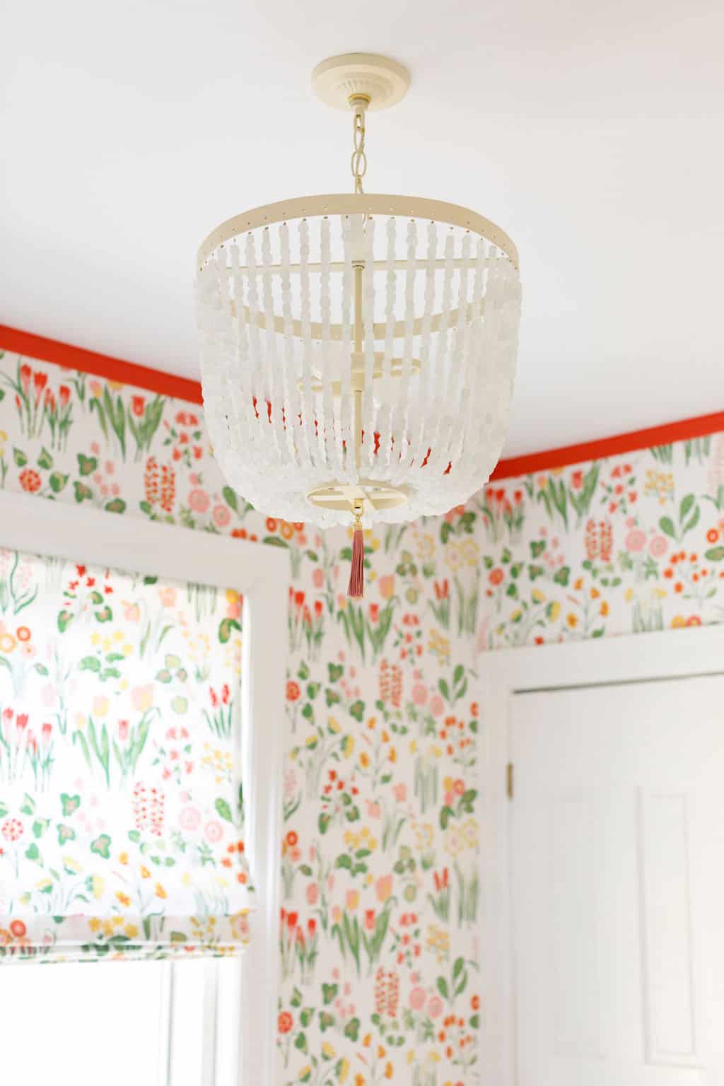
For lighting, we did a custom fixture with Sullivan + Phenix. Their pieces are all handmade by designer Elizabeth Martin, who does brilliant work (see more examples here). You can customize almost anything, and their pieces are so fun and whimsical: great for a playroom, as well as a beach house or casual dining room. It’s so fun to be able to customize lighting, all the way down to the type of bead or stone incorporated in the fixture.
To finish the look and add a layer of coziness, without being too matchy, I went with a cheery yellow rug from Revival Rugs. This is a fantastic source for vintage and Moroccan rugs, which you can purchase direct to consumer. We had a fantastic experience working with them, and they have so many unique pieces (see more examples here). You can use discount code CENTEREDBYDESIGN10 to get 10 percent off your rug purchase.
Showing Willa the Playroom Design Results
The day of the “big reveal” to Willa, she was crabby and didn’t think much of it (such is life with toddlers). But I remember the day we put the wallpaper up, she ran in and loved it. She was giddy with excitement to have her “own special playroom.”
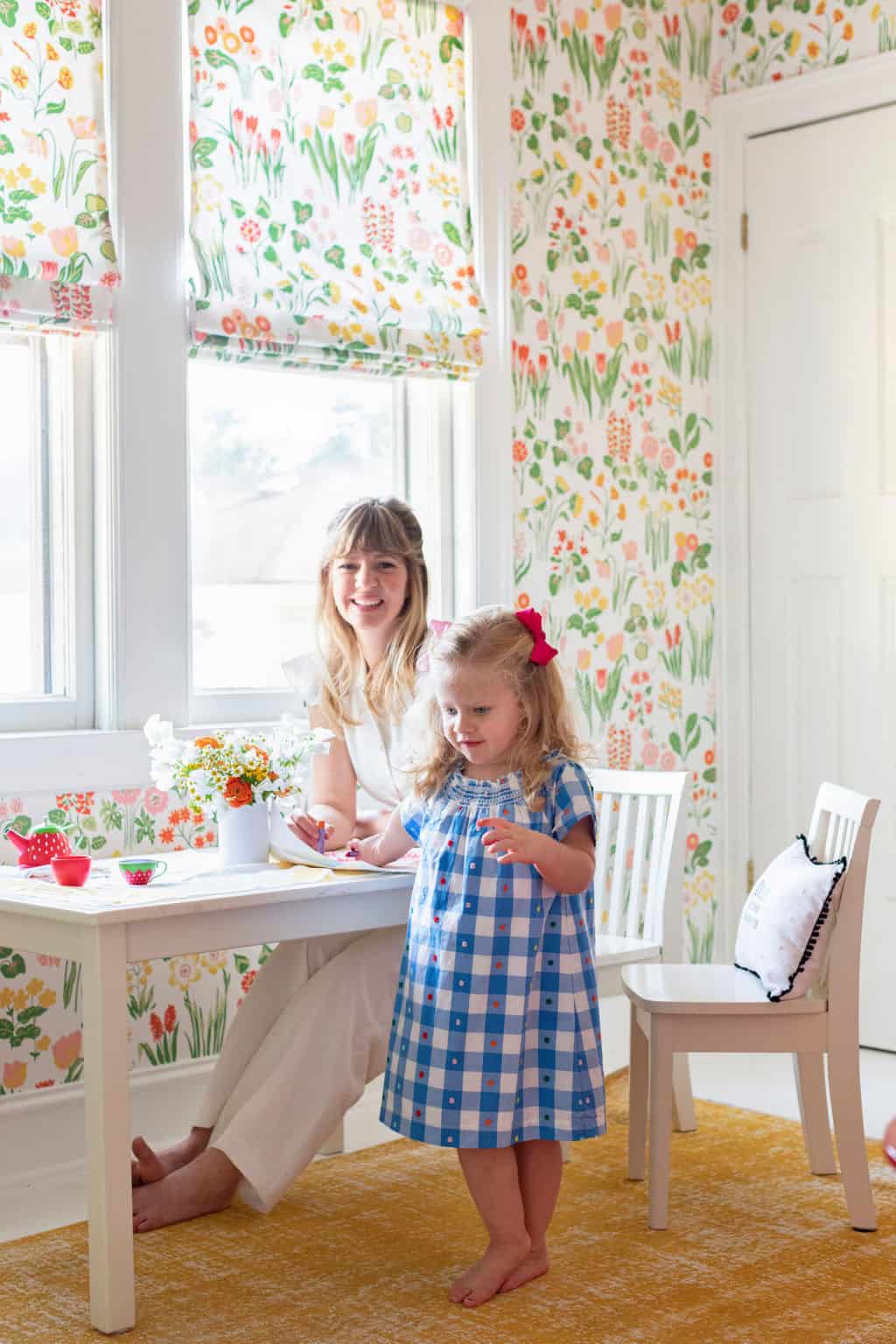
Of course, her playroom doesn’t look as pristine all the time like these staged photos show—but we do have a few systems in place to keep her things organized. For example, we have an IKEA shelving system for all her toys which are stashed in baskets (these are great storage systems). And in the closet I keep all the arts and crafts organized in rolling drawer sets like this one from Target.
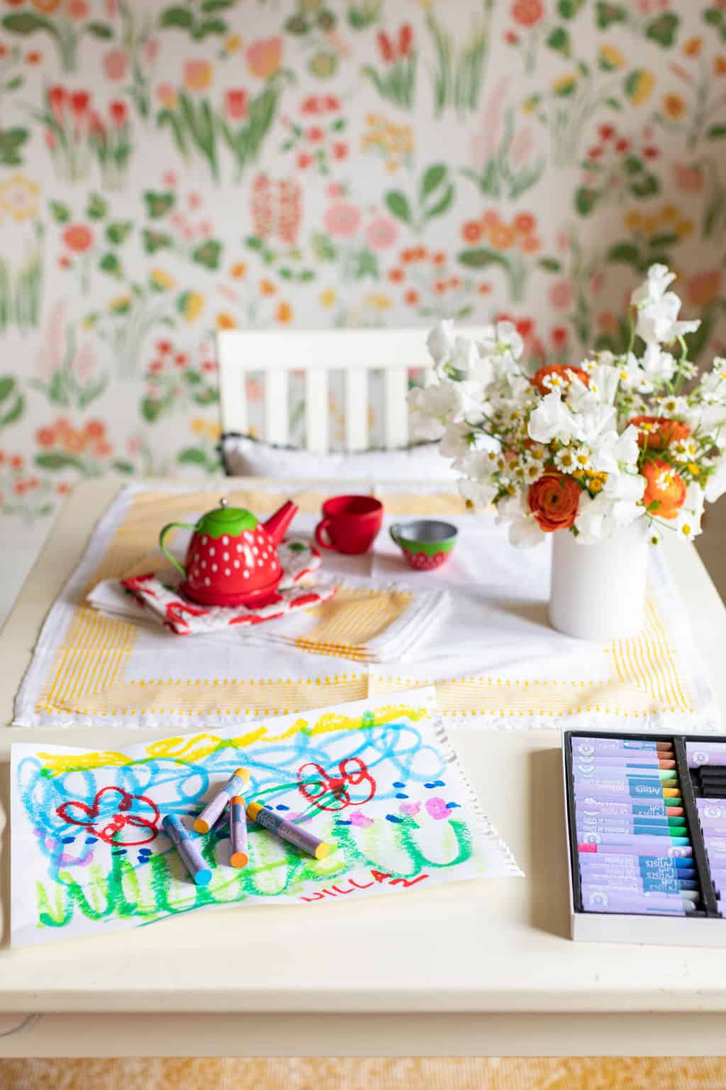
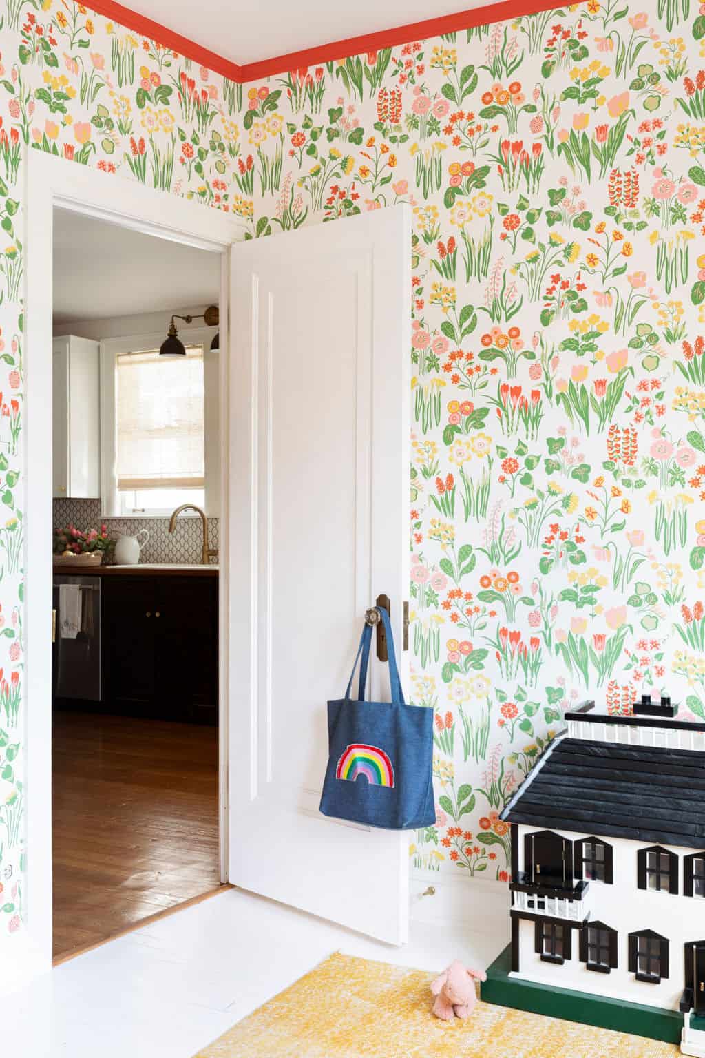
Want to see more of Willa’s spaces in our house? You can see how I designed her nursery here.
For more on working with Centered by Design – contact us here.
Leave a Reply
October 7, 2024
read the post
YOU MIGHT ALSO LIKE
April 17, 2024
read the post
September 2, 2021
read the post
August 24, 2021
read the post
Meet Claire
Claire’s creative energy comes from her unique perspective on the world as both a trained interior designer and a passionate yoga teacher. Her affinity for kitchen design, timeless style and eclectic decorating are shared here, along with lots of interior design education and tips. Thanks for being here, please enjoy!