How to Create a Layered Home with Pattern Mixing
May 15, 2024
Designing a home that feels effortlessly curated is a passion of ours. Trends are starting to swing away from minimalism, welcoming back pattern and color. While we aren’t ones to follow trends, it’s exciting to see our clients more interested in unexpected design choices that make their home tailored to them. I keep seeing the social media sound from Historically Zane, “I’m interested in those homes where you walk in and I know exactly who you are in the first two seconds.” This is all over social for a reason. The idea of collected interiors are resonating. But, it can be hard to know where to start. Think of it this way: every element in a room is a layer – paint, wallpaper, flooring, furniture, accessories, etc. Even if it’s subtle, mixing patterns across elements makes a space feel thoughtfully designed. Our sunroom from the House Beautiful Whole Home proves that by pattern mixing and layering, you can create a cozy and serene space.
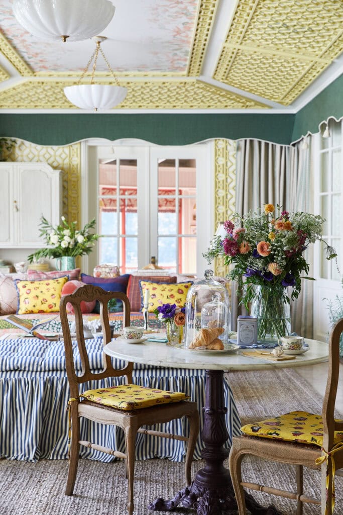
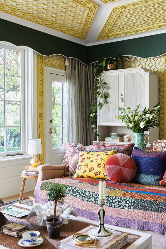
The Process: Pattern Mixing
There isn’t a perfect recipe for pattern mixing. It will take some time playing around with pattern combinations and textures until the space feels balanced and curated. Here are some of our tips!
- Scale & Proportion: Find a pattern you love, then pick more patterns that will work with it. Mix different scales to create contrast.
- Color Coordination: Consider your color story for a cohesive room.
- Balance: Balance bold, intricate patterns with a more subtle patterns or solid colors.
- Texture: Varying materials like velvet, linen, wool and tile add depth and even more pattern to a space. Not every pattern needs to be fabric. Consider textures like a title backsplash contribute to the pattern of the room.
- Layer: The magic word! Layer rugs, pillows, window treatments, and artwork with different textures and patterns.
- Experiment: The truth is that pattern mixing is all about experimenting. There are no rules. Sometimes unexpected pairings are actually just right. Trust your instincts!
- Edit: Once you think you’re done, walk away for a little bit and come back to it with fresh eyes. The final editing and finessing is an important last step. Maybe it feels too busy now, or you are missing something that you had included before. You’ll know it when you see it!
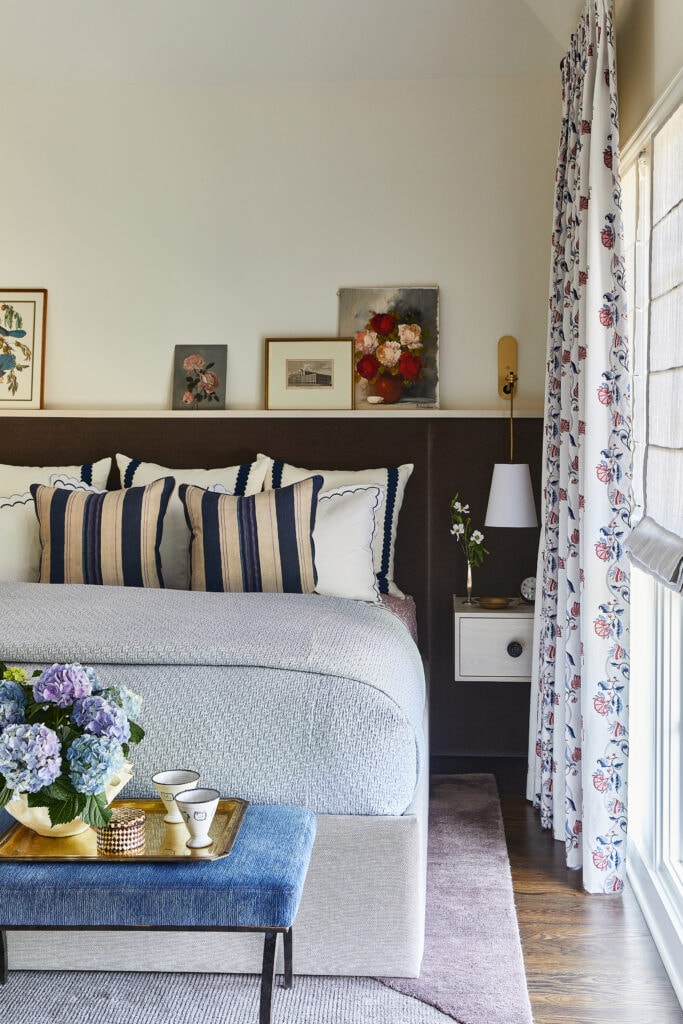
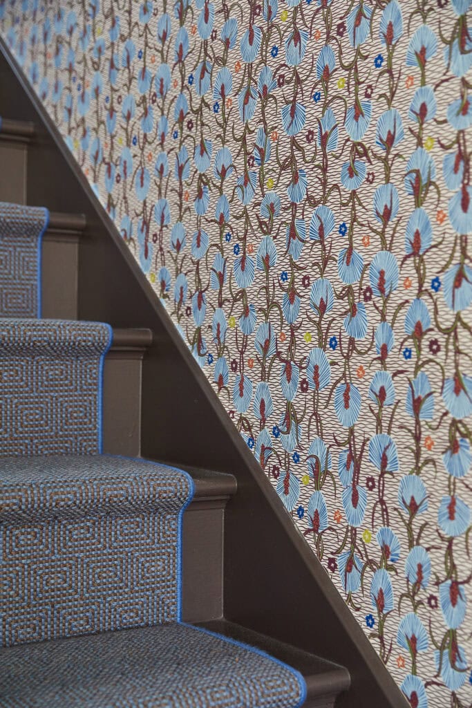
Check out our Pattern Play Project!
Pattern Mixing Inspiration
As a designer, I’m not sure there is anything more inspiring than beautiful, pattern forward interiors. I hope these spaces fuel your creativity the way they do for me.
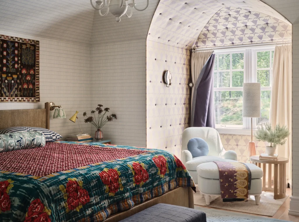

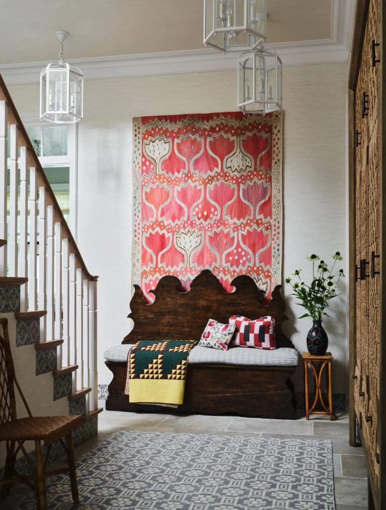

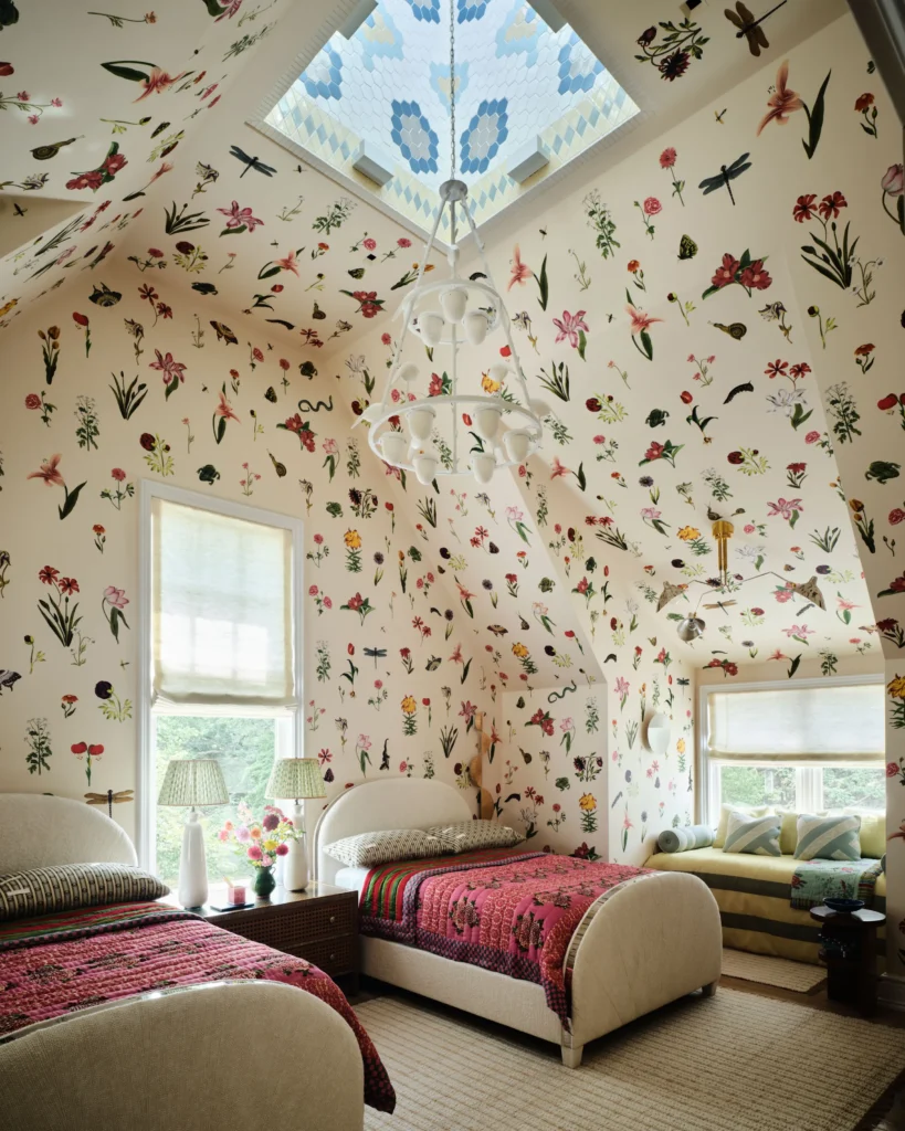
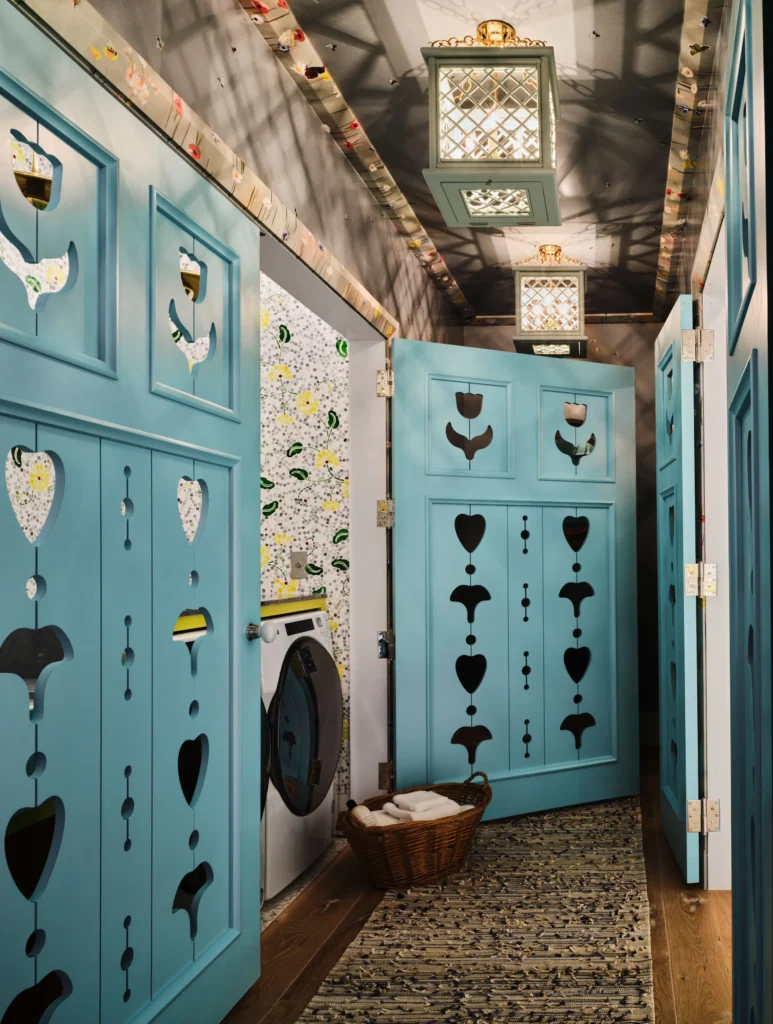
I could sit and study this home all day. The use of multiple wallpapers in the same room and the tufted walls in the bedroom nook is so good. This is truly an example of a designer trusting their gut and their client trusting in their designer!
Designer: Jessica Jubelirer | Source: Architectural Digest
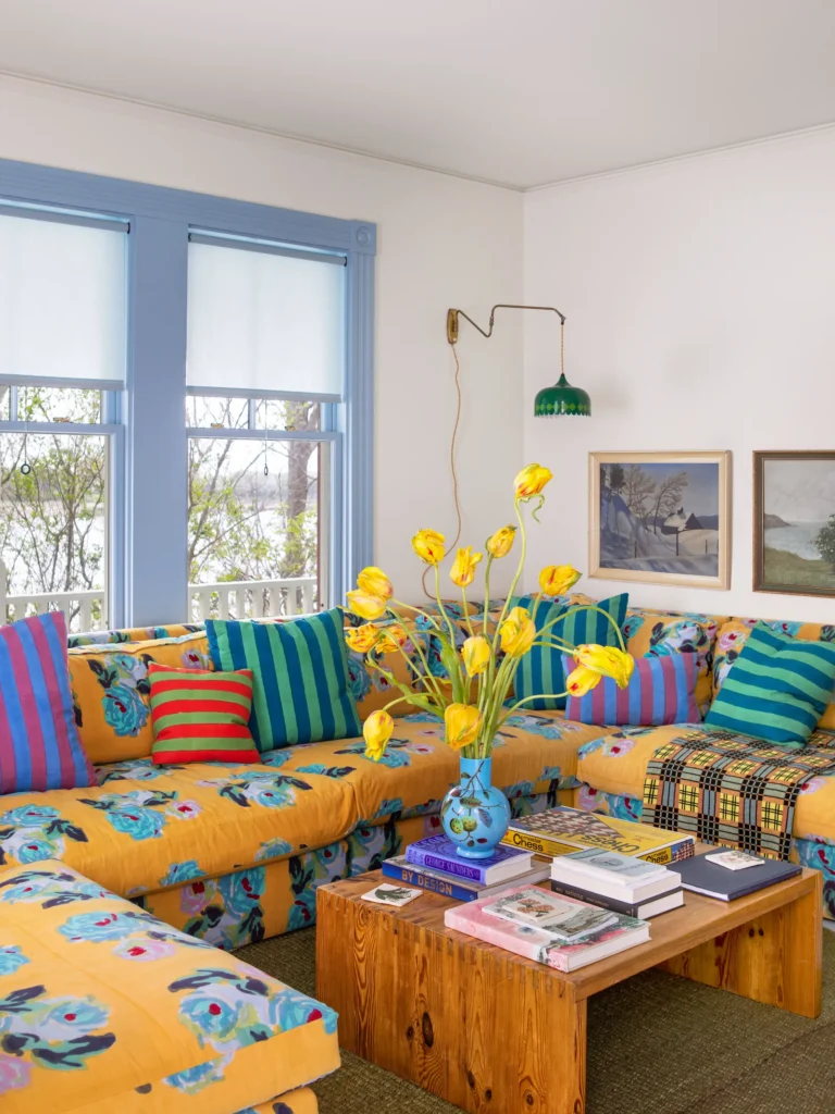

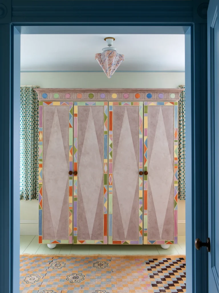
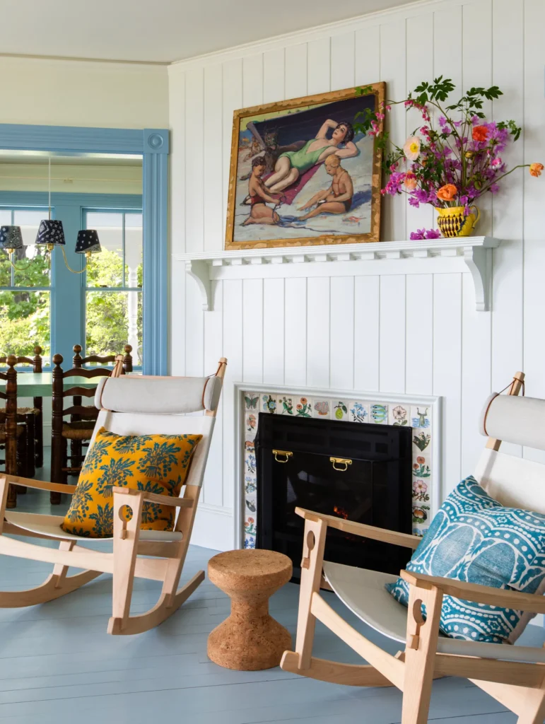

Color and pattern give this home such fun character. That sofa speaks for itself! What a bold example of mixing florals with geometric pattern. Florals and more organic patterns, often pair well with a classic geometric like a stripe or plaid pattern.
Designer: Reath Design | Source: Architectural Digest


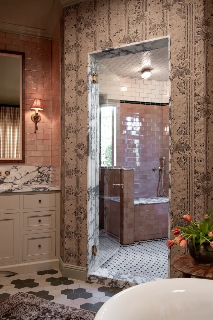

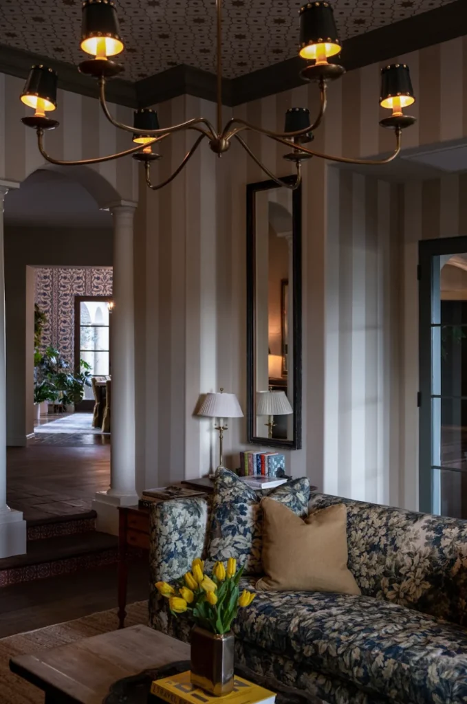
Pierce and Ward never shies away from a pattern mixing moment. Their projects always lean a big gothic and moody. Proving pattern mixing isn’t only preppy, it can be done in a more dramatic way.
Designer: Pierce and Ward
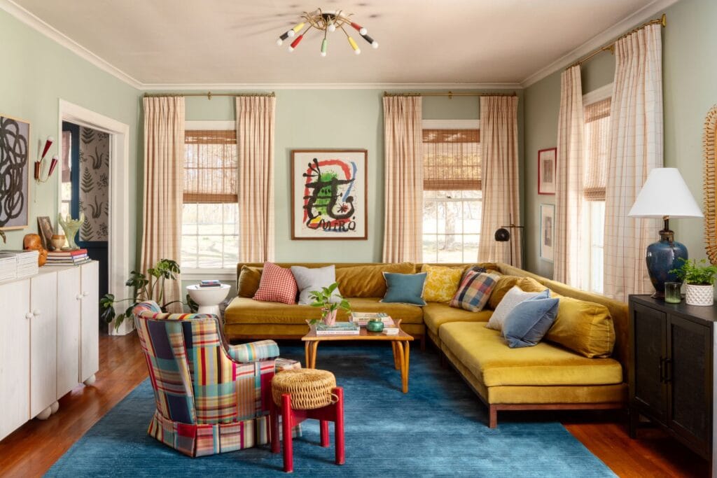
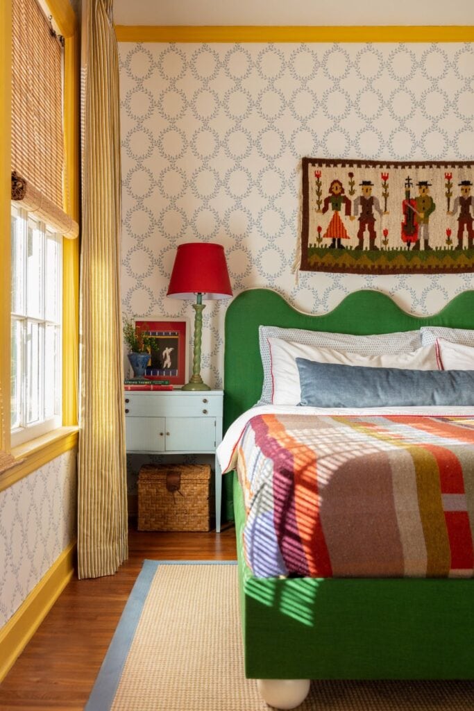
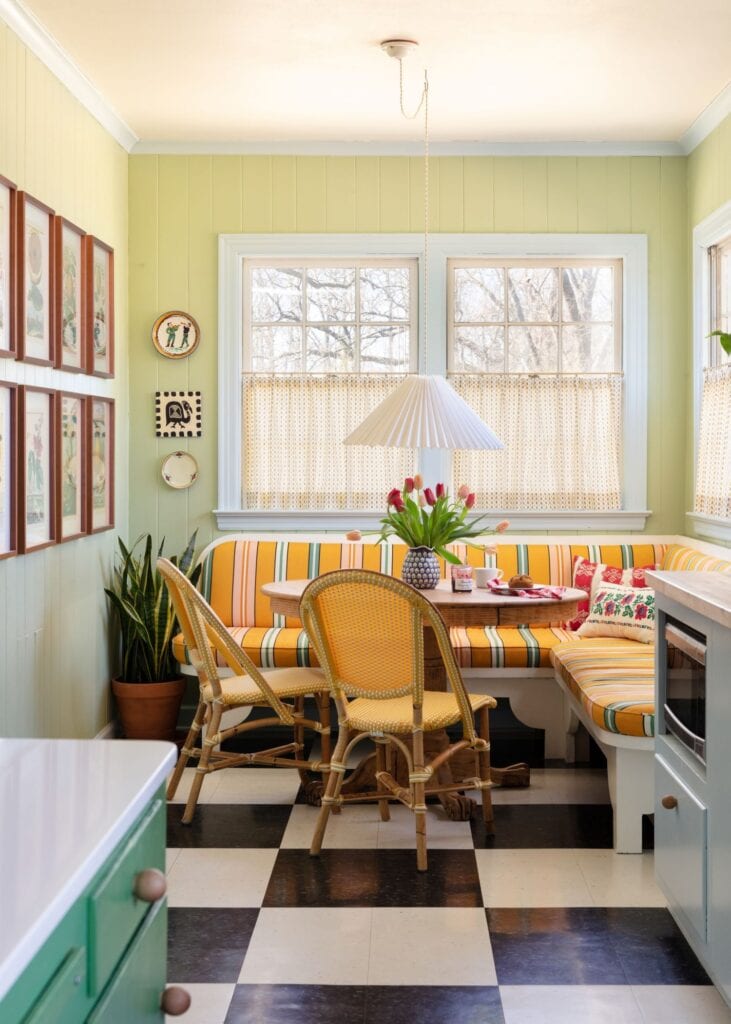
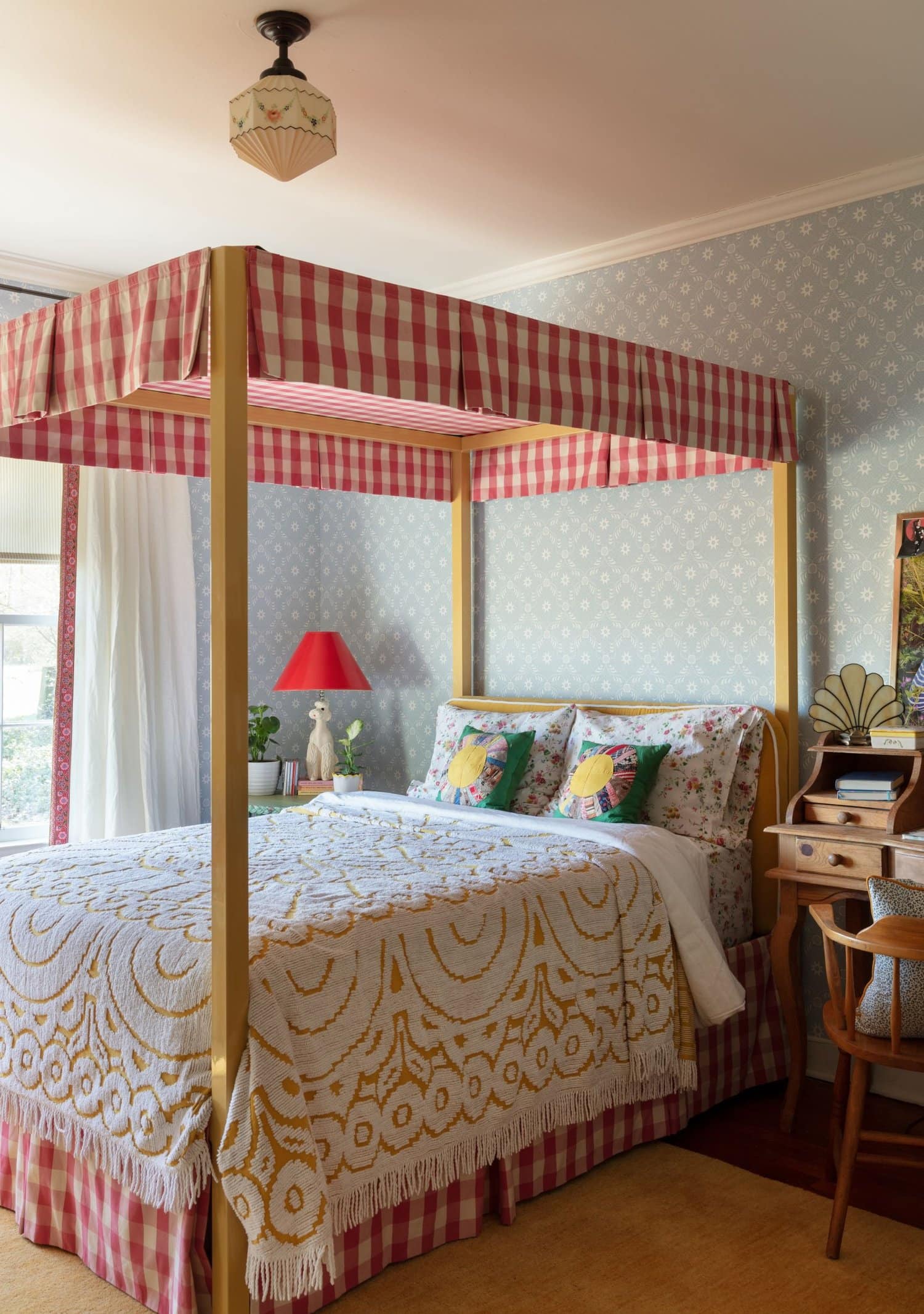
This home uses blocks of solid color to balance out the patterns. While still bold, this gives the patterns breathing room. The mix of primary colors in similar values help everything feel cohesive.
Designer: Meta Coleman
Does your home feel plain all of a sudden?! Just remember all of these rooms started off empty with blank walls. While these examples are quite pattern forward, even small touches of pattern play can make your space feel more personal and curated. Contact us for help on your next project!
Leave a Reply
October 7, 2024
read the post
YOU MIGHT ALSO LIKE
April 17, 2024
read the post
September 2, 2021
read the post
August 24, 2021
read the post
Meet Claire
Claire’s creative energy comes from her unique perspective on the world as both a trained interior designer and a passionate yoga teacher. Her affinity for kitchen design, timeless style and eclectic decorating are shared here, along with lots of interior design education and tips. Thanks for being here, please enjoy!