Welcome to our Lake Forest Manor home tour. We are so excited to walk you through this beautiful family home, especially the European-inspired kitchen transformation. This project is special for a few reasons. When the family first purchased it, they didn’t do so with the intention of making major changes or embarking on a full kitchen renovation. Instead, they moved in, lived with the home, and allowed time to reveal what was working — and what wasn’t for their young family and daily routines. What began as a single-room design consultation has since evolved into a multi-phase collaboration. At this point, we have touched nearly every corner of the home over the last two years!
Starting Small: A One-Room Design Consultation
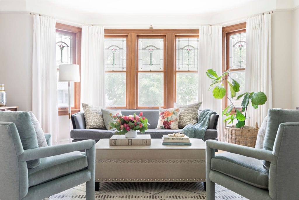
Like many of our clients, this family began with a design consultation — in this case, the front living room. They had furniture, but needed help pulling the space together and making it feel more interesting. We provided a revised floor plan, created drawings for applied wall moldings, a new paint color selection, added lighting, sconces and styling. This service is often a great way to test the waters and build a relationship with a designer. It gives clients a chance to get to know our team and process before committing to a larger renovation.
From Consultation to Full-Service Design
That initial consultation soon turned into a full-service project, including:
-
A gut renovation of the kitchen
-
Re-decoration of the family room, study/office, powder room, hallway, and entry
-
A full build-out of the unfinished basement (currently in progress!)
Their design style is classic at heart: think Nancy Meyers, Ralph Lauren, soft neutrals, layered blues, and original artworks. The goal throughout was to create a home that felt timeless yet interesting, elevated, but approachable — using color in a way that felt livable. This client was most comfortable with neutrals, but let us push for deeper blues, greens and even a deep burgundy butler’s pantry!
Kitchen: European-Inspired and Function First
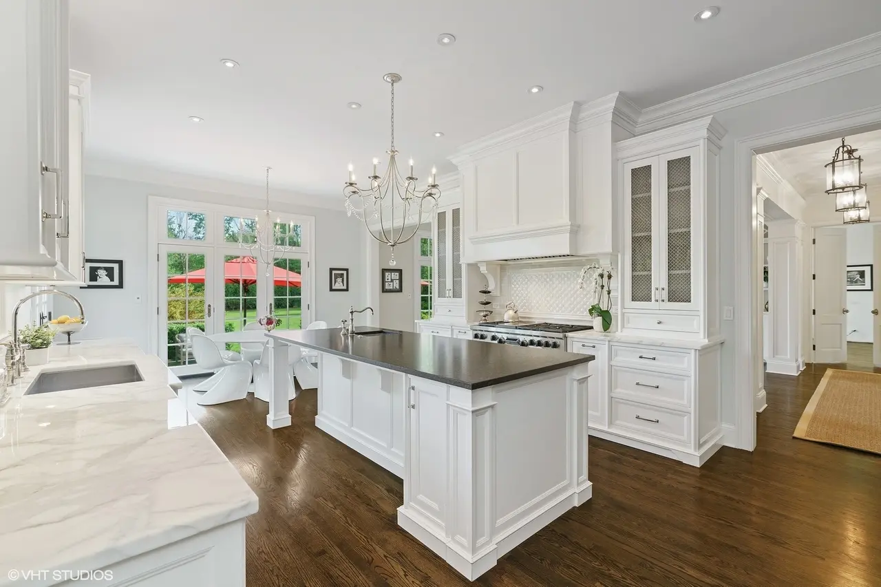
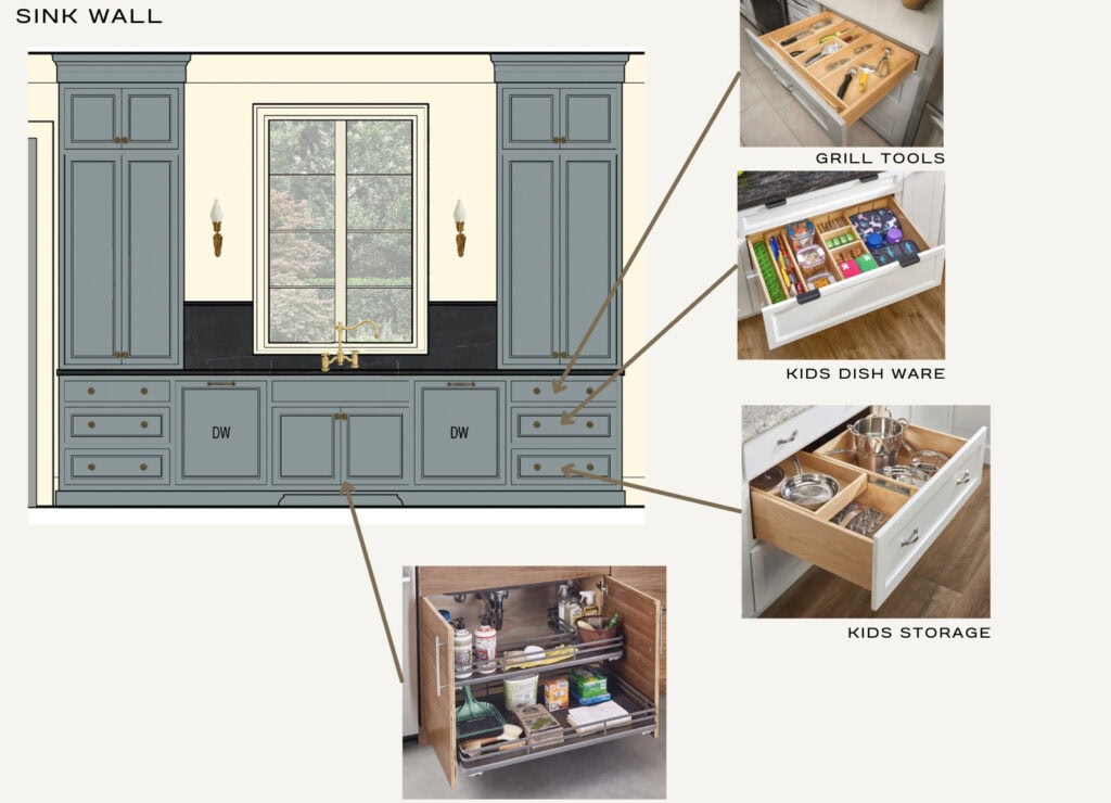
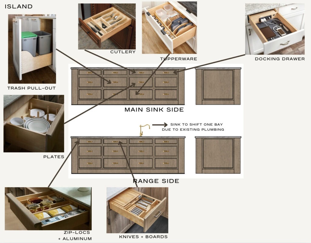
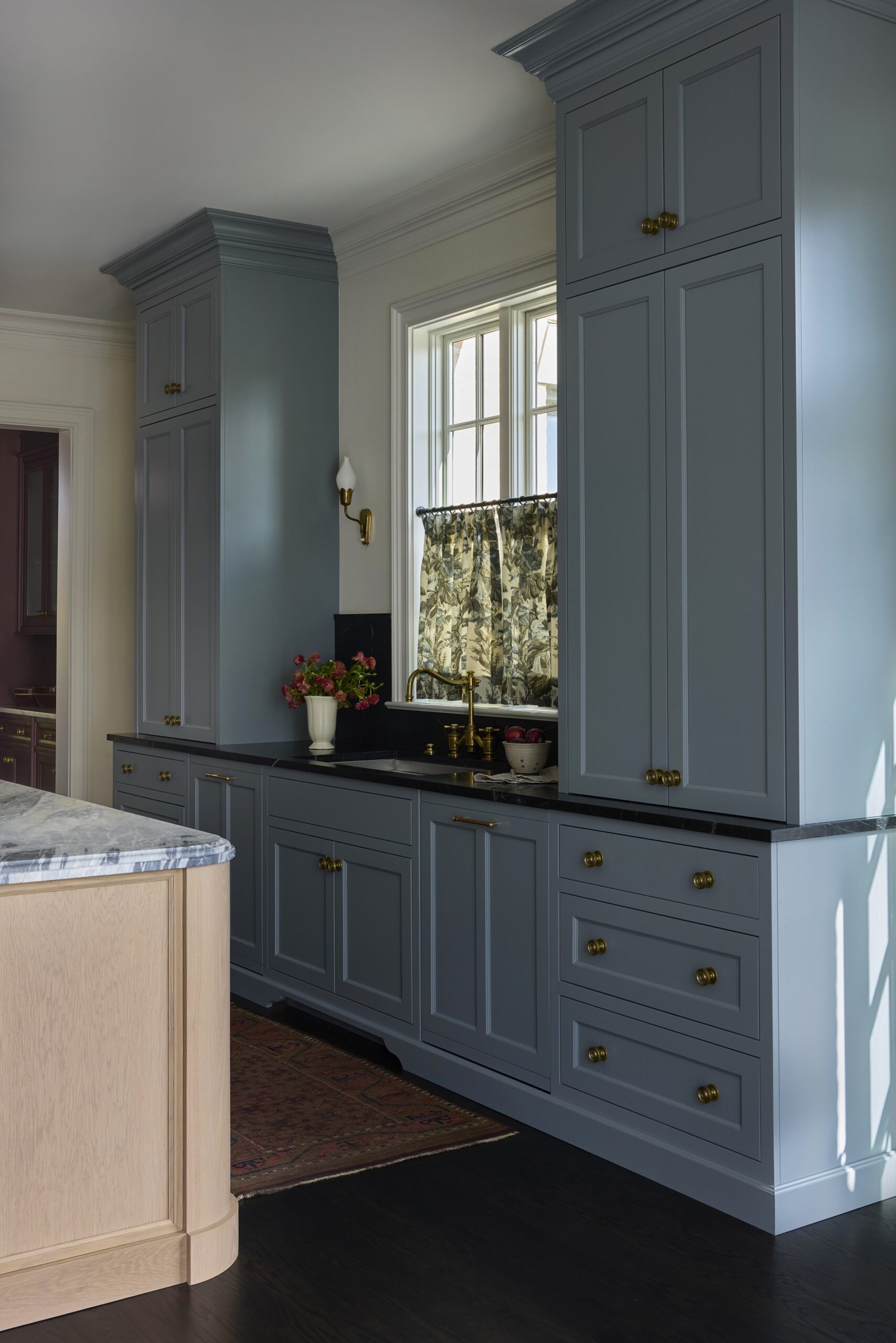
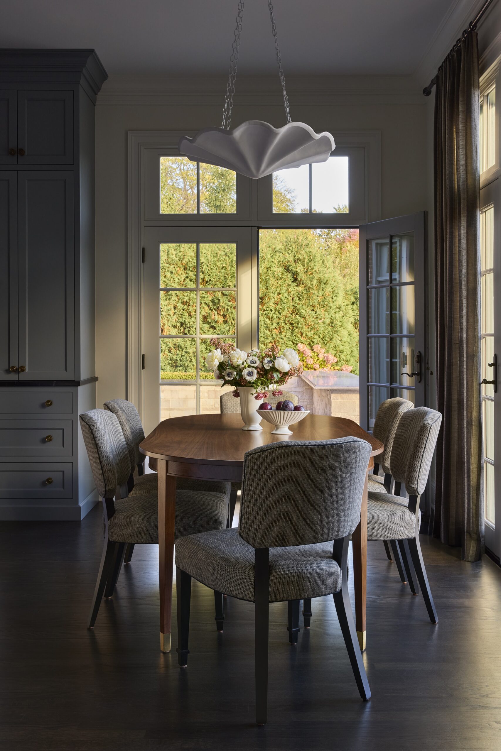
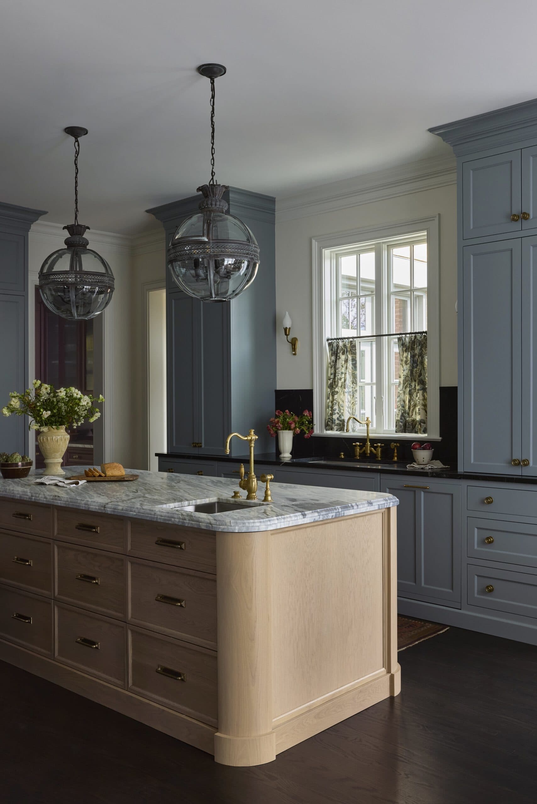
The original white kitchen (was actually much more beat up than it appears in the listing photo) and didn’t support the family’s needs for storage, cooking, or ideal appliance functions. From the beginning, our design conversations centered on function before form. One immediate consideration was seating at the island. The family primarily used their adjacent breakfast table. We opted to maximize island storage instead, incorporating full-height drawers on both sides.
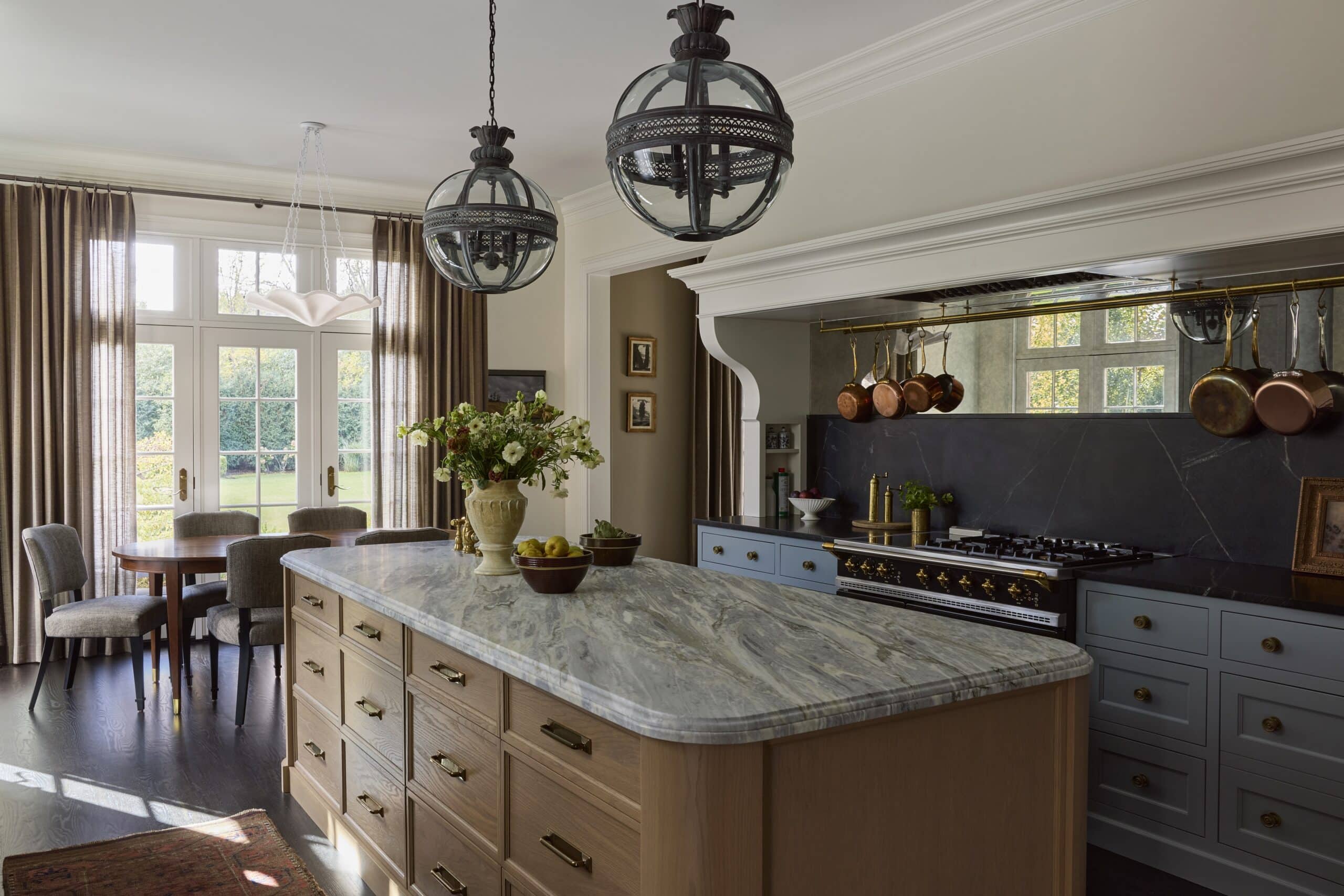
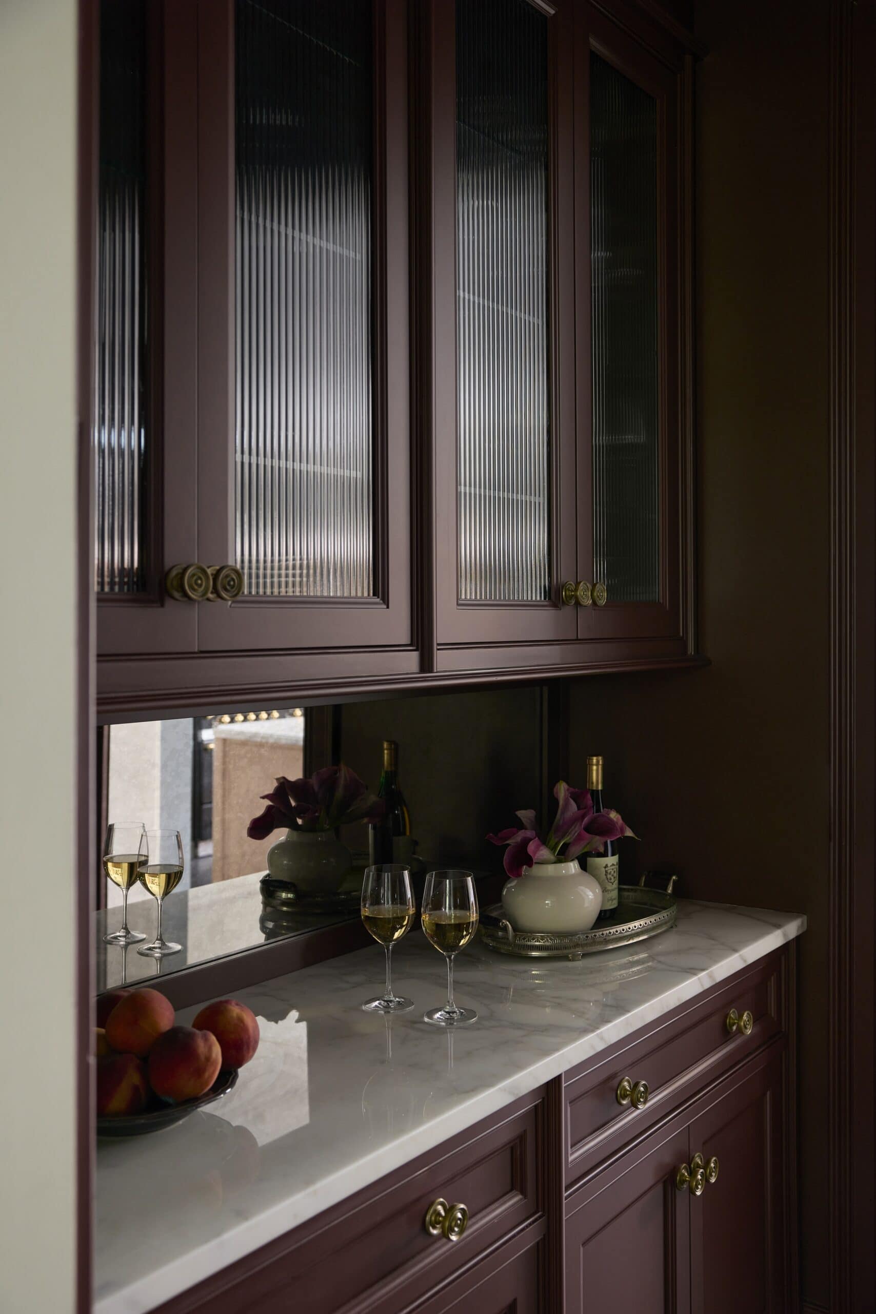
The clients also wanted a wide range of appliances: a coffee maker, a steam oven, a 5-in-1 convection oven, and a full-size wine fridge. Because the kitchen is very open, we explored the idea of a back scullery, but ultimately designed a kitchen and butler’s pantry that could accommodate everything seamlessly. The butler’s pantry houses an appliance wall with the steam oven, 5-in-1 oven, and wine fridge, while a dedicated coffee station was built into a cabinet tower near the sink — creating an intuitive flow for their morning routine and preserving valuable counter space.
As with all our kitchens, we provided the clients with a detailed document outlining each drawer’s purpose. Layout isn’t just about how a kitchen looks; it’s about how it works.
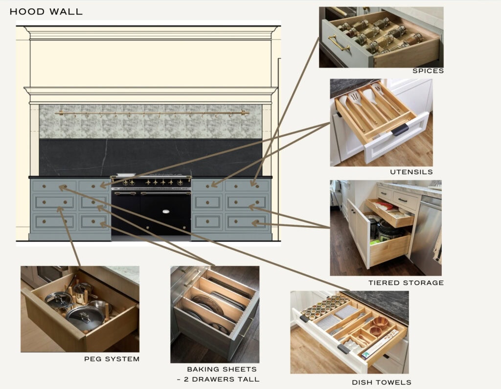
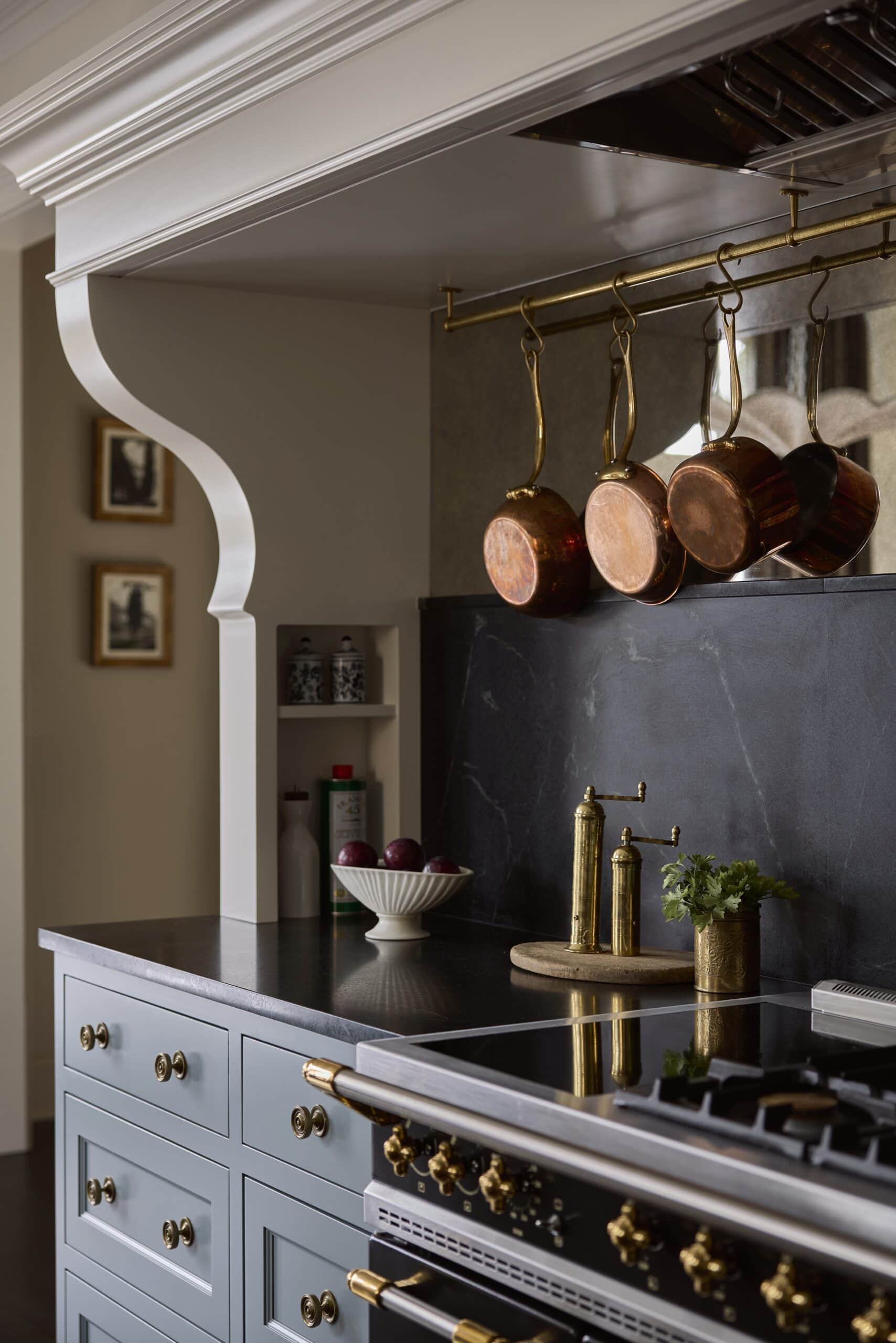
A Statement Hood Wall
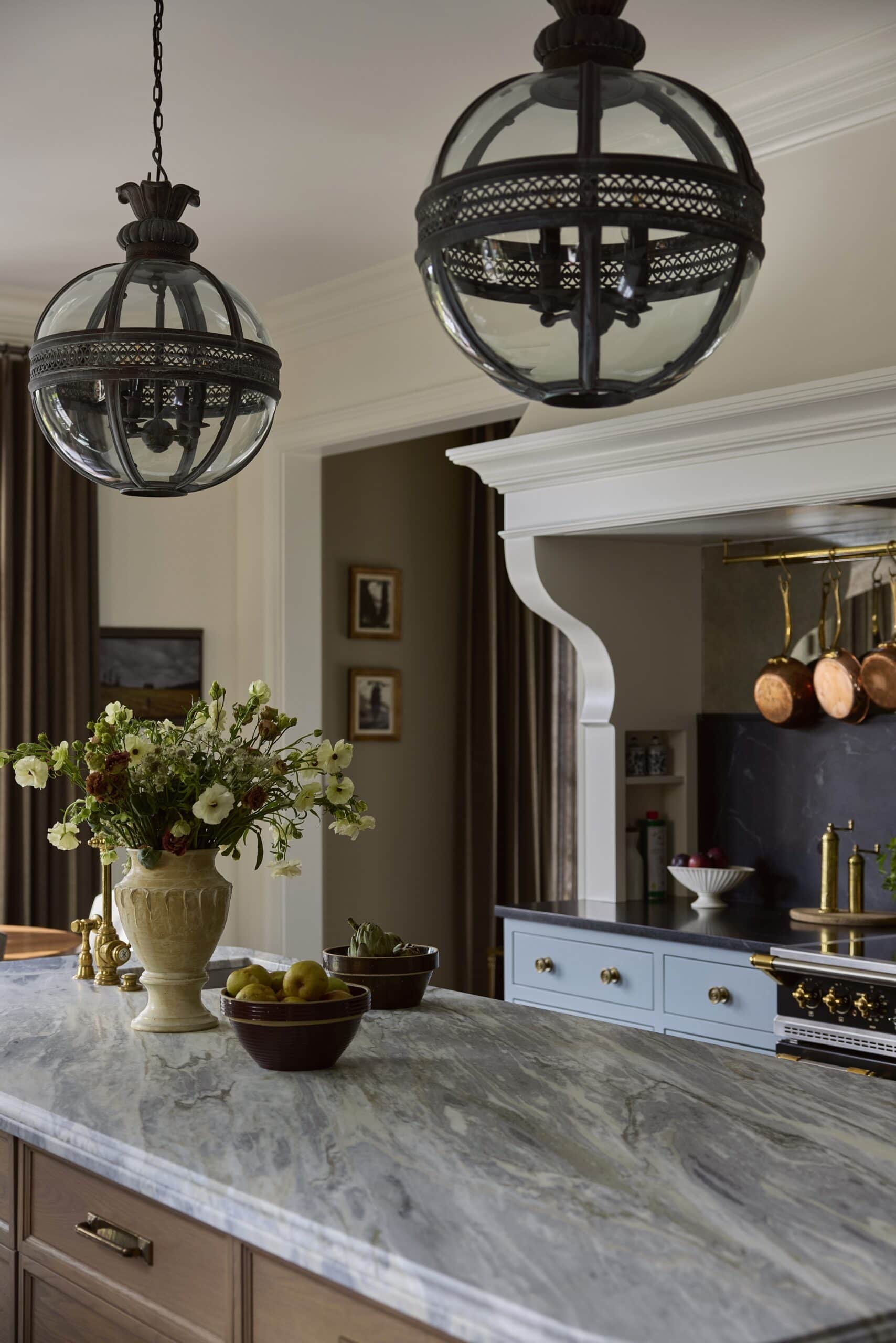
The hood wall became one of the most special features of the kitchen, and likely the largest we’ve ever designed. The original kitchen had tall towers flanking the range. This made counter space very limited and it was tricky to set anything down without turning behind you. Because the clients love to cook and wanted more room to spread out, we took a new approach. The entire wall became a hood and counter moment. The shape and silhouette required careful consideration, and we ultimately painted the hood the same color as the walls so it would feel like an architectural element. A pot rack was added, inspired by the client’s collection of family vintage cookware.
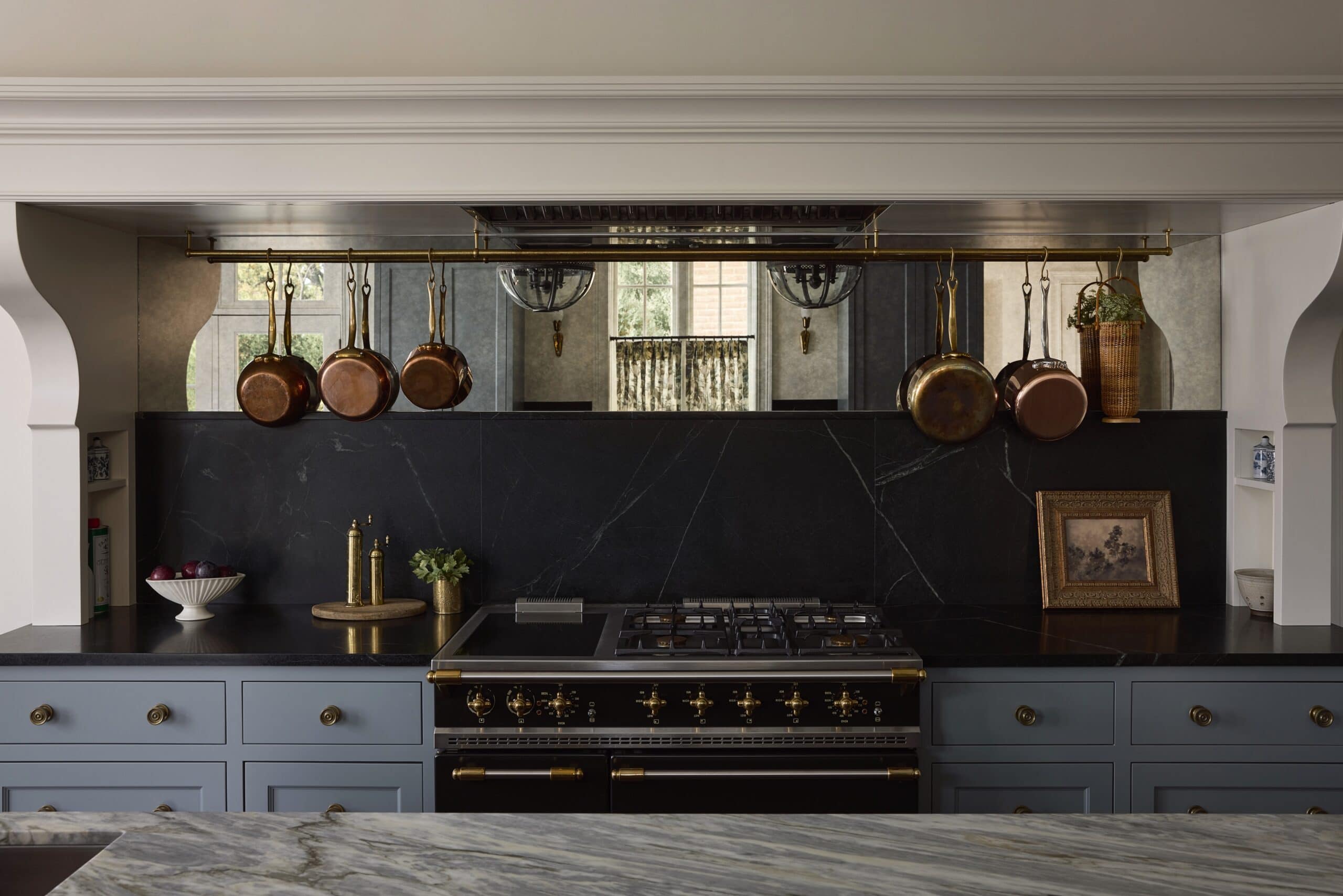
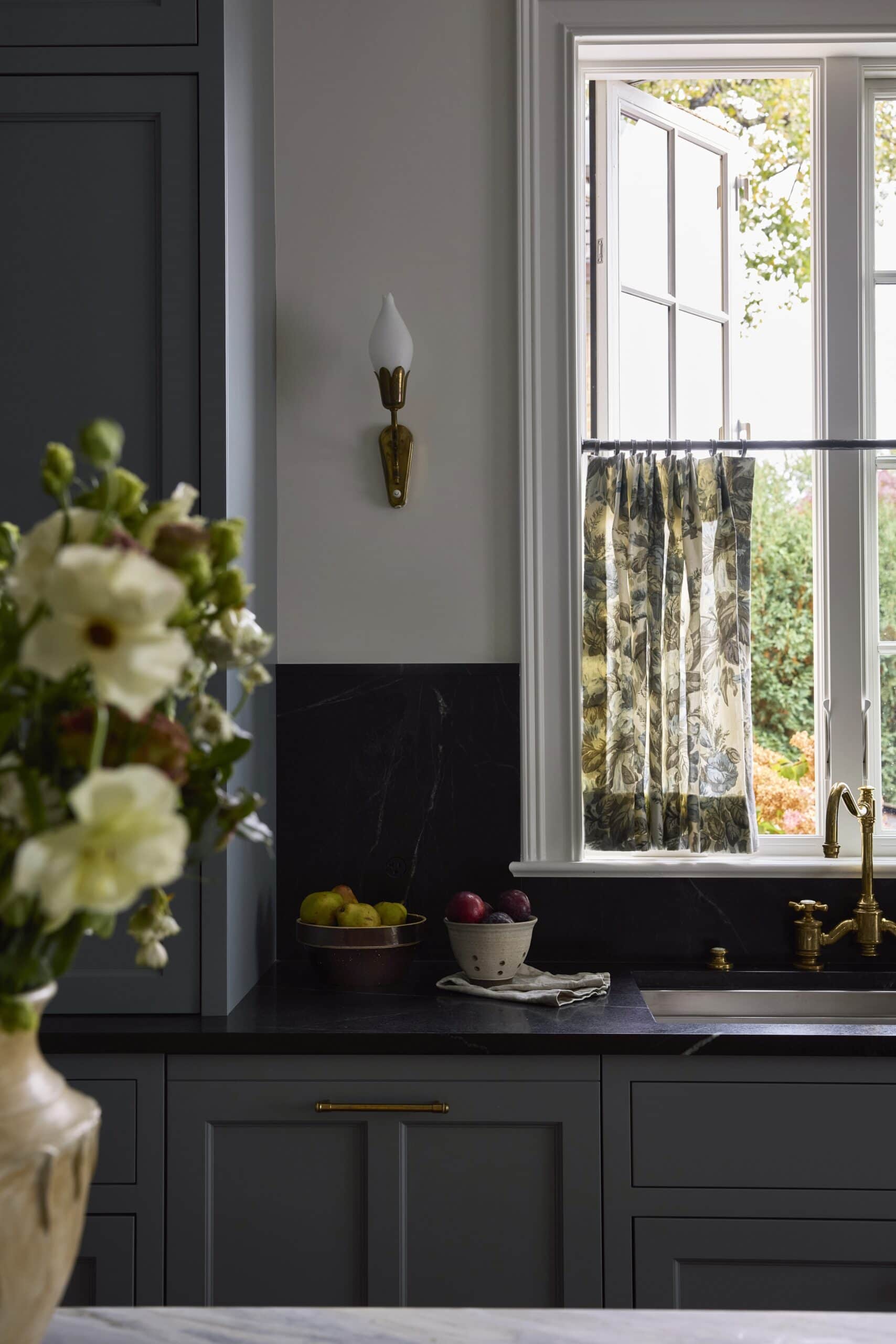
This kitchen is a great example of how impactful design doesn’t always rely on bold color. While the blue cabinetry is beautiful, it’s the European-inspired details that truly elevate the space:
-
British vintage–inspired pendants over the island
-
European pre-aged, unlacquered brass hardware
-
Danish sconces flanking the sink
-
Softened island corners and stone edges
-
Two-toned stone: marble on the island and soapstone elsewhere (sourced from Calia Stone and treated with anti-etch making it completely impermeable)
-
Antique mirror integrated into the hood design
-
Waterstone plumbing from Studio 41
- … And a European range, which served as a key design jumping-off point. We love seeing appliances that are meant to be seen and thoughtfully designed, rather than purely utilitarian.
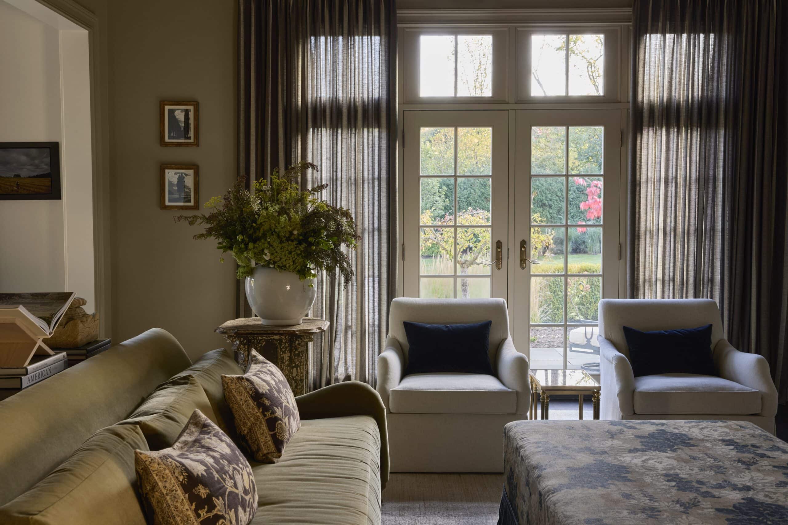
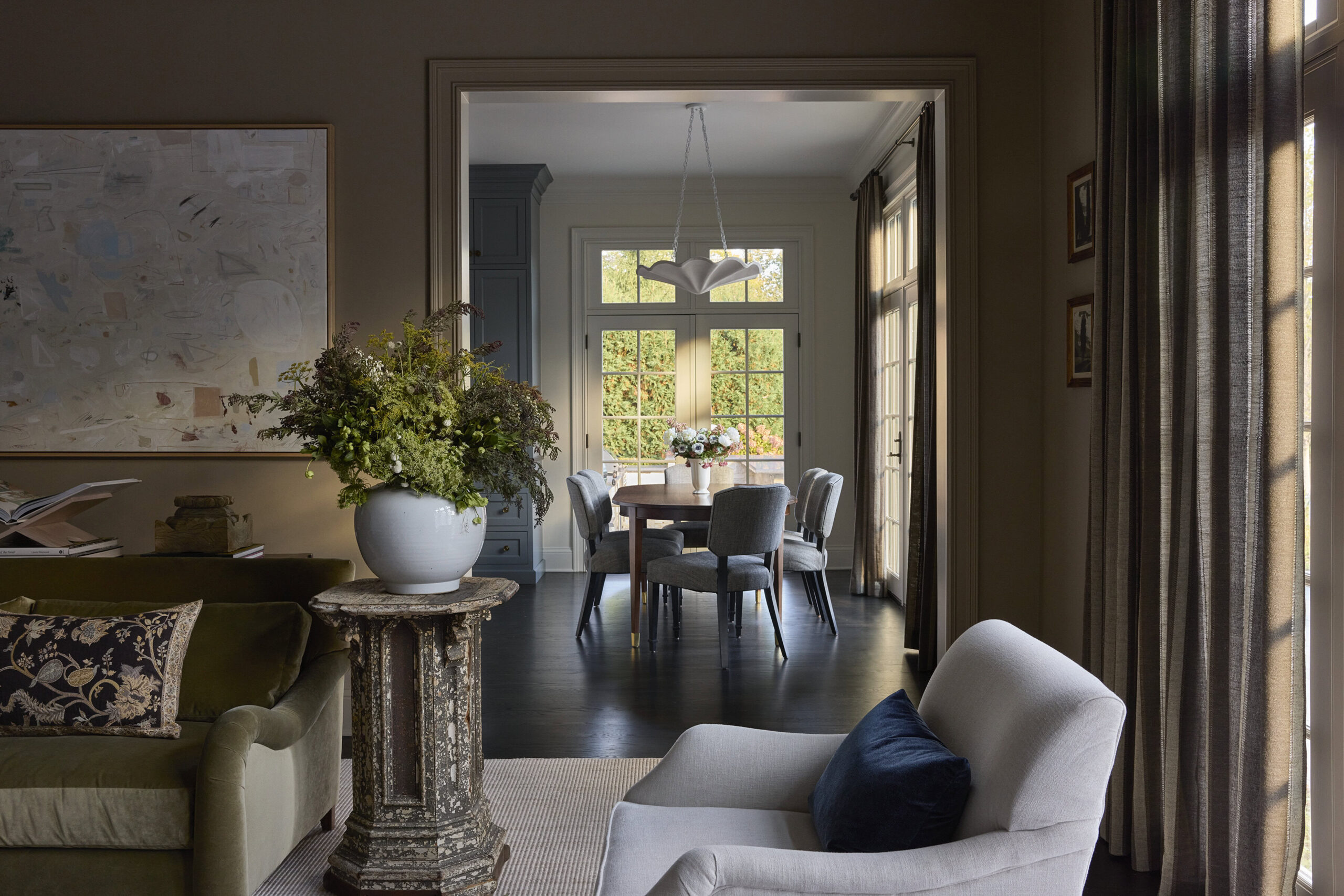
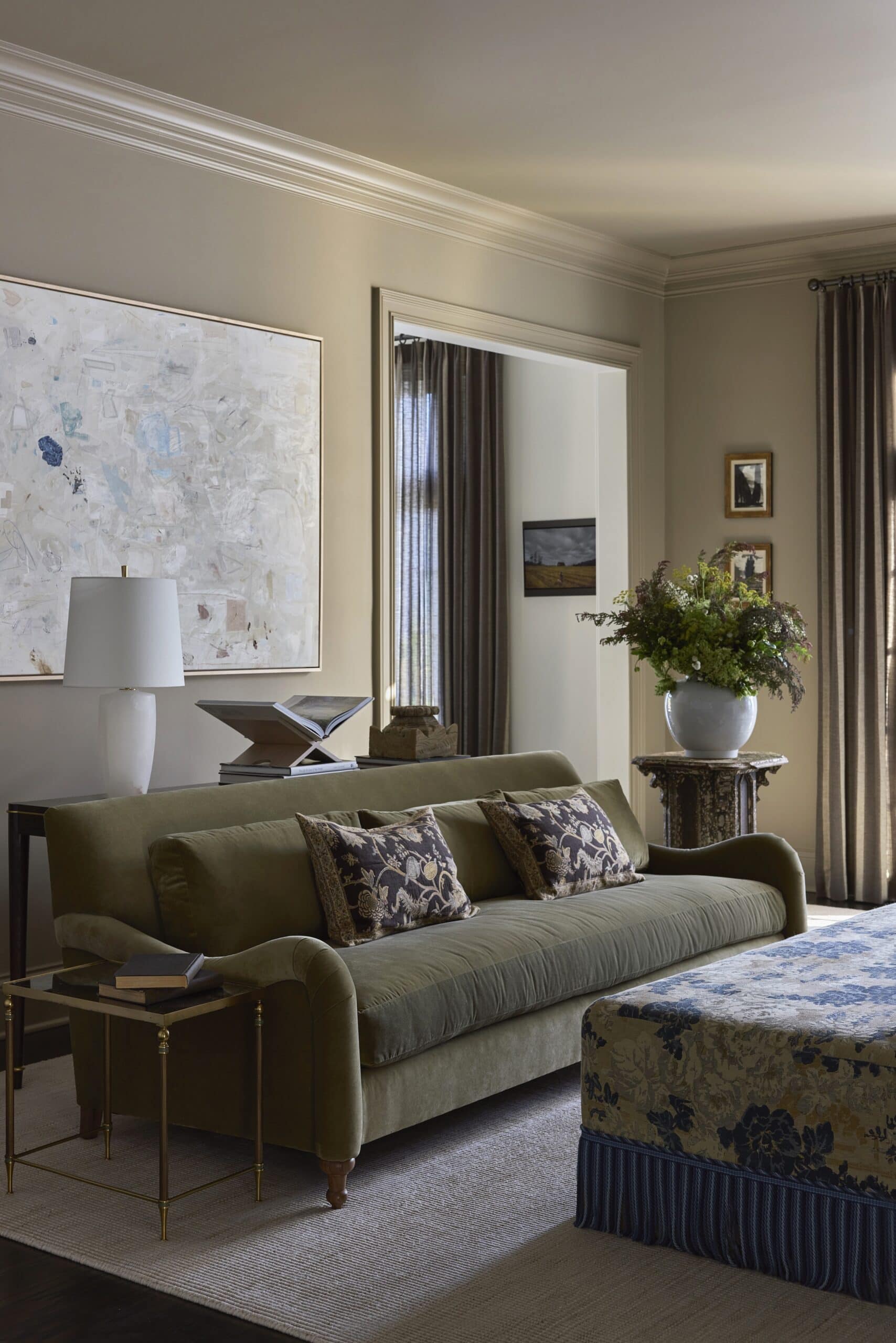
Family Room: Cozy, Elevated, and Family-Friendly
In the family room, we kept the existing lower cabinetry and added upper shelving and drenched it with a warm color. The goal was to lean into neutrals while still creating a sense of transformation. We simplified the architecture by replacing cased-out pillars with a clean drywall opening — a subtle change that elevated the space. Performance fabrics, an ottoman in place of a coffee table to accommodate their young children, and thoughtful lighting ensure the room is elegant, refined, and truly family-friendly. It’s all about the fringe and curved sofa arms for us.
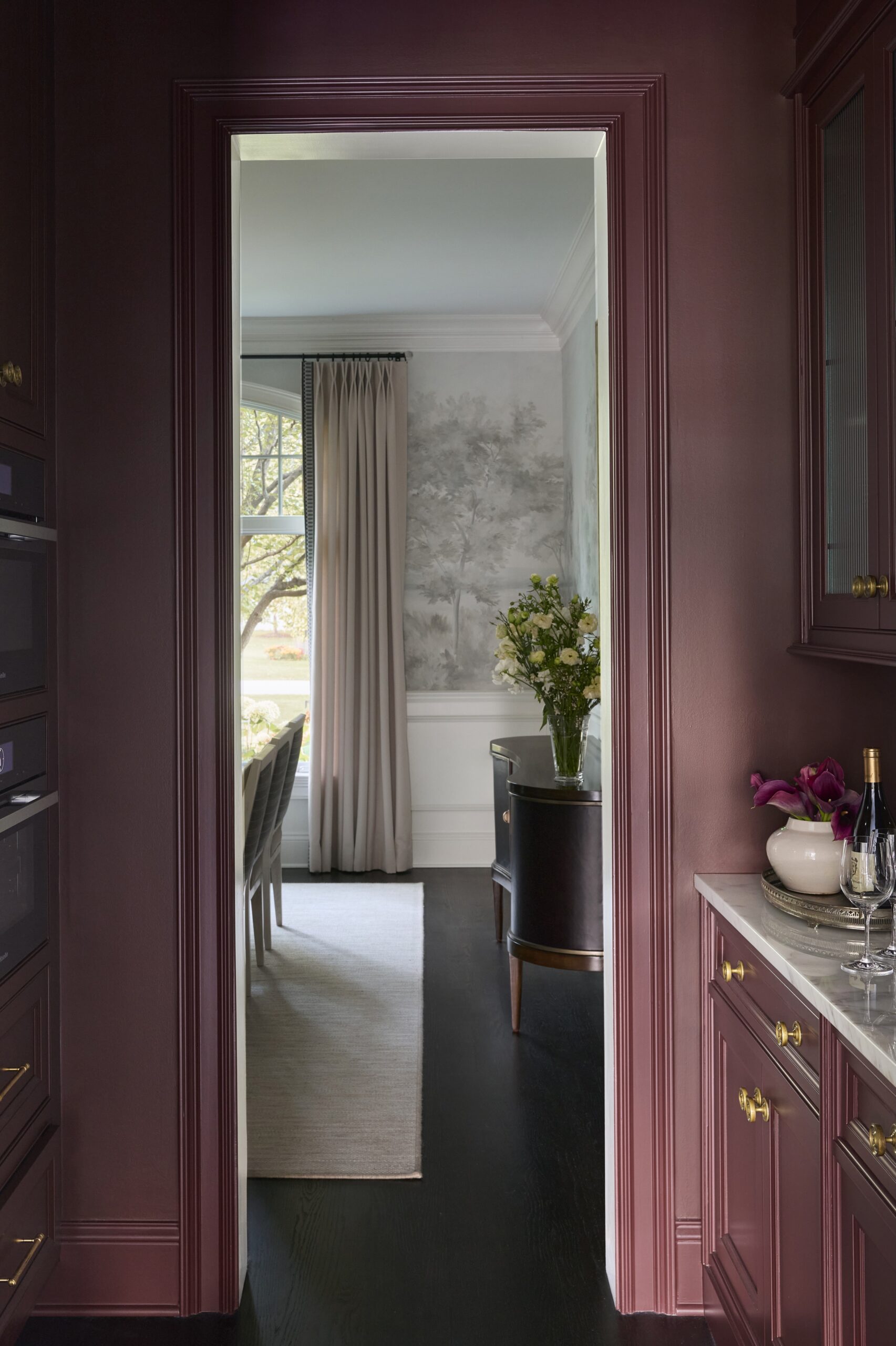
Butler’s Pantry: A Small, But Bold Moment
The saturated color in the butler’s pantry was a push for the clients, and one that paid off. We kept the existing cabinetry but replaced the glass with reeded panels, extended cabinets to the ceiling, and added a backsplash with antique mirrors to coordinate with the kitchen’s range wall. We also pulled cabinetry details onto the opposite wall to ensure everything felt cohesive and finished. This small yet bold space is home to several appliances and additional storage.
Entry: Architectural and Welcoming
In the entry, we introduced custom applied moulding designed to feel original to the home. The goal was for the space to feel architectural, layered, and welcoming — setting the tone for what’s to come.
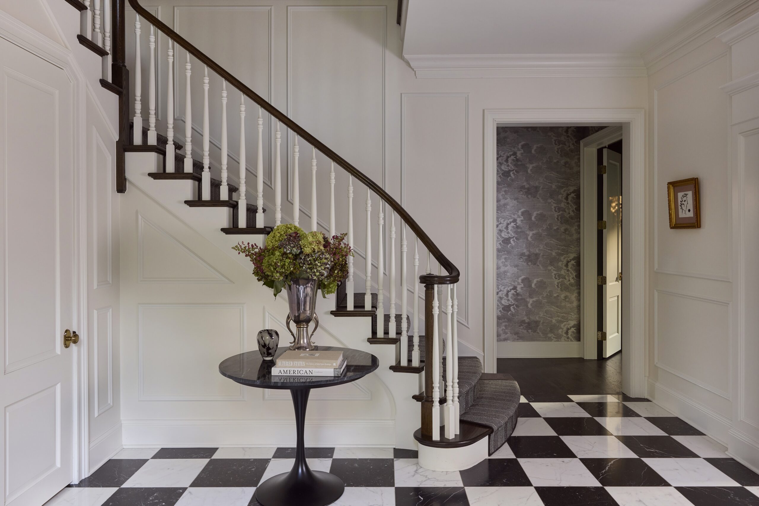

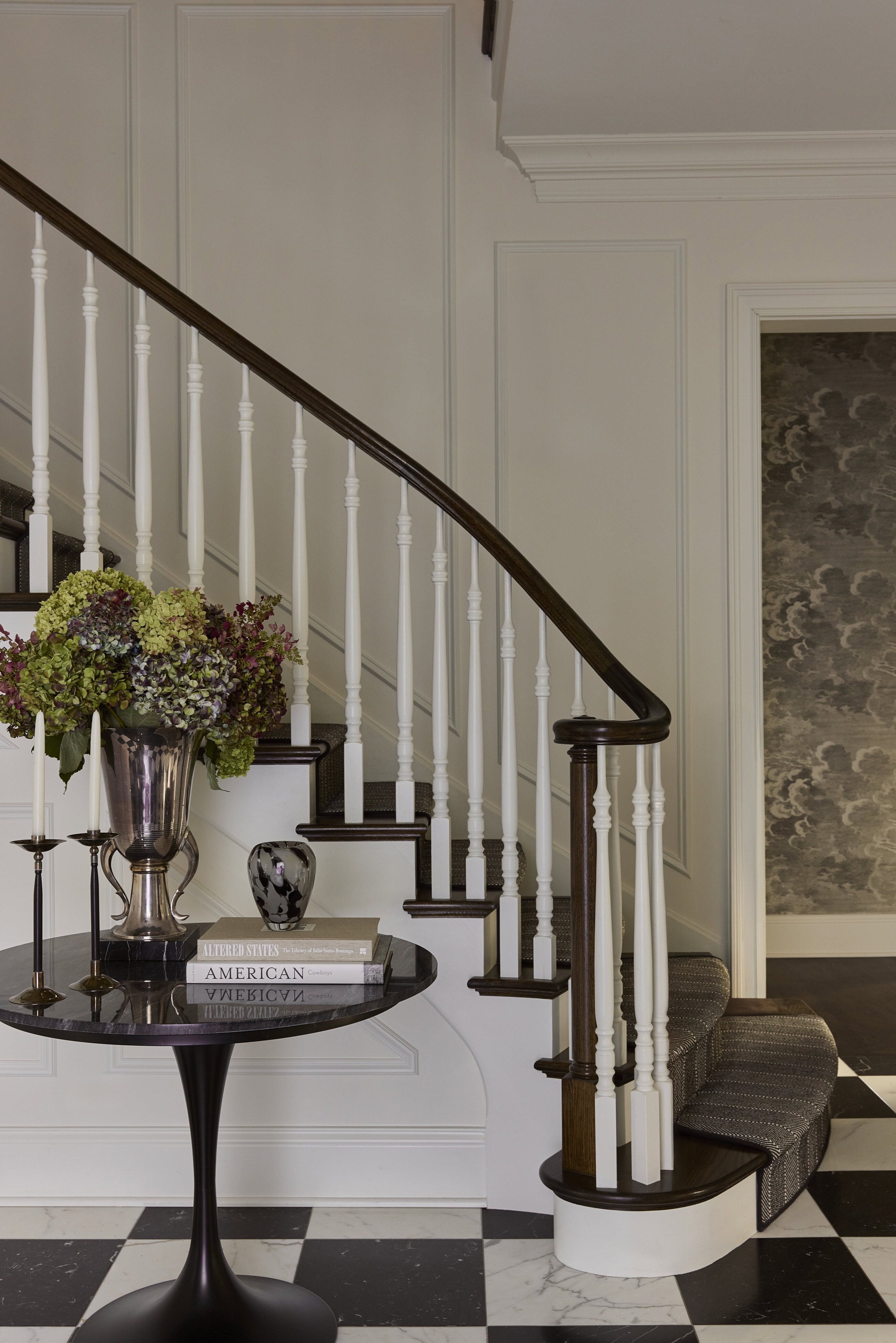
We love the wallpaper moments against the entry moulding.
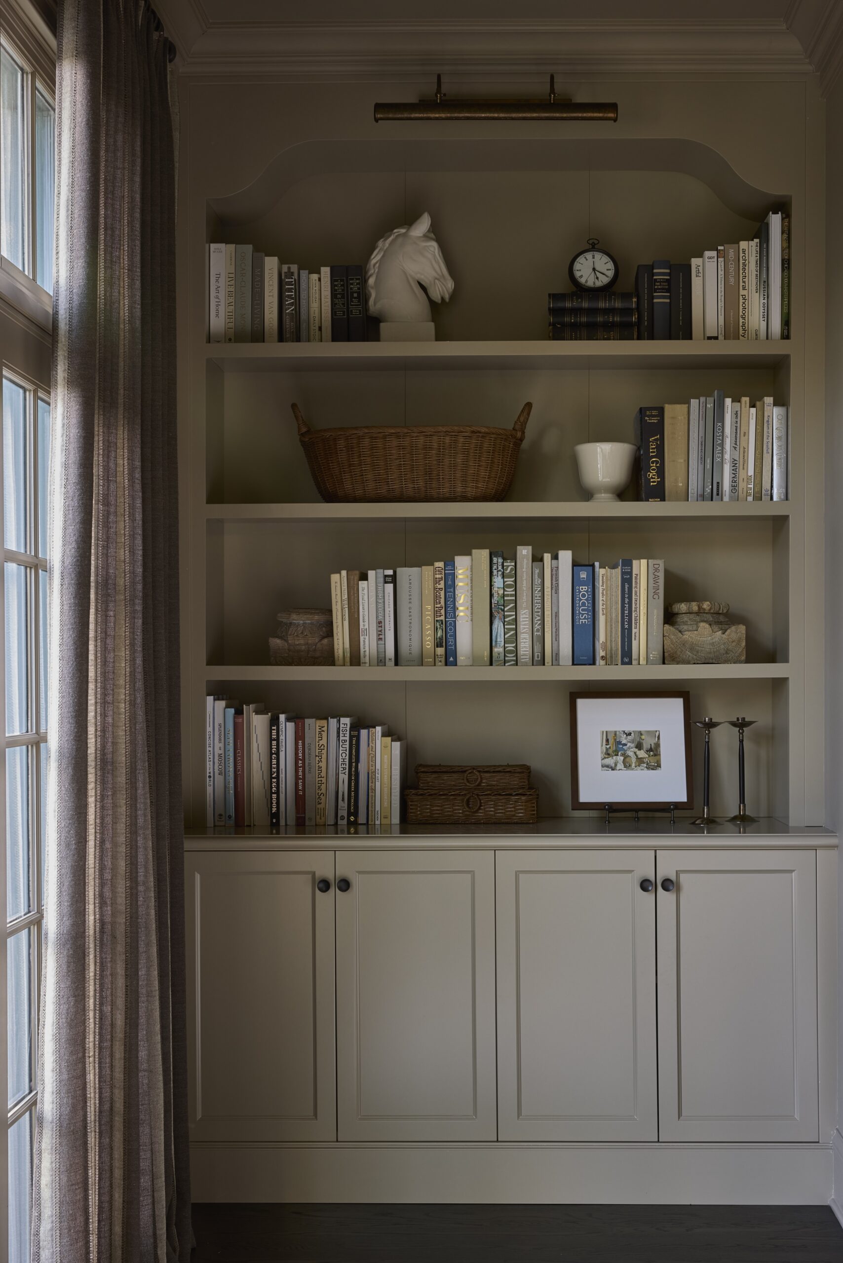
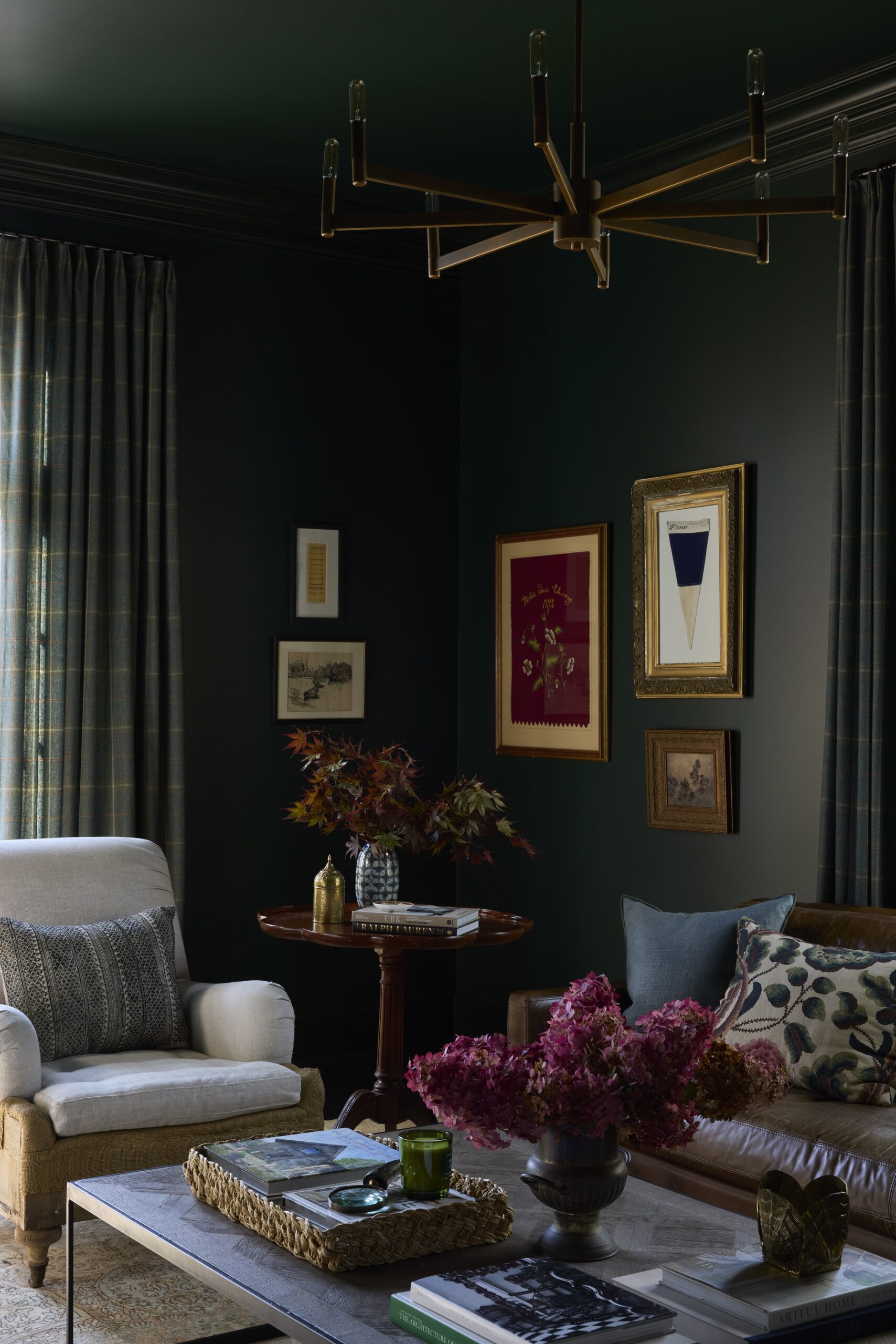
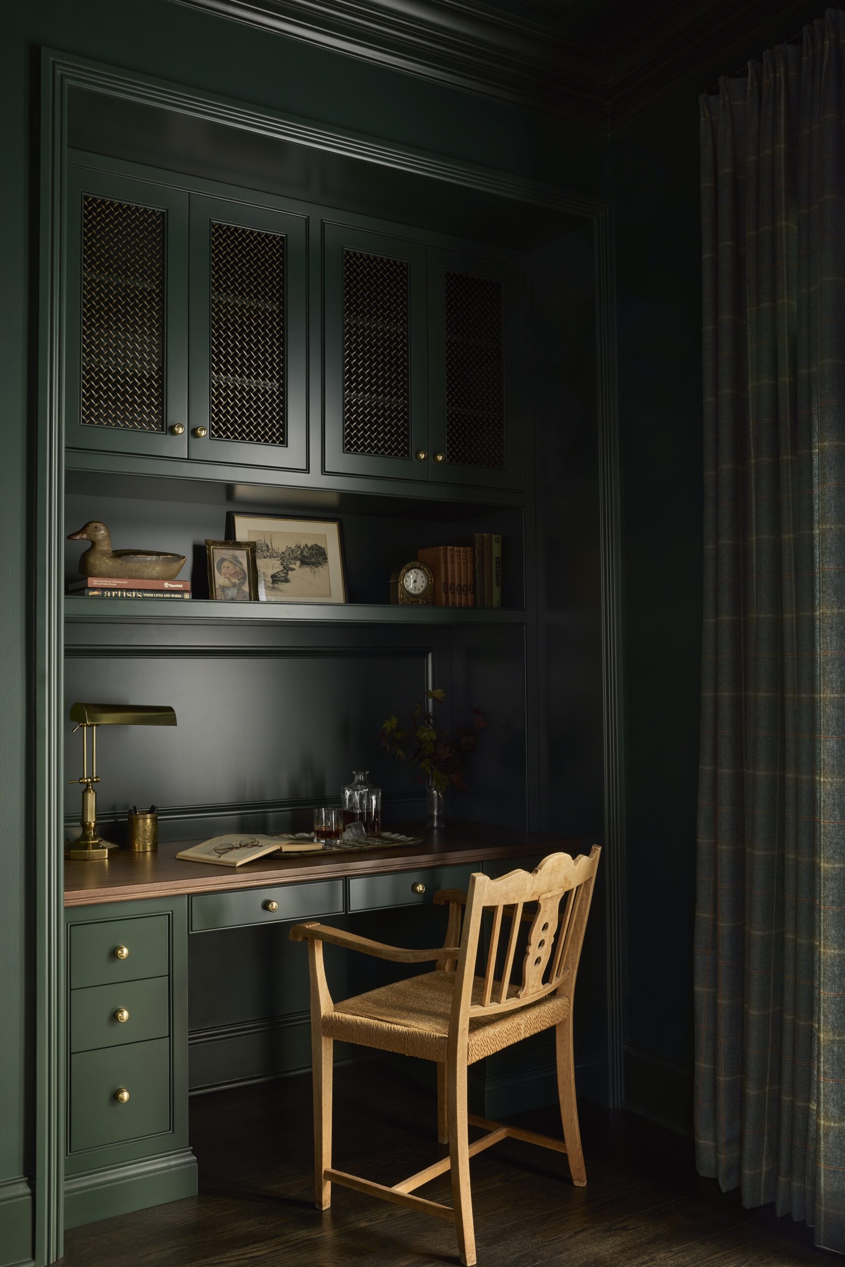
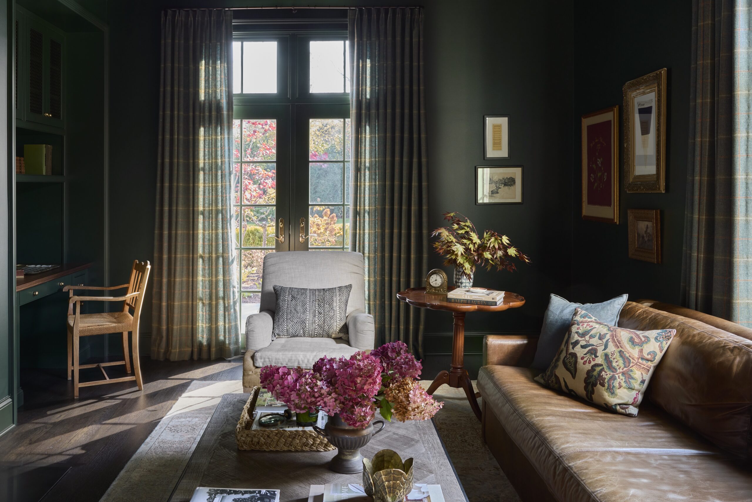
Office: More Than Just a Workspace
The clients wanted this room to function as an office, but also as a media and hangout space. So, instead of sourcing an oversized desk, we design one integrated into the room. The built-in desk and millwork replaced a freestanding bookshelf and created a cozy workspace. This room is our take on Ralph Lauren, with plaid drapes, a classic leather sofa, and gorgeous green walls.
This project is a reminder that you don’t always need to renovate everything at once. This home has come together over time and in a way that supports our client’s family. This fall, we had the honor of celebrating this home and the homeowners with an incredible house tour hosted by Sheridan Road Magazine. It was such a beautiful milestone to share this home’s transformation with the community.