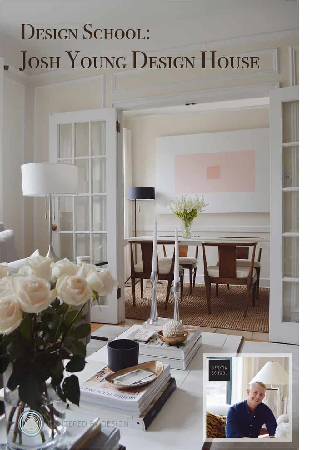
Happy day design lovers! I’m thrilled to have Josh Young Design House on the blog today. Josh is a recent Chicago transplant, but developed his keen sense for blending the Old World with a more modern sensibility during six years of university in Milan, Italy. Of course, Josh’s work caught my eye on Instagram. We have a mutual friend in the talented photographer Aimée Mazzenga, which is how I first discovered Josh’s fabulously funky portraits and bold graphic artwork.
Several other editors have discovered Josh Young Design House recently too! Josh’s portrait collection was recently featured in O’ The Oprah Magazine and his home tour will be up on MyDomaine soon (congrats Josh!). I’m thrilled for him and this recent wave of press, he’s truly putting himself and his work out into the world, trying to continually improve and reinvent the work (as he mentions below). I hope you enjoy the interview with Josh and the gorgeous phots of his home, studio and artwork. Also, don’t miss our giveaway on Instagram. Josh Young Design House is giving away one 8×10 piece from his signature portrait collection, Emma.
Design School with JOSH YOUNG DESIGN HOUSE:
The most difficult aspect of my job:
Honestly? Always trying to reinvent myself and my work. Of course it’s always amazing and an honor as an artist be recognized for a signature look which my avant-garde portraits have provided me with, but it’s also crucial, in my opinion, to challenge yourself to reinvent. There isn’t a day that I don’t wake up, walk into my studio and think, “what’s next”?

My secret styling trick:
Edit, edit, edit. Whenever I feel like a space is perfectly styled and complete, I remove one thing. I’m not a minimalist by ANY means, but, I find it’s crucial to allow the beautiful objects in your home the room to breathe and have their own moment in a space.
If I could design anyone’s home it’d be:
I’ve sat and pondered the answer to this question for the last 15 minutes but the honest answer would be to actually design my own dream home. It would be a toss-up between a classic canal home in Amsterdam or a brownstone in New York’s West Village. I love the historic charm both have to offer and the juxtaposition they provide by remaining quaint and removed while nestled in a large city setting.
When I’m uninspired, I turn to:
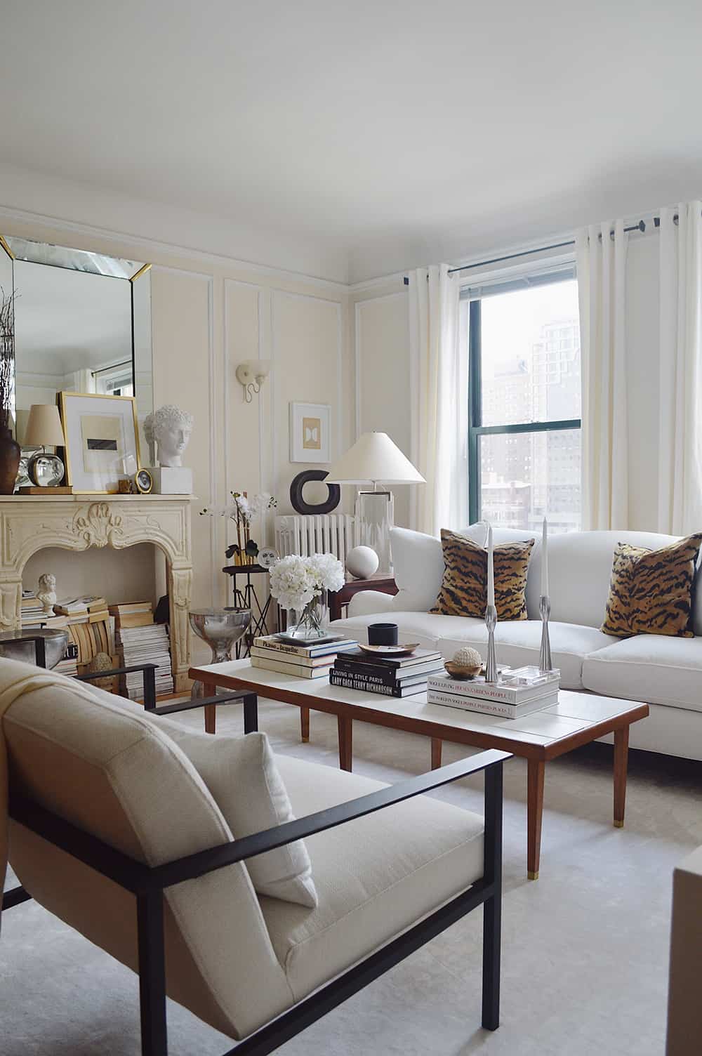
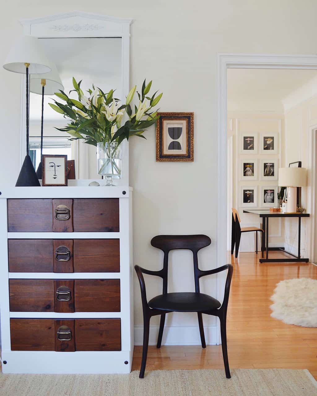
I go for a long walk here where I live in downtown Chicago’s historic Gold Coast neighborhood. Every street is lined with gorgeous pre-war townhomes and stunningly ornate high rise buildings. It really is the gem of Chicago and I am so incredibly inspired by the architecture it has to offer. I think my obsession with beautiful architecture is easily represented in my interiors by my use and adoration of clean lines, and the input of architectural salvage pieces.
In my college dorm room, you’d find:
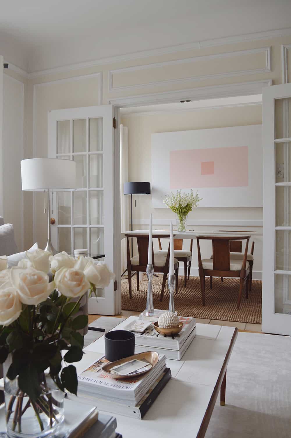
I’m a lucky guy. I went to university in Milan, Italy and had apartments filled with mid-century Italian furniture and beautiful European antiques. Some that I would find on the side of the street (true story) and some that were actually left by the previous owners/tenants. Milan taught me how to tastefully mix old and new elements and gave me a good lesson on how to properly juxtapose modern furniture within ornate, Belle Époque era apartments. Of course, I was a student on a budget so I certainly took advantage of brands like Ikea whenever needed! You gotta make it work!
The one design that makes me cringe now:
I think Scandinavian Design has become a bit TOO mainstream and I honestly think it’s had its moment. I don’t know. I’ve always stressed the importance of if you’re going to identify or use a certain design/aesthetic, don’t be too literal with it. What I mean is, you can take certain elements from that specific design that you’re interested in and incorporate it into your living space without it having to be represented in every single thing in your room/home that you’re designing.
You can spot this in all of my projects:
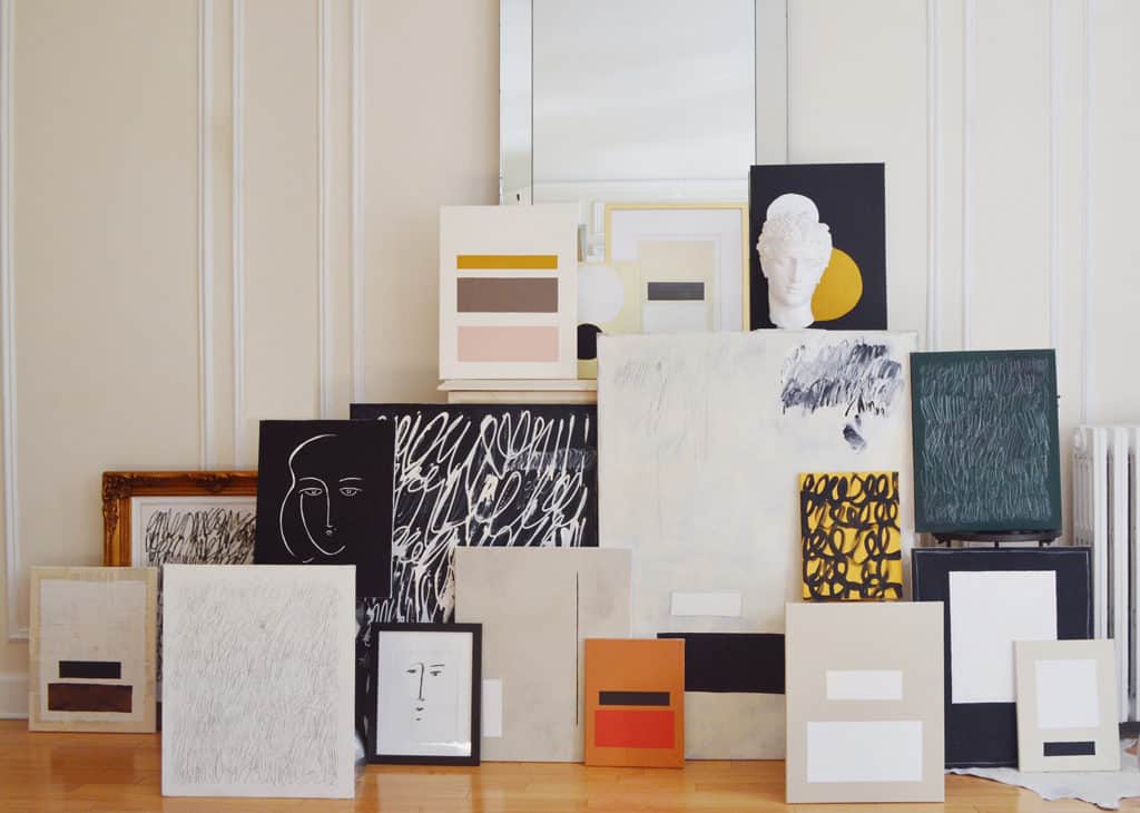
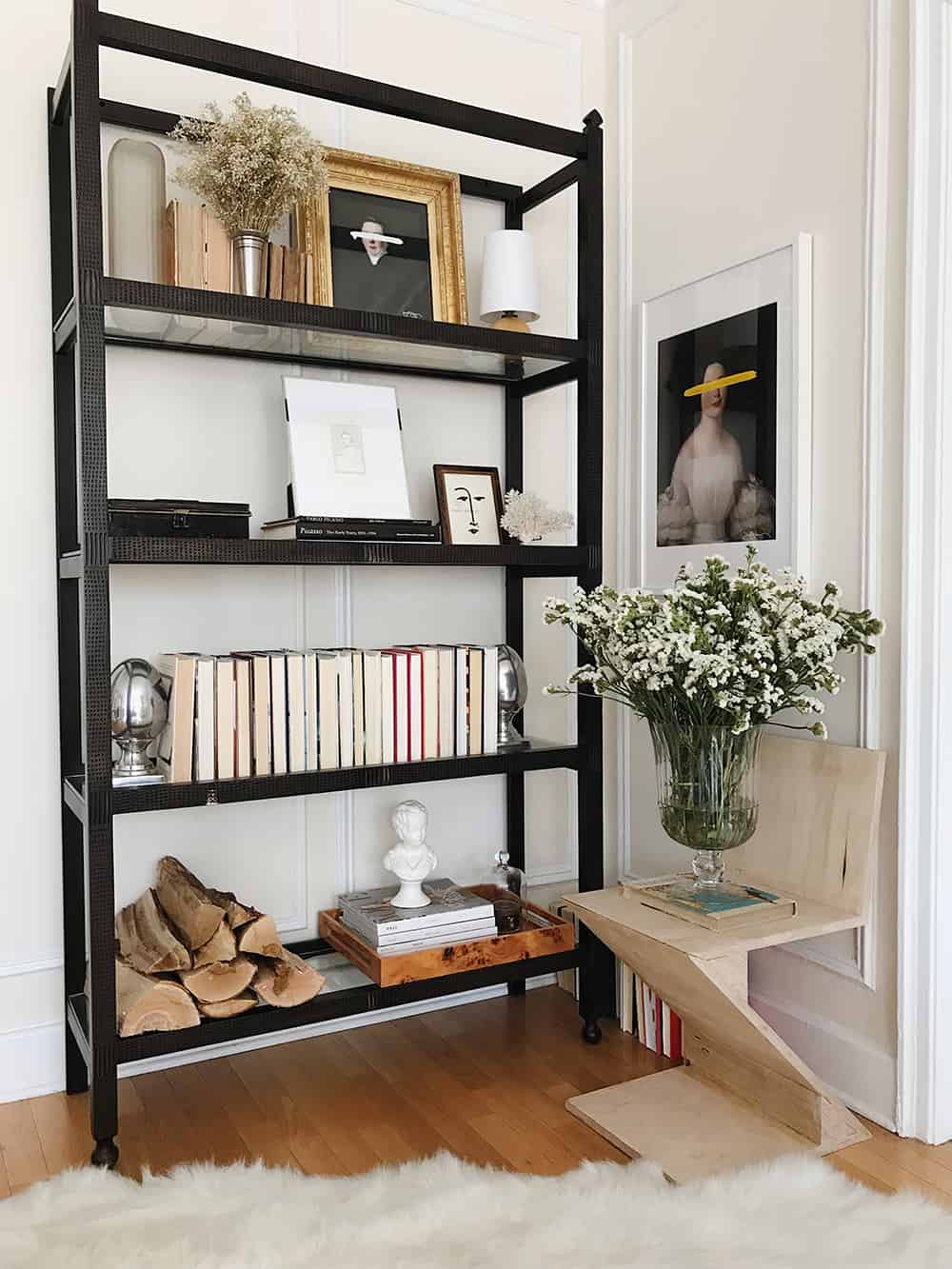
My portrait art. They’ve become my signature and I love how they fit in literally any environment. Years ago, I started experimenting with appropriation art and using old portraits that I had photographed and began painting on top of them to create a juxtaposition of old world elements with modern-day techniques.
When viewing a portrait, you’re usually drawn to their eyes as the first main focal point. I started painting blunt, avant-garde slashes across their eyes to abruptly change this focal point which ultimately changes the entire mood and composition of the painting, but also then allows your eyes to appreciate other elements of the portrait such as their wardrobe and facial expressions. I’ve always been an artist, but the creation of these portraits would ultimately be the beginning of my artistic career.

My favorite person to follow on Instagram:
Alyssa Kapito. I absolutely adore everything she designs and creates.
If my style were defined as a piece of furniture, it’d be:
Alberto Giacometti’s Lampadaire à tête de femme. No words nor explanation, it just visually and aesthetically represents everything I’m about.
The source you’d be surprised to know I use:
Craigslist and OfferUp. Believe it or not, I’ve been able to find some really, really unique pieces that I literally paid next to nothing for.
I always encourage clients to get rid of:
Get rid of items that don’t inspire nor draw out a certain emotion in you. Your home should truly be filled with objects and items that not only represent who you are as an individual, but more importantly, your home should make you feel a certain way when your inside of it. Whether the items in your home make you nostalgic or they just simply visually stimulate you, it’s so important to be surrounded by things you cherish and adore. If they don’t inspire you, get rid of them.
The future of interior design will most certainly include:
Art Deco, Art Deco, Art Deco. It had a comeback in the mid-late 90’s and it’s back again. You’ll begin to see elements of it here and there in editorials but I’ve been noticing an uptick of it’s presence a lot since the new year and I’m LOVING it. French, German and American Art Deco is back and I couldn’t be happier.
I always tell clients that if you invest in one thing, it should be:
Artwork. It’s true. It’s the one thing that will stand the test of time and one of the few things that you can invest in that if purchased wisely, will increase in value.
The project I’m most proud of is:
It’s a work in progress but actually my new art studio here in Chicago. I wanted to take a completely new approach with the studio and have it be an authentic representation of who I am as an artist and have it filled with everything that inspires me. I’ve worked hard on our apartment and feel I was able to successfully curate a space that is refined and provides a sophisticated comfort to it. But I wanted my studio to be just the complete opposite. A space that is unrestricted and a celebration of everything that I create and curate. No boundaries nor limits. If you’d like to follow it’s progress, you can certainly check out my Instagram @jyoungdesignhouse
The pattern that I’ll never tire of is:
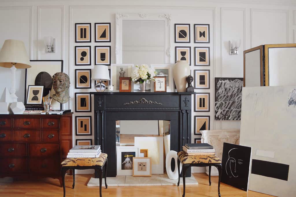
Scalamandre Le Tigre. Obsessed. I first noticed it back in 2012 on Carole Radziwell’s sofa, which was actually gifted to her by her mother-in-law, Lee Radziwell. I’ve loved it ever since. I actually just purchased two, antique stools that are upholstered in the original pattern (circa 1930’s/1940’s) for my studio and they just make me smile. Such a chic textile and so iconic.
How has living in the Midwest inspired your design Style?
I’m a recent transplant to Chicago and I’m absolutely loving it. The city itself has inspired me so much with it’s sophisticated ability to mix modern architecture with pre-war gems. To say that I love juxtaposition would be an understatement and this city is filled with it. So incredibly happy to call this place home.
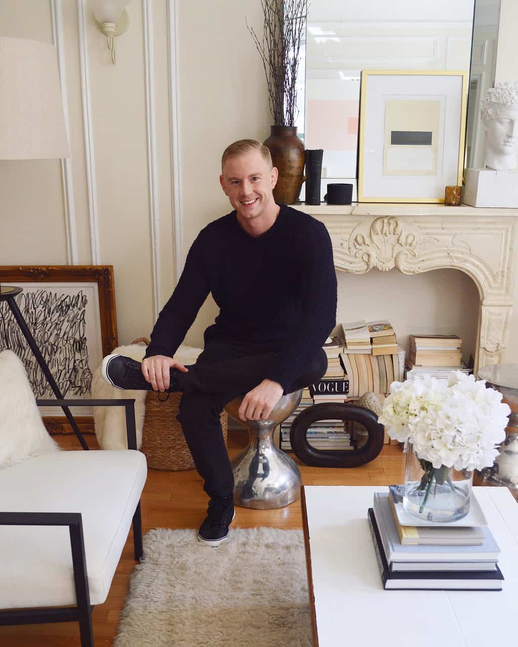
Many, many thanks to Josh for sharing his time, thoughts and talent with us!
DESIGN SCHOOL LINKS:
I thought adding a few of my favorite links that are relevant (and educational) to the latest DS interviewee would be a fun new way to end these posts. Here are three links to help you get your European design skills in check:
- REVIEW – Milan Design Week 2018, and get the latest news and trends for 2019 from one of my favorite Italian design bloggers, https://www.italianbark.com
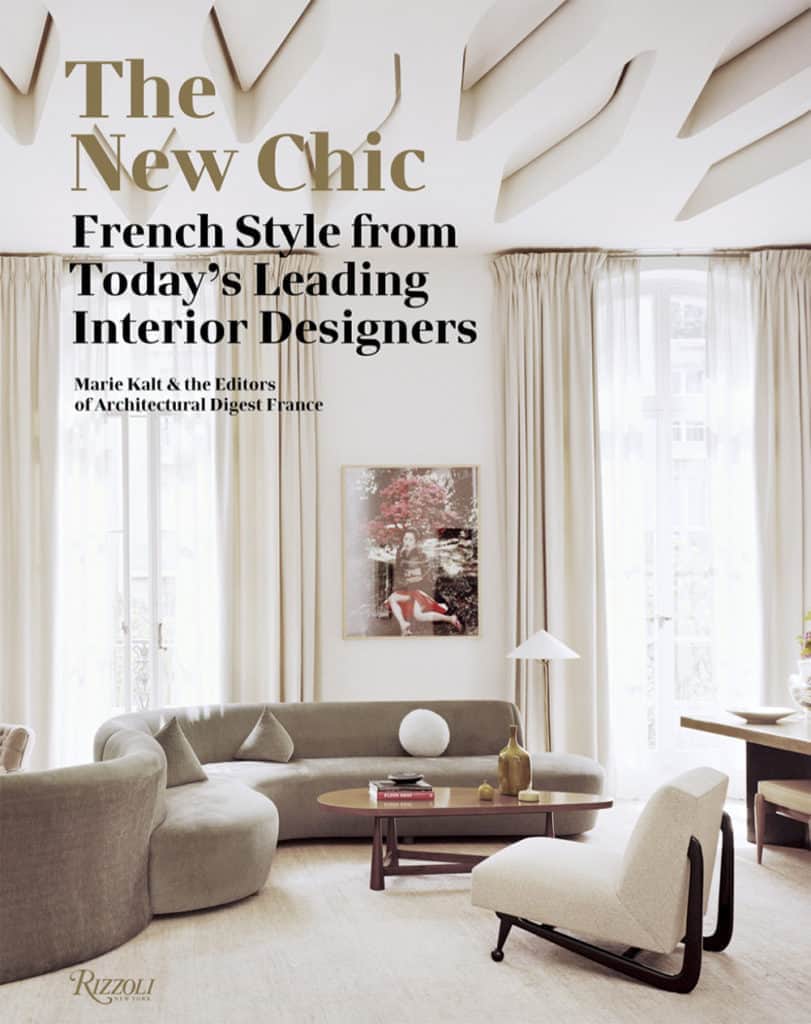
- READ – Want to see how top French designers decorate? This collection of interiors by top designers like Joseph Dirand, curated by AD France looks like a must own.
- SHOP – Don’t miss visiting Josh Young Design House’s website and latest collection – GÈOMÈTRIQUE
XOXO – CLAIRE
Pin this image to share the article on Pinterest and follow us on Pinterest for more design inspiration!
Leave a Reply
October 7, 2024
read the post
YOU MIGHT ALSO LIKE
April 17, 2024
read the post
September 2, 2021
read the post
August 24, 2021
read the post
Meet Claire
Claire’s creative energy comes from her unique perspective on the world as both a trained interior designer and a passionate yoga teacher. Her affinity for kitchen design, timeless style and eclectic decorating are shared here, along with lots of interior design education and tips. Thanks for being here, please enjoy!
I absolutely loved reading about Josh Young’s design philosophy and the unique blend of classical and modern elements. His ability to create timeless yet contemporary spaces is so inspiring! The way he incorporates fine art and bold textures into his designs feels incredibly fresh and distinctive. Thank you for featuring such a talented designer – I’m definitely taking notes for my next project!