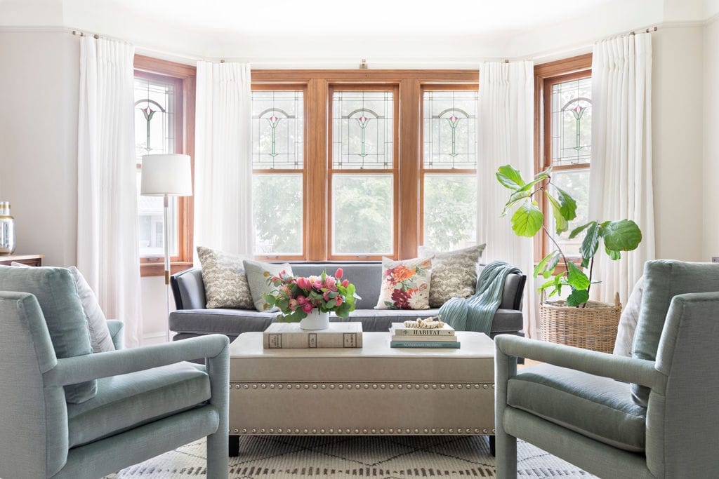
Lovely little project to add to the portfolio this week! A contemporary town house makeover in the northwest suburbs.
This project consisted of a decorating face lift for an outdated town house. My client had to relocate quickly and needed a paint color scheme, and new floor plan that would incorporate existing furniture from her prior residence. With a little bit of re-imagining, fresh paint, and some new pieces to update the contemporary/global look, this town house went from garish and (too) bold to tranquil and textured in no time.
The pictures really tell the whole story, but the key was definitely to re-think the floor plan. It’s often hard for people to see past what the space looked like before.
Design Tip: Try and erase the existing floor plan from your mind! Just because the prior tenant used the space one way does not mean it’s the best way. Even if you think you are terrible at drawing, try to generally sketch a blank floor plan on paper. This gives you a clean slate on which to play with new ideas. Don’t worry about scale at first. Simply try to think of how you’d like the space to function, and play around with where those areas or pieces of furniture might fit into the floor plan. At the very least, this quick exercise will help you generate new ideas about possibilities for the floor plan.
Here are the before photos:

The living space is open concept. Sometimes not having walls can make “rooms” or separating spaces more of a challenge.

There are several problems here, but the most glaring is the bright orange paint that stops midway along the wall!
This project was a fun challenge because my client had several pieces of existing furniture that she was hoping to incorporate into the floor plan for the new town home. My job was to make the furniture look great and fit well into a totally different layout. Of course, we also added in some new pieces and picked paint colors to complement what was already available from the old residence.
Design Tip: Just because you have a bench (insert any piece of furniture) that once lived in your bedroom (insert any room in your home) does not mean it needs to stay there! Mixing and matching pieces and placing them in new areas of the floor plan is the best way to get more milage out of your existing furniture.
Here is a look at one of the design boards for the downstairs where I incorporated existing pieces like the rug and green cabinet with new concepts such as the office space and paint palette.
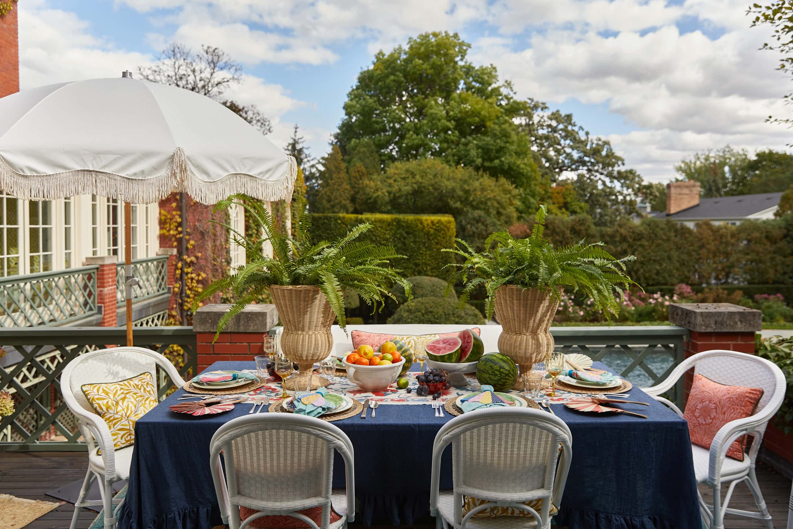
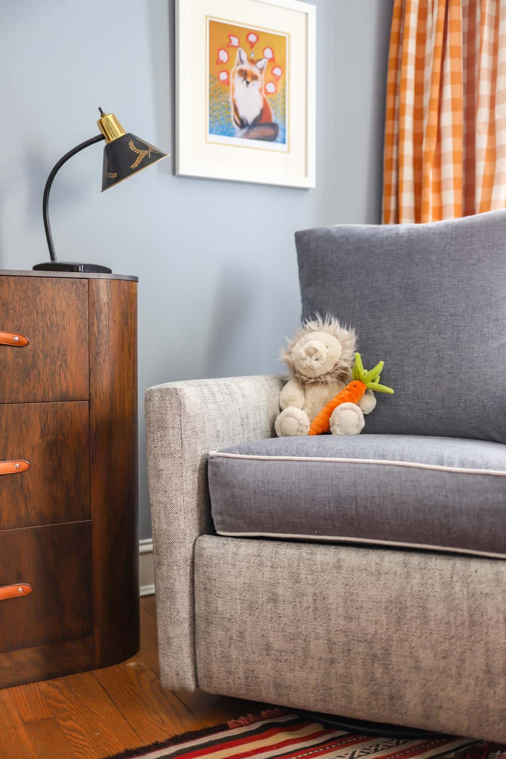
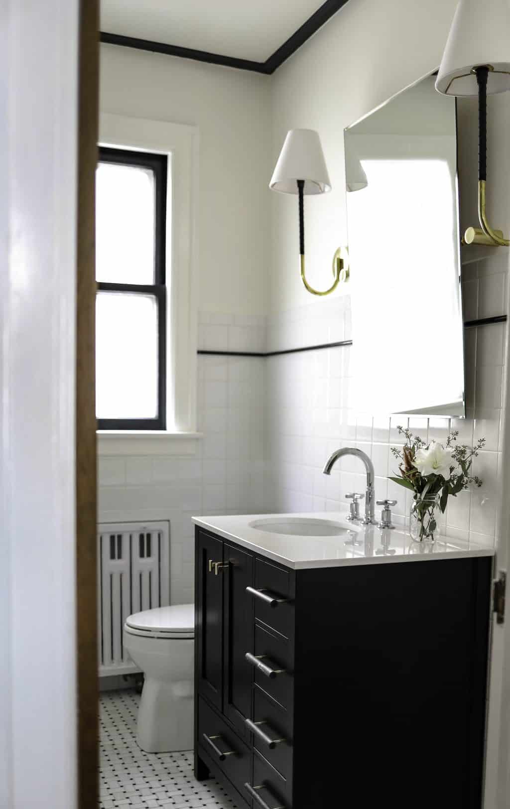
And here are the after photos!


 Don’t you agree that we gave the place a great update?! I love how restful the entire town home feels after the makeover. Thanks for taking a peek!
XO – CLAIRE
Photography by Joe Tighe
Leave a Reply

October 7, 2024
read the post
YOU MIGHT ALSO LIKE

April 17, 2024
read the post

September 2, 2021
read the post

August 24, 2021
read the post
Meet Claire
Claire’s creative energy comes from her unique perspective on the world as both a trained interior designer and a passionate yoga teacher. Her affinity for kitchen design, timeless style and eclectic decorating are shared here, along with lots of interior design education and tips. Thanks for being here, please enjoy!


How stunning! Where did you find that incredible desk??
Thanks so much Heather! Desk is from West Elm.
Beautiful updates, Claire! Really love how you made the space look fresh and inviting.
Thanks Ellen! Yes, isn’t amazing what an impact paint colors can have on the feeling of the environment.
You brought into the space so much comfort and warmth! Turned out very nice and cozy!
Thanks so much Eva! It was lovely to discover you on Instagram, I just love your drawing and watercolor skills!