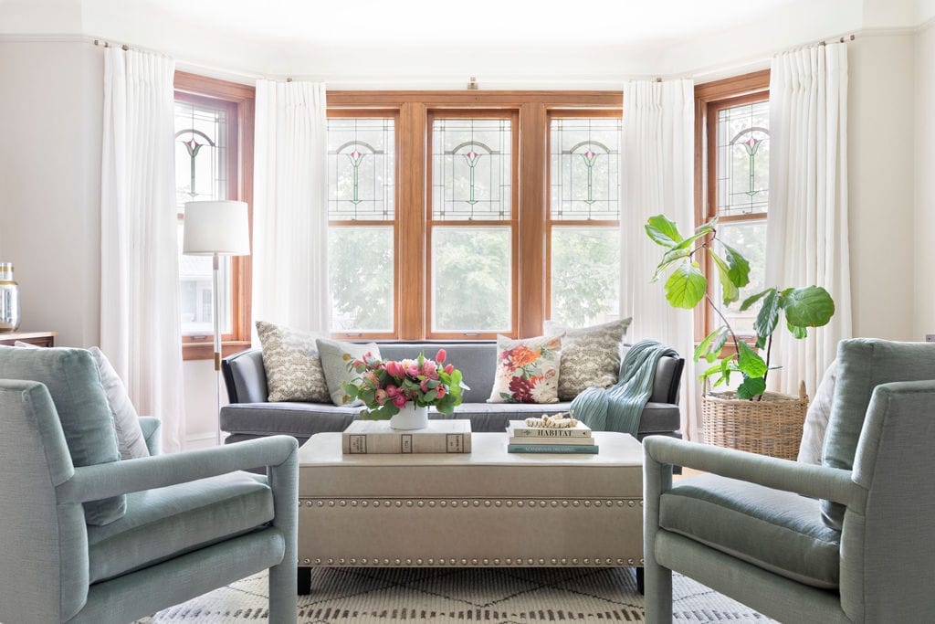
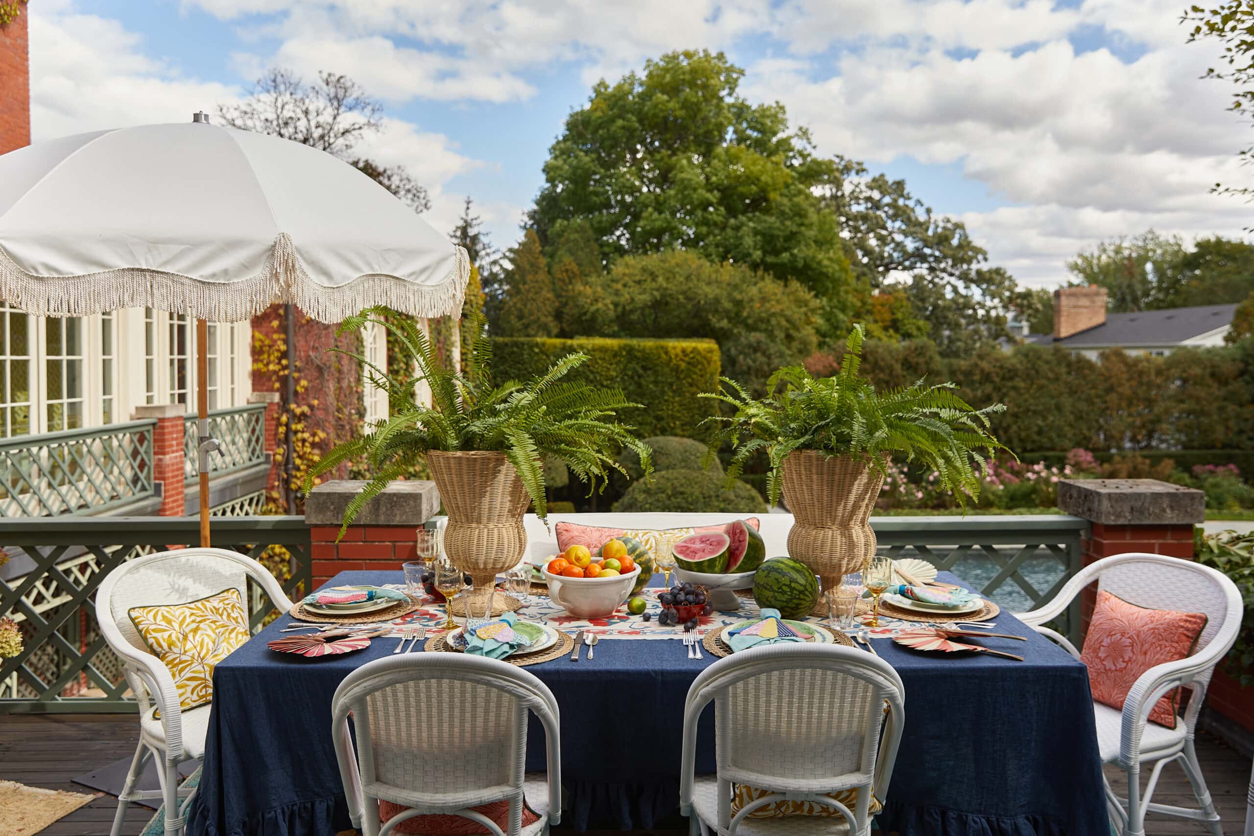
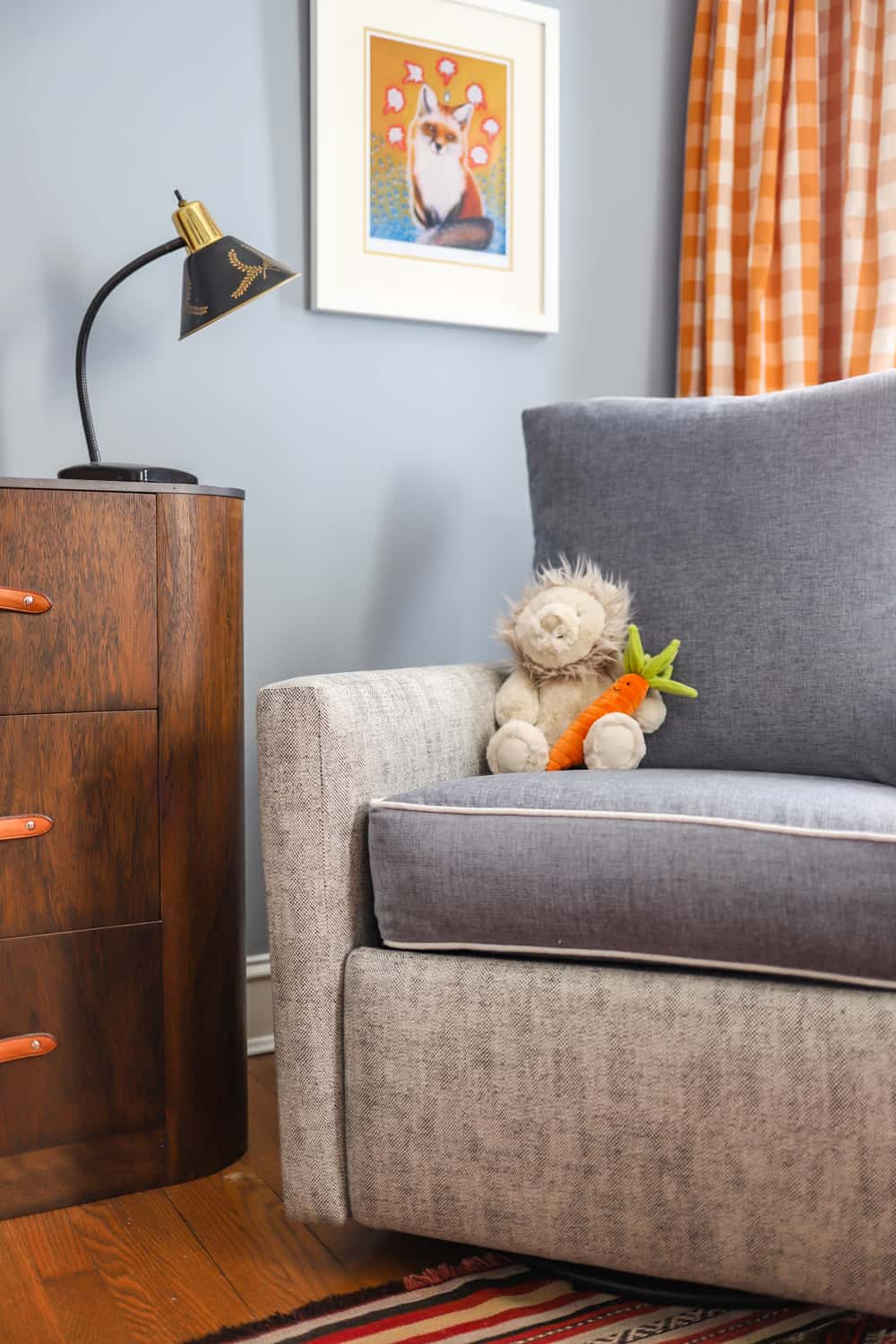
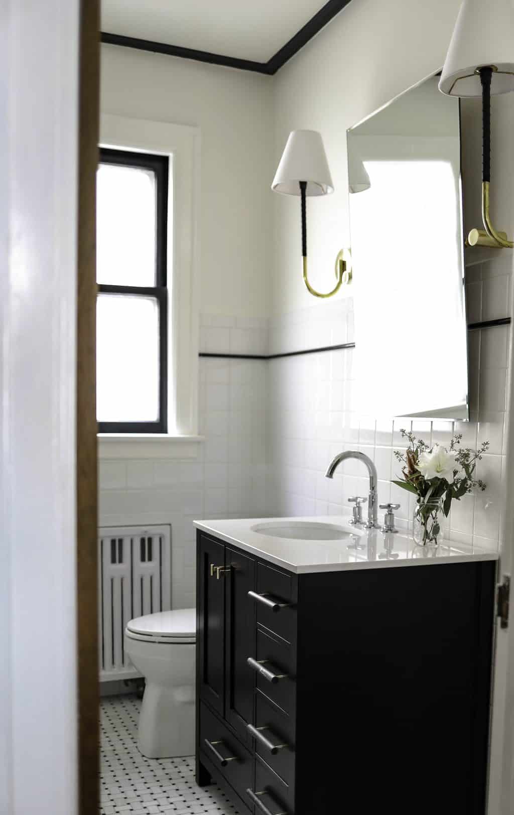
Last week our apartment tour went live on Apartment Therapy! I was really impressed with how well our AT editor seemed to “get us.” It’s always a bit nerve-racking to know whatever you say or do, might end up on the internet in front of thousands (or millions of readers). But PHEW! she definitely didn’t mention any of our crazy quirks so we are safe this time around!
I was also really touched that she used the word SOULFUL to describe our place. Honestly, I don’t think I could have some up with anything better myself. Soul is where it’s at; in my design work and in my yoga/daily life. Spaces with Soul, that would be another great name for an interior design company, huh? Here’s the interview survey and some of my favorite pictures from the shoot:
Apartment Therapy Feature:
Our Style: We love mid-century and Scandinavian modern design aesthetics, but also have a penchant for a more bohemian style and enjoy global textiles. We’ve melded these elements for quite the eclectic look.
Inspiration: We are inspired by our travels, our love for vintage and handmade, and the desire to create things ourselves. Luke is a woodworker and created our dining table and my office desk. I am learning to sew and made several of the curtains and pillows in the apartment.
Favorite Element: The built-in fireplace and mantle are really lovely. The teal tiling and woodwork around the fireplace influenced several design choices, and we were looking for and thrilled to find a rental with a working fireplace!
Biggest Challenge: I would say having landlords who are strict about remodeling has been our biggest challenge. We have not been able to make some of the updates or changes we’d like to because we want to respect our landlord’s wishes.
What Friends Say: We love your style! It looks so clean.
Biggest Embarrassment: The kitchen. We love that our kitchen has updated appliances, but everything else about it is kind of a nightmare. It was poorly designed from the start, so the layout is awkward and there’s not much natural light. We do love vintage, but the kitchen is bad vintage. Our first project in a house someday will be the perfect new kitchen!
Proudest DIY: For Luke it would be the dining table, which was the first piece of furniture he made (aside from our cat tower!) For me, it would be the patchwork denim chair in my office. I found the chair at a garage sale for $15; it was my first reupholstery project and I used pairs of Luke’s old jeans to create the fabric and pattern. It was a lot of work, but I love the results.
Biggest Indulgence: The chandelier over the dining table. I looked at a lot of fixtures that would blend the more mid-century look of the living room with the more traditional look of the dining area.
Best Advice: Create a pinterest board or physical mood board to solidify the style you are trying to achieve. Make sure your roommate or partner and you agree on the look you are going for! I can’t tell you the number of friends and clients I work with who want to redecorate, but they don’t know what they actually like. Some of my favorite sites for imagery are Apartment Therapy, Remodelista, Houzz, Pinterest, Domino, and Rue Magazine.
Dream Sources: School House Electric, Heath Ceramics, Jayson Home & Garden, Loloi Rugs, An Orange Moon, and Sojourn.
What do you think your home says about you? What do you want it to say? I’d love to help you bring some soul into your space!
XO – CLAIRE
Leave a Reply

October 7, 2024
read the post
YOU MIGHT ALSO LIKE

April 17, 2024
read the post

September 2, 2021
read the post

August 24, 2021
read the post
Meet Claire
Claire’s creative energy comes from her unique perspective on the world as both a trained interior designer and a passionate yoga teacher. Her affinity for kitchen design, timeless style and eclectic decorating are shared here, along with lots of interior design education and tips. Thanks for being here, please enjoy!


