Powder Room Makeover with Ferguson Showrooms
May 14, 2018
I’m so excited to be revealing our Powder Room Makeover Challenge with Ferguson Showrooms today. This little room has gone from forgotten to unforgettable! The plans for this makeover took place over the last several months, while both myself and the homeowner had babies! I have to say, I’m pretty impressed with both of us for pulling this off with flying colors, and we owe a lot of thanks to our friends at Ferguson for making the shopping and sourcing process so seamless. Ferguson also has made it super easy for you to shop this post, VISIT HERE, for links to all the resources we used in this powder room makeover.
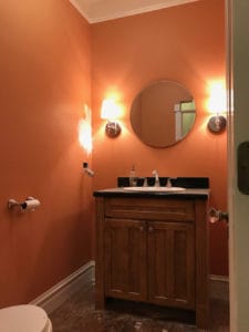
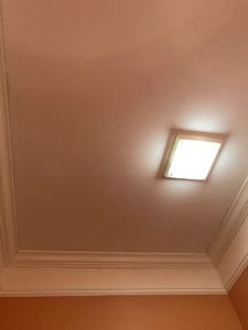
The before photos of the powder room are below. Before the room had an oddly placed overhead light and was not making good use of the high ceiling. It just felt sad and dated. There was so much potential, which is one of the main reasons I chose this as the winning space for the makeover. Nice tall ceilings, detailed moldings and a hardwood floor were a great foundation for the room. I knew with a beautiful wallpaper, plumbing fixtures, lighting and stand out mirror the space would be GORGEOUS!
Ferguson gave us a choice of Spring, Summer, Winter or Fall for the powder room theme and we picked Spring – because who doesn’t LOVE a floral print?! And I knew the reveal would be nicely timed for Spring here in Chicago. We knew Ferguson would have fabulous options for plumbing and lighting, and we wanted to make the most out of our shopping trip. I advise taking a sample of your wall covering or paint color with you as it makes for easier decision making in the showroom!
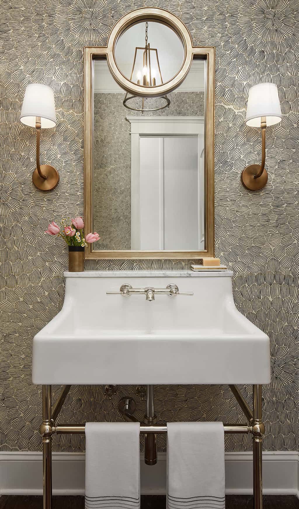
We started the overall design with the wall covering. My client prefers neutrals and loves a bit of glam. Florals are often brightly colored and can often read as sweet or preppy, so I went in search of something that felt more “grown up” and a little bit glamourous. I stumbled across an install photo of Feather Bloom by Celerie Kemble for Schumacher and loved the effect of the large scale floral. In the gold and black color way, printed on grasscloth we had our winner to bring with us on the shopping trip to Ferguson Showrooms.
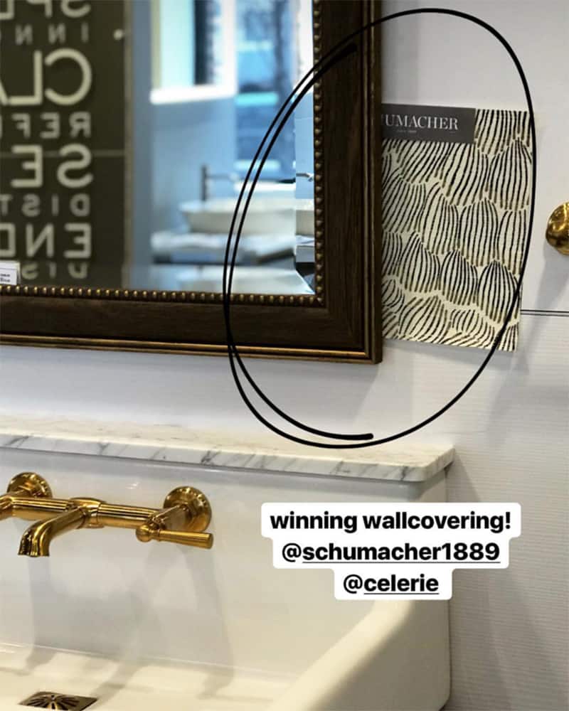
Pairing our winning wall covering with the DVX Luxury Oak Hill console sink. Love!
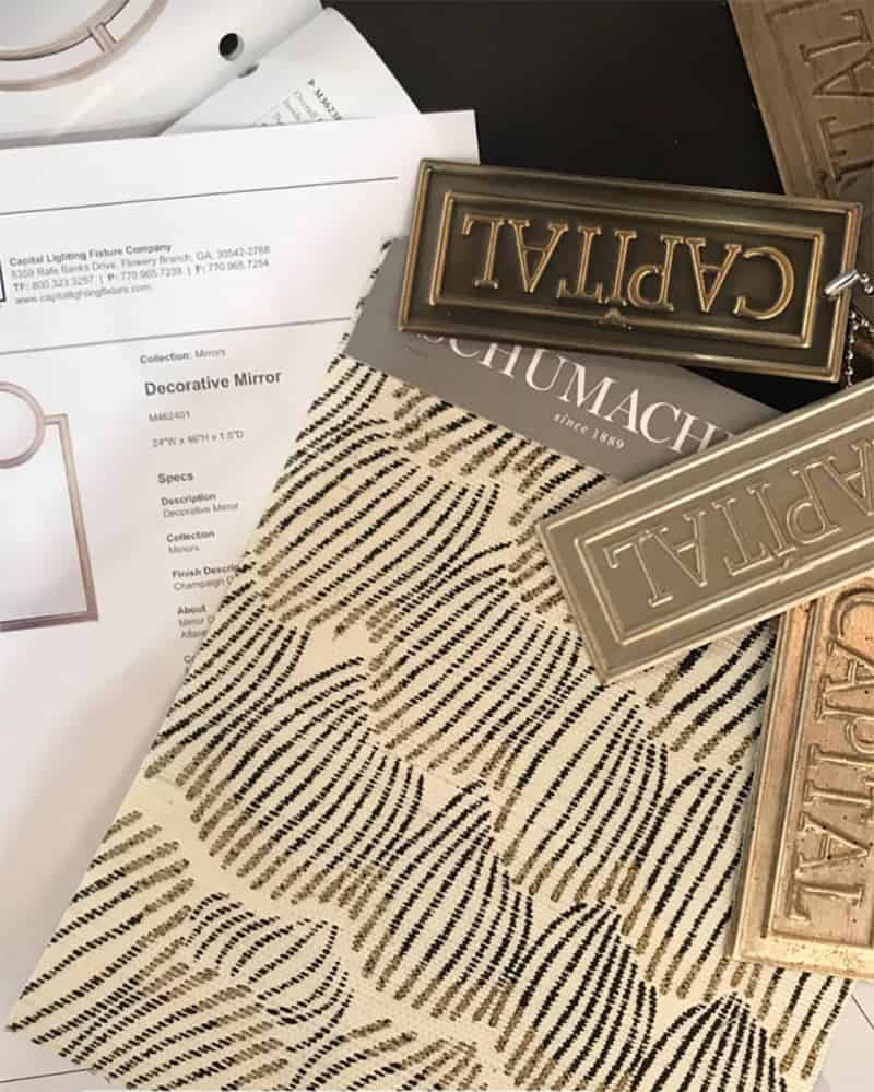
We printed out mirrors we liked with our showroom rep and then got out the Capital finish samples to make sure we chose the right finishes for lighting and the mirror.
We both loved the concept of an open console sink with palmer style legs for the powder room. It gives that glam feeling, but also with a bit of vintage, so it’s not too over the top. We fell in LOVE with the Oak Hill Collection from DVX Luxury and chose the console sink with a polished nickel finish and the matching toilet.
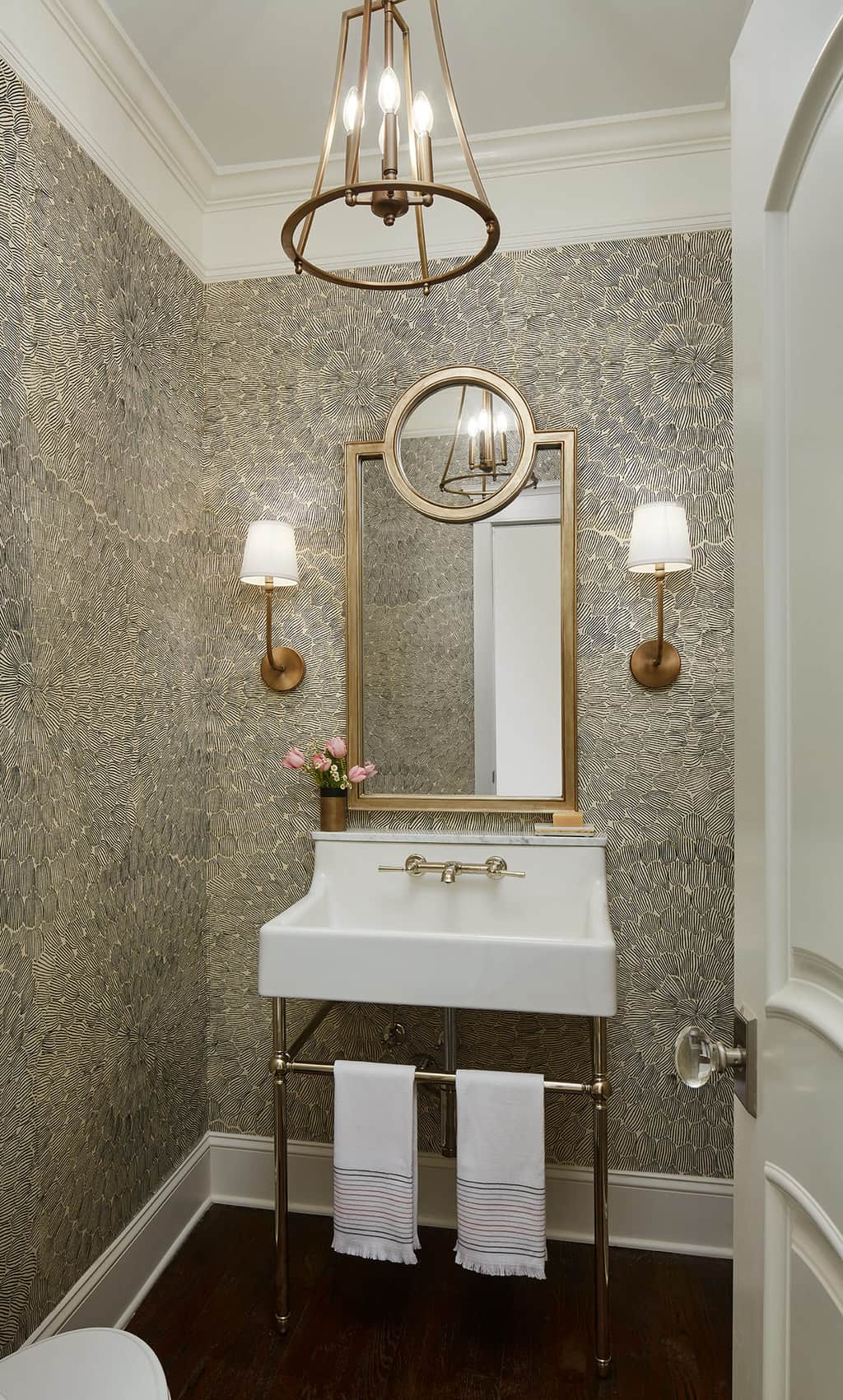
The beautiful new powder room!

DVX Luxury Oak Hill Collection toilet.
One of the biggest areas for improvement in the old powder room was the mirror. With the beautiful moldings and tall ceilings we needed a big, bold mirror to make a statement and to make the space feel larger. I love the lines of this decorative mirror from Capital Lighting.
With the lines of the mirror having both square and circular motifs, it gave us the opportunity to use repetition in the design by choosing lighting with a circular design. Also, from Capital Lighting both our sconces and overhead lantern are from the Dawson collection.
A few designer tips on powder room lighting are as follows:
- Make sure your overhead chandelier hangs no lower than 7′ from the floor. If you don’t have high ceilings consider a decorative flush mount instead.
- Don’t hang sconces too high! Try 60 – 65″ above the floor and think about where the junction box on fixture sits. For instance, these sconces projected upwards so we hung them them a bit lower for the correct height. You really want the bulb or shade/light at about eye level.

Close up look at the Dawson lantern.
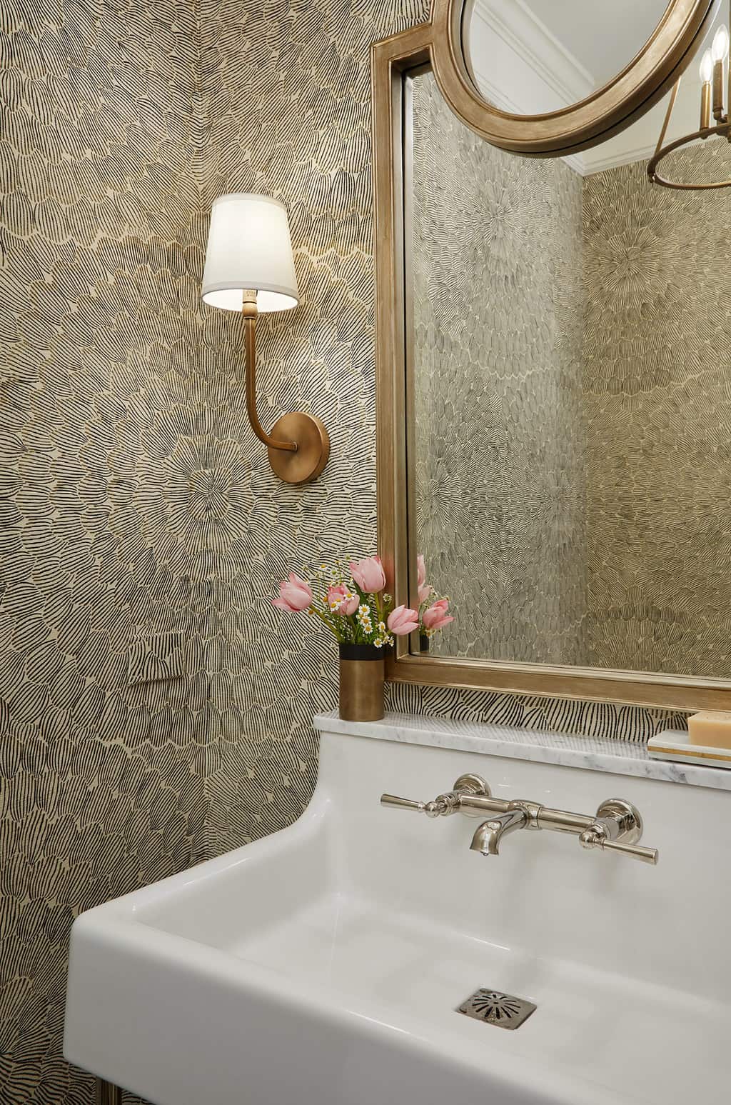
The Dawson sconce detail.
And there you have it – our completed challenge! What do you think? Certainly makes a case for a bold choices doesn’t it? Next time you’re on the fence about a design choice – go bold! It can still be classic and beautiful. Thanks to Ferguson for this fabulous experience! And don’t forget to SHOP HERE for more information on all our fixtures.
Photography by: Dustin Halleck
XOXO – CLAIRE
This post was sponsored by Ferguson Showrooms, but as always, all opinions are my own. Thanks for supporting the posts and sponsors that keep the blog going.
Leave a Reply
October 7, 2024
read the post
YOU MIGHT ALSO LIKE
April 17, 2024
read the post
September 2, 2021
read the post
August 24, 2021
read the post
Meet Claire
Claire’s creative energy comes from her unique perspective on the world as both a trained interior designer and a passionate yoga teacher. Her affinity for kitchen design, timeless style and eclectic decorating are shared here, along with lots of interior design education and tips. Thanks for being here, please enjoy!

Wallpaper is gorgeous can you share where I might buy it please?!
Thank you it is by Schumacher and Celerie Kemble.