If you are consistently drawn to decorating with neutrals and bright or bold colors are just not your thing, fear not, you CAN decorate with neutral colors and still have an interesting and unique space. Today, I’m sharing a recent project reveal and I’ll explain some of the design process, and tips I use when trying to create neutral rooms that still feel fresh and interesting (and not like a total snooze fest!). Before and after photos will help explain.
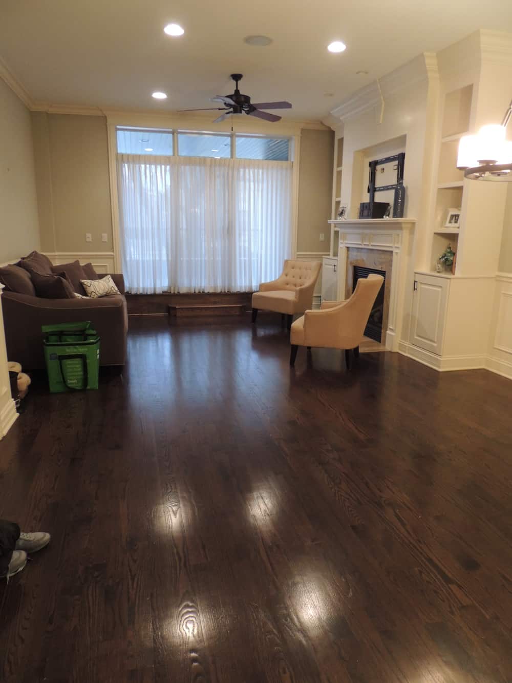
BEFORE LIVING ROOM:
Lots of great millwork, but the cream and pale green was a very hard color palette to decorate with. The client wanted a much more modern and contemporary look, which translates to cooler colors. When you are decorating with neutrals think about warm vs. cool. Do you want a warmer white and coordinating paint colors, or a cooler white and coordinating colors? The color of your floors or existing furniture pieces may help you decide. There is no right or wrong, but in this case, we wanted cooler colors for a more modern feeling.
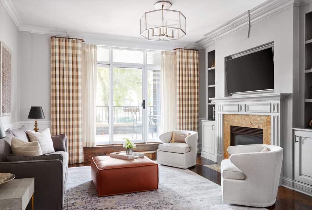
AFTER: LIVING ROOM
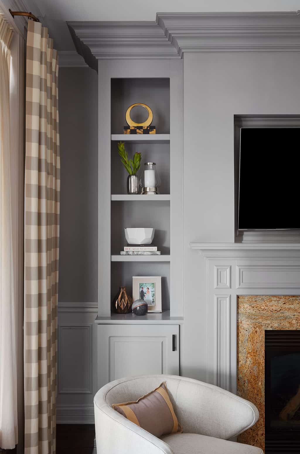
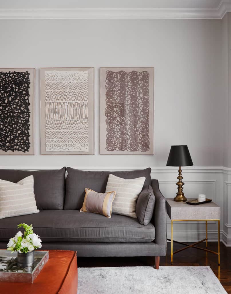
You can see how instantly with the cooler neutrals (more blues/grays/black in the paint) the space feels for modern and contemporary. We used a cool white, Benjamin Moore Chantilly Lace on the ceiling, crown and wainscoting. On the upper walls we used Farrow & Ball Cornforth White (pale gray) and to make the millwork on the built-in stand out we painted the entire piece in Farrow & Ball Worsted (med. gray).
I added some warmth back into the space by playing off the tans, browns and creams in the fireplace stone. Using some tans in the drapery, adding gold accents and cognac leather helps the space from feeling one note. Also, I love a pop of black and often feel that is makes a more modern room complete. It’s used on the lamp shades and in the art work for a nice grounding touch.
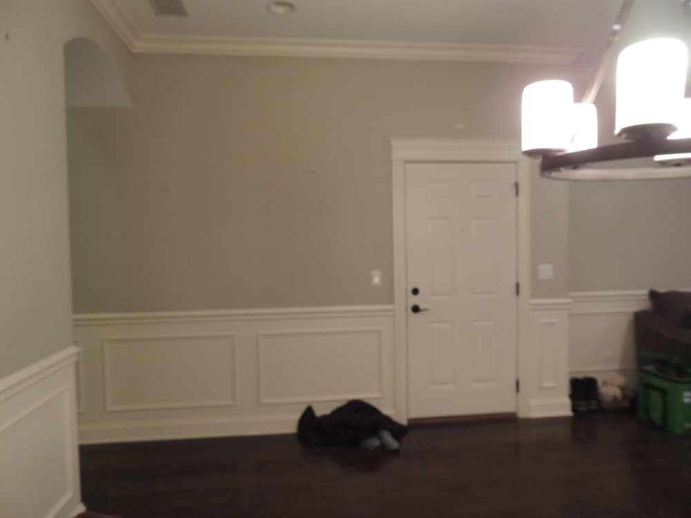
BEFORE ENTRY:
Don’t forget about your entryway! Even in condos where you don’t have a traditional entry, you can combine form and function for a beautiful and useful entry.
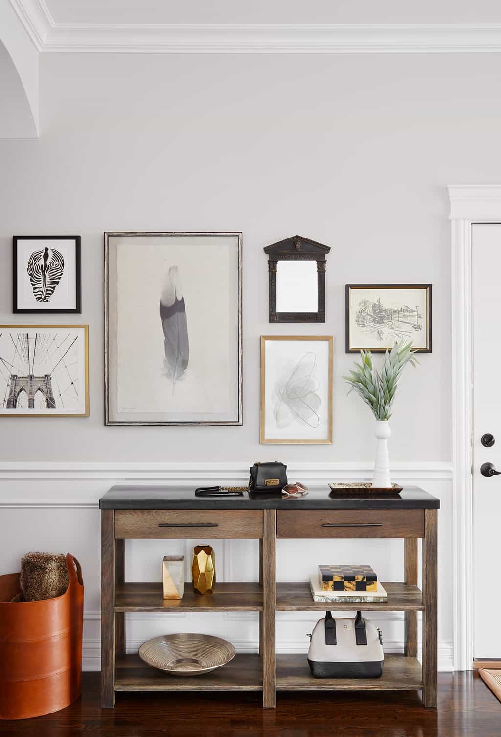
ENTRY AFTER:
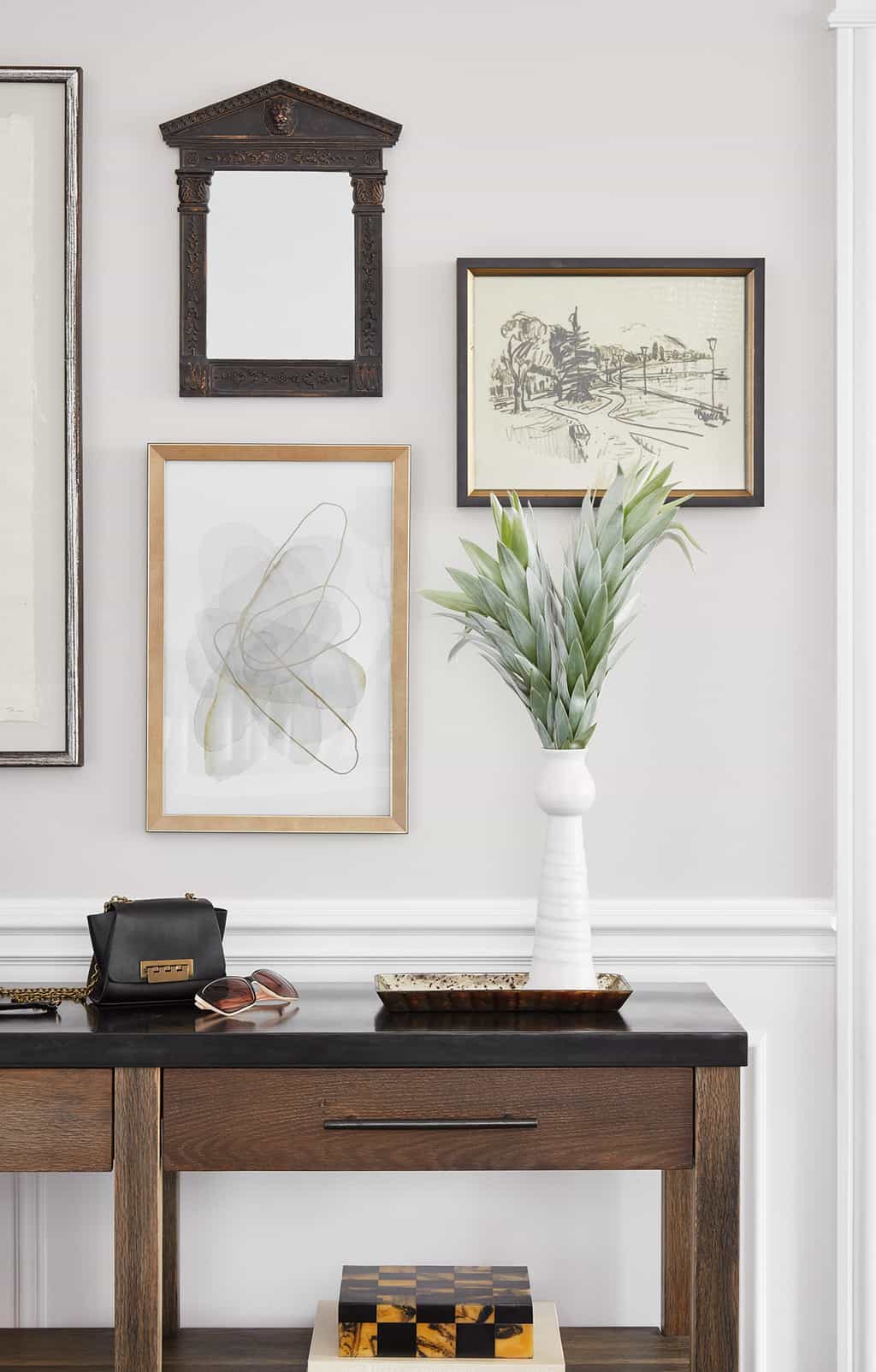
A gallery wall takes the once boring wall from drab to fabulous, and ties colors from the living room into the dining room. A custom console has drawers for keys and mail, and shelving for purses and accessories. A big leather basket can hide shoes, backpacks and more.
BEFORE DINING:
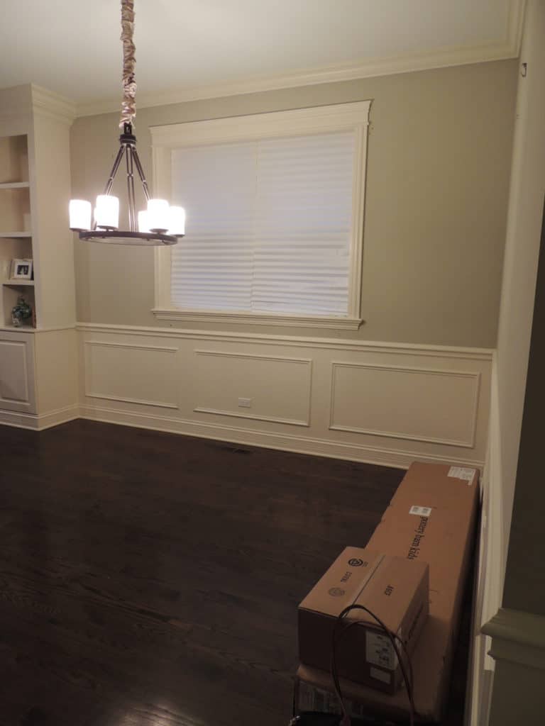
Connected to the living room, the dining room needed to coordinate as two independent spaces really function as one room.
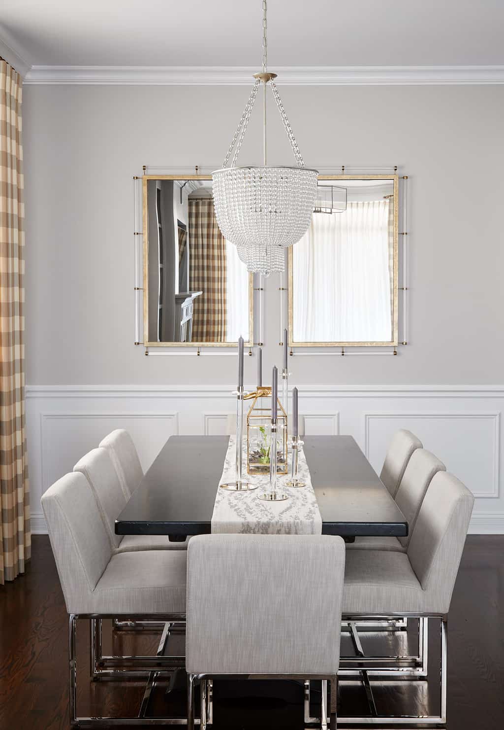
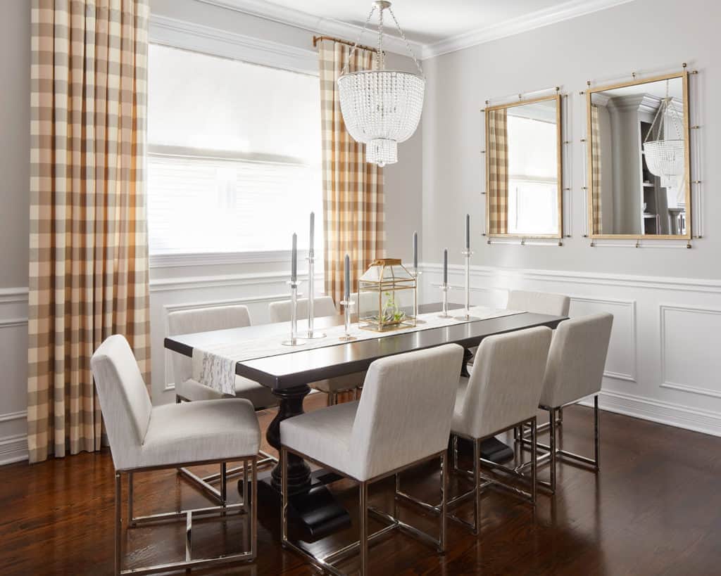
DINING ROOM AFTER:
Using the same drapery fabric on the dining room window helps unite the rooms, and using a black table helps with that modern and edgy feel. Mixing silver and gold accents works as it’s been done in the lighting, art, hardware and even chair legs – the lucite or glass also adds a touch of glamour. Don’t be afraid to mix metals and textures – it makes the space much more interesting than if everything matched!

Hope this gives you a few tips when thinking about when decorating with neutrals!
You can see the family room, nursery and all photos from this project in our PORTFOLIO.
If you are looking to create your version of a beautifully designed home, please contact us HERE.
XO – CLAIRE
Leave a Reply
October 7, 2024
read the post
YOU MIGHT ALSO LIKE
April 17, 2024
read the post
September 2, 2021
read the post
August 24, 2021
read the post
Meet Claire
Claire’s creative energy comes from her unique perspective on the world as both a trained interior designer and a passionate yoga teacher. Her affinity for kitchen design, timeless style and eclectic decorating are shared here, along with lots of interior design education and tips. Thanks for being here, please enjoy!