

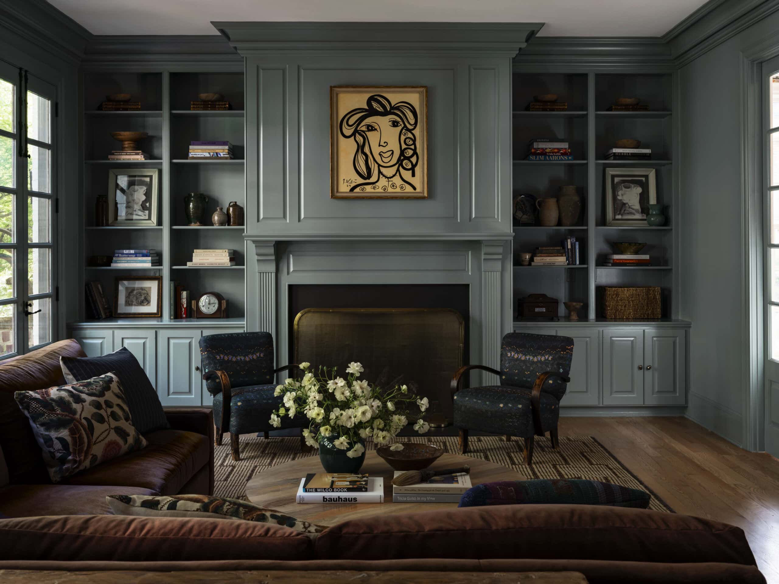
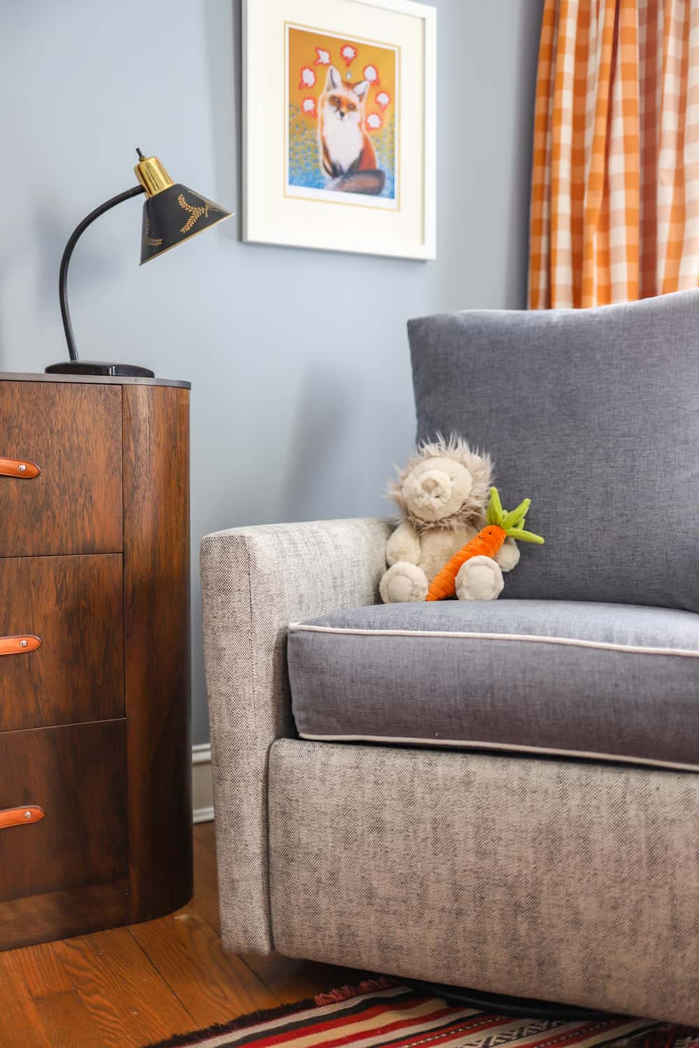
Just this week, our team was talking about how we are all drawn to moody mid-tone pastels right now, and hours later, Farrow & Ball released twelve new colors we are ready to sink our teeth into! It’s no secret that we aren’t afraid of using color in our designs. As a firm, we’ve been thinking more about our Centered by Design signature color palette. We often gravitate towards colors that have a softness and a richness. Nothing that is too bright or punchy. Colors that you would see somewhere in the natural world. We use color to balance feminine and masculine elements in our projects and to highlight architectural details like millwork. Don’t underestimate a coat of paint!
Farrow & Ball is a long-time favorite brand around here. These new colors are exactly what we’ve been craving in our interiors: they feel like a warm hug, a room you could spend all afternoon daydreaming in. Rooms with personality!! Long gone are the days of sterile grey and white interiors, and we couldn’t be happier about it!

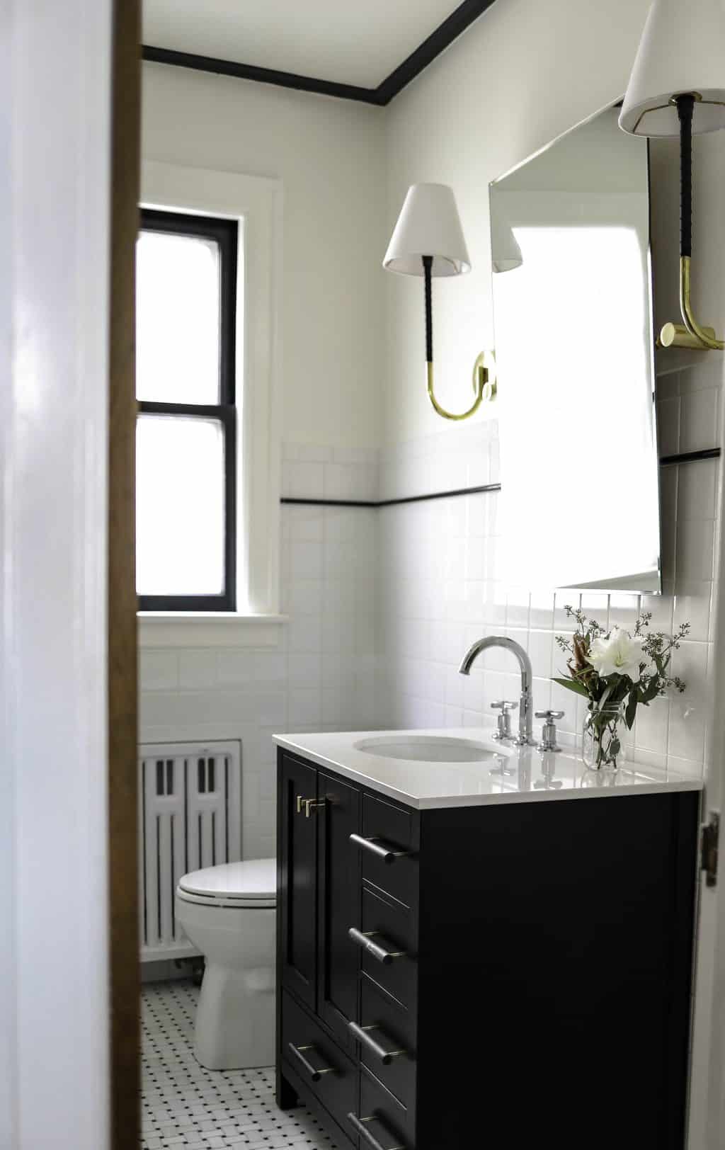
All work by Centered by Design.
We have loved introducing a similar palette in our recent projects! More to come…
All work by Centered by Design
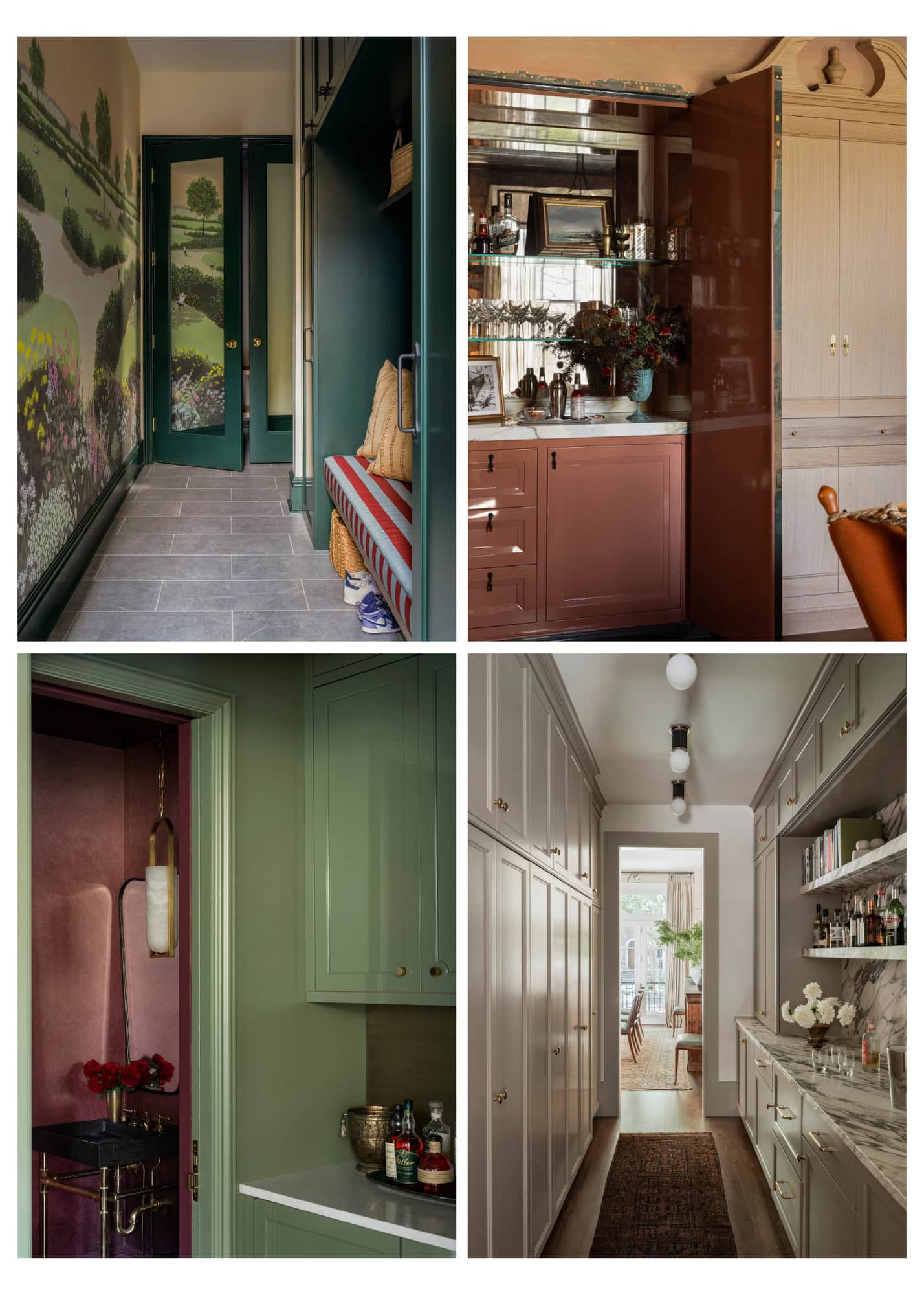
Color drenching is a designer technique when the entire room is painted from top to bottom in the same color including the trim and doors. It can also include the ceiling, fully drenching the room in color. You’ll notice we have been loving the impact it makes with these beautiful, livable colors.
Centered by Design North Carolina Colonial Project
Discover Farrow & Ball’s New Colors
Glancing through the new colors, we are excited about the fresh takes on well-loved colors and are already pulling them for new schemes!

SCALLOP: This muddy pale blush tone almost feels like a softer desaturated version of Dead Salmon (a CBD favorite!). We love that it has pink undertones in it but is digestible in a common space to not feel overly feminine. We have a feeling that we will start seeing this used as a designer staple.
Where we want to use it: Scallop would be perfect in a light filled breakfast room.


Where we want to use it: A room with natural light to amplify it. Soft pastel tones like these often sing in the sun.


Leave a Reply
October 7, 2024
read the post
YOU MIGHT ALSO LIKE
April 17, 2024
read the post
September 2, 2021
read the post
August 24, 2021
read the post

Meet Claire
Claire’s creative energy comes from her unique perspective on the world as both a trained interior designer and a passionate yoga teacher. Her affinity for kitchen design, timeless style and eclectic decorating are shared here, along with lots of interior design education and tips. Thanks for being here, please enjoy!

