

It’s been almost two months since move-in day, and for the most part the house looks totally the same. I keep thinking how have we not gotten more done?! The designer in me that is used to managing timelines, budgets and finishing rooms in six weeks is feeling very frustrated! But as a homeowner on a budget, I realize this stuff take some serious time and thought! Hence we are in what I am deeming the “planning phase”. After multiple meetings and discussions about our priorities, Luke and I have come up with a loose timeline and task list to keep us on track. We are both the type who love crossing items off our to-do list, so this spreadsheet will allow us to mark when tasks have been accomplished and see our progress in an otherwise daunting list of things that need work.
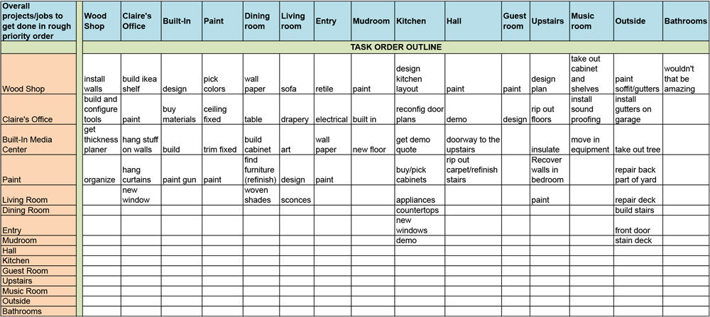
Exhibit A – The SPREADSHEET
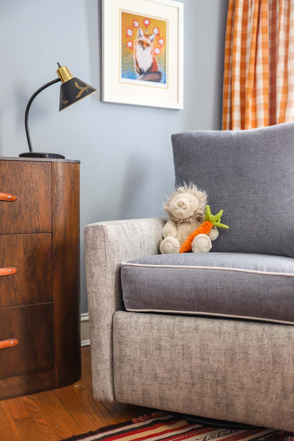
We are also in a bit of a holding pattern until Luke is officially off for the summer, and we’ve decided not to repaint until he’s done teaching for the year. He’s a great painter, and I’m decent so we’re choosing to save on the labor and paint most of the downstairs ourselves. This has allowed me to go crazy thinking about paint colors. The main thing that is different about this house from our last second story walk-up is the light. We used to live in a light flooded space, and I really took for granted all the eastern and southern exposure. Our main living room in the new house faces north, and the adjacent dining room has some eastern light. Northern facing rooms don’t get a lot of bright light, and they usually feel cold and can turn colors more gray or green.
There is lots of different advice when it comes to painting a northern facing room, but the two I like the best are 1. warm it up, or 2. go dark and cozy. If this was not our main living space, and the first room you enter in the house, I might have gone the dark and cozy route. A deep dark grey would look lovely with all the natural wood work, but I fear that going dark just isn’t livable for us on a daily basis. I also don’t want to paint my walls white (too stark for this vintage home), and a cool grey will feel cold in the northern room, but if I go too beige/brown/yellow it will feel boring and dated…so that leaves me with GREIGE PAINT. Greige paint is a very popular mix of gray and beige. It’s basically a warm gray (with more browns and yellows) than a cool grey (with more blues and purples). I think a warm grey will help the space feel more modern, not too cold, and allow for a neutral backdrop for more colorful decor.
This leads me to my quick list of tips on choosing paint:
- Always look at paint colors in natural daylight and at several times of the day
- Test the paint! With big swatches on the wall or big sample pieces taped flat against the wall
- Paint two coats and let it dry overnight, it will look different in the morning!
- Paint colors (like all colors) look very different based on the light and other nearby colors
- HERE is great little cheat sheet from Farrow & Ball about light affecting paint colors in interior rooms
- Make sure if you’re ceiling or trim is going to be white that it has similar undertones as your wall color. For instance, you would not want a warm wall color, and then a white with a lot of cool undertones (like blue and grey) it would end up looking dirty instead of crisp white.
Hopefully, you can see what I’m talking about below with the paint colors we tested. We tested the same set of colors in both rooms, and these photos were taken around 10am. You can see how different they look just based on the location and the light quality in each room! Note: artificial light will impact the color as well. Always turn off the lights when looking at the colors first, and then with the lights on. You can change the color temperature of your light bulbs to help achieve the color/mood you want to set in the room. A good rule of thumb is looking for lighting around 4000K (Kelvin) for white light. HERE is another good cheat sheet to understand color temperature a little better. Basically, lower numbers will look more yellow (warm light) and higher numbers with look more blue (cool light).
Here are the colors we tested. They are all Benjamin Moore colors, with the exception of Skimming Stone. My husband wanted to see how the B.M. paint color matched to the Farrow and Ball Skimming Stone (which is much pricer per gallon). As you can see, it’s definitely not the same. It actually looks closer to Balboa Mist. This is why your designer tells you NOT to color match, it really cannot be done accurately due to the proprietary paint bases each company uses. Regardless, you can still try and you might like the color better or just as well. When looking at both photos below, you can see how the light is brighter in this top photo. I can see the undertones in the paint much more in the top photo. Cotton Balls has some yellow, White Dove some gray, Vintage Taupe some pink. Barren Plains almost looks purple! Balboa Mist and Skimming Stone are the most greige paint, but you can see the color matched version has more brown/red.
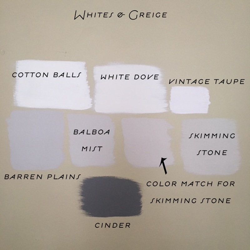
Eastern facing room
Moving onto the northern facing room, you can see how the cooler light works well with these colors and brings out the grays much more. Dove White looks the most different by far, and goes really gray/green in the cool light. We won’t be using that one for the trim, but it’s very popular in well lit kitchens for cabinetry.
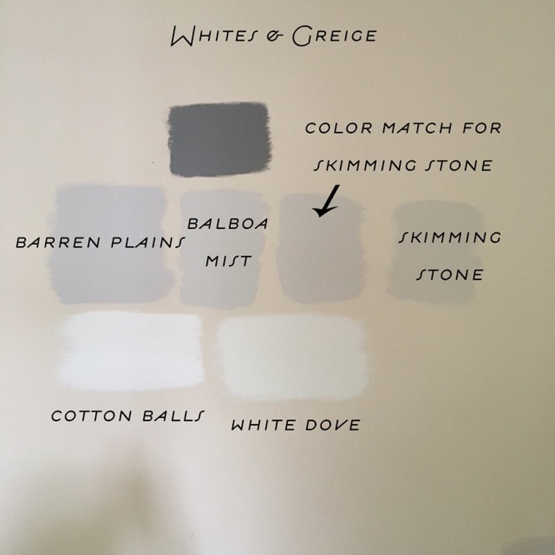
Northern facing room
The jury is still out on exactly what we are going to choose, but I’m so glad we tested multiple colors as I’m certain cotton balls is a better white for the trim and windows. Cinder (the dark grey) will most likely be the color we paint the built-in the living room, and I think we are leaning towards Balboa Mist as the wall color. We’ll probably run out and test a few more wall and ceiling colors just to be certain. I’d also love to paint the dining room ceiling a color, a sort of peach or blush, but it’s been hard to pull the trigger and convince Luke on that one. If you know any great peach/blush colors please let me know!
XO – CLAIRE
Leave a Reply
April 17, 2024
read the post
YOU MIGHT ALSO LIKE
September 2, 2021
read the post
August 24, 2021
read the post
May 15, 2021
read the post

Meet Claire
Claire’s creative energy comes from her unique perspective on the world as both a trained interior designer and a passionate yoga teacher. Her affinity for kitchen design, timeless style and eclectic decorating are shared here, along with lots of interior design education and tips. Thanks for being here, please enjoy!


So fun to read more about the colors we caught in-person over the weekend, Claire. Our apartment on Halsted was Balboa Mist!
How funny Tara! Jeez that afternoon went by too fast. We will need to catch up again soon. xx